How to configure and style Elementor Slider Widget
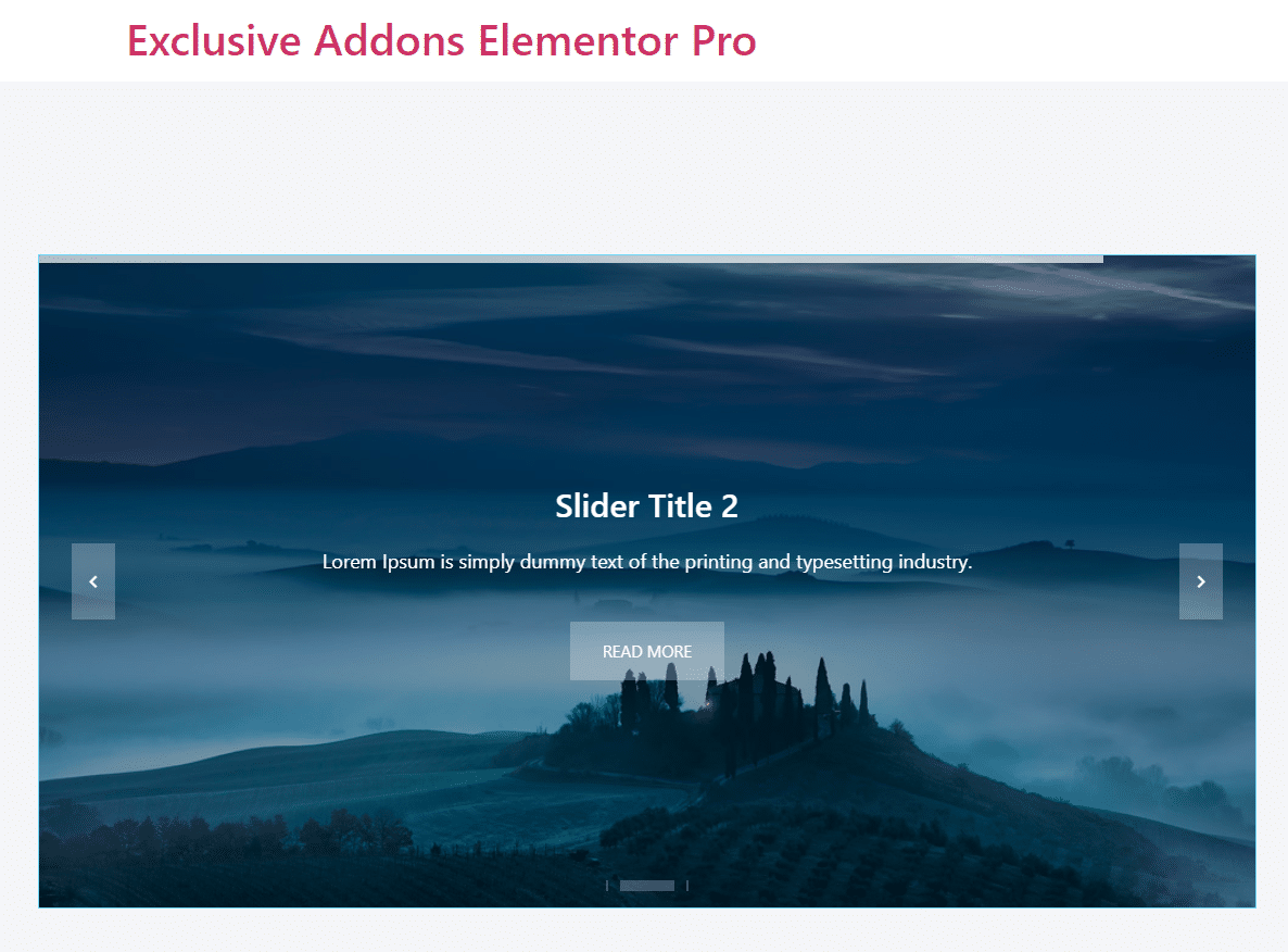
Show your content in a trendy and elegant way. Design a stylish slider with hero image, different navigation styles, and customizable options using Slider Widget of Exclusive Addons Elementor.
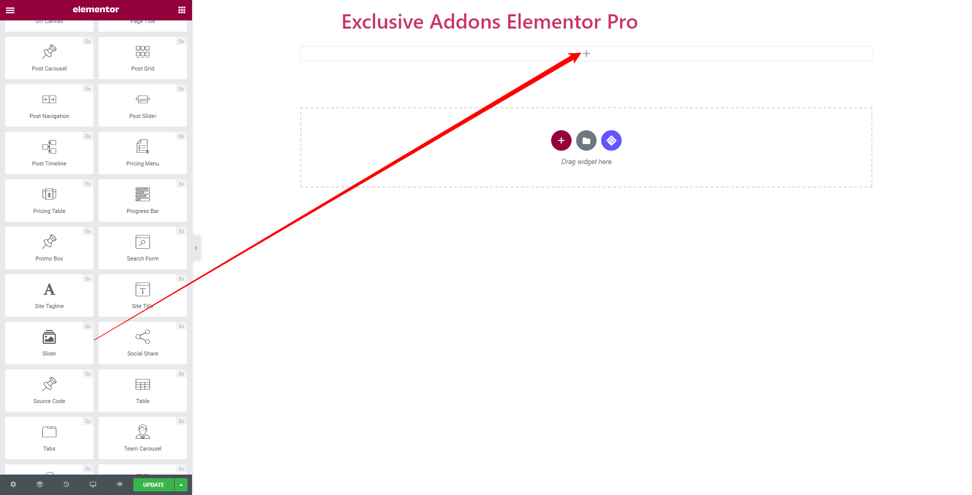
STEP 1:
Select the ‘Slider Widget‘ from Elementor panel. Then drag and drop it in the selected area.
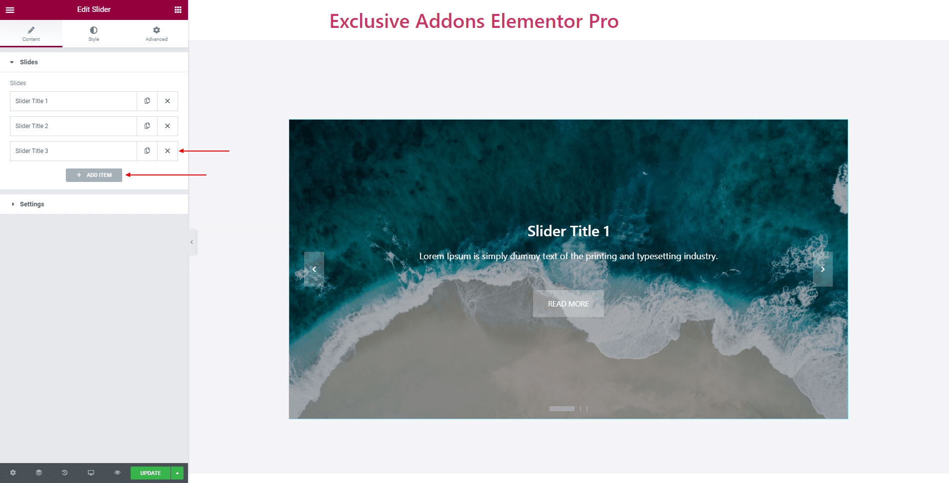
STEP 2:
Content tab allows you to configure Slides and Setting.
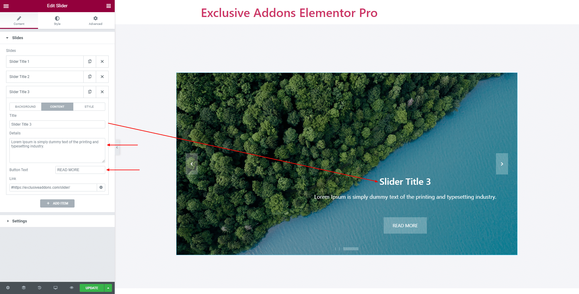
2.1 In Slides section, you can add as many Slides as you want by clicking ‘Add ITEM‘ button. Also can delete any of them with the ‘Cross‘ button.
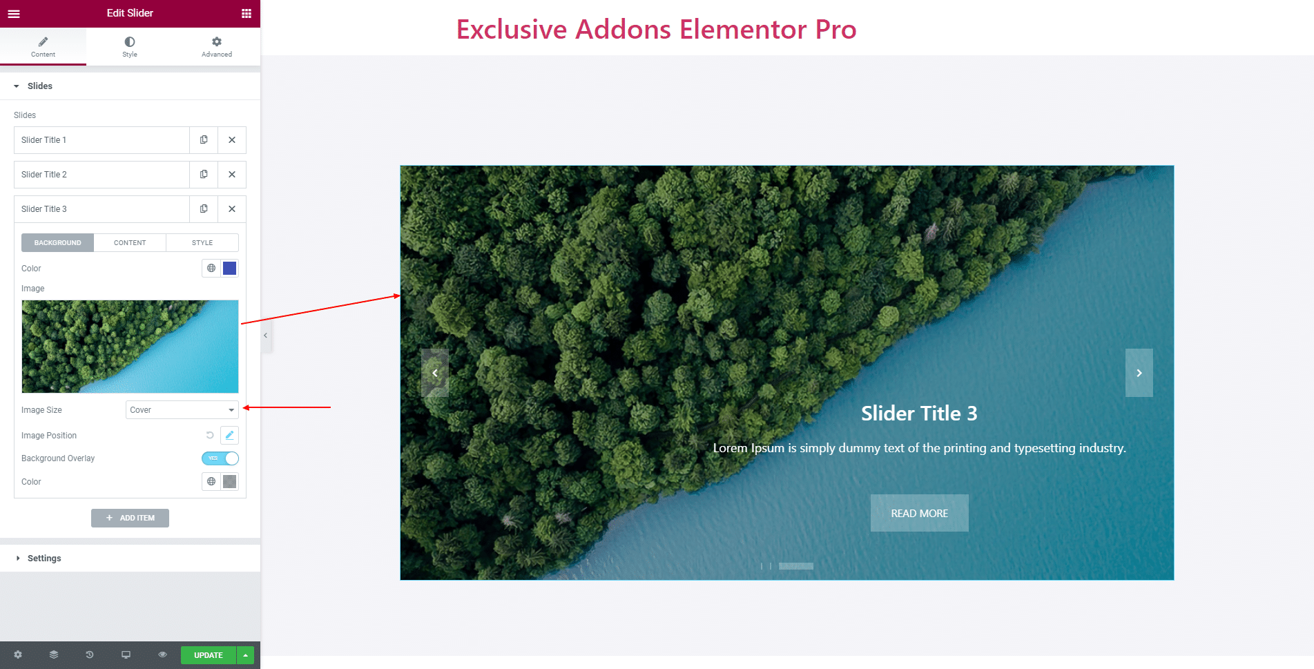
For each item you can configure the ‘Background‘ by changing its Color, Image, Image Size, Image Position, enable Background Overlay, and set Overlay Color.
Set the Title, Details, Button Text, and Link for ‘Content’.
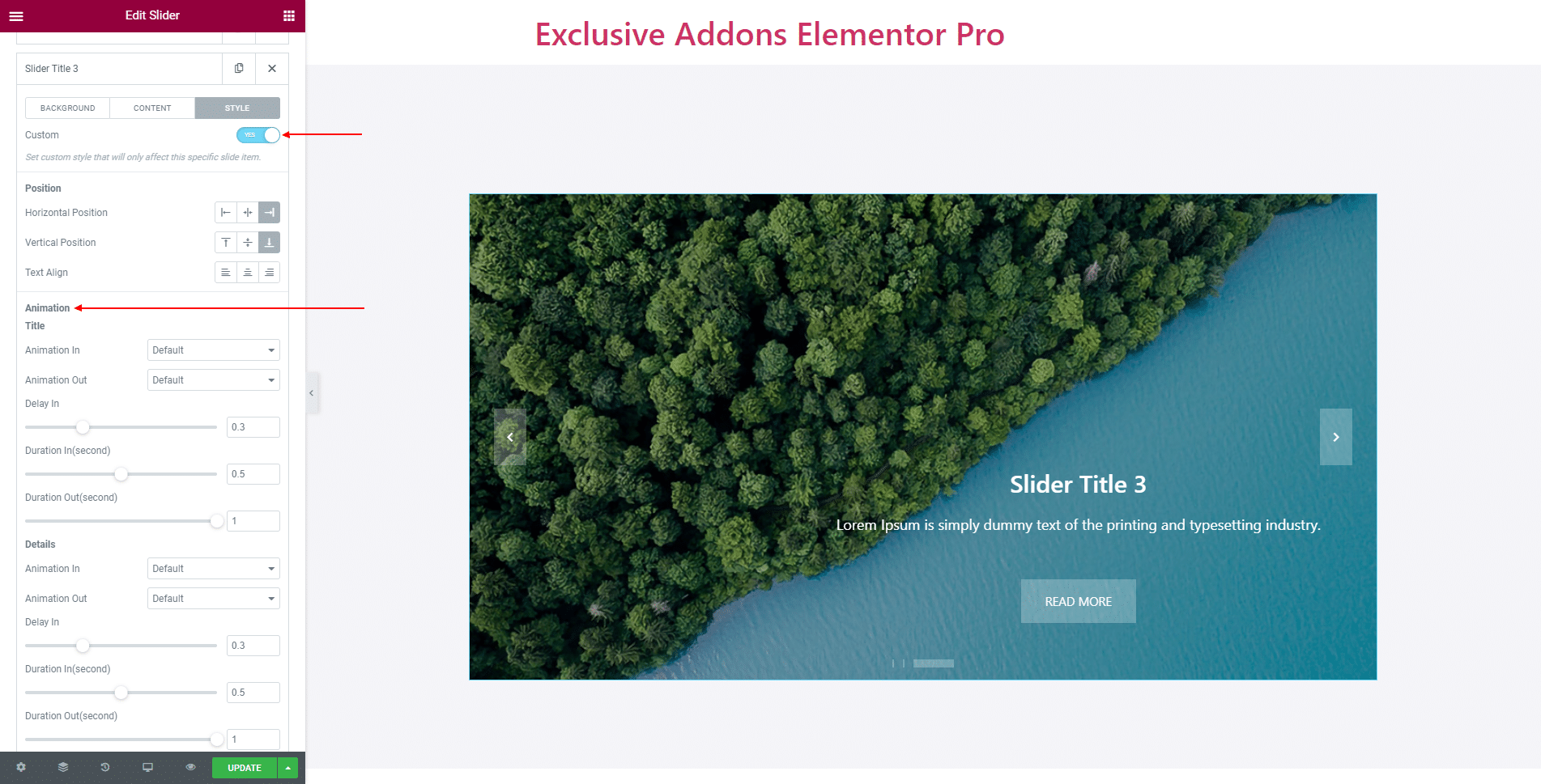
You can enable ‘Custom Style‘. If enabled set Horizontal Position, Vertical Position, and Text Alignment.
Choose Animation In and Animation Out style, and set Delay In, Duration In, and Duration Out time individually for ‘Animation Title’, ‘Details’, and ‘Button’.
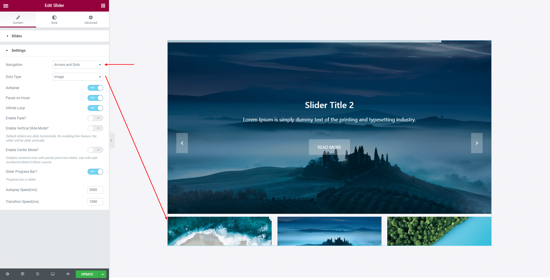
2.2 In Settings section, you can enable features like Autoplay, Pause On Hover, Infinite Loop, Slider Progress Bar, Enable Fade, and set the Transition Speed.
Also can enable Vertical Slide Mode and Center Mode. If Autoplay is enabled, set Autoplay Speed as well.
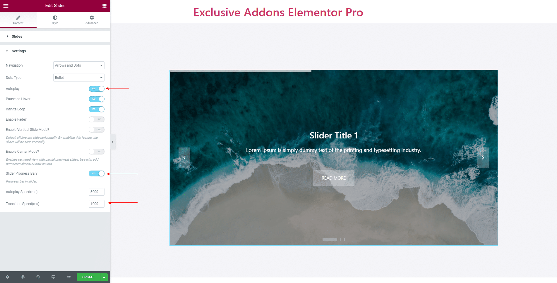
You also get to choose Navigation style as ‘Arrows’, ‘Dots’, and both ‘Arrows & Dots’. And choose Dots Type to ‘Bullet’ or ‘Image’.
STEP 3:
Style tab allows you to customize Container, Content Title, Content Details, Content Button, Progressbar, Arrow Controls, and Dots Bullet.
3.1 In Container section, set Padding, Border Radius, Item Margin, Box Shadow, Custom Height for image, and Content Width.
Also can set background image Height to ‘Full Screen’. Besides, choose Horizontal Position and Vertical Position as well as Text Alignment.

3.1 In Container section, set Padding, Border Radius, Item Margin, Box Shadow, Custom Height for image, and Content Width.
Also can set background image Height to ‘Full Screen’. Besides, choose Horizontal Position and Vertical Position as well as Text Alignment.
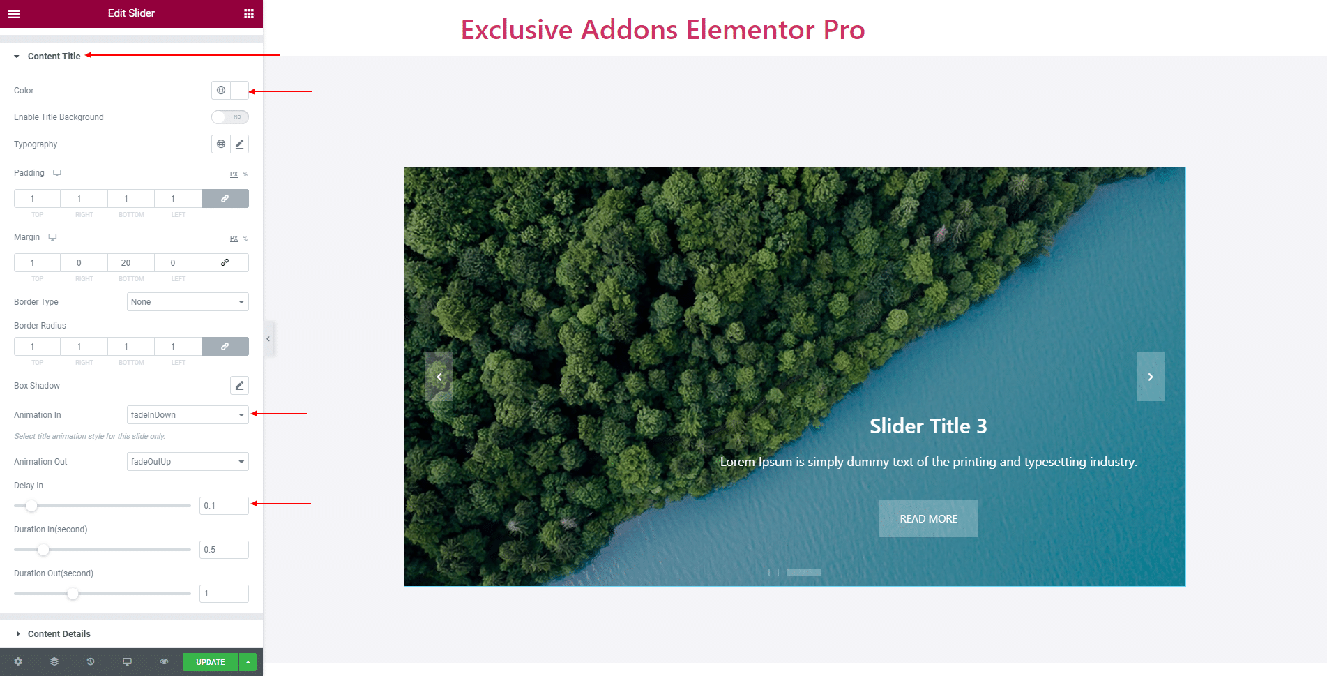
3.2 For Content Title, set its Color, Typography, Padding, Margin, Border Type, and Border Radius as well as Enable Title Background.
Also can choose Animation In and Animation Out style, and set Delay In, Duration In, and Duration Out time.
3.3 For Content Details, set its Color, Background Color, Typography, Padding, Margin, Border Type, and Border Radius.
Also can choose Animation In and Animation Out style, and set Delay In, Duration In, and Duration Out time.

3.4 In terms of Content Button, you can change Padding, Margin, Typography, and choose Animation In and Animation Out style, and set Delay In, Duration In, and Duration Out time.
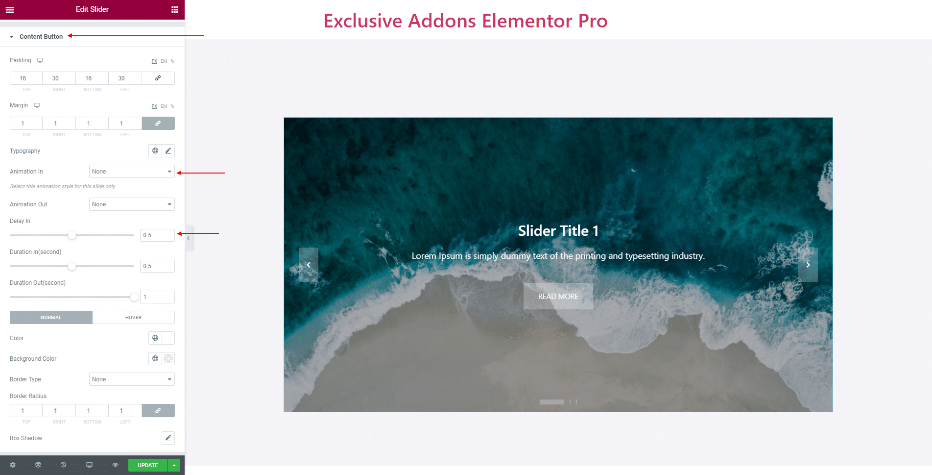
Use individual Color, Background Color, Border Type, Border Radius, and Box Shadow for both ‘Normal’ and ‘Hover’.

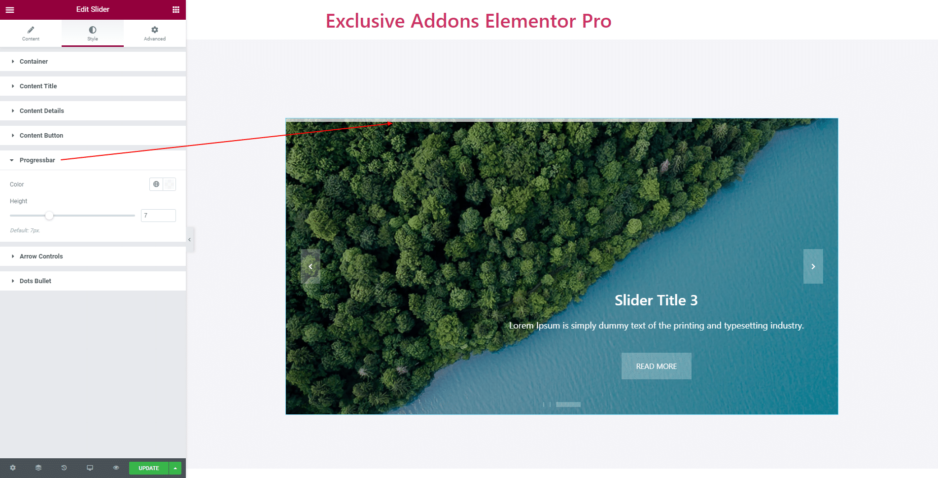
3.5 In Progressbar section, decide over its Color, and Height.
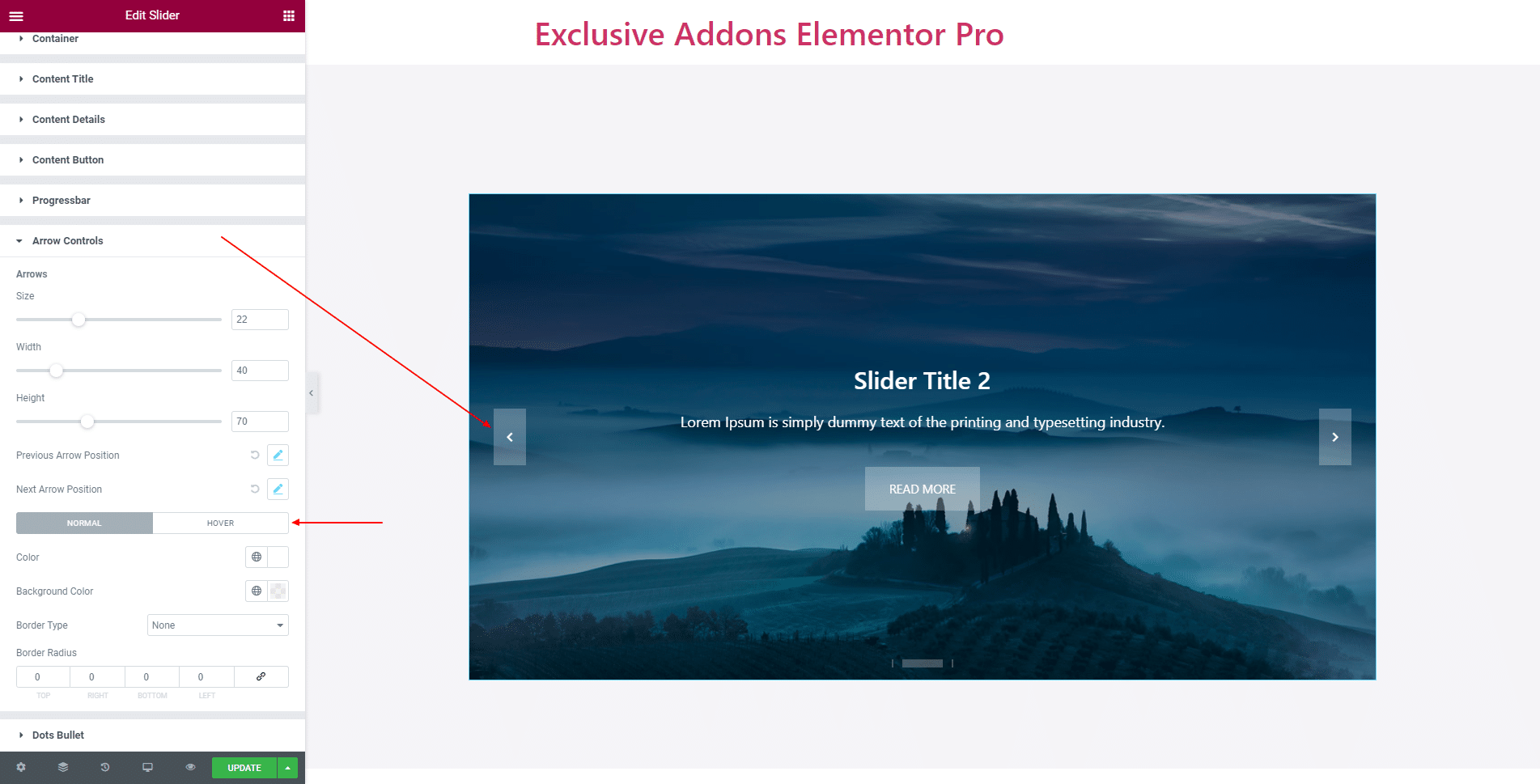
3.6 In Arrow Controls section, adjust its Size, Width, Height, also set Previous Arrow Position and Next Arrow Position.
Use different Color, Background Color, Border Type, Border Radius, and Box Shadow for both ‘Normal’ and ‘Hover’.
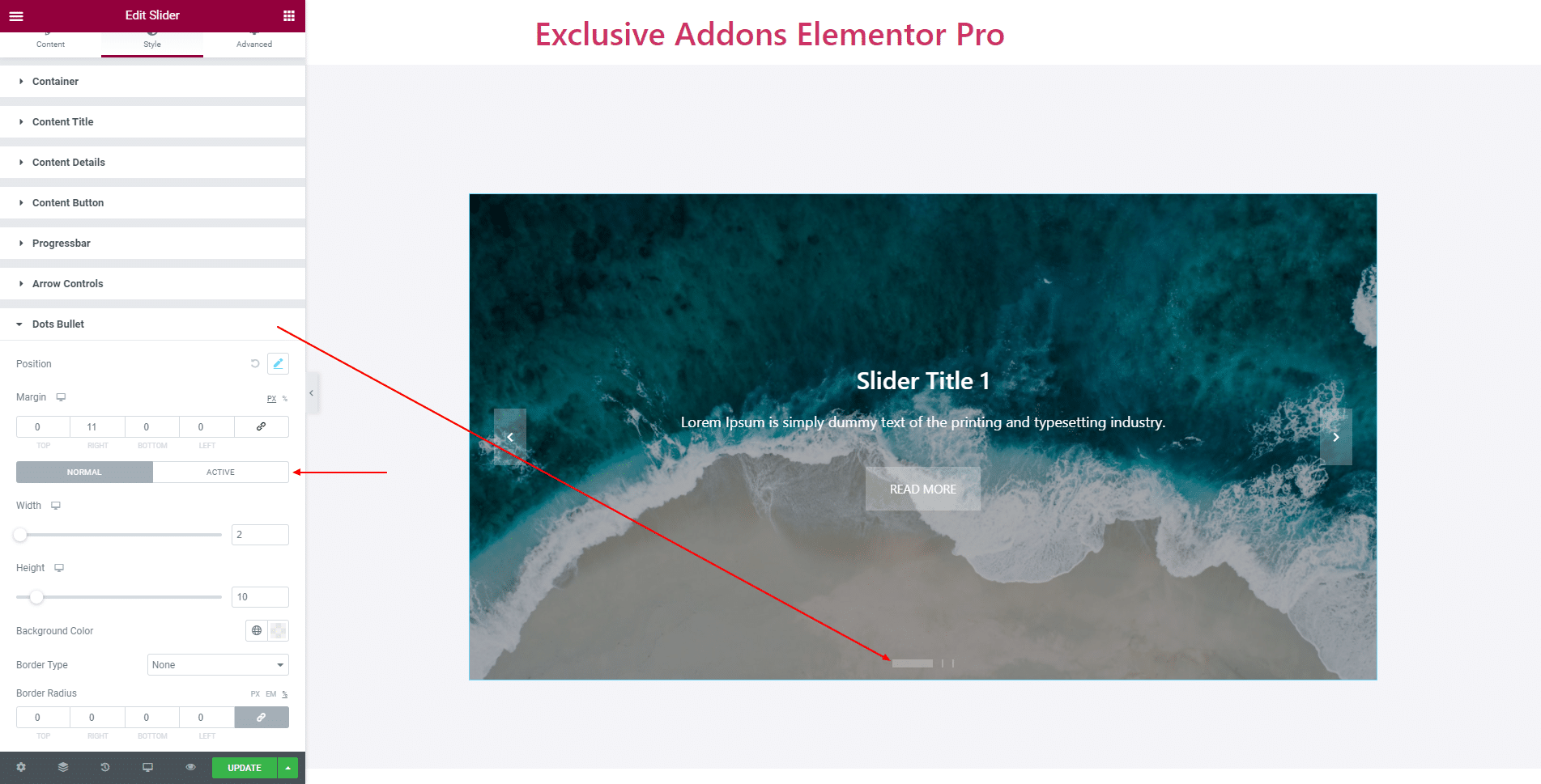
3.7 In Dots Bullet section, you can change Margin, and set Width, Height, Color, Border Type, and Border Radius individually for ‘Normal’ and ‘Active’ state.
STEP 3:
Finally, hit the Update button, and include a stylish Slider Widget on your Wordpress site.