How to Configure and Style Elementor Woo My Account Widget.
Woo My Account Widget from Exclusive Addons helps you to design a splendid Woo Commerce account profile page for your e-commerce site. Read this documentation to learn how to use the Exclusive Addons WooCommerce My Account page widget for Elementor.
Note: To use WooCommerce My Account widgets from Exclusive Addons, you need to have the WooCommerce plugin installed on your website.
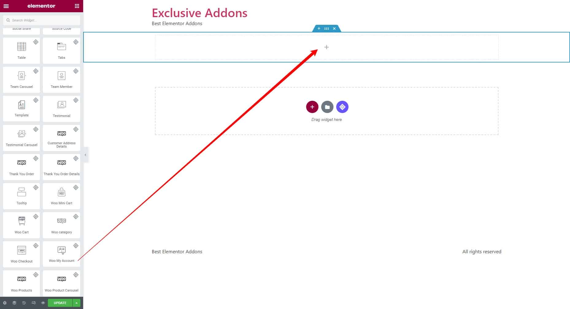
STEP 1:
Select the Woo My Account widget from the Elementor panel. Then drag and drop it in the selected area.
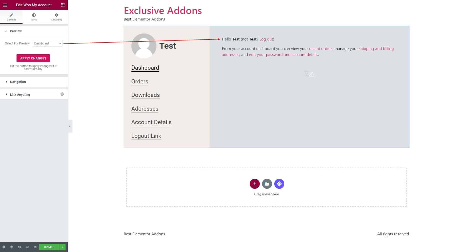
STEP 2:
The Content tab allows you to configure the widget.
2.1 In the Preview section, decide the preview you want to show. Choose the primary preview among the following options: Dashboard, Orders, Downloads, Addresses, and Account Details. Hit the “APPLY CHANGES” button to confirm the modifications.
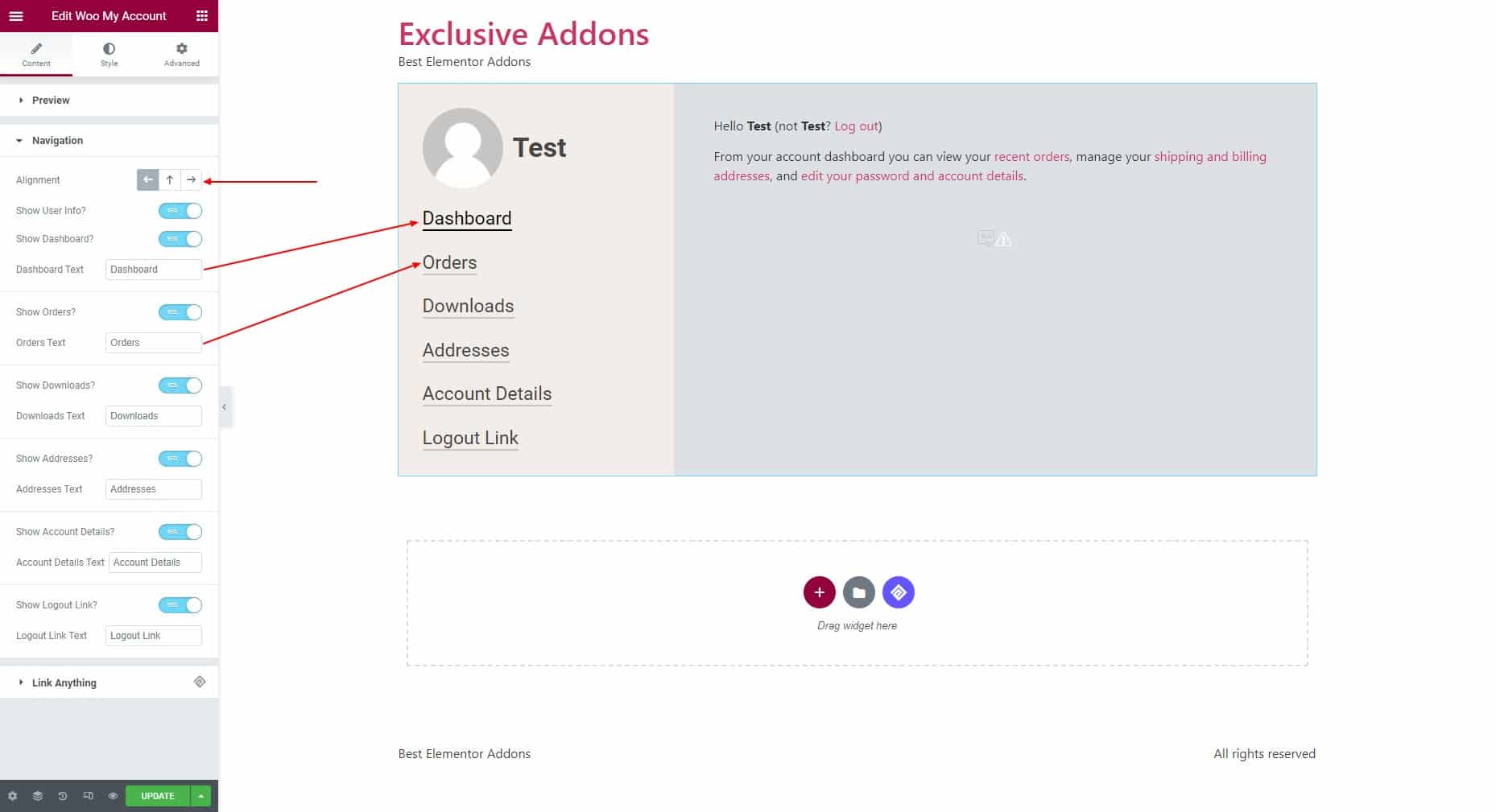
2.2 To configure the Navigation, choose the Alignment to right, left, or center and decide to Show User Info. If you decide to show the user info, choose to show the following navigation and set their text: Dashboard, Orders, Downloads, Addresses, Account Details, and Logout Link.
STEP 3:
The Style tab allows you to customize the widget styles.
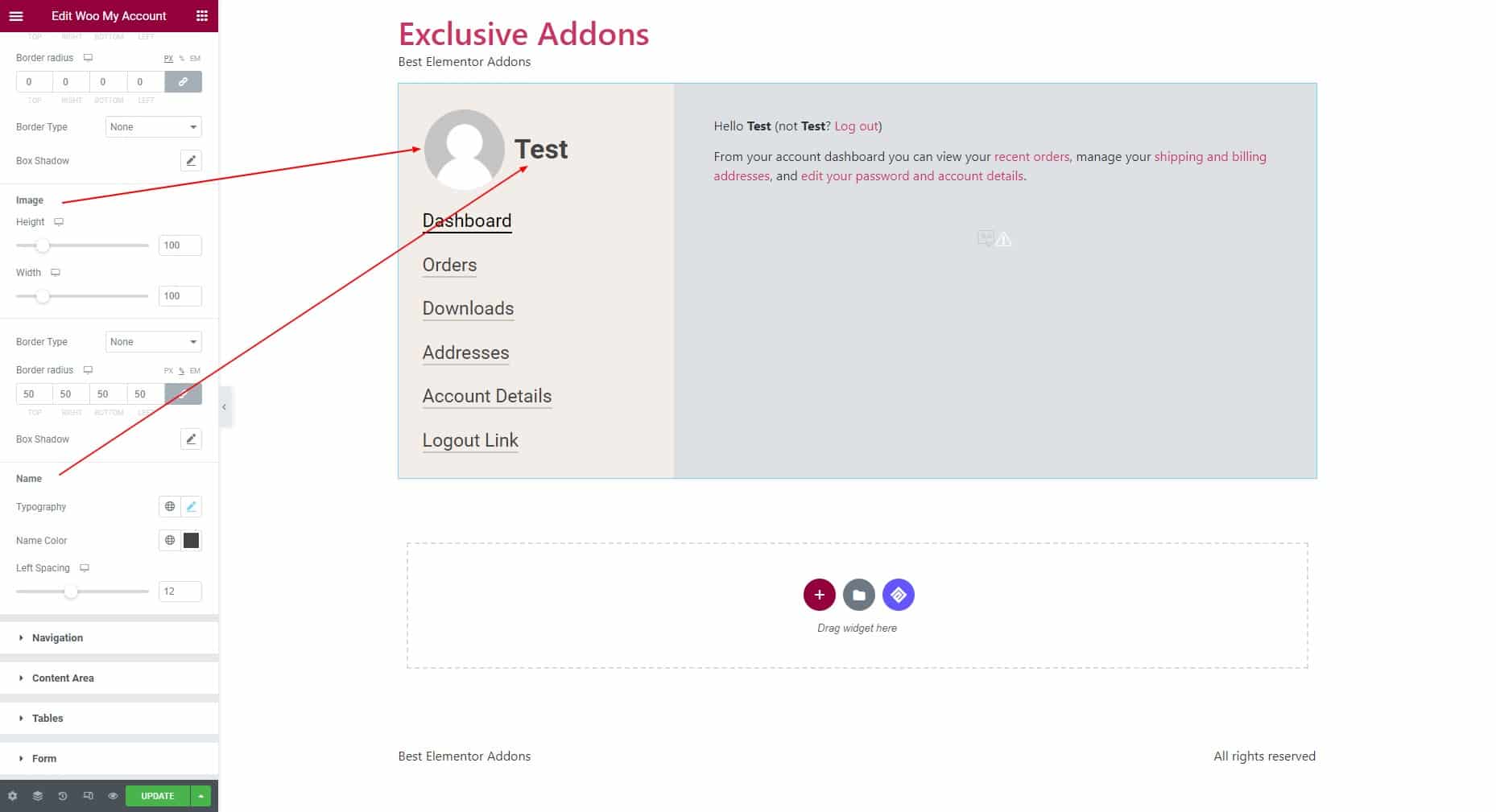
3.1 Under the User Info section, you can customize the User Container, Image, and Name styles.
User Container: Adjust the Bottom spacing and set the margin, padding, border radius, background type, and border type for this section.
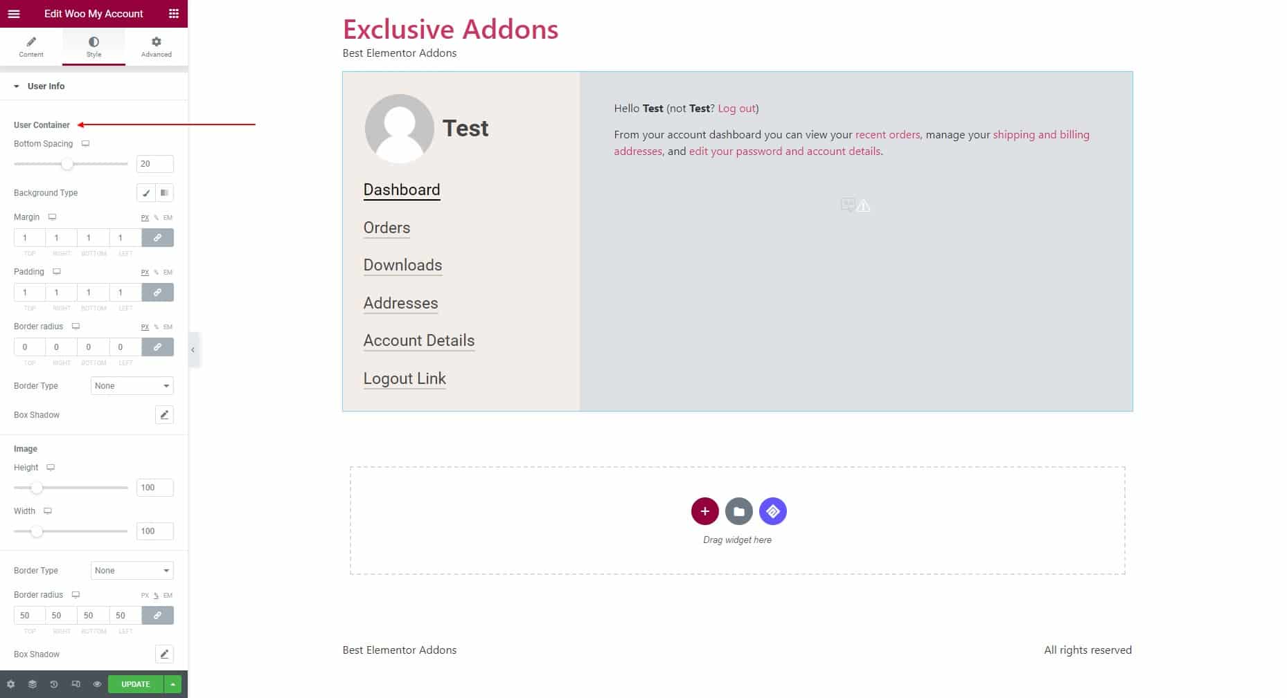
Image: Adjust height and width for the images. Then set its border type and border radius.
Name: Set the typography and name color, and adjust the Left Spacing for the Name.
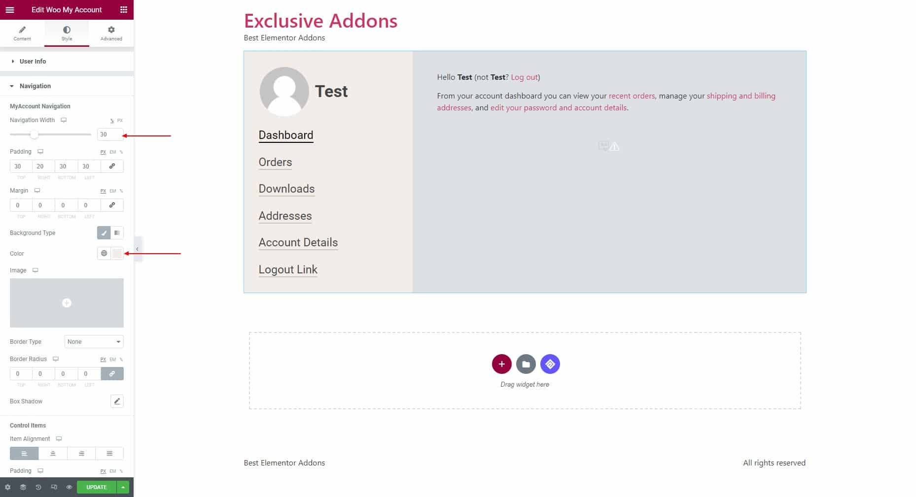
3.2 Under the Navigation section, you can customize the MyAccount Navigation and Control Items.
MyAccount Navigation: Adjust the navigation width and set the padding and margin. Then set the Background type and color. Also, set the Border type and border radius.
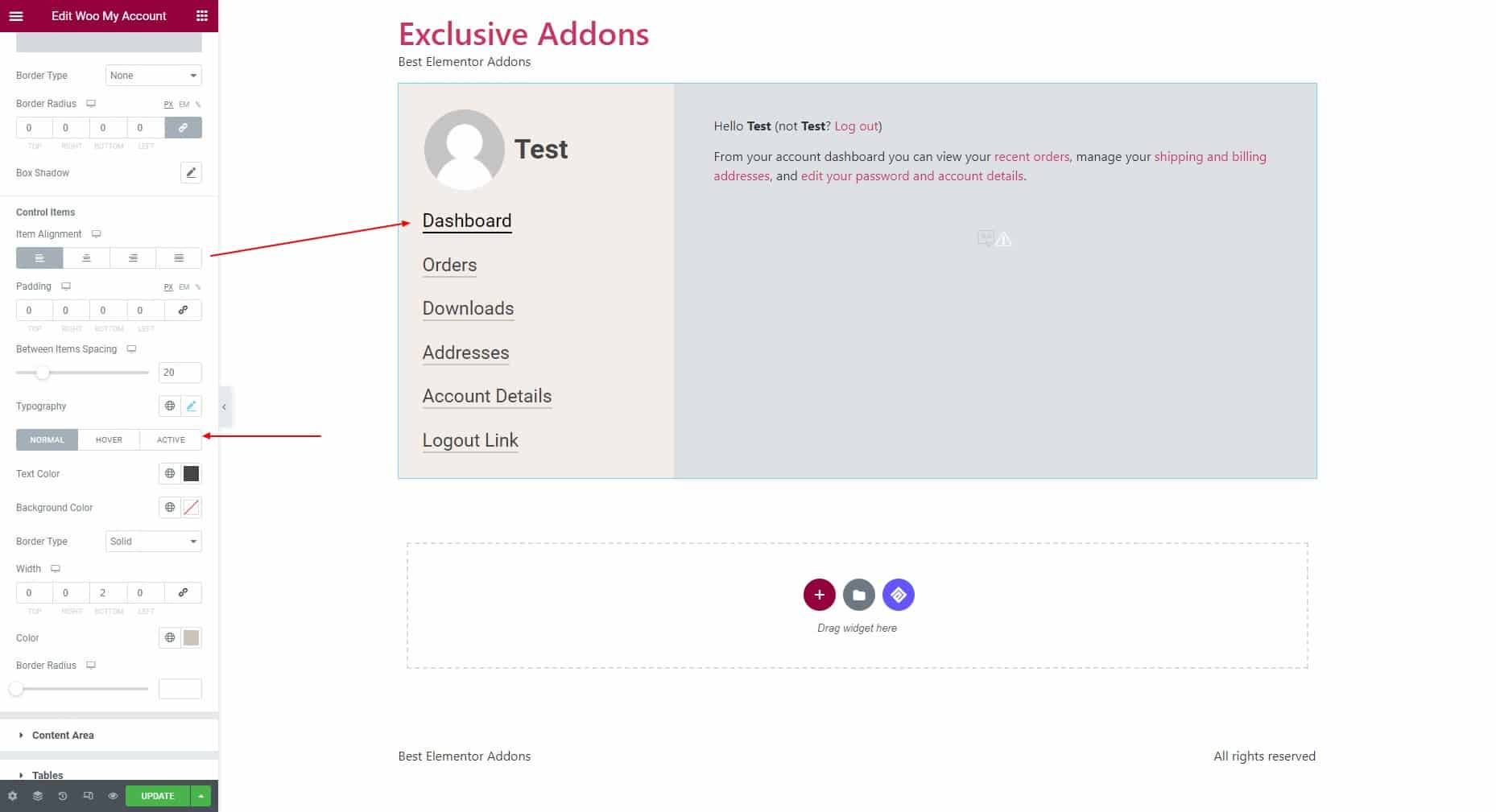
Control Items: Set the item alignment, padding, space between items, and typography. Then choose the individual text color, background color, and border type for “Normal”, “Hover”, and “Active” states.
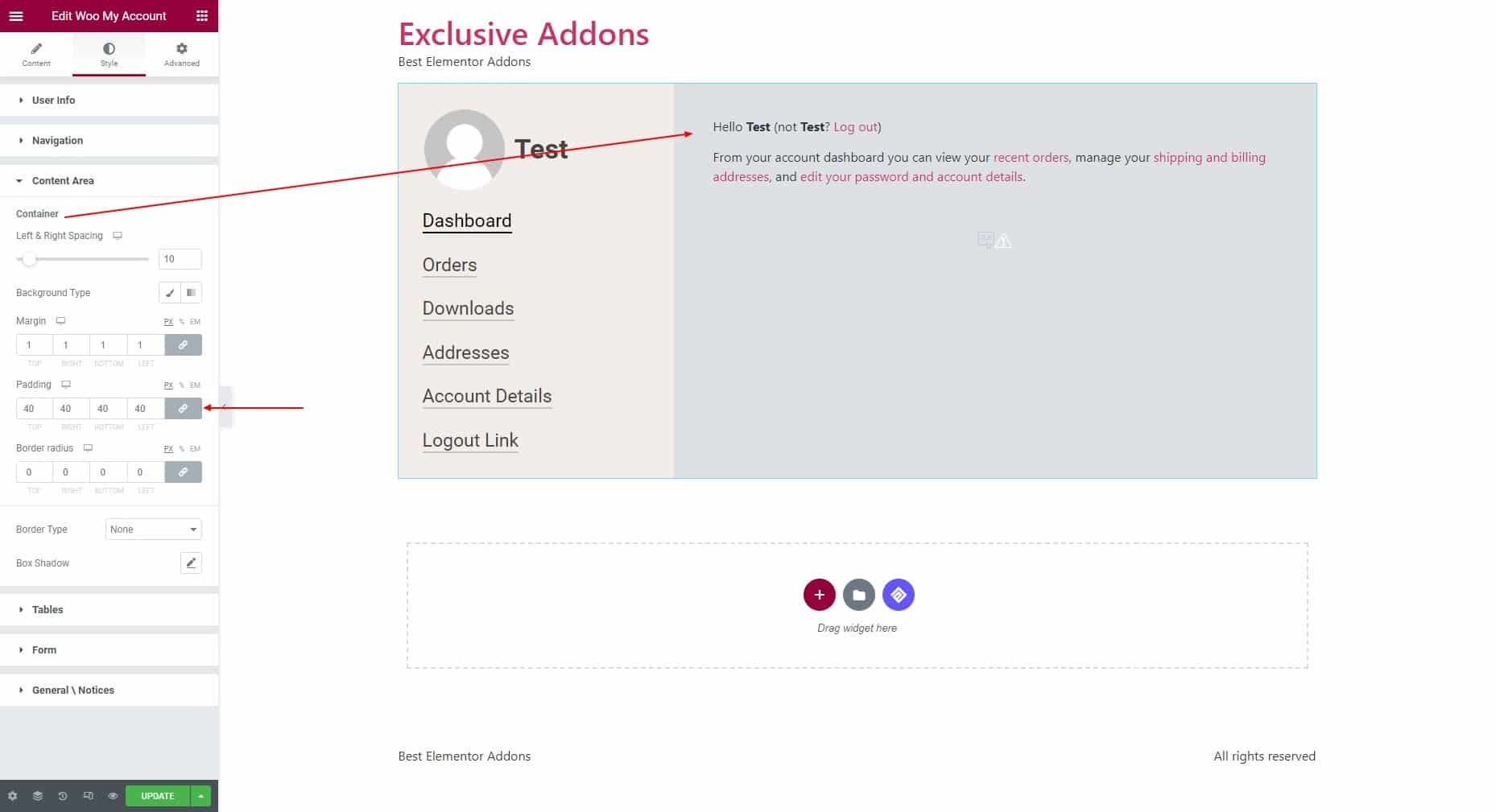
3.3 In terms of Content Area, adjust the left & right spacing for the Container. Then choose background type and set margin, padding, border radius, and border type.
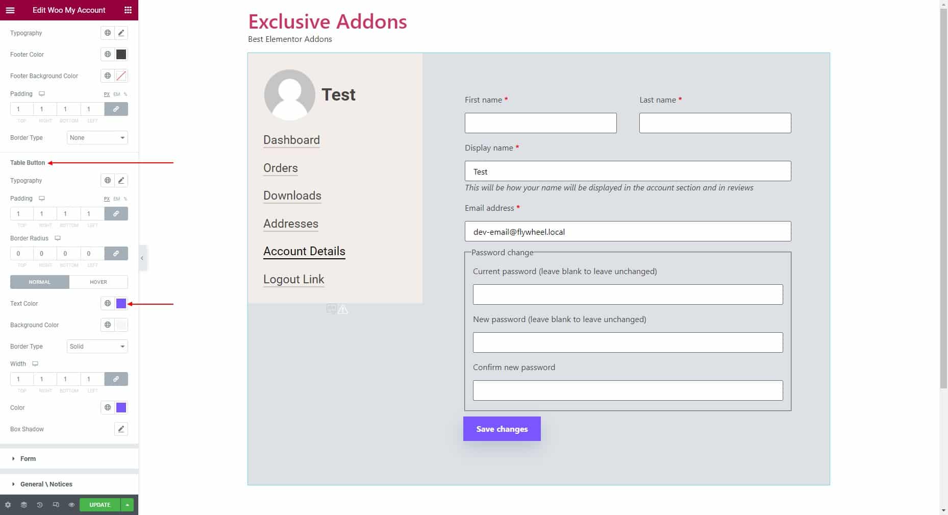
3.4 In the Tables section, customize the Table, Header, Table Rows, Table Cell, Table Footer, and Table Button.
Table: Set typography, vertical alignment, horizontal alignment, padding, background color, border type, and border radius.
Table Rows: Choose the row color, row background color, even color, and even background color.
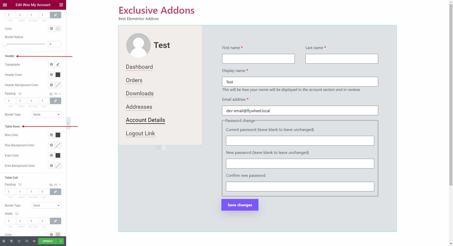
Table Cell: Set padding, border type, border width, and color.
Table Footer: Set typography, footer color, footer background color, padding, and border type.
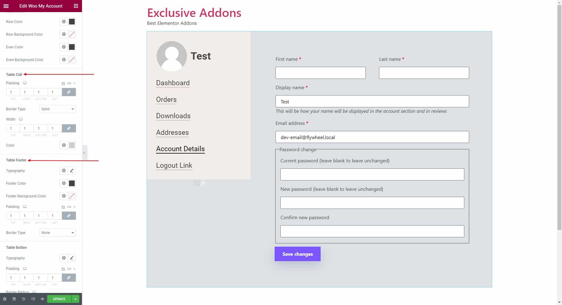
Table Button: Set the typography and border radius. Also set text color, background color, border type, width, and color.
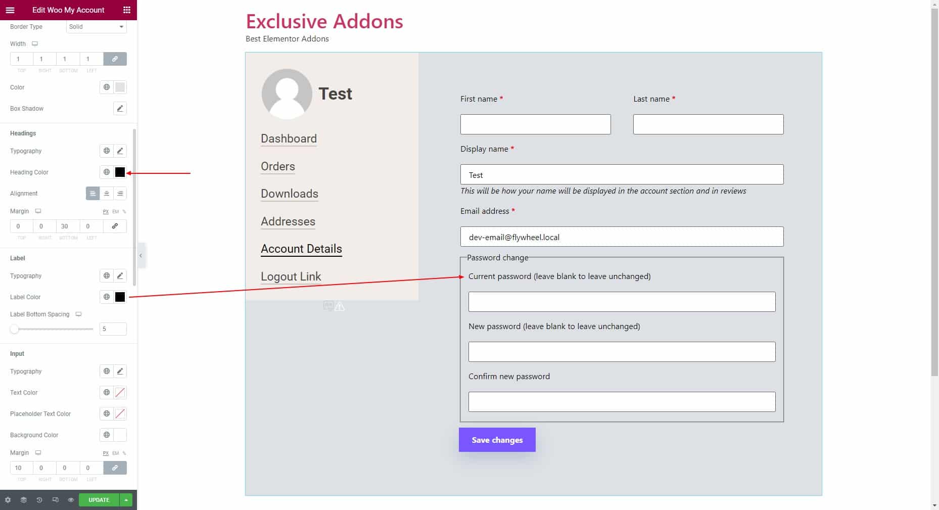
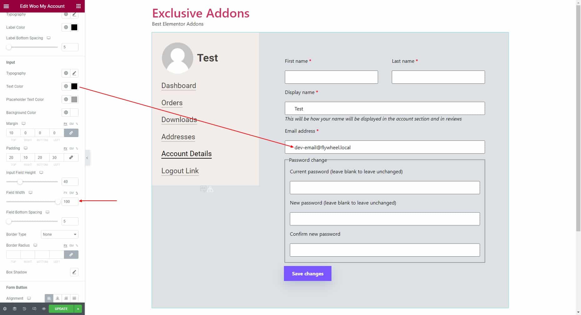
3.5 In the Form section, customize the Form Container, Headings, Label, Input, and Form Button.
Form Container: Set the background type, margin, padding, border radius, and border type.

Headings: Set typography, heading color, alignment, and margin.
Label: Set typography, and label color. Then adjust the label bottom spacing.
Input: Choose text color, placeholder text color, and background color. Also, set typography, margin, padding, and border radius. Then adjust the input field height, field width, and field bottom spacing.
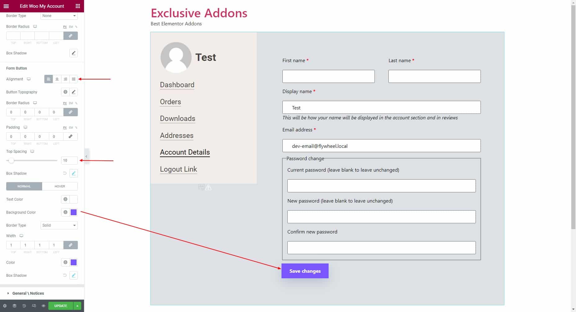
Form Button: Set alignment, button typography, border radius, padding, and top spacing. Then choose the individual text color, background color, and border type.
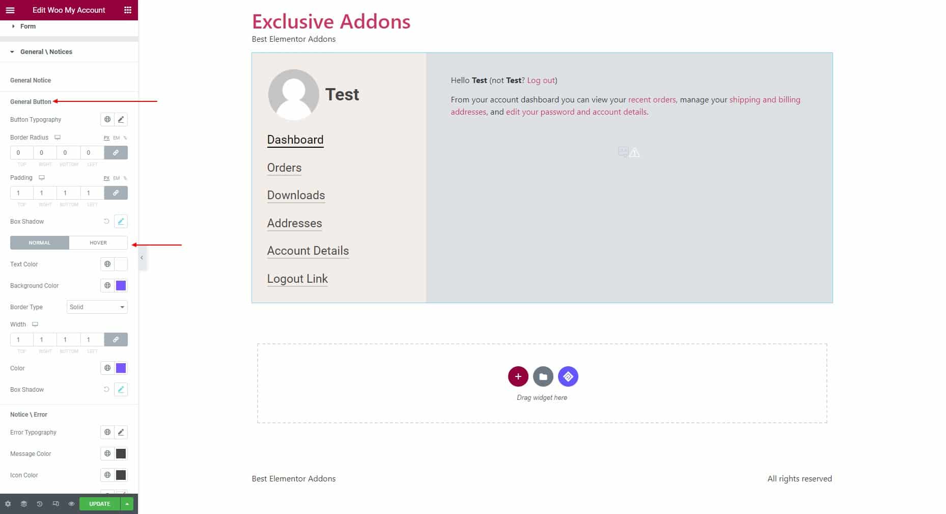
3.6 In the General/Notice section, customize the general button, Notice / Error, and message style.
General button: Set the button typography, border radius, and padding. Then choose the text color, background color, and border type.
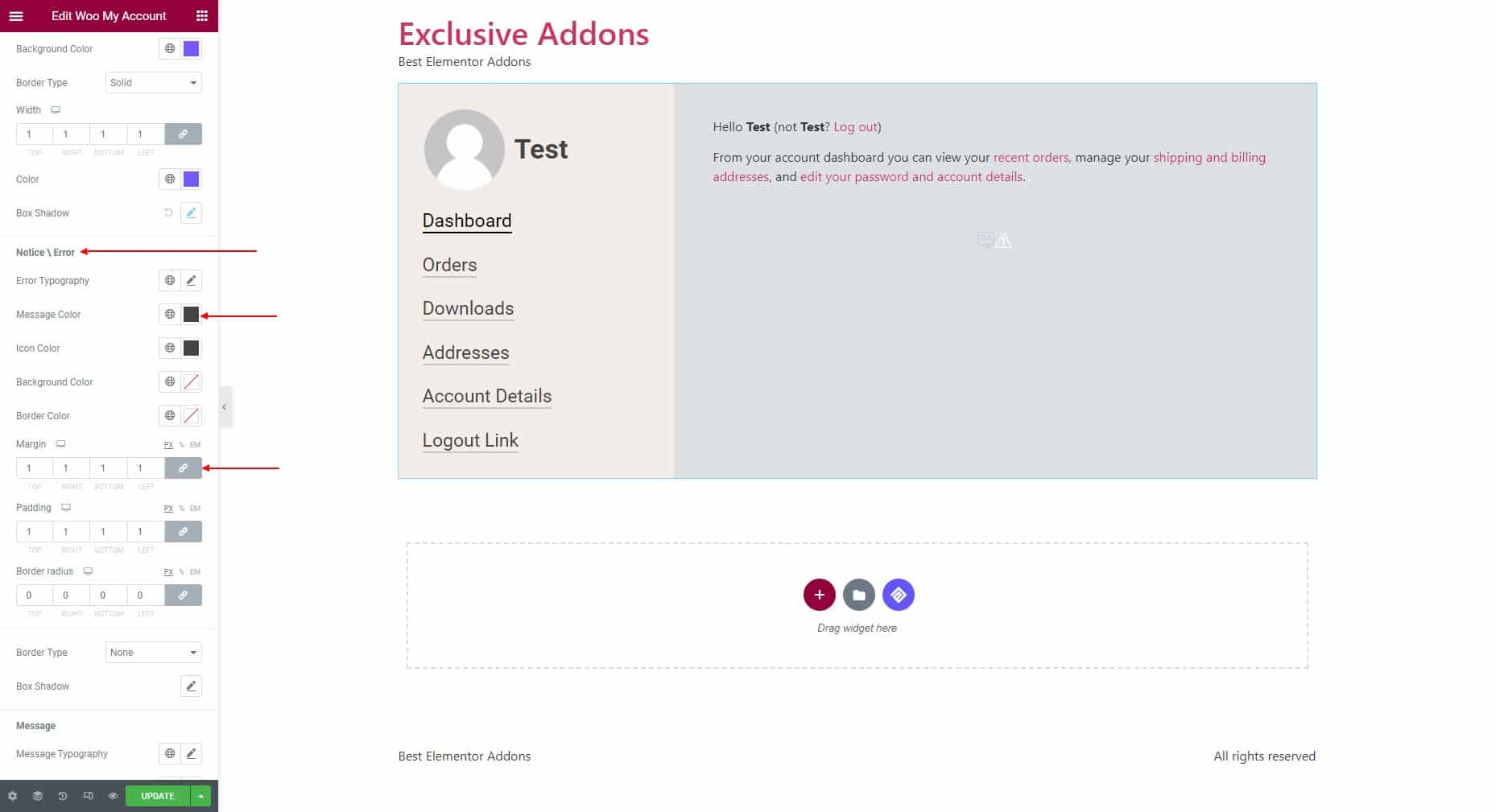
Notice / Error: Set the typography, message color, icon color, icon color, background color, border color, margin, padding, border radius, and border type.
Message: Set the message typography, message color, icon /link color, background color, border color, margin, padding, border radius, and border type.

STEP 4:
Finally, click on the Update button to finalize the changes you made.