How to configure and style Elementor Filterable Post Widget.
The Filterable Post widget lets you add post filters for the blogs on your website. It helps the readers to filter the post according to categories, post tags, and more. Read this documentation to learn how to use the Exclusive Addons Filterable Post widget for Elementor.
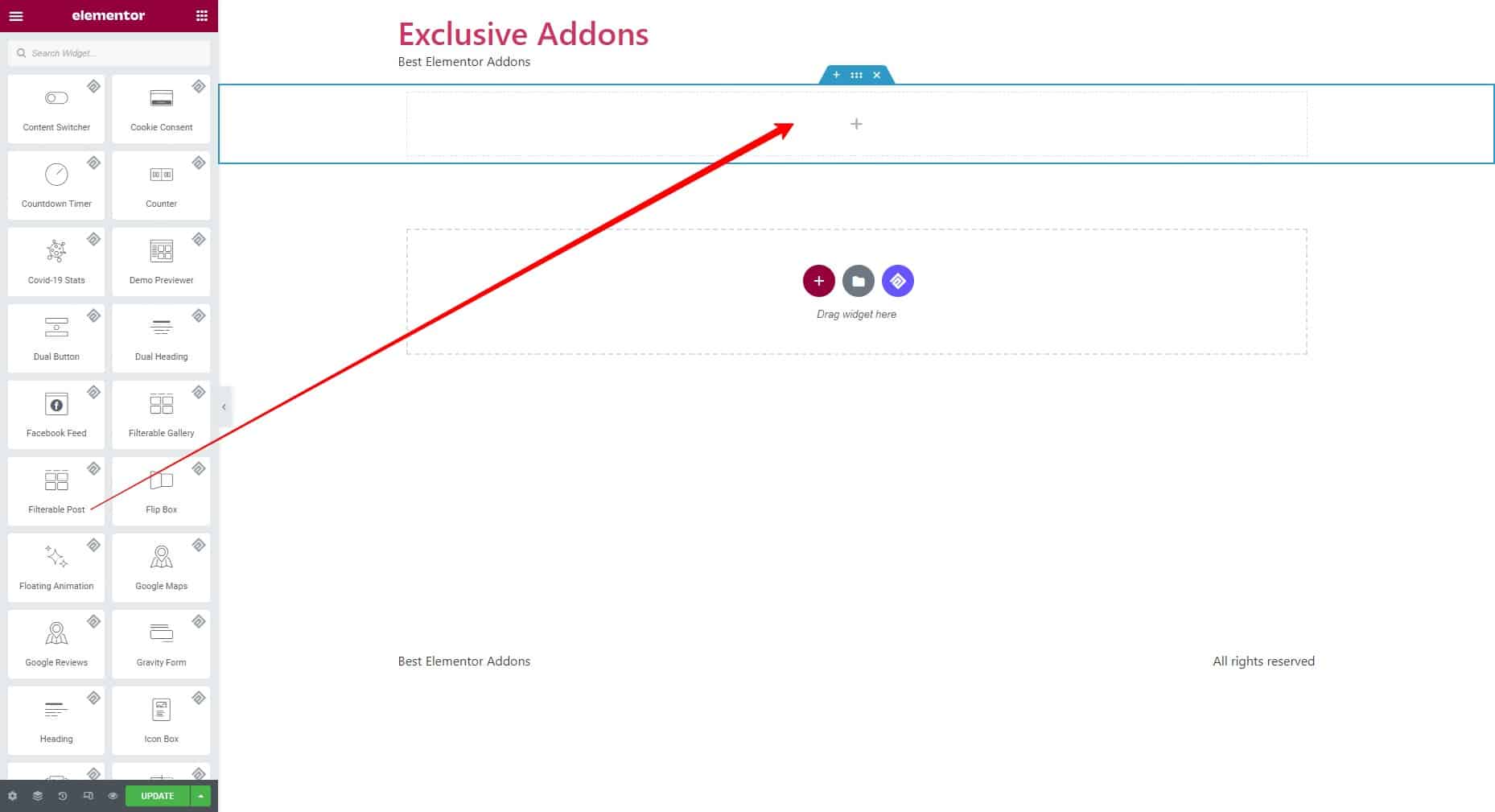
Step-1: Drag & Drop
Select the Filterable Post widget from the Elementor editor panel. Then drag and drop it in the selected area.
Step-2: Content
The Content tab allows you to configure the Settings and Post Meta for the widget.
2.1 Settings
1. Under Settings, select the Post Type to Post, Page, Landing Page, and Product.
2. You can set the Taxonomies to Categories, Tags, Product Categories, and Product tags.

3. Decide the number of Posts Per Page to show. Then set the number of posts a Column includes. Also, set the Offset and Image size afterward.
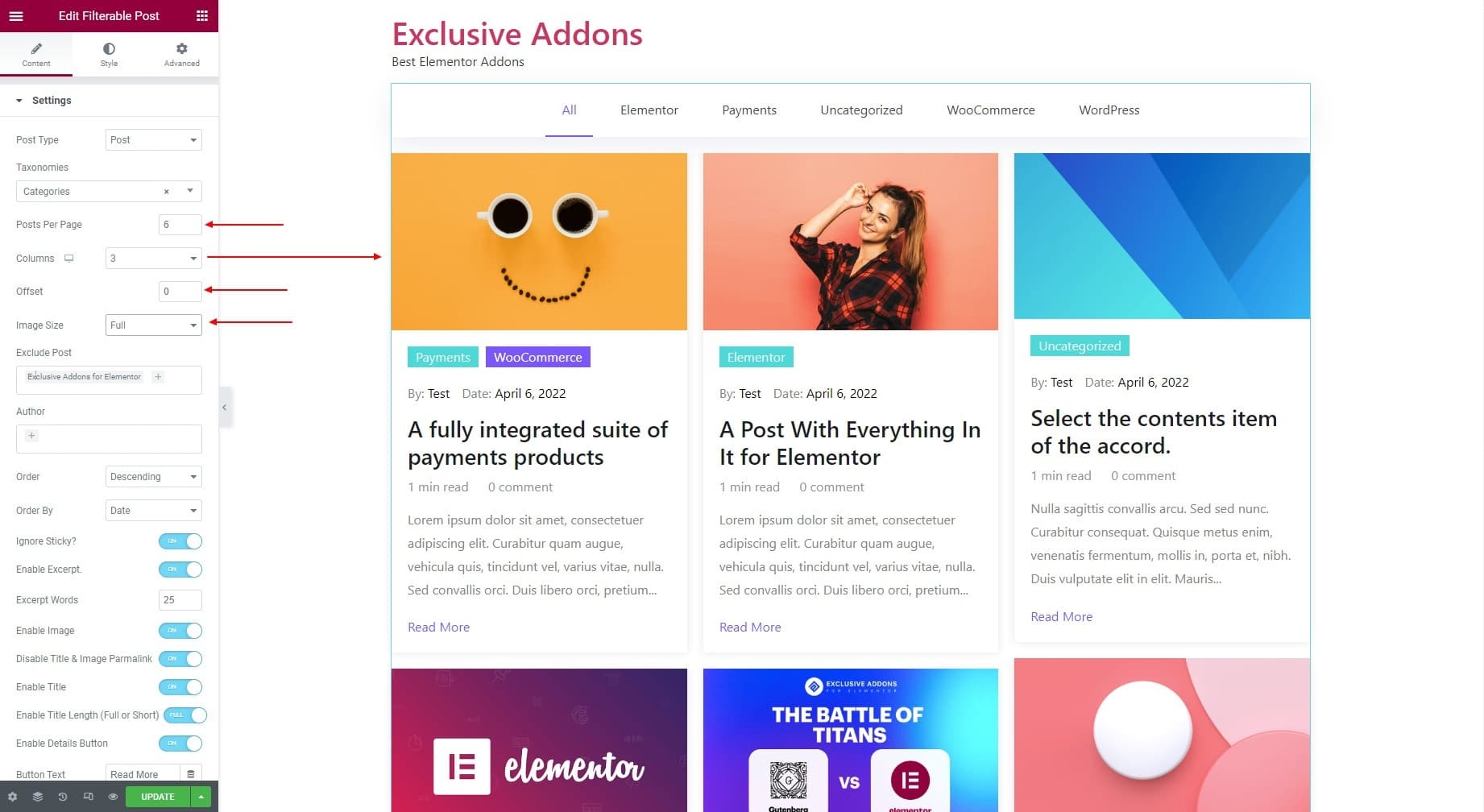
4. Enter the post you want to exclude under the Exclusive Post. Enter the Author names to show their posts.
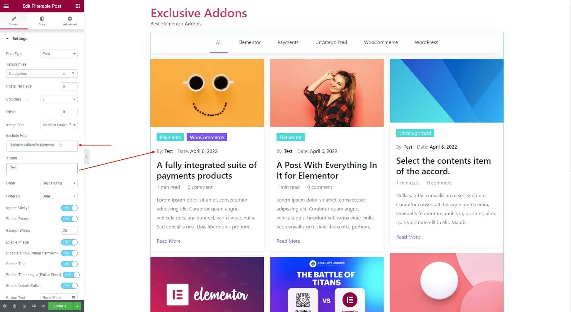
5. Choose the post Order By date, ID, author name, post title, post name, modified, and random. Also, set the Oder to descending or ascending.

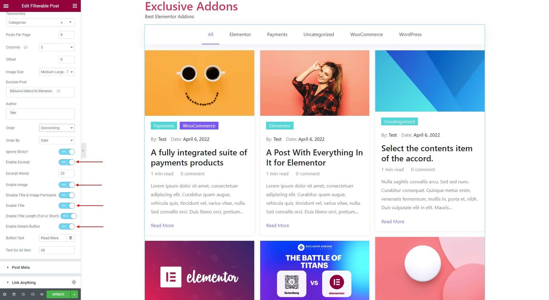
6. You can decide on options like, Ignore Sticky, Enable Excerpt, Enable Image, Disable Title & Image Permalink, Enable Title, Enable Title Length, and Enable Details Button. If enabled, set the Excerpt Words, Button Text, and Text for All Item respectively.
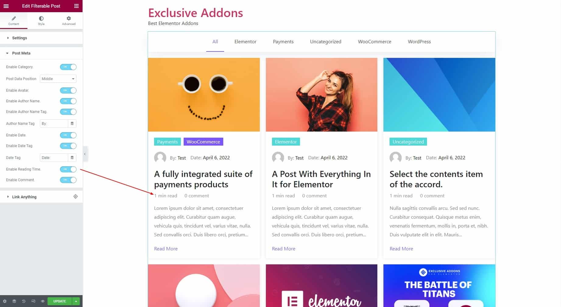
2.2 Post Meta
1. Under the Post Meta section, you can Enable Category to show, and set Post Data Position.

2. You can Enable Avatar of the author, then Enable Author Name, Enable Author Name, and set the Author Name Tag.

3. You can Enable Date, Enable Date Tag, and set the Date Tag.

4. Option to Enable Reading TIme and Enable Comment is available also.
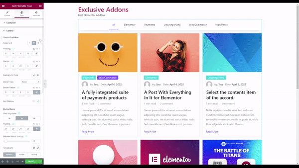
Step-3: Style
Under the Style tab, you can customize Container, Control, Image, Content, Title, Excerpt, Category, Author & Date, Reading Time & Comment, and Button Style design.
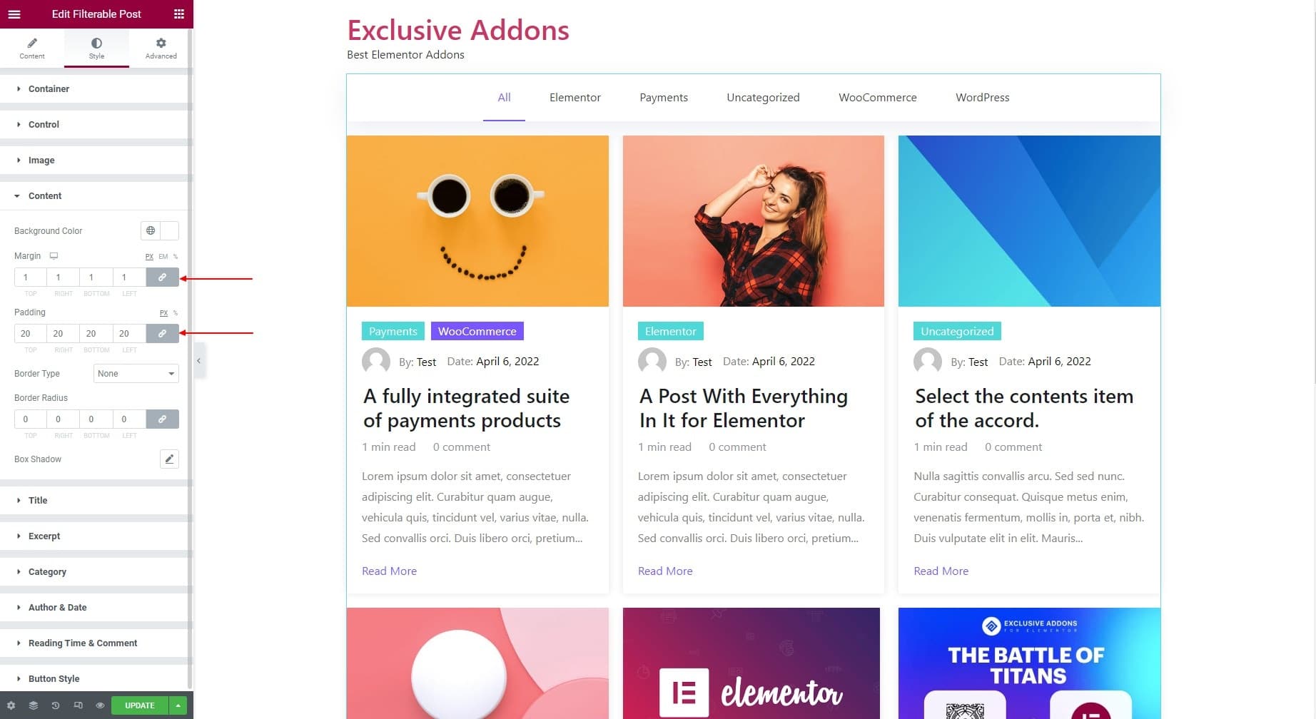
3.1 Container
In the Content section, you can choose the Background Color, Border Type, Border Radius, Box Shadow, Margin, and Padding.

3.2 Control
The Control section lets you customize Control Container and Control Items.
1. Under the Control Container, you can set the Alignment to Right, Left, or Top. For the Right and Left alignment, adjust the Width and Left & Right Spacing.
2. Also can set the Padding, Margin, Background Type, Border Radius, and Box Shadow for Control Container.
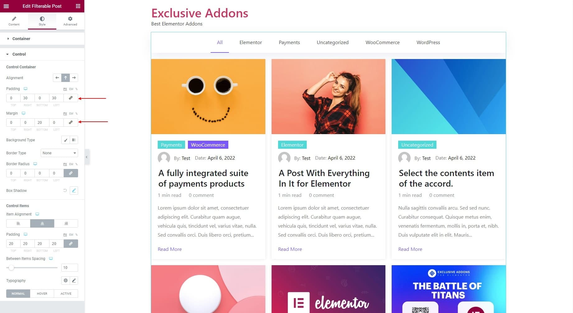
3. Under the Control Items, you can set the Item Alignment to right, left, or center. Then set the Padding, Typography, and Between Items Spacing.
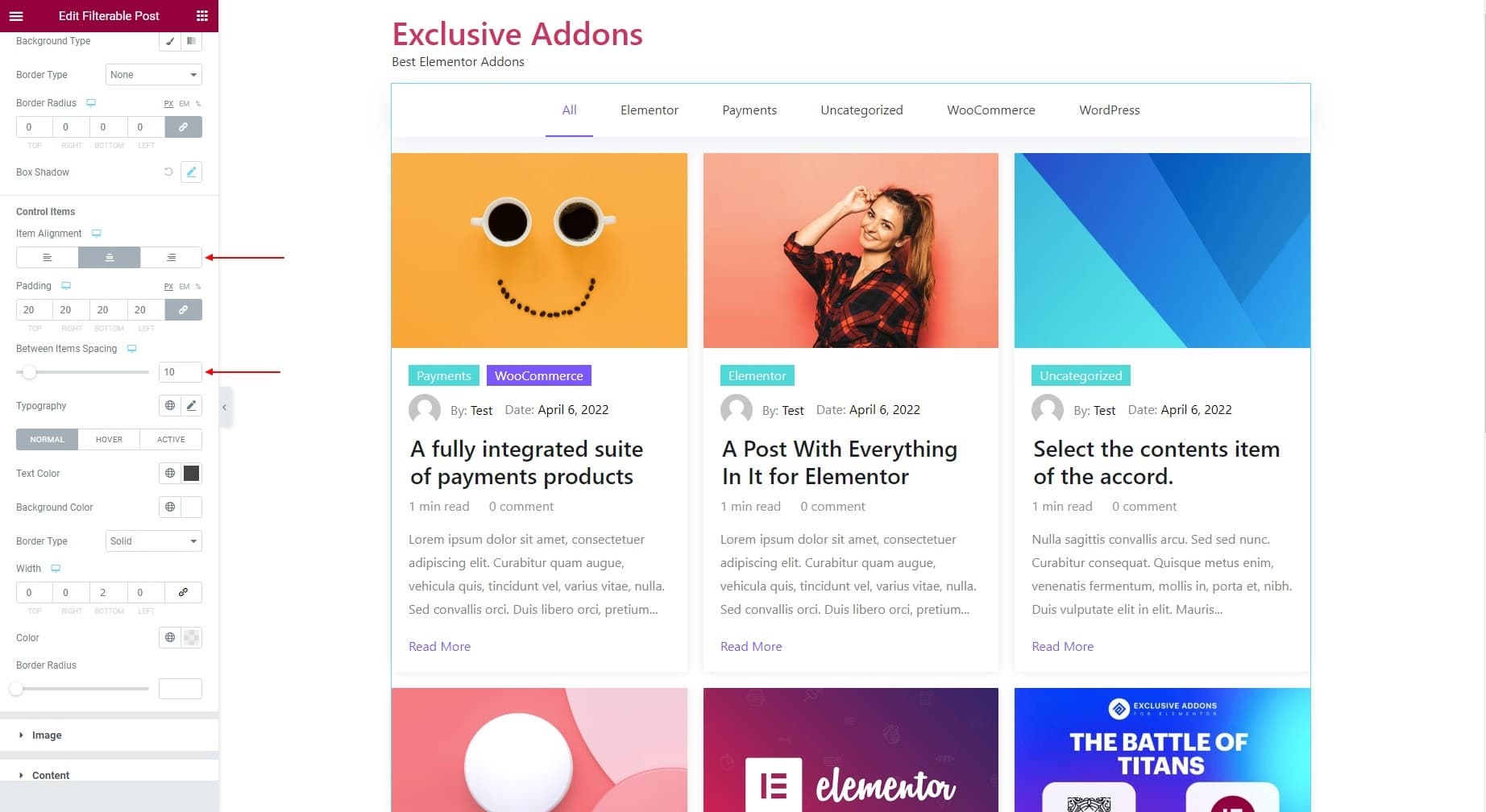
4. You also have the option to choose Text Color, Background Color, Border Type, Border Width, Border Color, and Border Radius individually for Normal, Hover, and Active state.

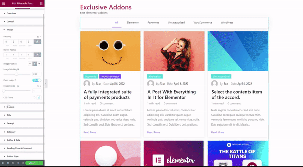
3.3 Image
For the Images, you can tailor their Padding, Border Radius, Image Position, Image Minimum Heigh, and decide to set a Fixed Height. You can also set CSS Filters for images.

Different Image Positions.
3.4 Content
For the Content, change the Background Color, Margin, Padding, Border Type, and Border Radius.
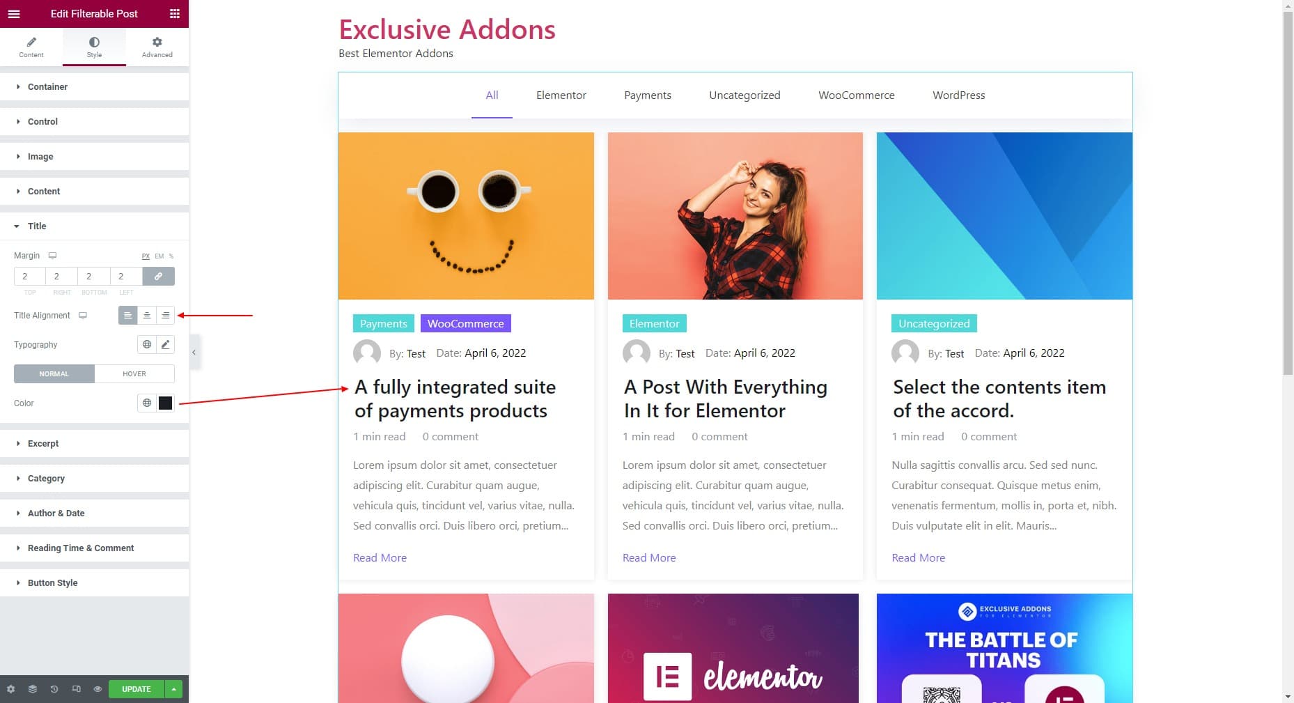
3.5 Title
For the post Title, set its Margin, Title Alignment, and Typography. Also, choose different Colors for the “Normal” and “Hover” state.
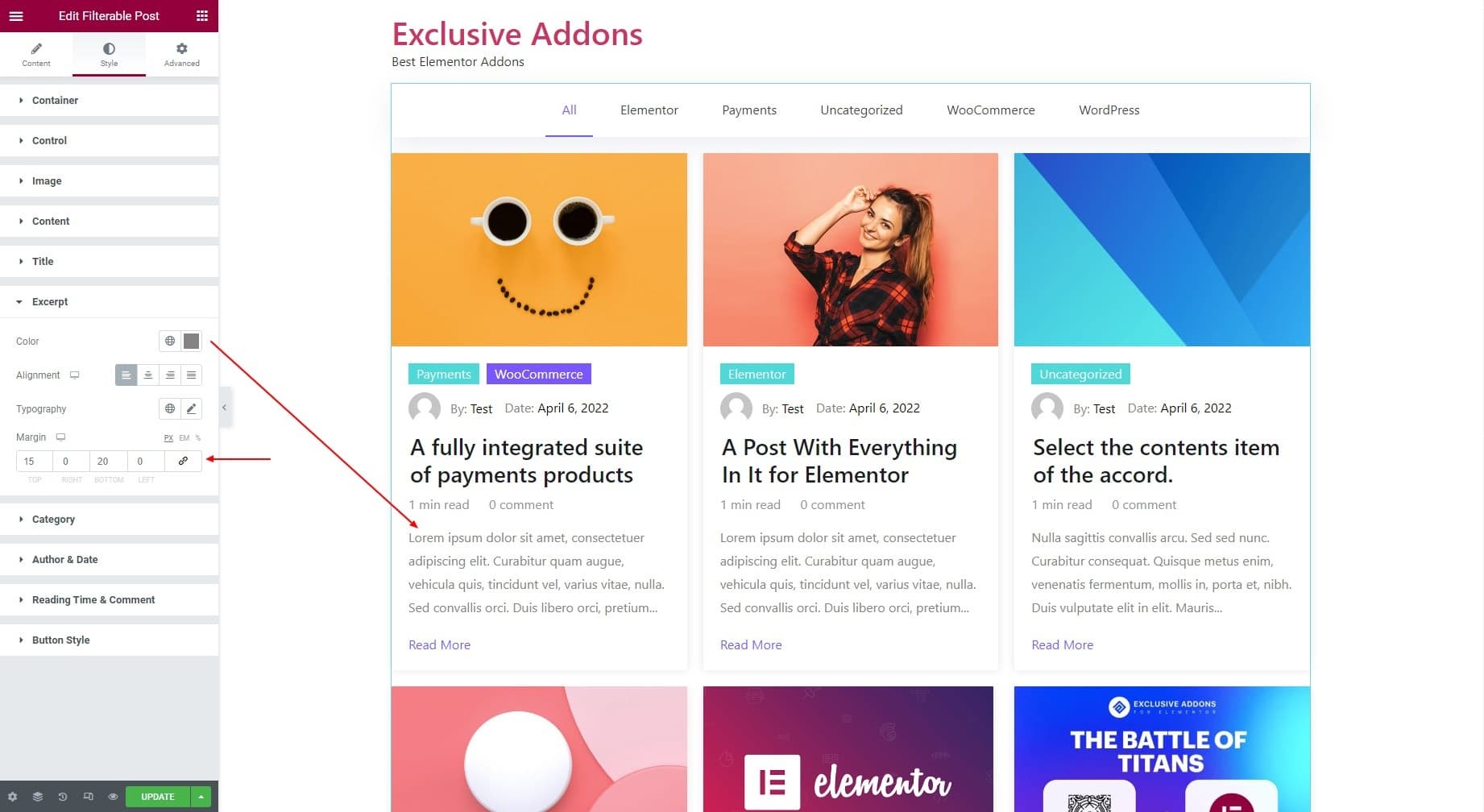
3.6 Excerpt
In terms of Except, choose its Color, Alignment, Typography, and Margin.
3.7 Category
1. Set the Category Position to Default. Otherwise, you can also set Category Position Over Image to Bottom Left Corner or Top Right Corner.
2. Set the Typography and Border Radius. Also set Margin for Each Item, and Margin for All Items individually.

3. Choose individual Background Color, Text Color, Border Type, and Box Shadow for Odd and Even categories.

3.8 Author & Date
1. Adjust Author Image Size and set Margin.

2. For Meta, adjust the Spacing Between Author & Date, then set Color and Typography.

3. For Meta Link, set its Color and Typography.

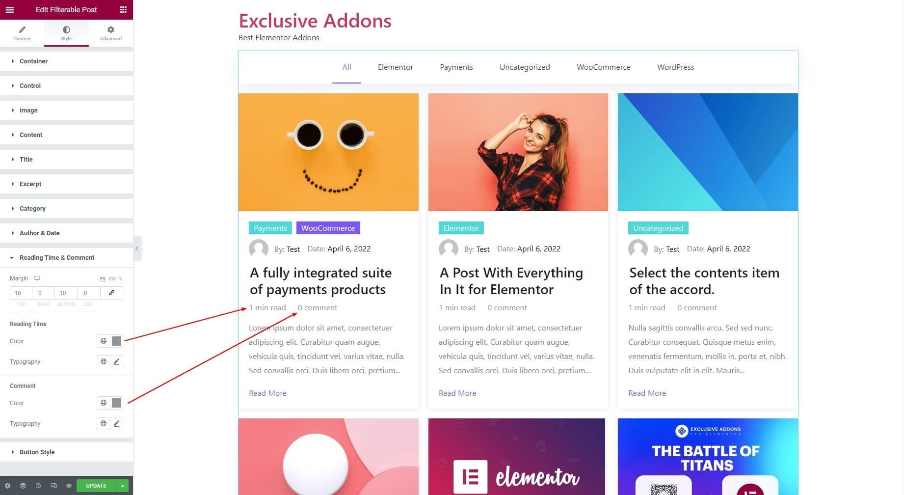
3.9 Reading Time & Comment
1. For Reading Time & Comment, set their universal Margin.
2. Set Color and Typography for Reading Time.
3. Set Color and Typography for Comment.
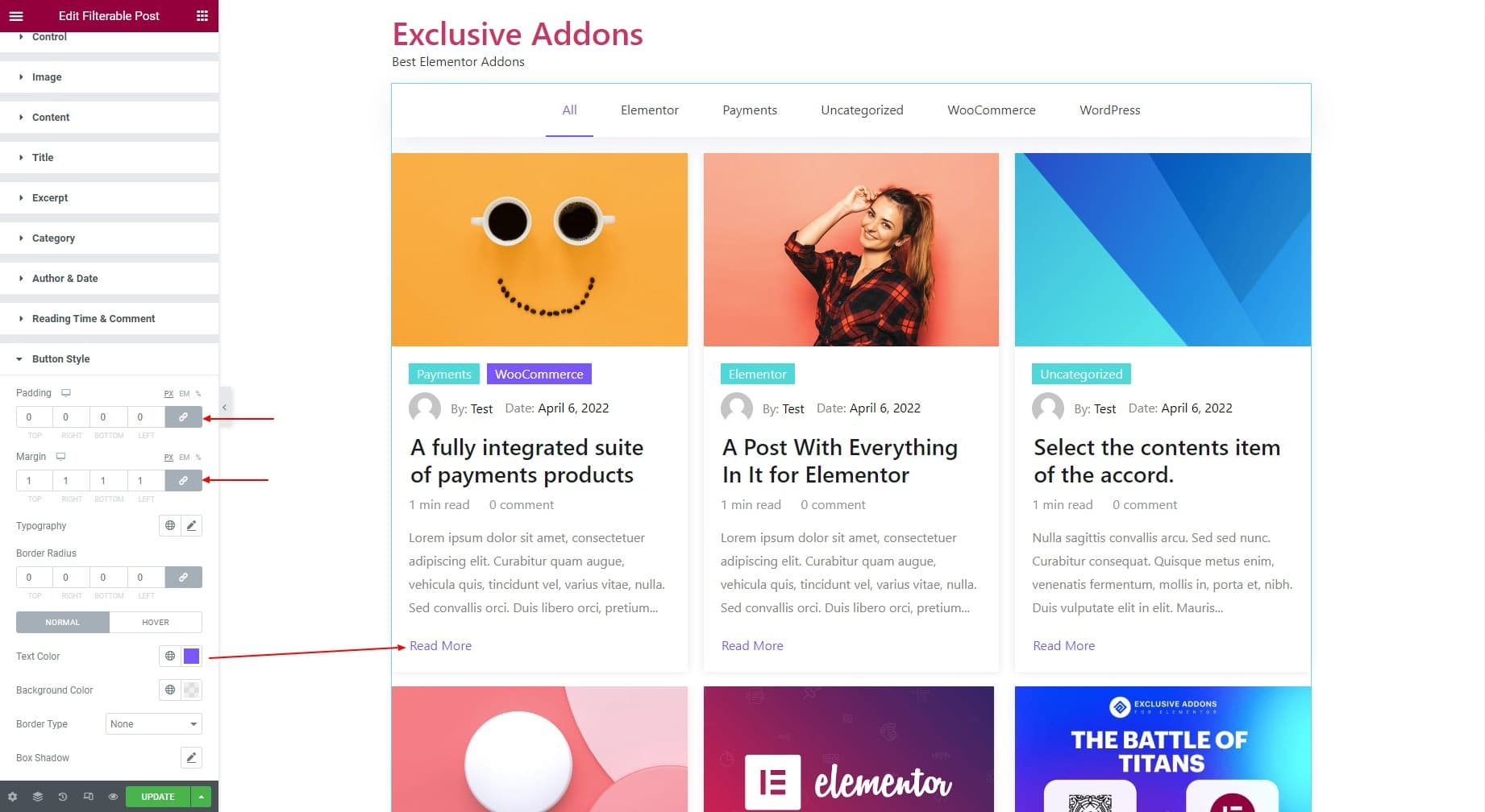
3.10 Button Style
1. For Button Style, set its Padding, Margin, Typography, and Border Radius.
2. Set individual Text Color, Background Color, Border Type, and Box Shadow for “Normal” and “Hover” state.
Step-4: Finalize Updates
Finally hit the Update button to finalize the configuration and customization of the Filterable Post widget.