How to configure and style Elementor Image Hotspot Widget
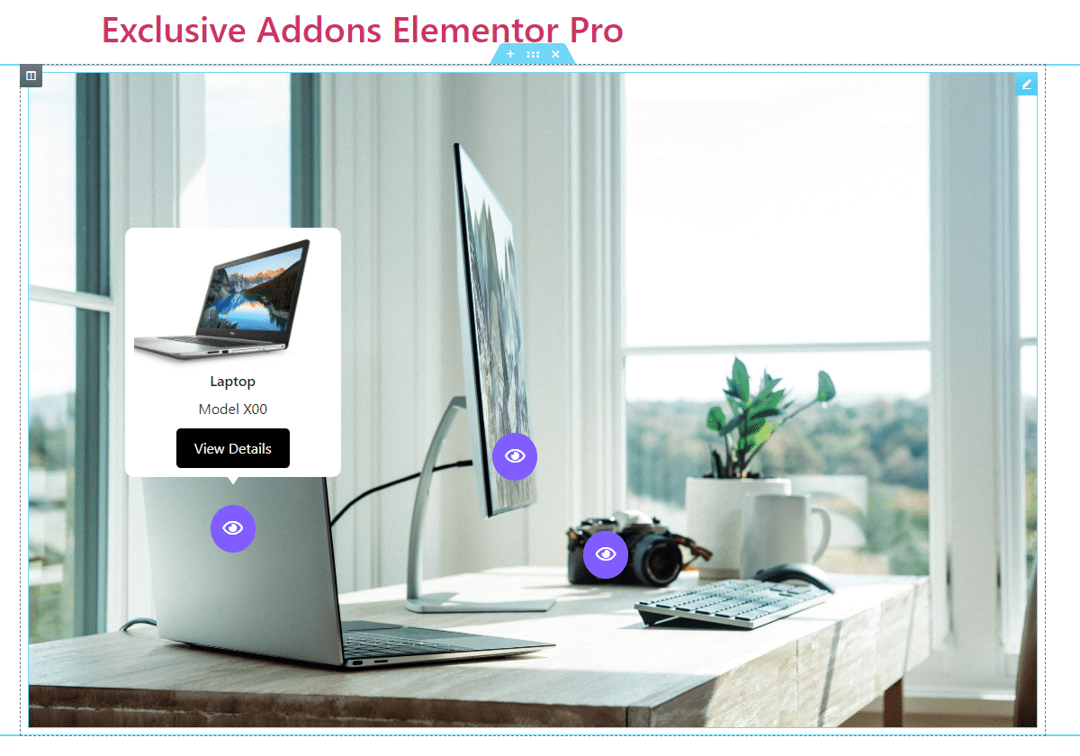
Place several interactive points on the hotspot images that will unveil a popup tooltip when clicked or hovered. Add an interactive section with 3 different styles endless customizable options using Image Hotspot Widget of Exclusive Addons Elementor.
STEP 1:
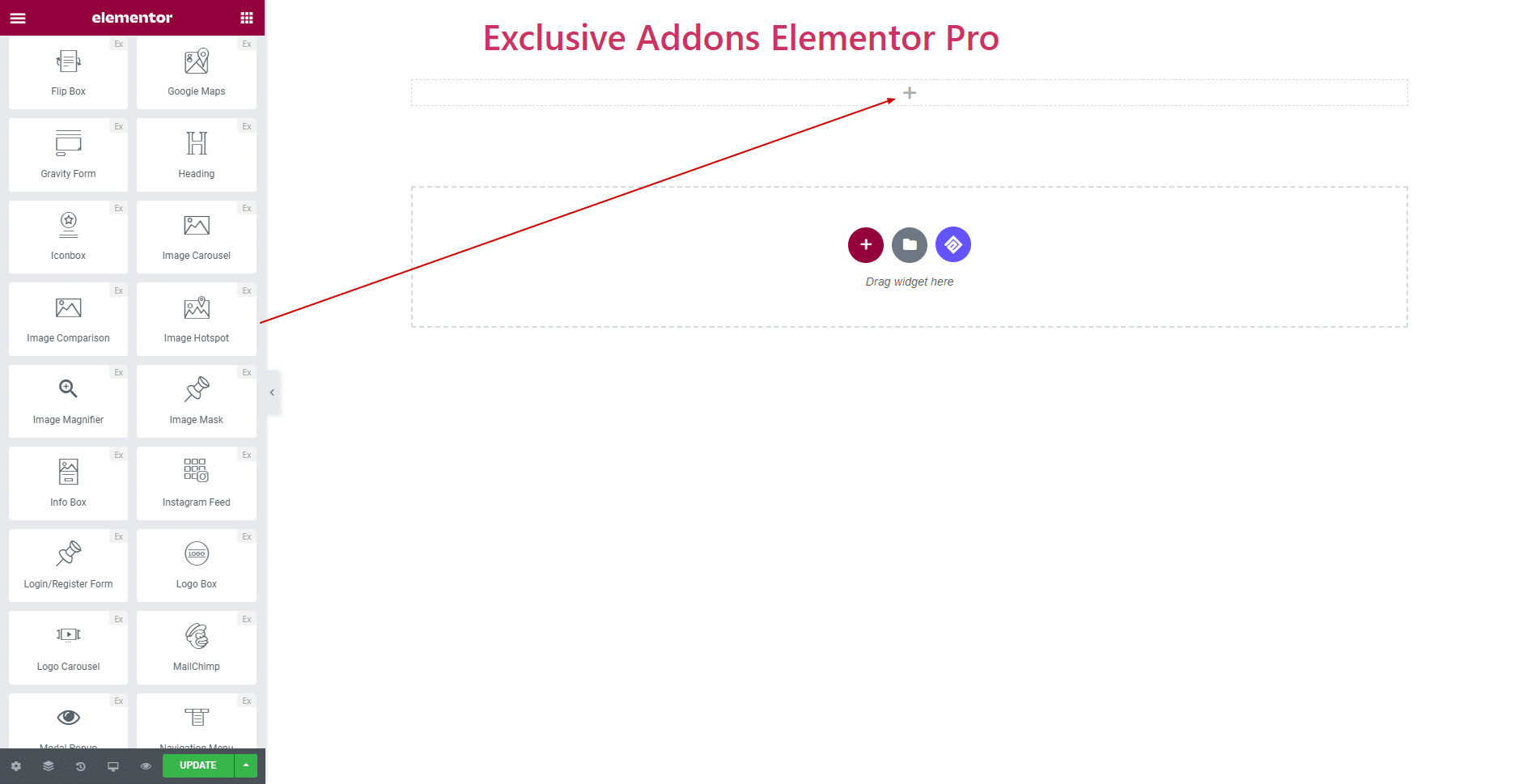
Select the ‘Image Hotspot‘ widget from Elementor panel. Then drag and drop it in the selected area.
STEP 2:
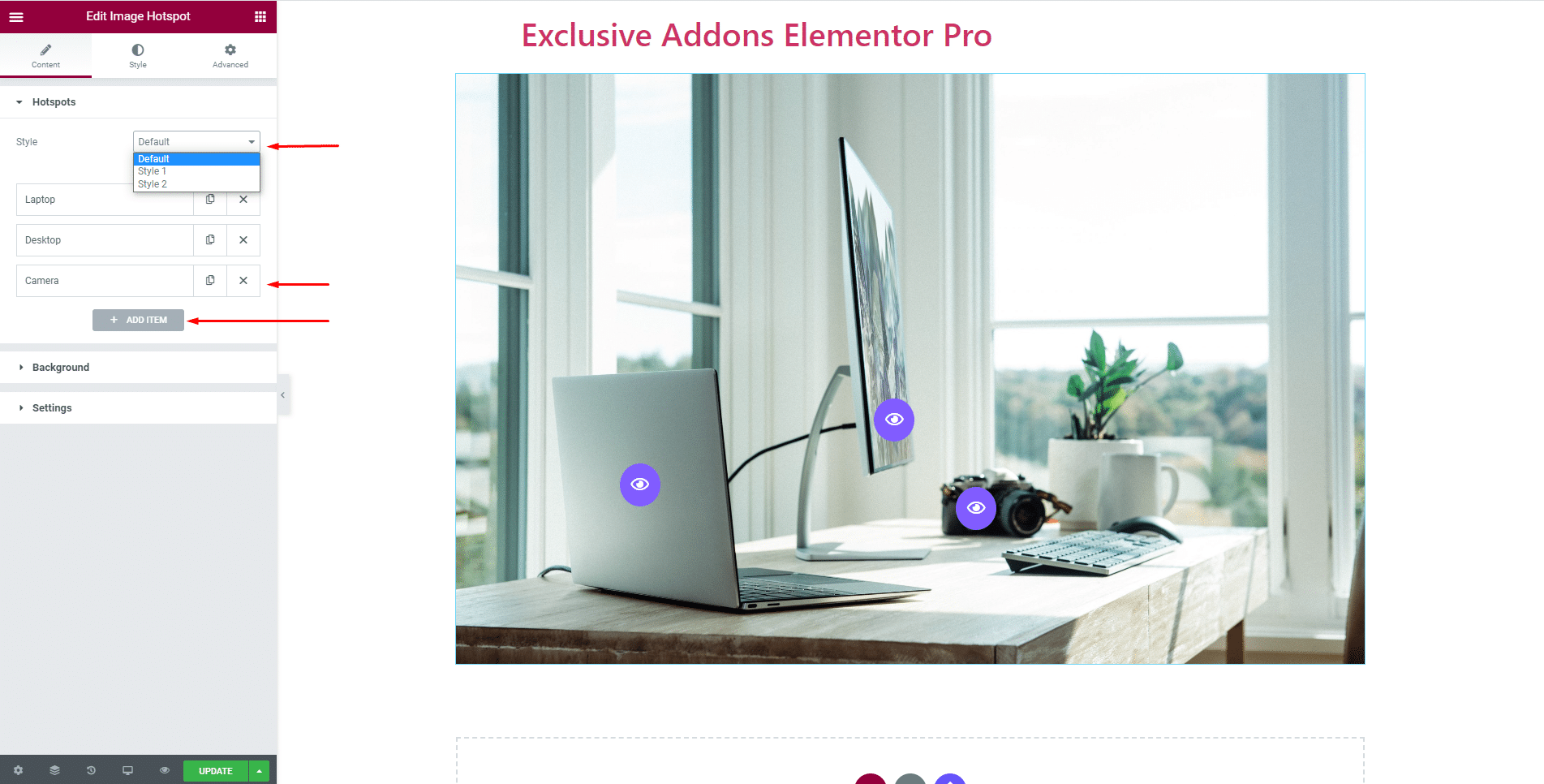
In the Container tab, you have the options to configure Hotspots, Background, and tooltip Settings.
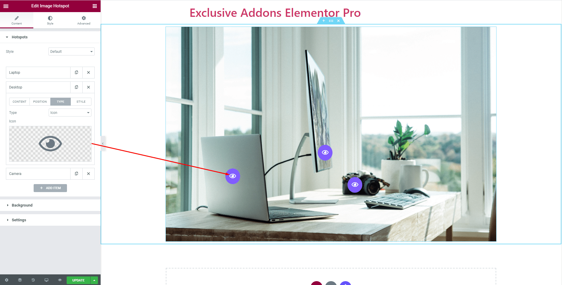
2.1 In Hotspot section, choose hotspot Style among ‘Default‘, ‘Style-1‘, and ‘Style-2‘.
Also, add as many hotspots as you want by clicking ‘Add Items’ button, and delete items with ‘Cross’ button.
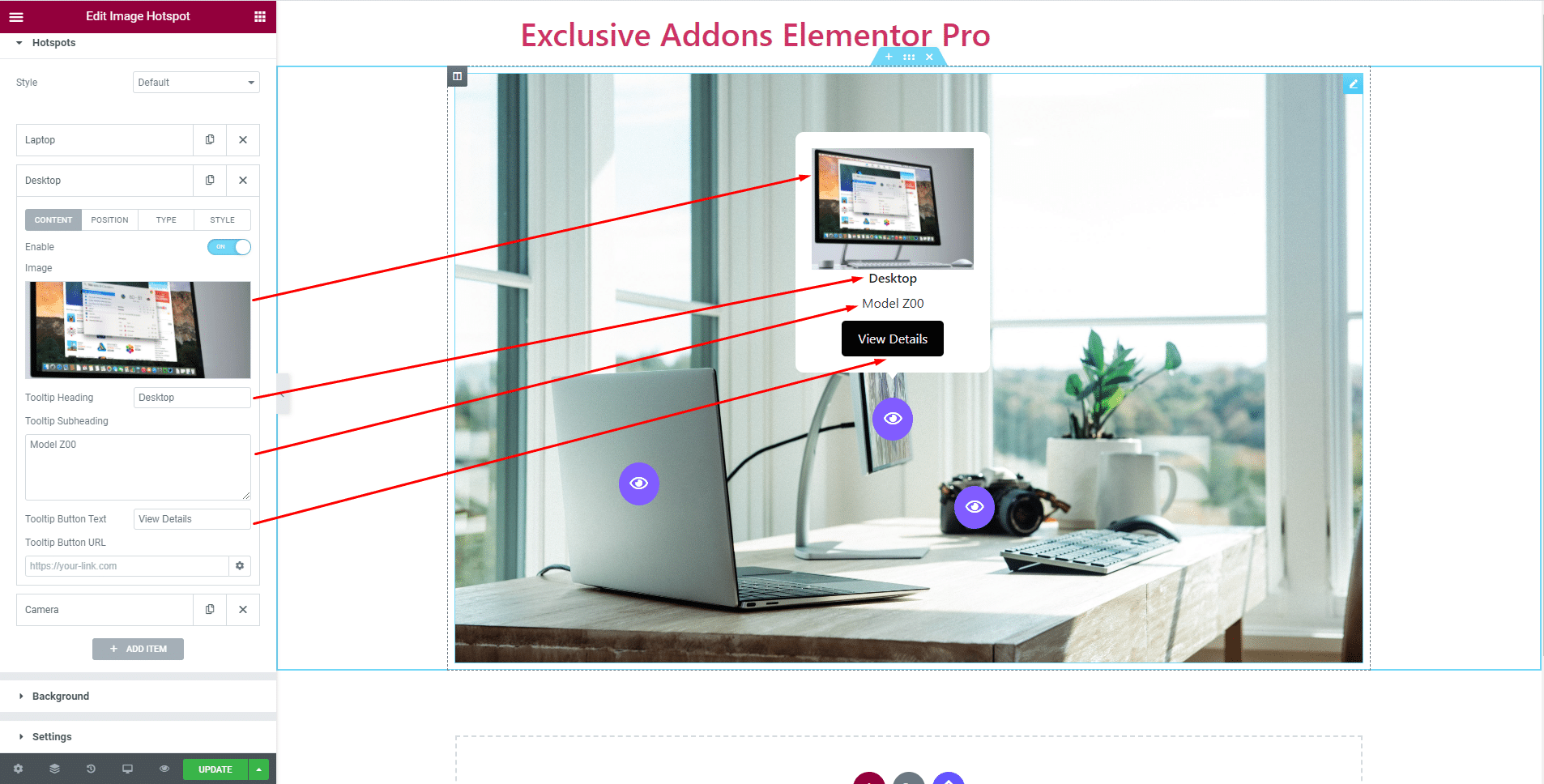
With each hotspot, you can enable or disable tooltip and set its contents like tooltip Image, Heading, Subheading, Button Text, and URL.
Also, you can adjust hotspot Position for each hotspot.

Choose the icon type between Icon and Text. If you select Icon, set Icon Image as well.
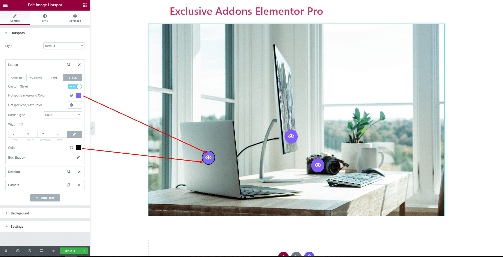
You can enable or disable Custom Style option. When enabled, set Background Color, Icon Color, Border type, and Box shadow.
STEP 3:
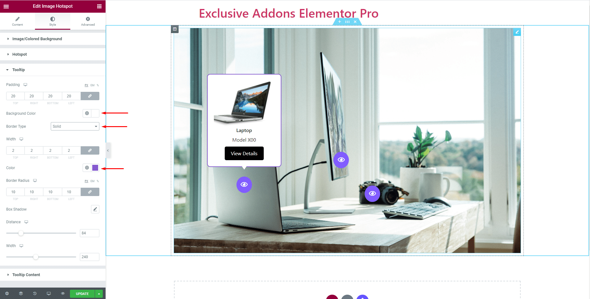
Style tab allows you to customize Background, Hotspot, Tooltip, and Tooltip Content.
3.1 In the Image/Colored Background section, enable or disable Overlay option.
Also, adjust Image Height/Background Height, choose Border Type, set Border Radius, and Box Shadow.

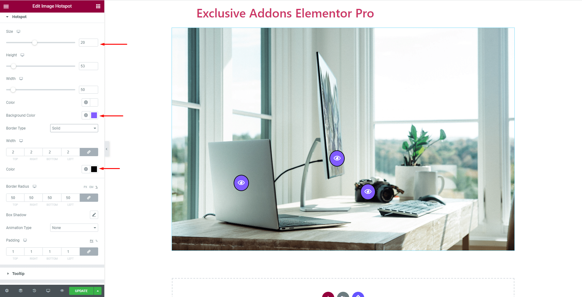
3.2 For Hotspot section, you can set Icon Size and Color. Also, choose Background Color, adjust Height and Width, and decide over Border Type, Border Radius, Box-shadow, and Padding.
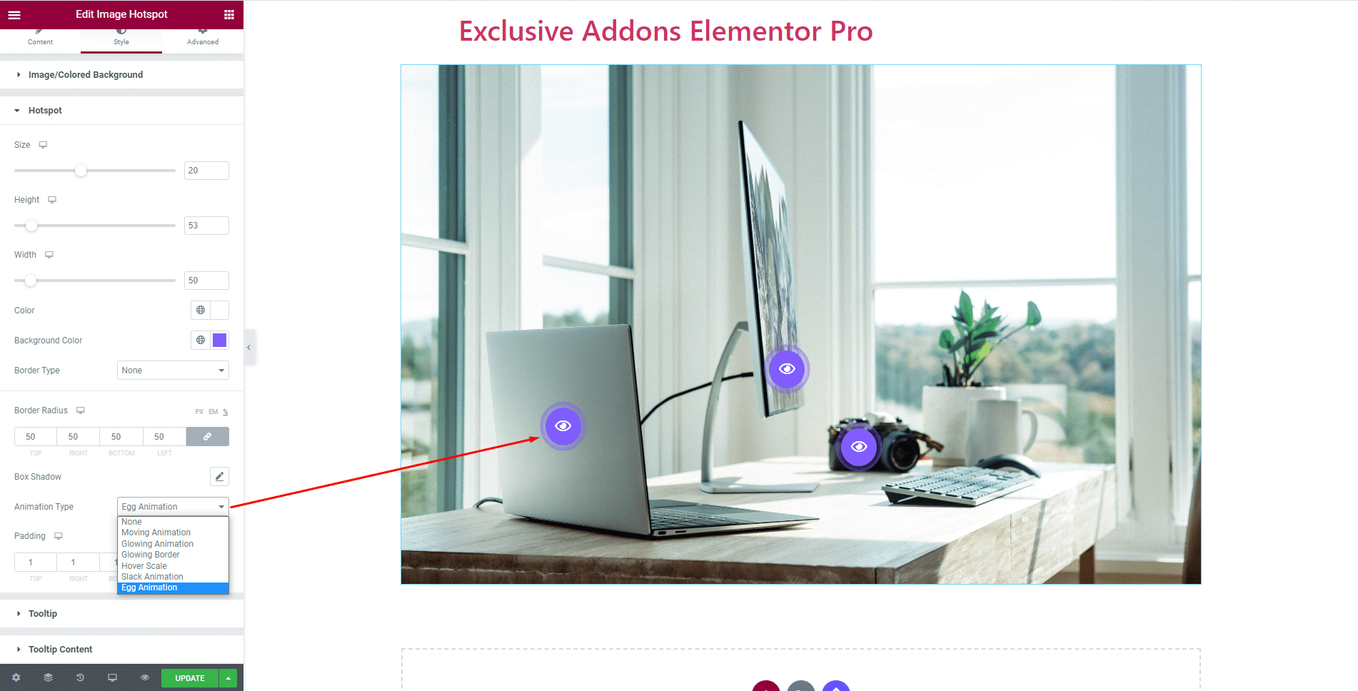
What makes this Image Hotspot unique is animation. Decide which one suits you the best from a list of animations available with the widget.
3.3 Tooltip section lets you decide over the attribute like tooltip Padding, Background color, Border Type, Border radius, and so on.
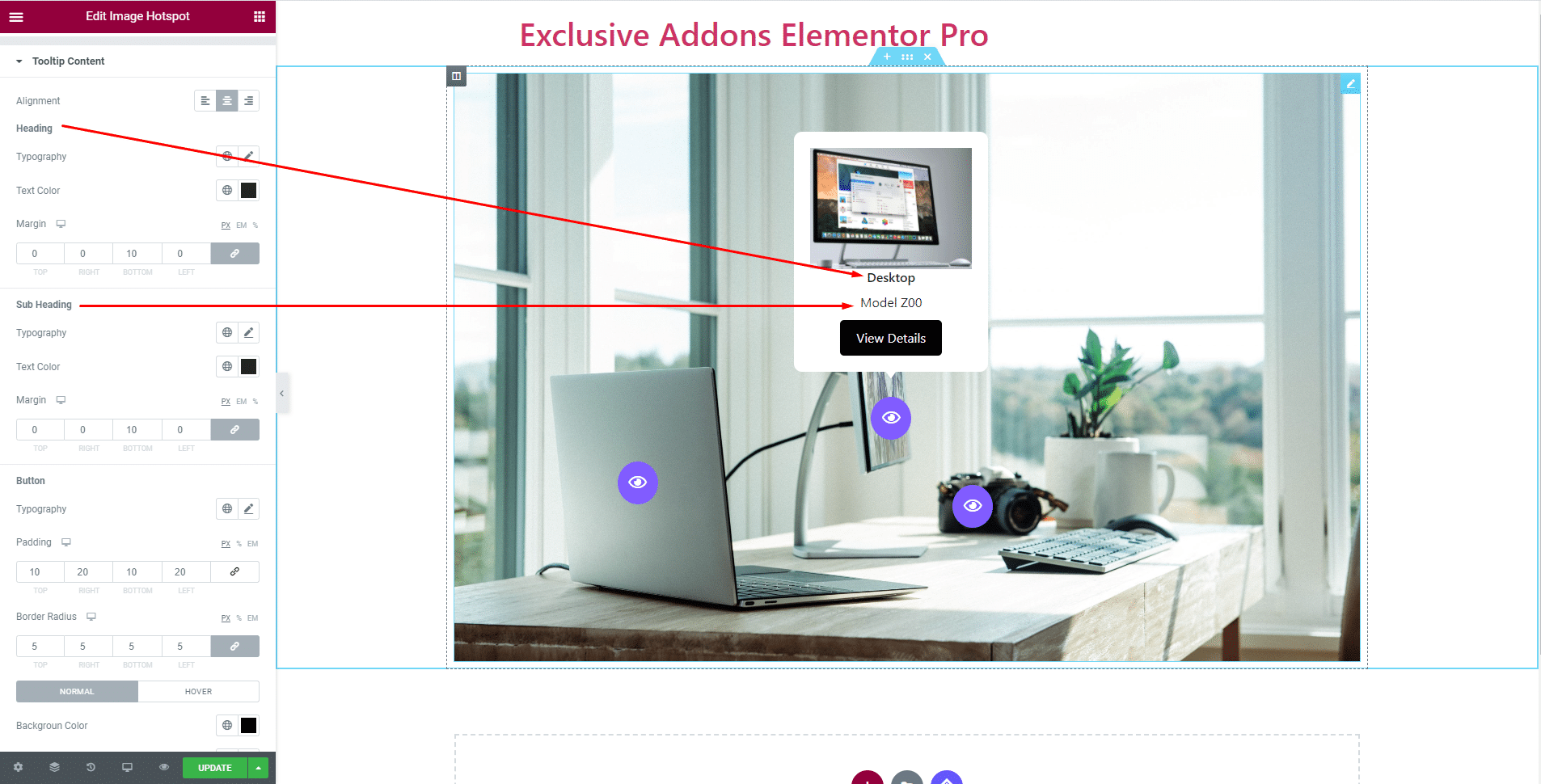
3.4 Tooltip Content section comes with a lot of customizable options for each item. Set Alignment, Typography, Text Color, and Margin for Heading. Also set Typography, Text Color, and Margin for subheading.
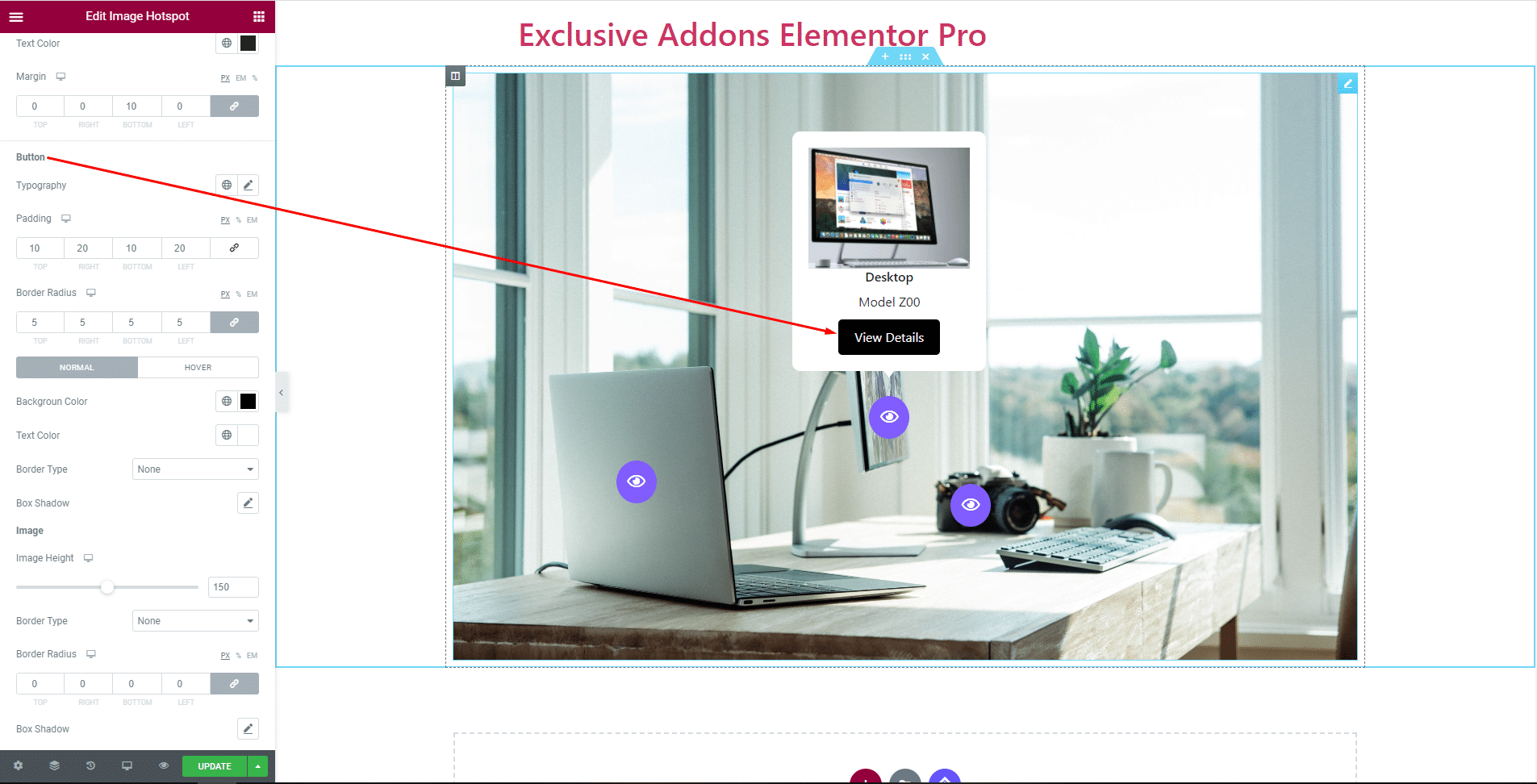
For Button, set Typography, Padding, and Border Radius along with choosing different Background Color, Text Color, Border Type, and Box Shadow for both ‘Normal’ and ‘Hover’ state.
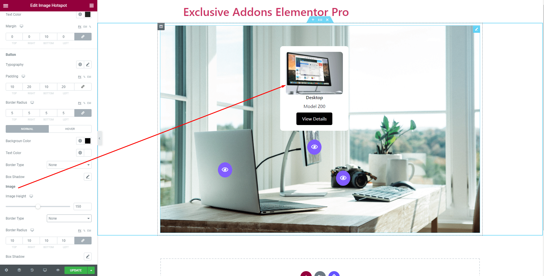
Choose Image Height, Border Type, Border Radius, and Box Shadow for Tooltip Image.
STEP 4:
Finally, hit the Update button, and include a stylish Image Hotspot Widget on your WordPress site.