How to configure and style Card Widget.
Showcase different items with beautiful demo card using Exclusive Addons Card Widget for Elementor.
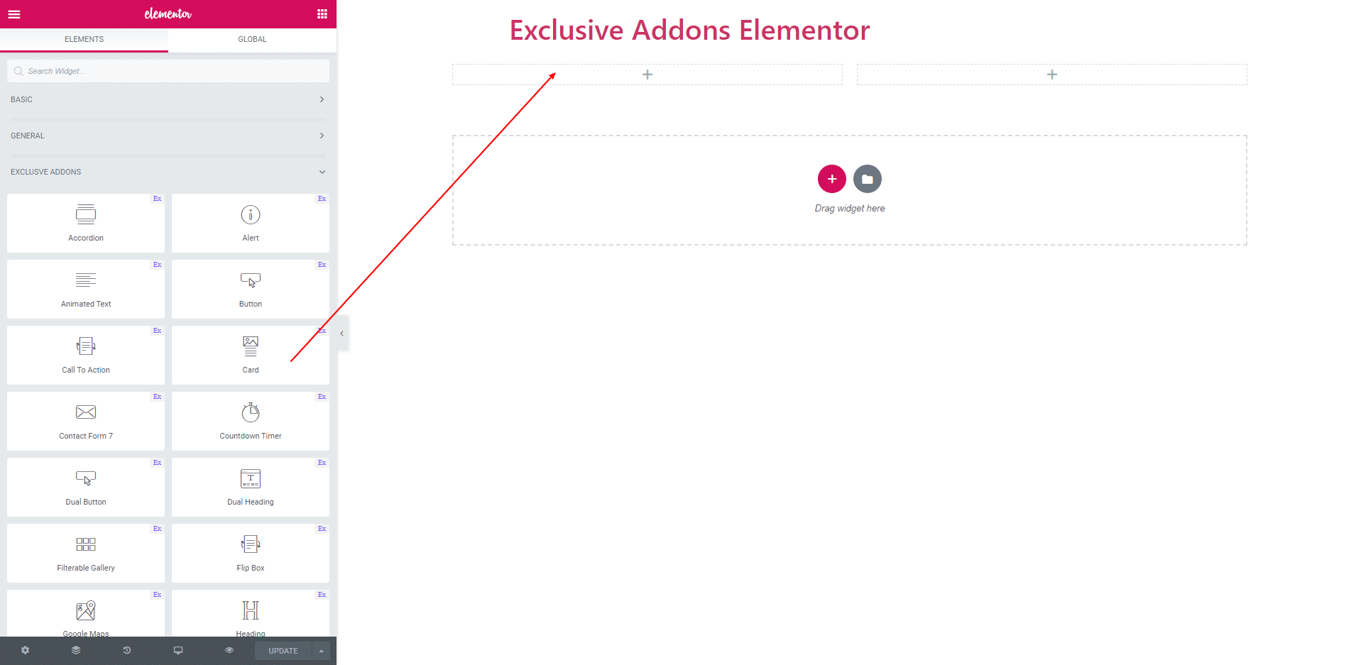
STEP 1:
Select the ‘Card’ widget from Elementor panel. Then drag and drop it in the selected area.
STEP 2:
In Content section, you will find ‘Contents’ and ‘Layout’.
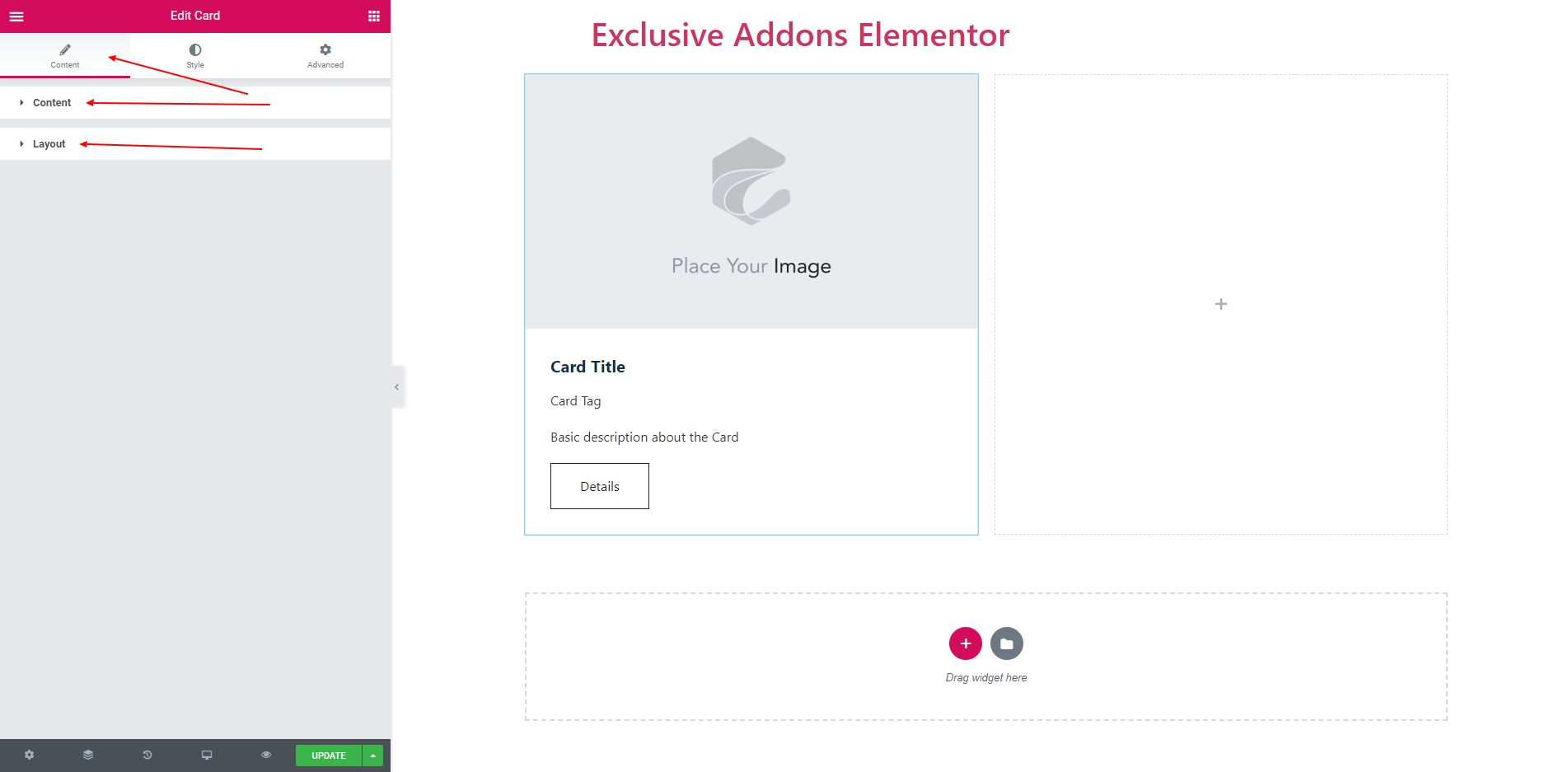
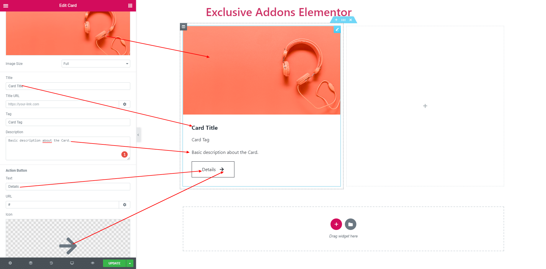
2.1. ‘Content’ section consist of ‘Image’, ‘Card Title’, ‘Tag’, ‘Description’ and ‘Action’.
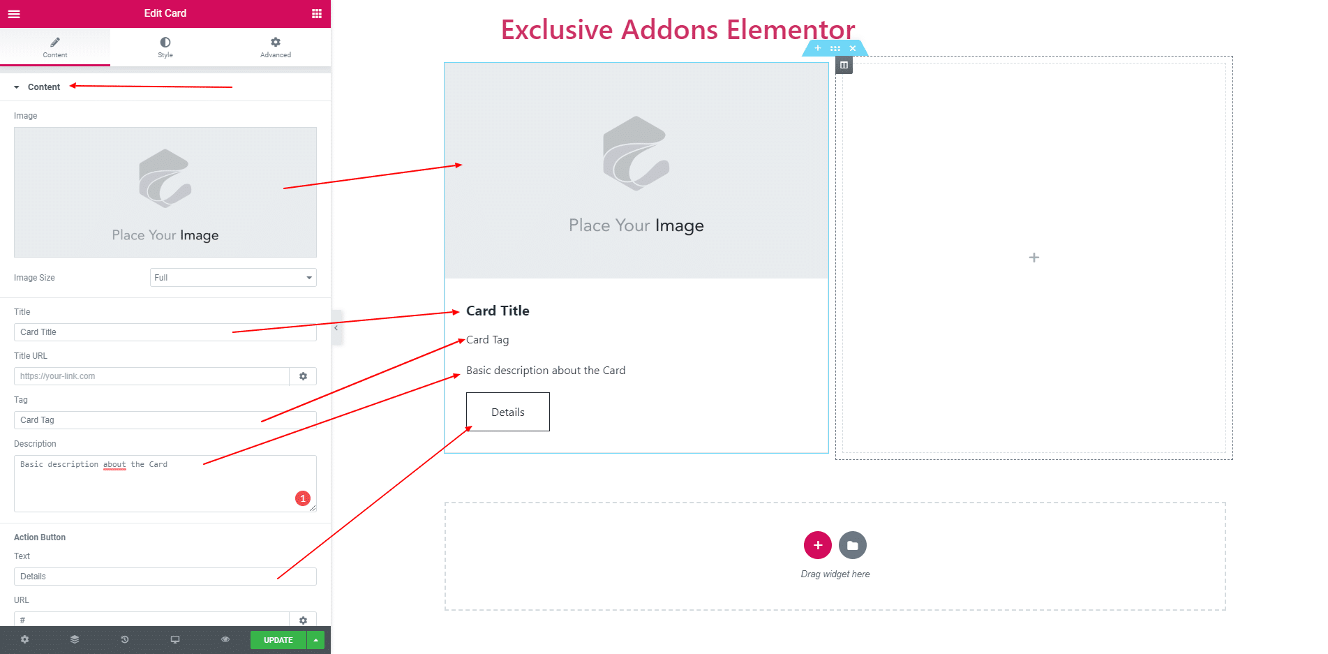
2.2. You can choose an image and set image size. You can change card title, attached a link, set tag and description. In action button set action text and change icon.
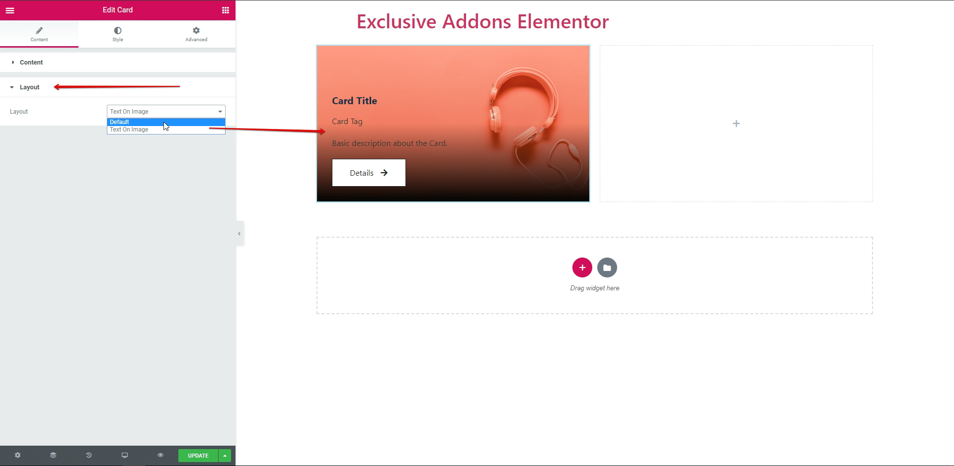
2.3. In ‘Layout’ section you can find two types of layout ‘Default’ and ‘Text on Image’.
STEP 3:
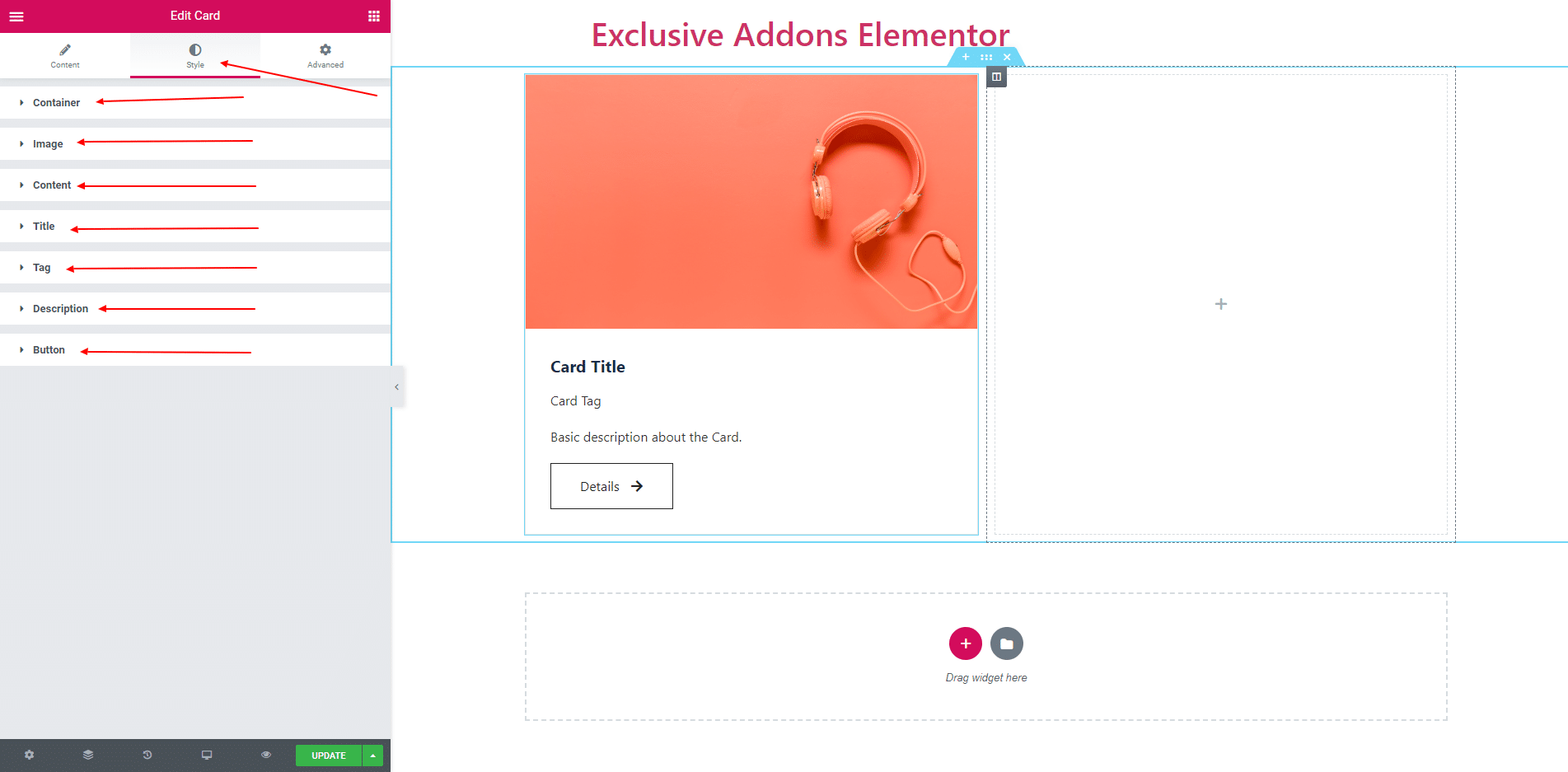
In Style section, you will find ‘Container’, ‘Image’, ‘Content’, ‘Title’, ‘Tag’, ‘Description’, ‘Button’.
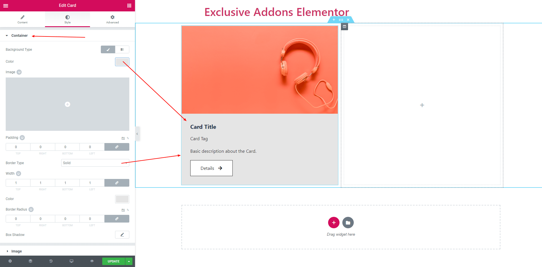
3.1. Container section consist of Backgorund Type, Padding, Border, Border Radius and Box Shadow.
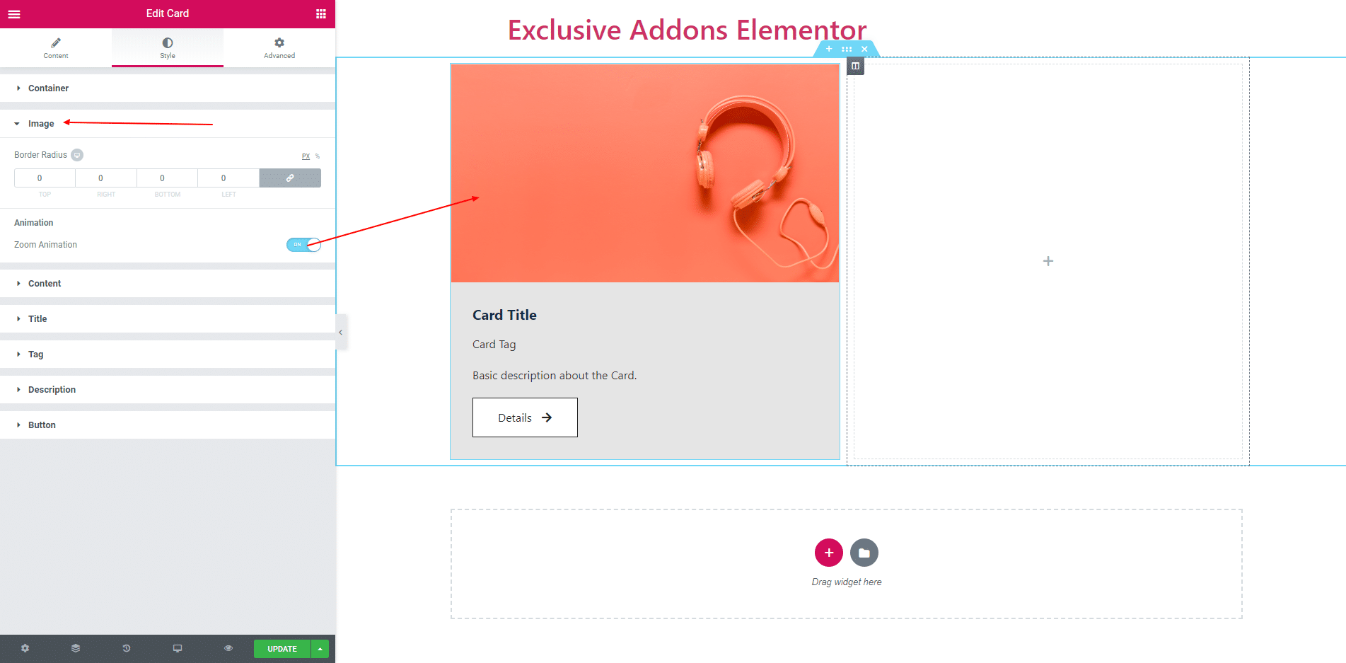
3.2. Image section consist of Border Radius. You cal turn on or off the zoom animation.
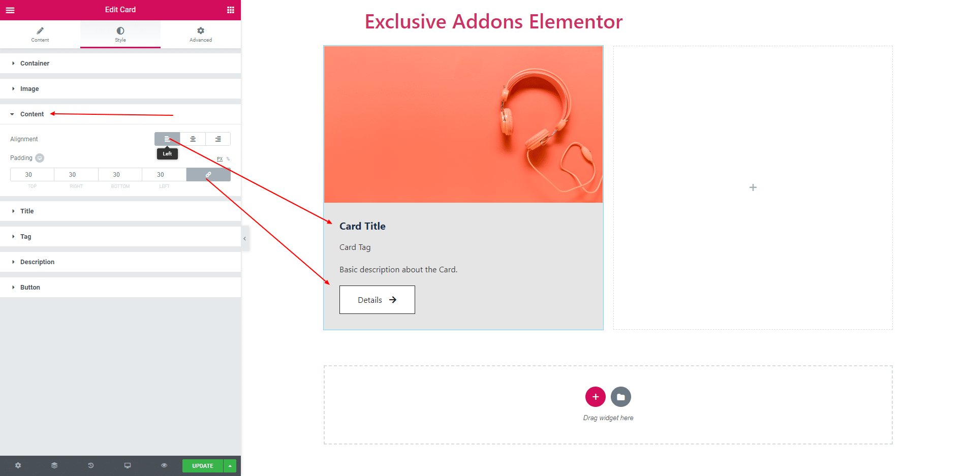
3.3. In Content section, You get Alignment and Padding. You can align the content in Left, Center and Right.
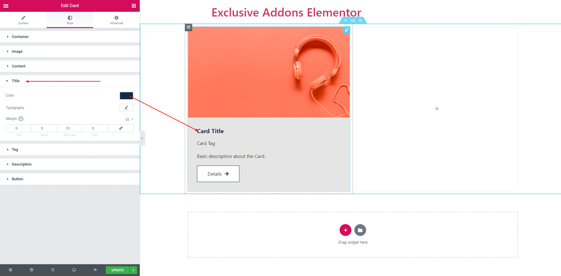
3.4. In Title section, you can give Typography, Text Color and Margin.
3.5. In Tag section, you can give Typography, Text Color and Margin.

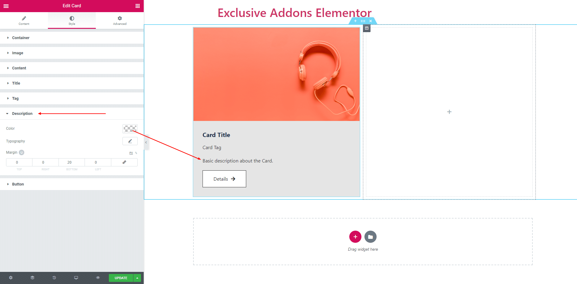
3.6. In Description section, you can give Typography, Text Color and Margin.
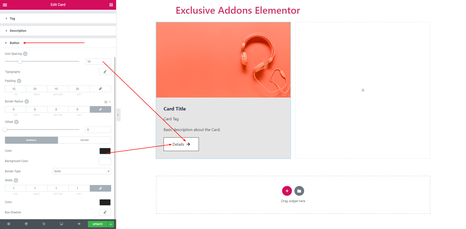
3.7. Button section consist of different types of options to design the button.
STEP 4:
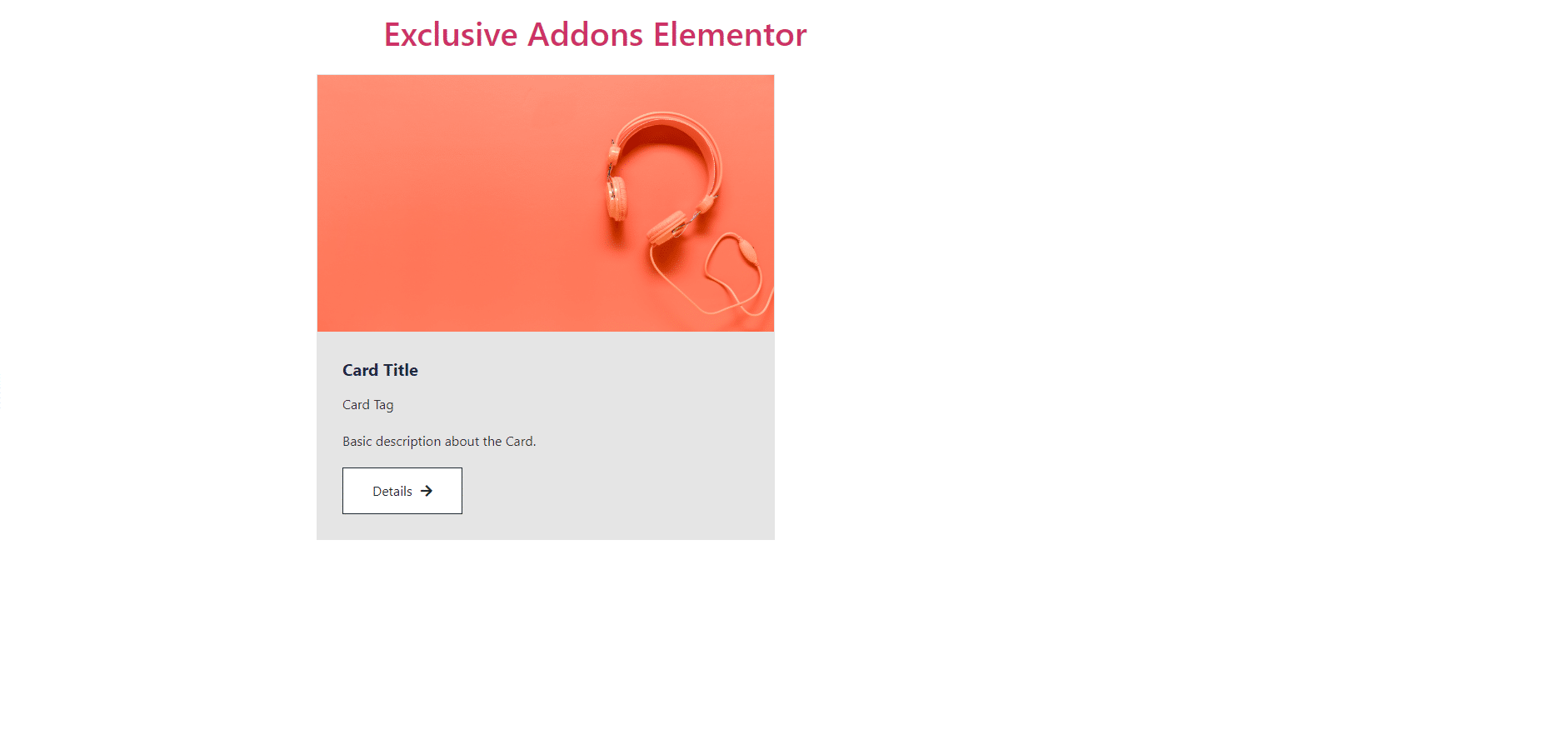
Finally, after clicking the update button you will see the beautiful Cards on your webpage.