How to Configure and Style Elementor Woo Product Carousel Widget.
Woo Product Carousel Widget from Exclusive Addons helps you to design a splendid product carousel for your e-commerce site. Read this documentation to learn how to use the Exclusive Addons WooCommerce Product Carousel widget for Elementor.
Note: To use WooCommerce Product Carousel widgets from Exclusive Addons, you need to have the WooCommerce plugin installed on your website.
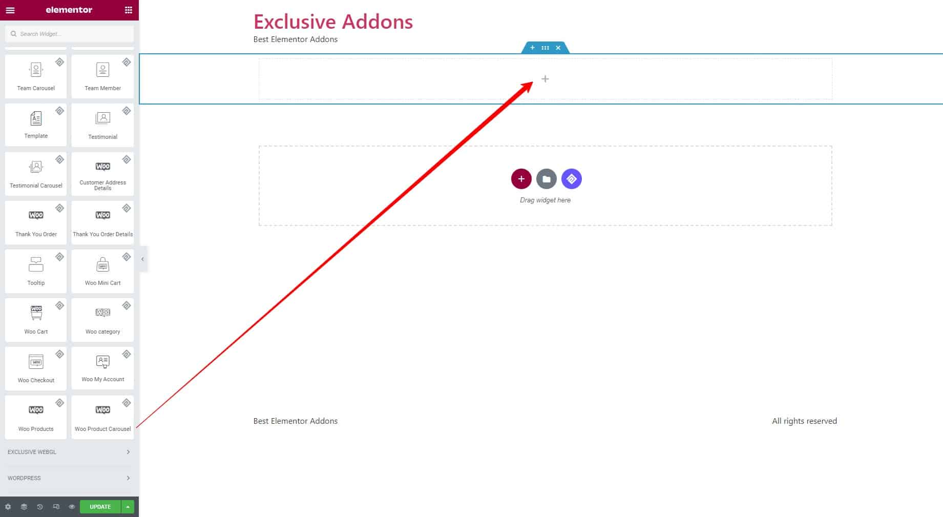
STEP 1:
Select the Woo Product Carousel widget from the Elementor panel. Then drag and drop it in the selected area.
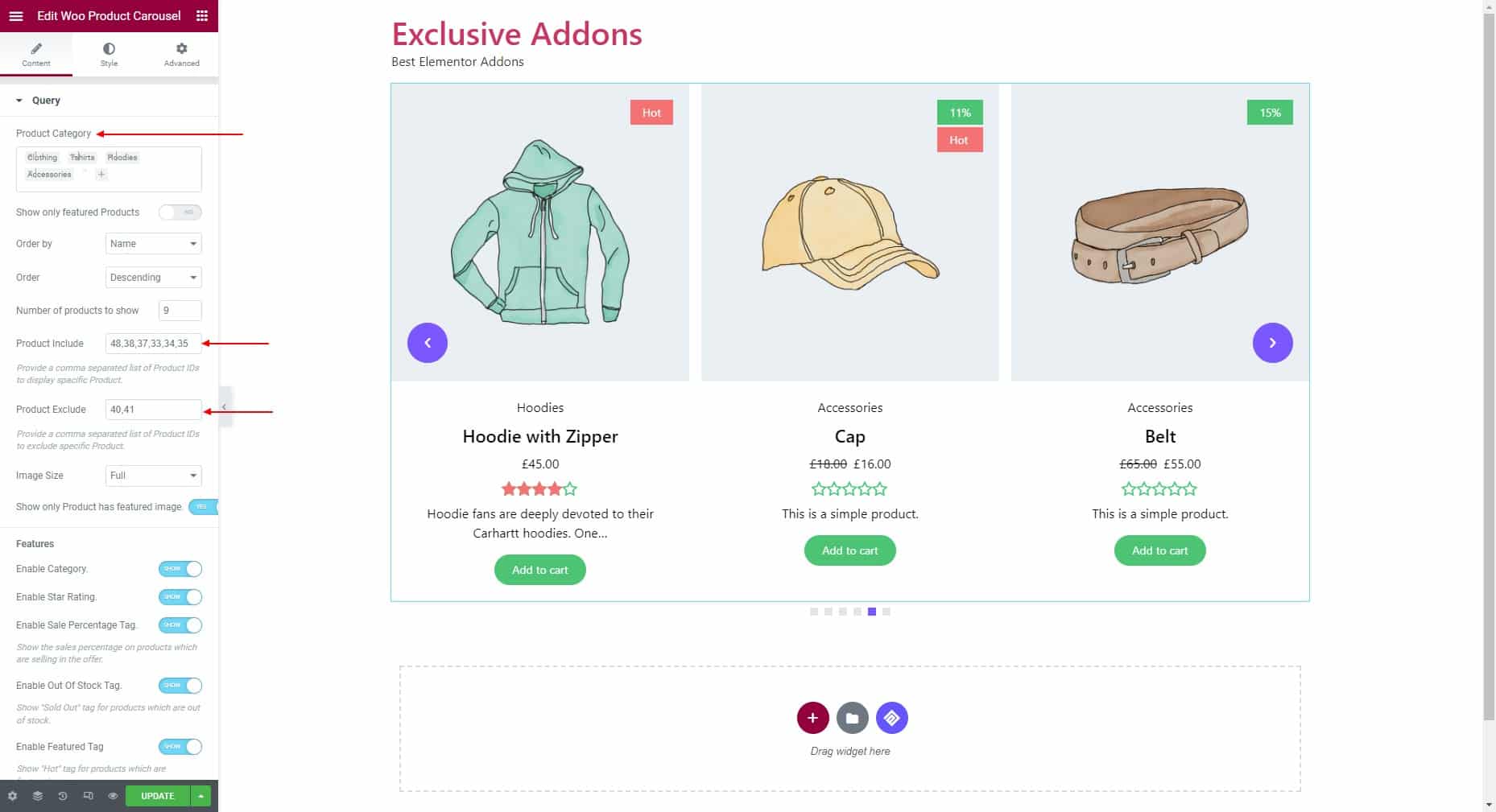
STEP 2:
The Content tab allows you to configure the Query and Carousel Settings.
2.1 In the Query section, enter the Product Categories you want to include on the carousel. Set the product Order and the Number of Products to show.
Then enter product IDs to include specific products. Use comma separators to include multiple products. After that enter product IDs to exclude specific products from the carousel. Use comma separators to exclude multiple products.
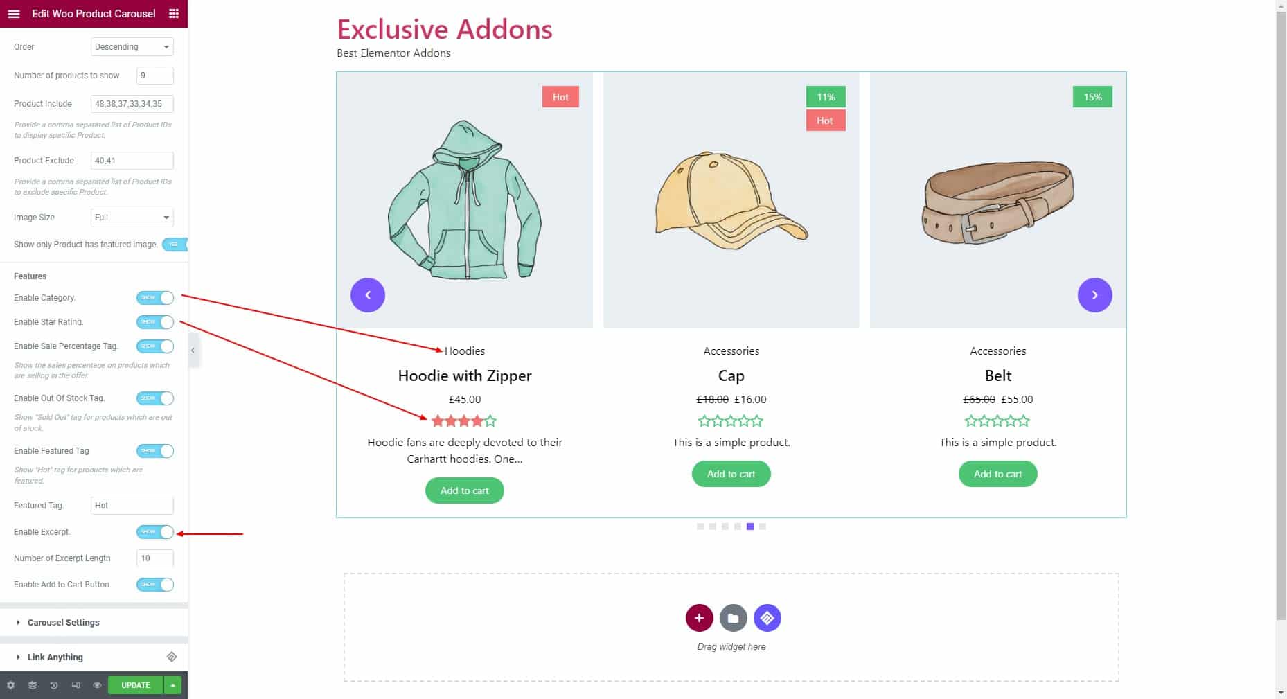
For the Features, enable category, star rating, sale percentage tag, out-of-stock tag, featured tag, and enter text for the featured tag. Then enable excerpt and set the excerpt length. Also can add enable button.
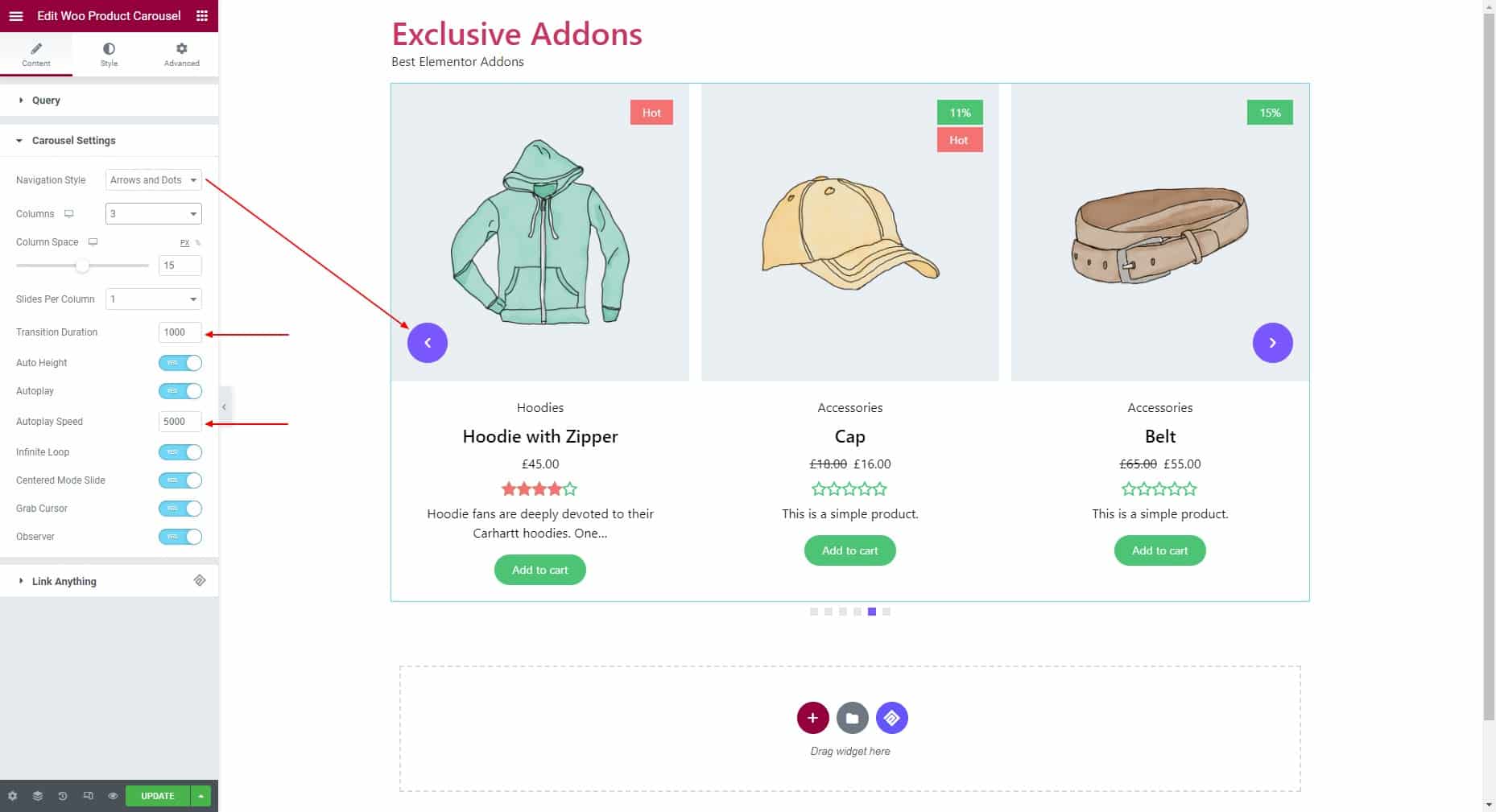
2.2 To configure the Carousel settings, set the navigation style. Adjust the number of products in the column, column spacing, and slides per column. Set the transition duration then choose options like auto height, infinite loop, centered mode slide, grab cursor, and observer. Enable the autoplay option and set the autoplay speed.
STEP 3:
The Style tab allows you to customize the widget styles.
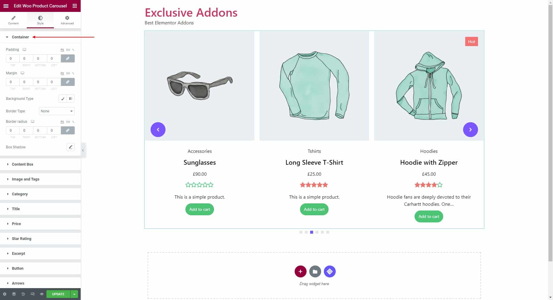
3.1 Customize the Container by setting the padding, margin, background type, and border radius.
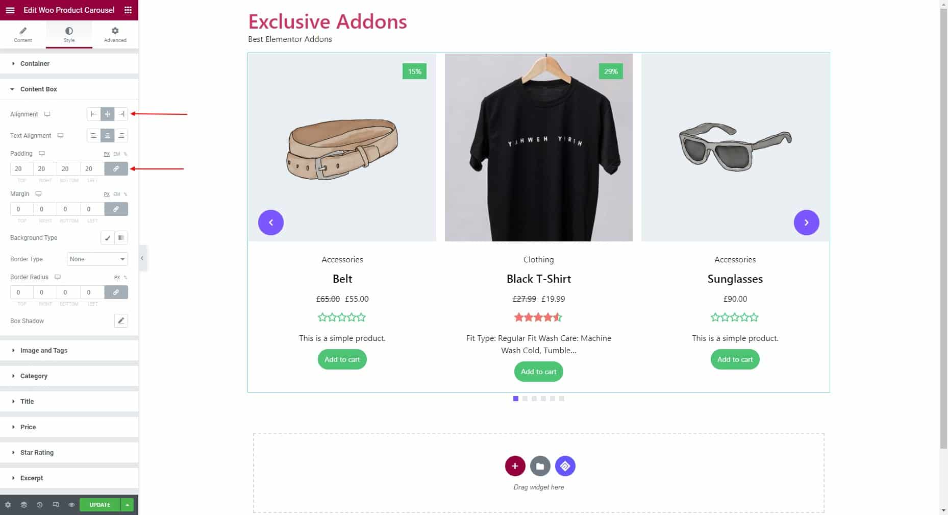
3.2 For the Content Box, set alignment, text alignment, padding, margin, background type, border type, and border radius.
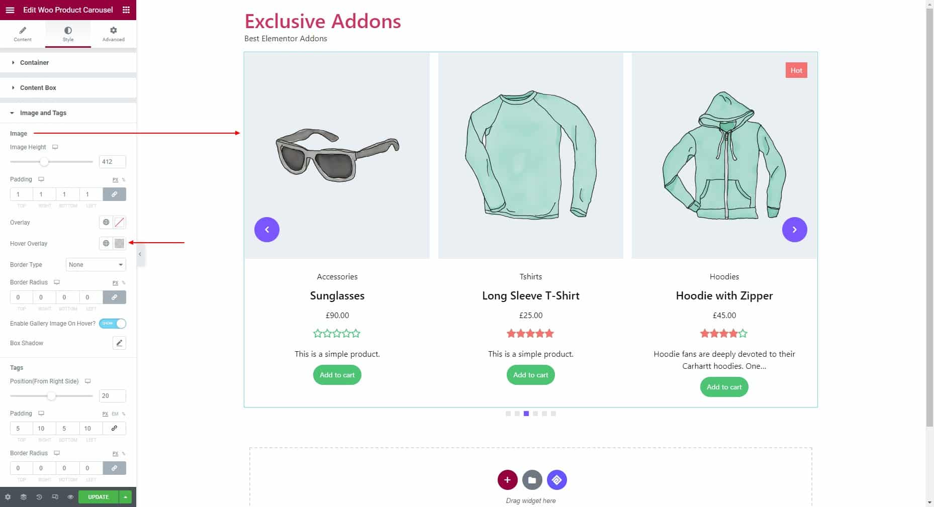
3.3 In terms of Image, adjust the image height, then set image overlay color, hover overlay color, and border type. The option to enable gallery images on hover is available too.
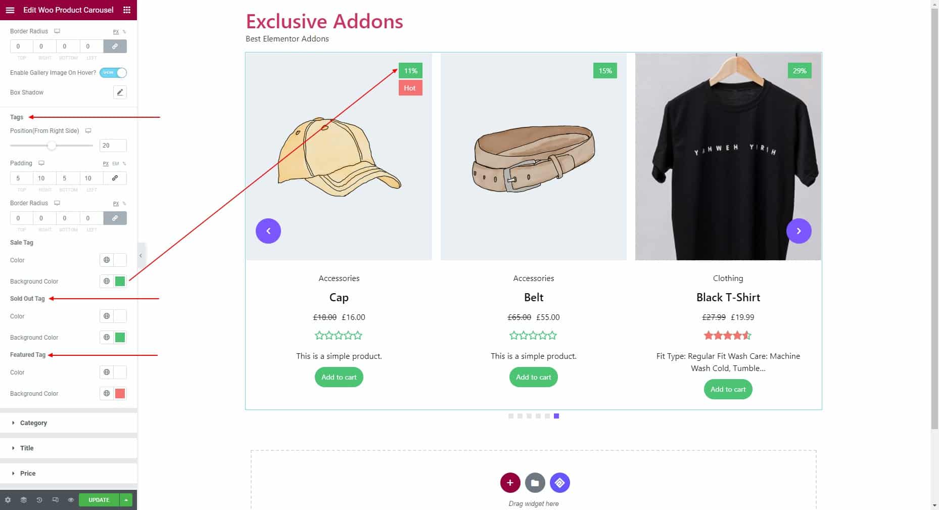
For the Tags, adjust the position from right side, padding, and border radius. Set text color and background color individually for Sale Tag, Sold Out Tag and Features Tag.
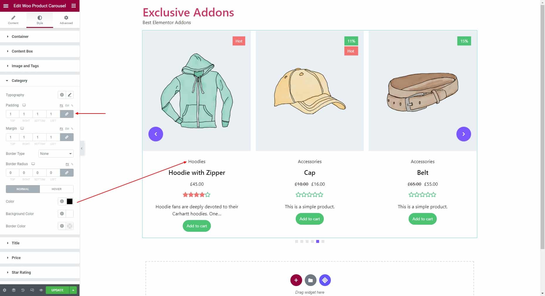
3.4 In terms of Category styles, set typography, padding, margin, border type, and border radius. Set individual color, background color, and border color for “Normal” and “Hover” state.
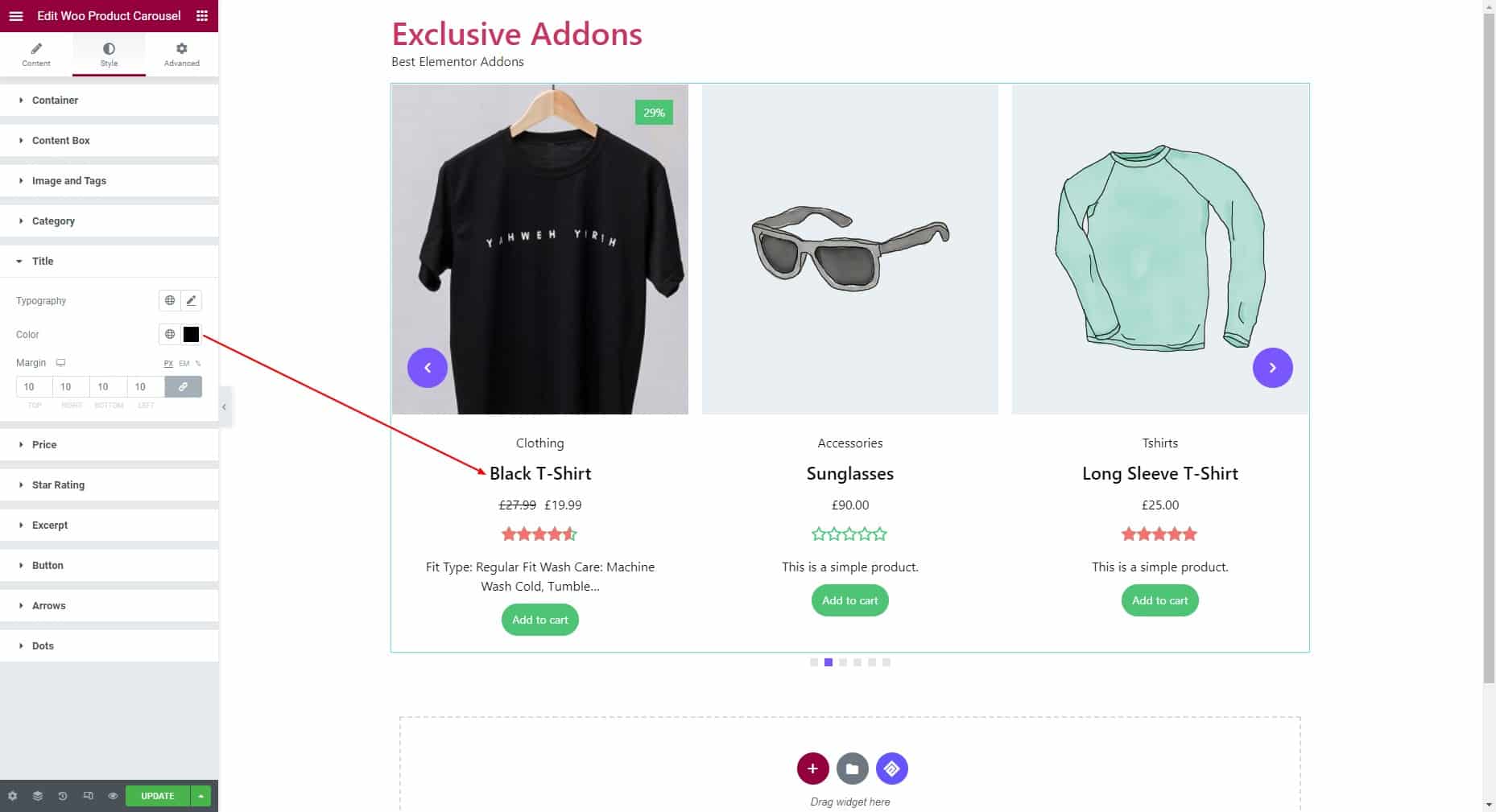
3.5 Set typography, color, and margin for the Title.
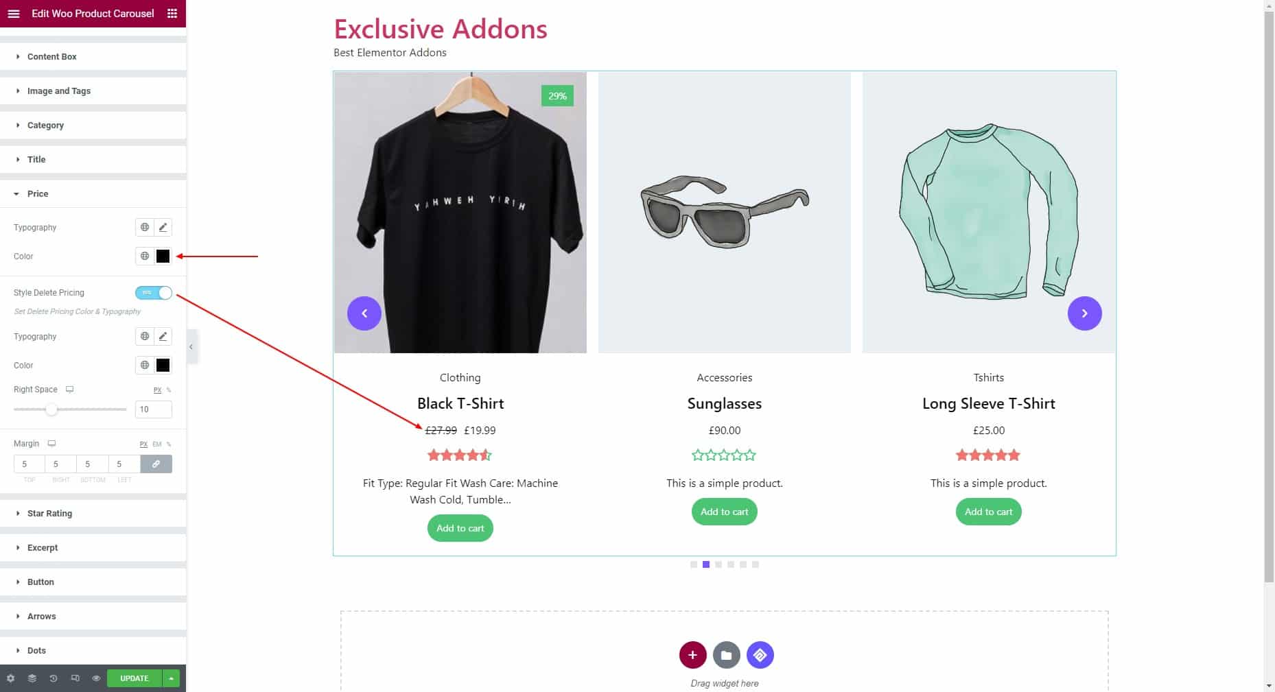
3.6 For Price styles, set its typography, color, and margin. If you want to style delete pricing (price before discount), you can customize its typography, color, and right space.
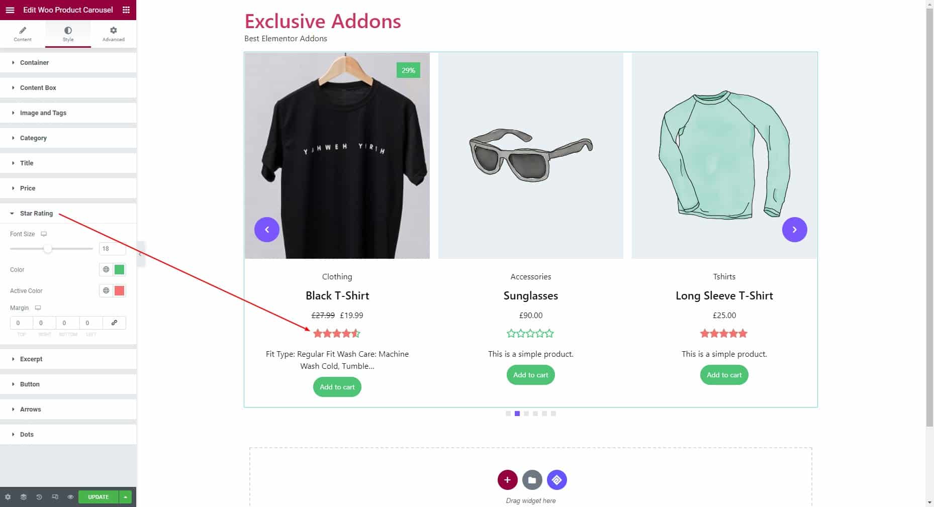
3.7 Adjust the font size, then choose color, active color, and margin for Star Rating.
3.8 Set typography, color, and margin for Excerpt.

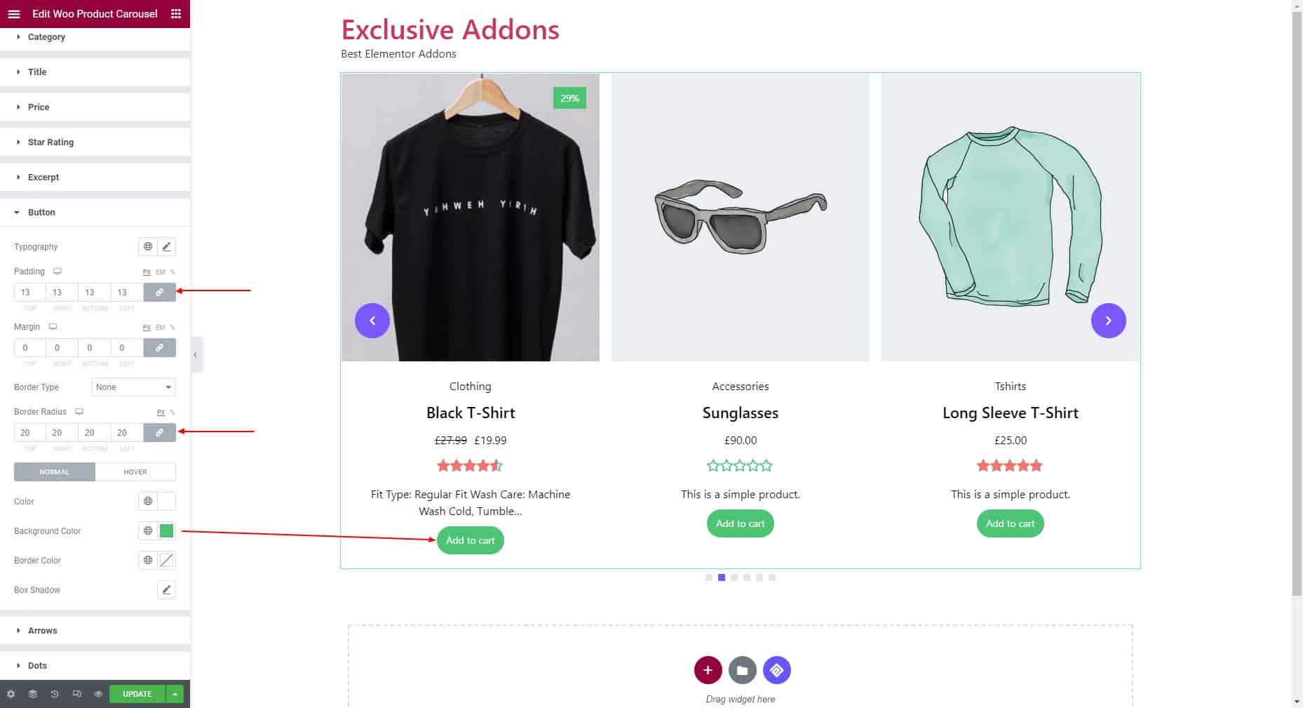
3.9 For the Button styles, you can set the typography, padding, margin, border type, and border radius. Then choose color, background color, border color, and box shadow individually for the “Normal” and “Hover” state.
3.10 If you choose Arrow as navigation style, you can adjust box size, icon size, and border radius. Then set the individual background color, icon color, and border type for the “Normal” and “Hover” state.
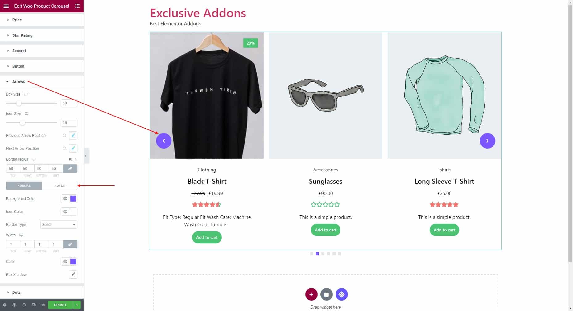
Set Previous Arrow Position and Next Arrow Position to fit the arrows into your design.

3.11 If you choose Dots as navigation style, adjust the alignment, top spacing, space between, and border radius. Also set height, width, background color, opacity, and border type.

STEP 4:
Finally, click on the Update button to finalize the changes you made.