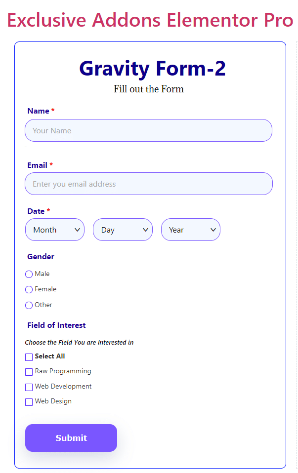
How to configure and style Elementor Gravity form Widget
Create nearly all types of forms including Ajax forms on your website. Customize input fields, add title, label, placeholder and show validation & error message using Gravity-Form Widget of Exclusive Addons Elementor.
[Note: Make sure you have the ‘Gravity Form Plugin’ installed before using the widget.]
STEP 1:
Select the ‘Gravity-form‘ widget from Elementor panel. Then drag and drop it in the selected area.
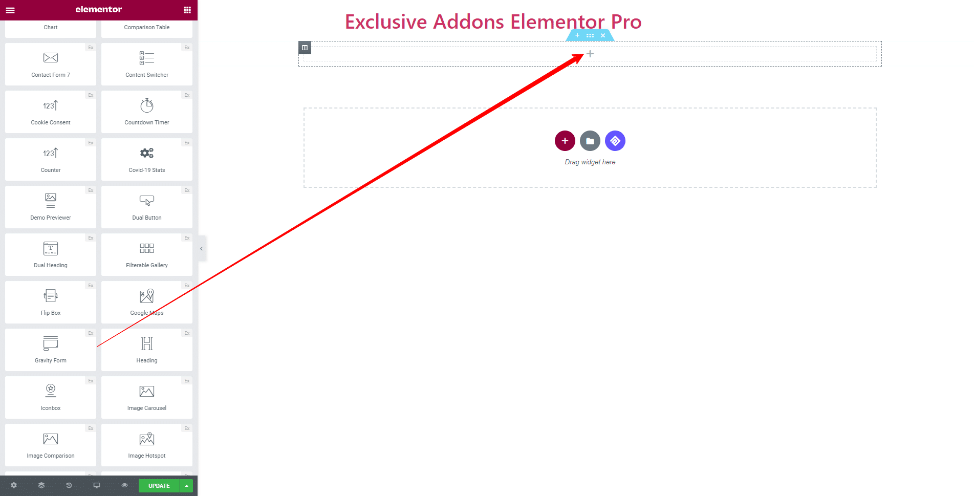
STEP 2:
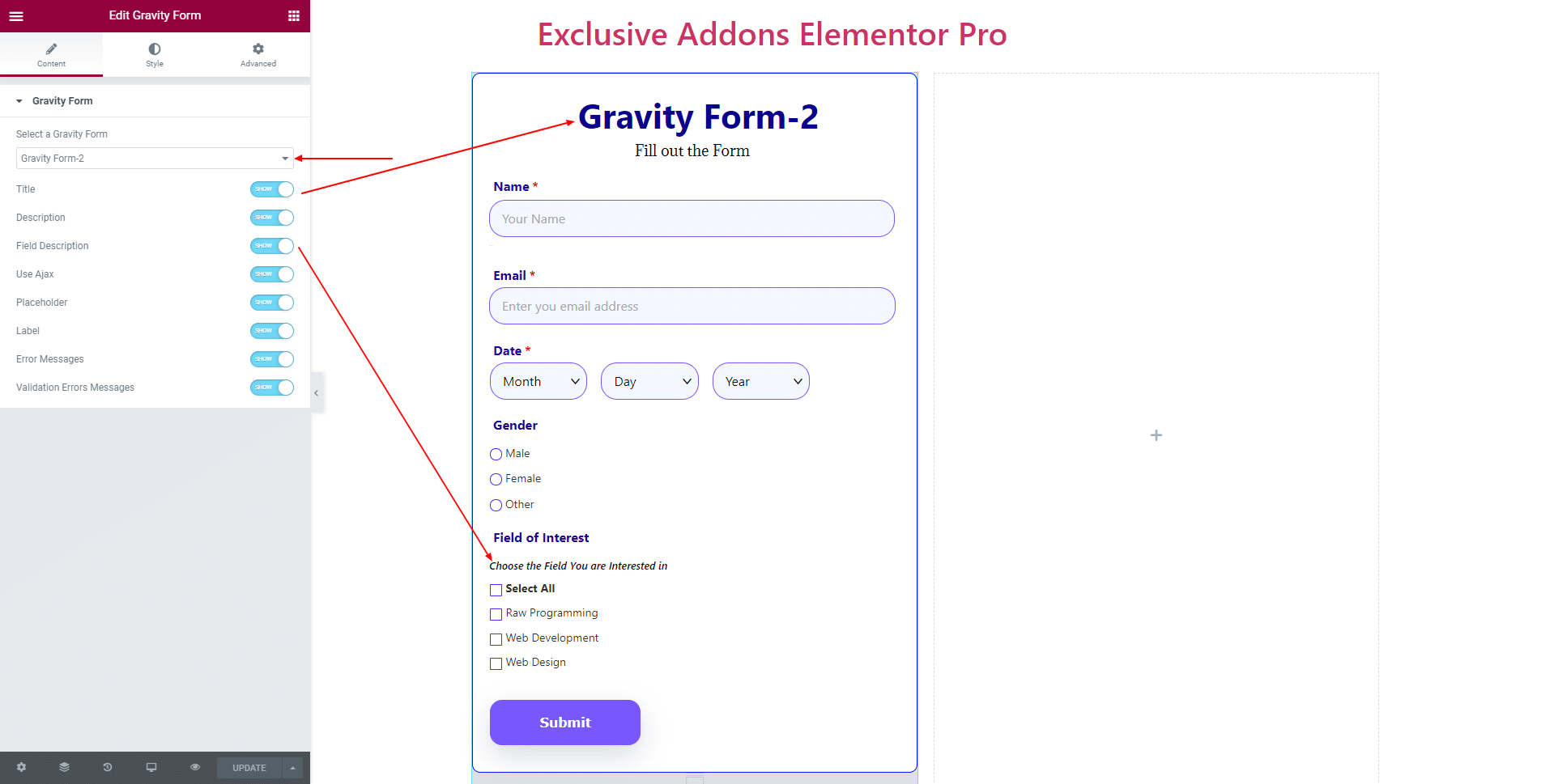
In the Content tab, you can configure the Gravity Form.
First, you get to Select a Gravity Form. Then you have the options to show or hide the following: Title, Description, Field Description, Placeholder, Label, Error Message, Validation Errors Message. Also, can Use Ajax for this form.
STEP 3:
Style tab allows you to customize Form, Title & Description, Form Fields, Label, Radio & Checkbox, Dropdown, Submit Button, Field Description, Price, List, Errors, and Thank You Message design.
3.1 In Form section, you can set form Alignment, Max Width, and adjust the actual Width according to it. Also can select Border Type, Margin, Padding, Border Radius, Border Type, and Box Shadow.
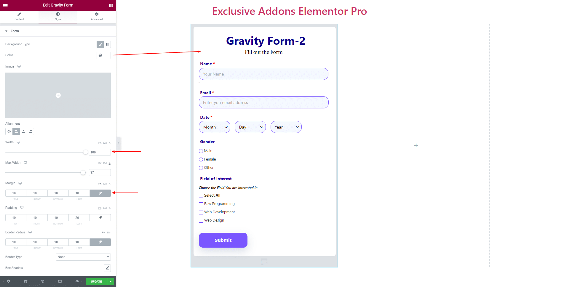
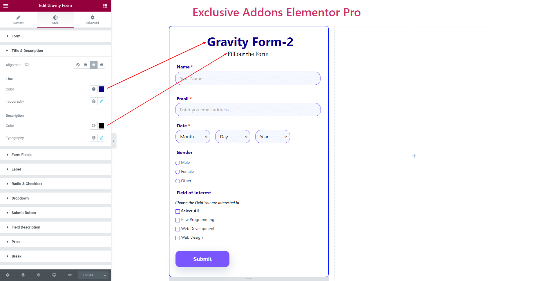
3.2 In Title & Description section, set the Alignment and use individual Color and Typography for ‘Title‘ and ‘Description’.
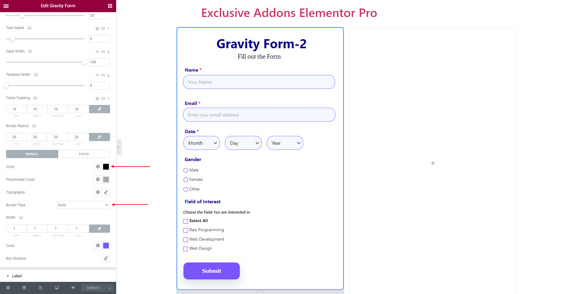
3.3 In Form Fields section, you can adjust Field Gap, Text indent, Input Width, Textarea Width, as well as set Input Field Gap, Fields Padding, Border Radius.

You can also choose Color, Placeholder Color, Typography, Border Type, Border Color, and Box Shadow individually for ‘Normal’ and ‘Focus’ state
3.4 In Label section, choose its Color, Required Asterisk Color, Typography, Label Margin, also set Sub Label Typography, Sub Label Margin.

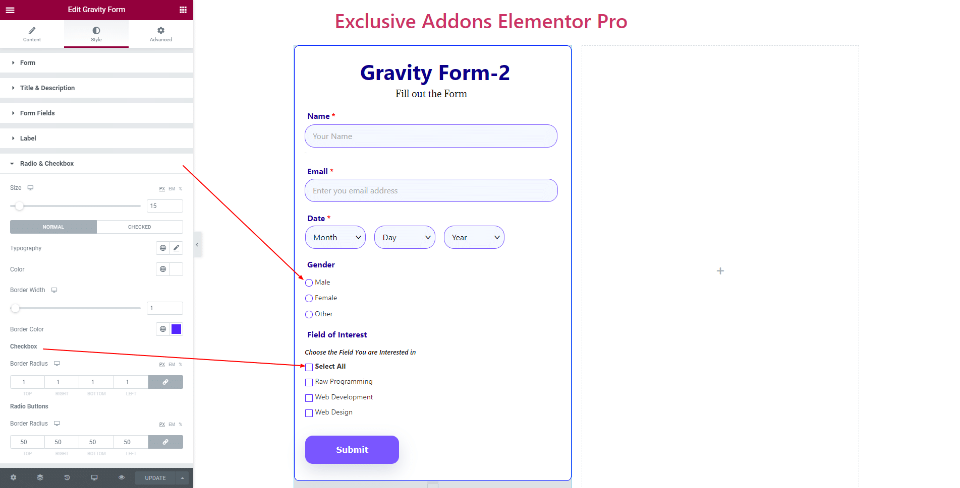
3.5 For Radio Buttons & Checkbox, set the Size and use different Typography, Color, Border Width, Border Color for ‘Normal’, and ‘Checked’ condition. Choose individual Border Radius for ‘Checkbox‘ and ‘Radio Button‘.
3.6 In Dropdown section, you can adjust Dropdown Field Width, Dropdown Field Spacing, Dropdown Icon Right Spacing, and Dropdown Icon Size.

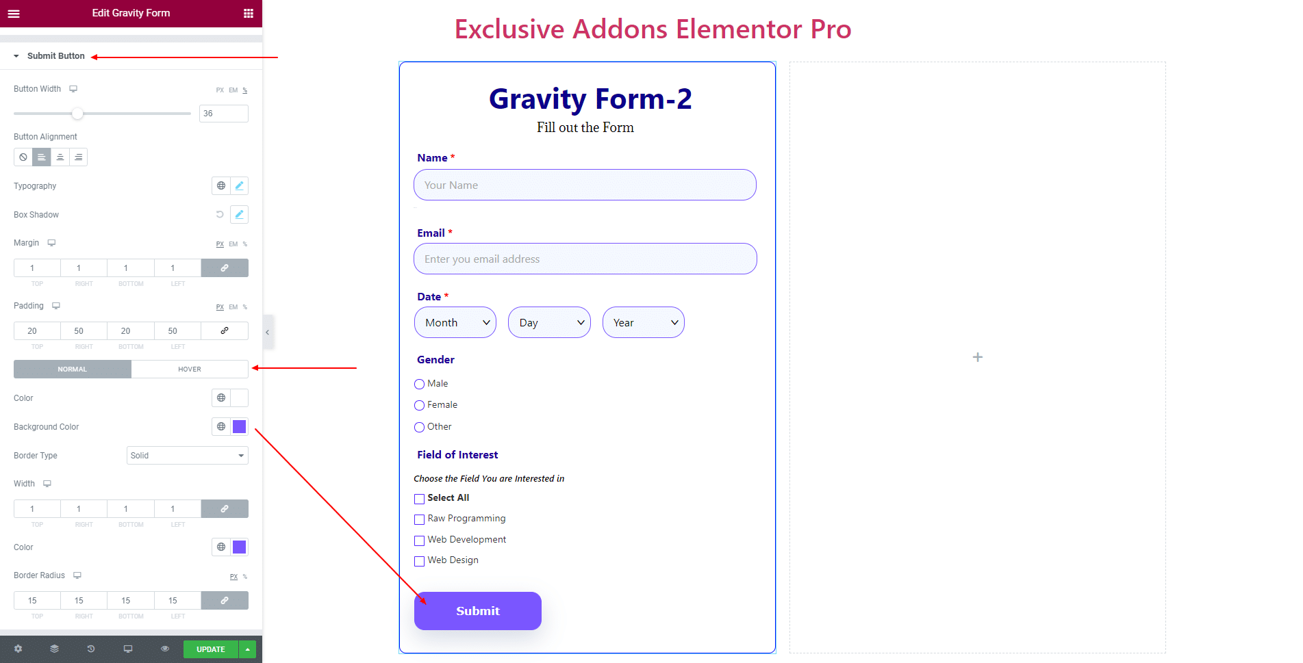
3.7 For Submit Button, you can change Button Width, Button Alignment, Typography, Box Shadow, Margin, and Padding. For ‘Normal’ and ‘Hover’ state, set individual Color, Background Color, Border Type, and Border Radius.
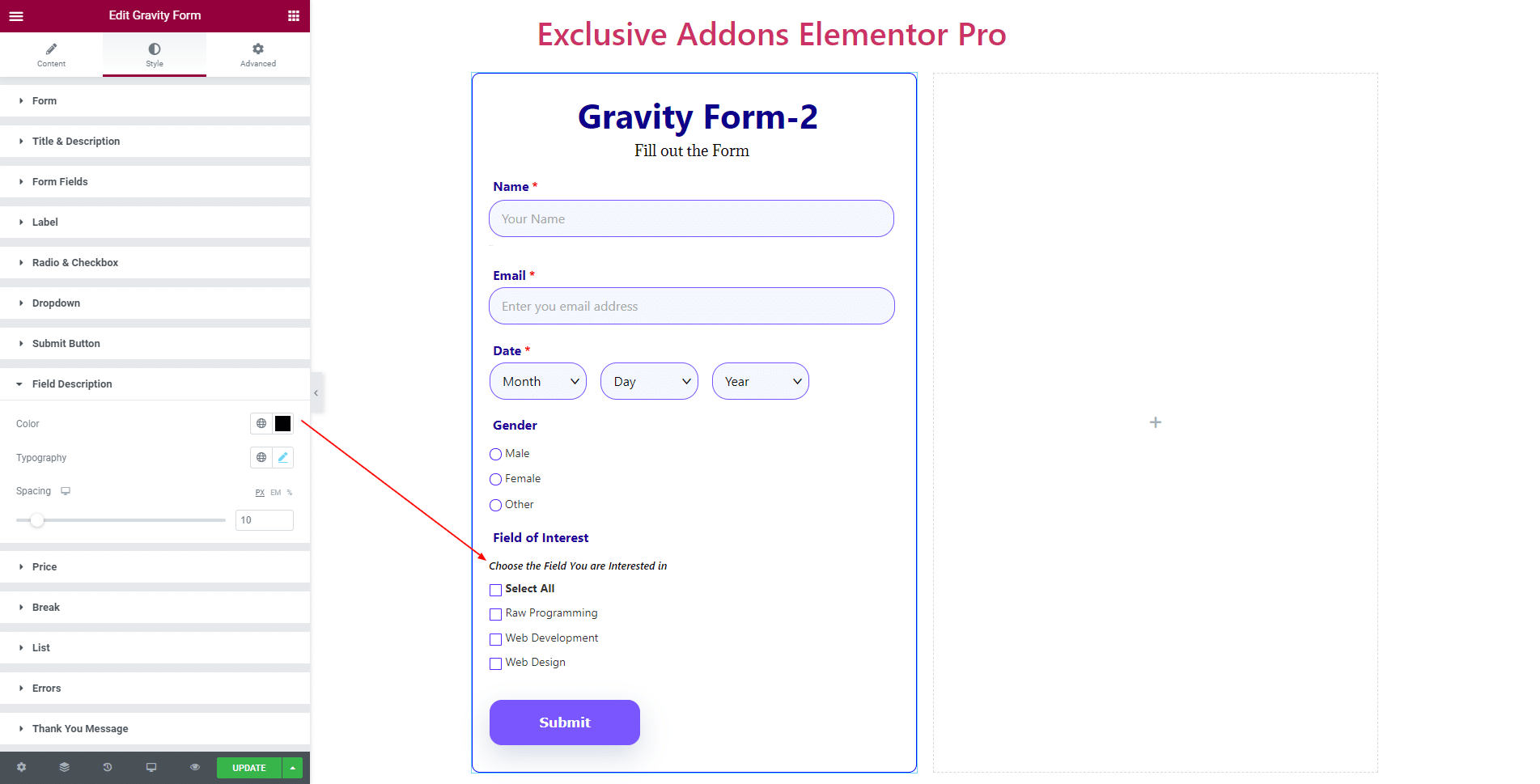
3.8 In Field Description section, choose the Color, Typography, and Spacing.
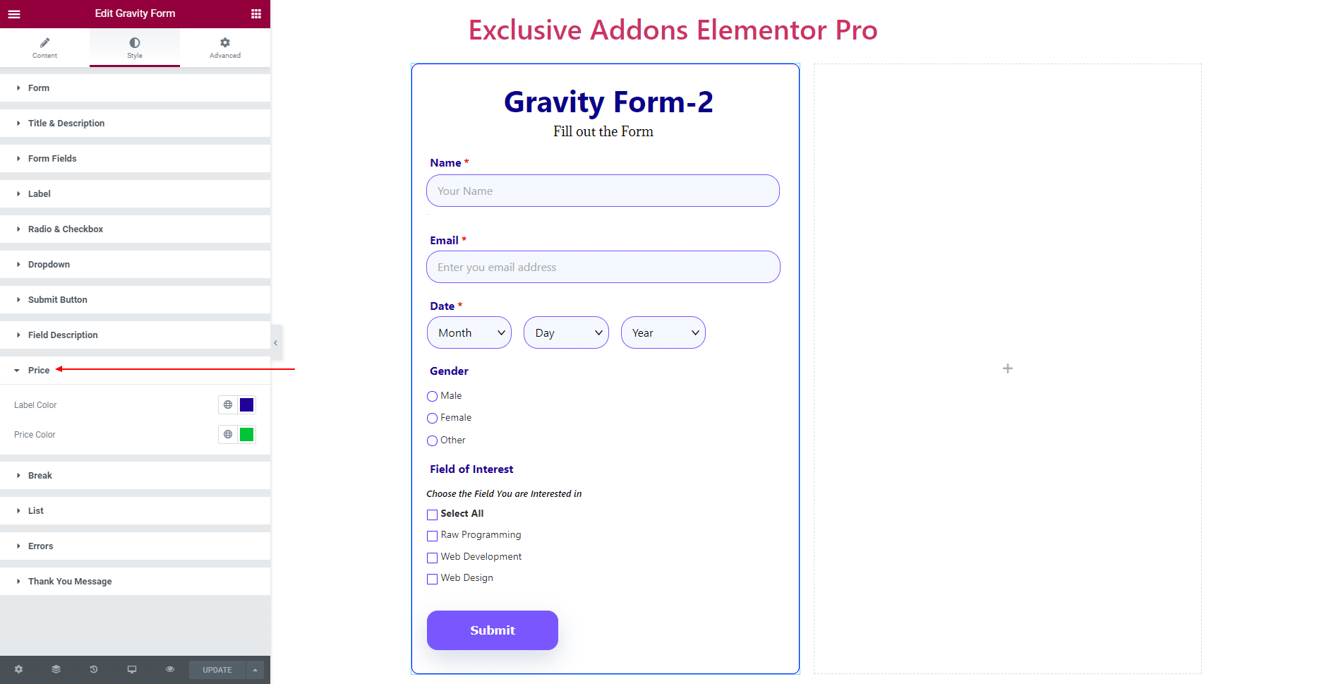
3.9 In Price section, you can choose Label Color, and Price Color.
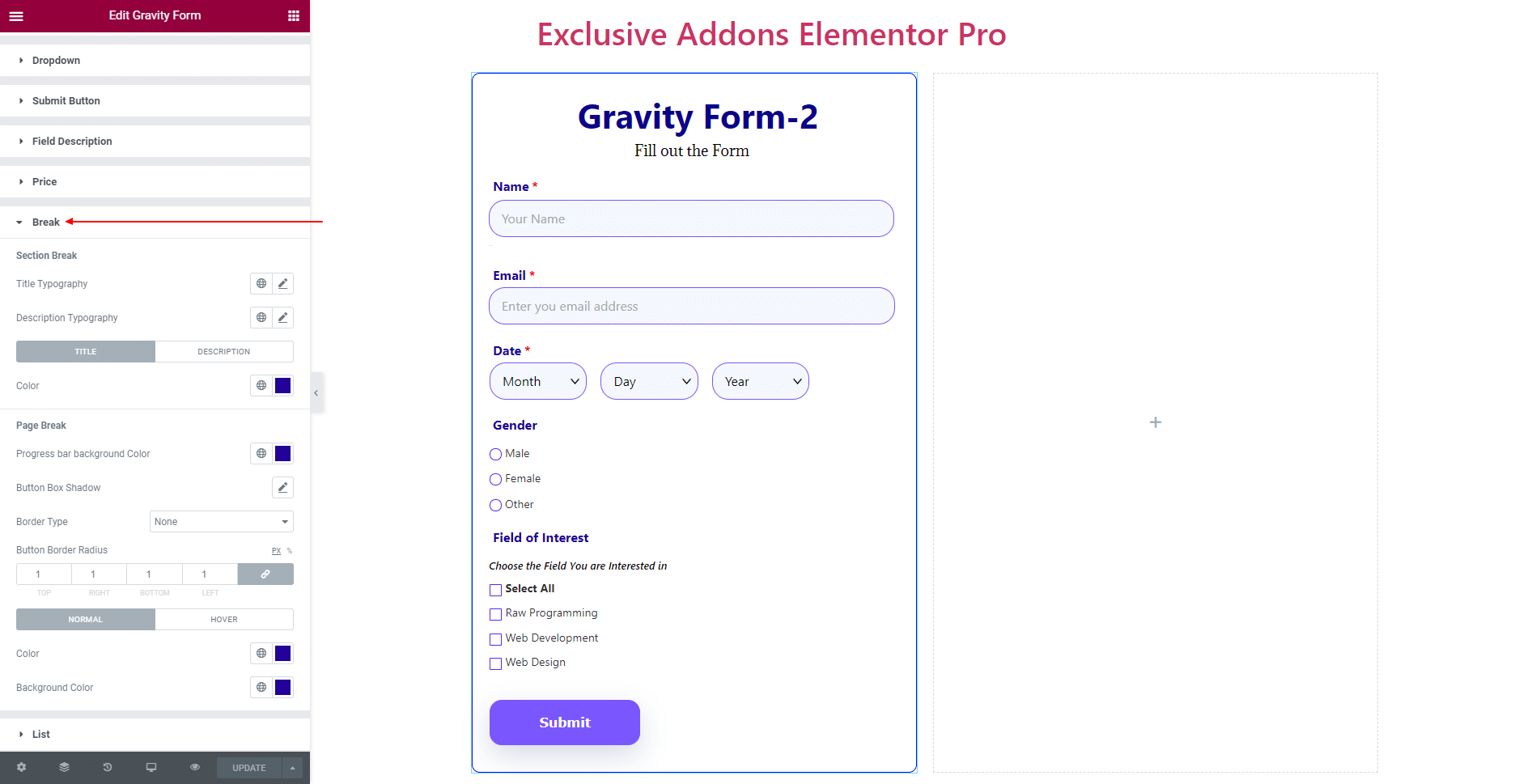
3.10 In terms of Break, set ‘Section Break‘ Title Typography, Description Typography, different Color for ‘Title’ and ‘Description’.
Also, for ‘Page Break‘ set Progress Bar Background Color, Button Box Shadow, Border Type, Button Border Radius, and separate Color, Background Color for ‘Normal’ and ‘Hover’ state.
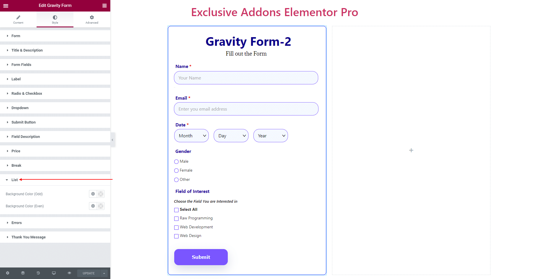
3.11 In List section, set separate Background Color for ‘Odd’ and ‘Even’ items.
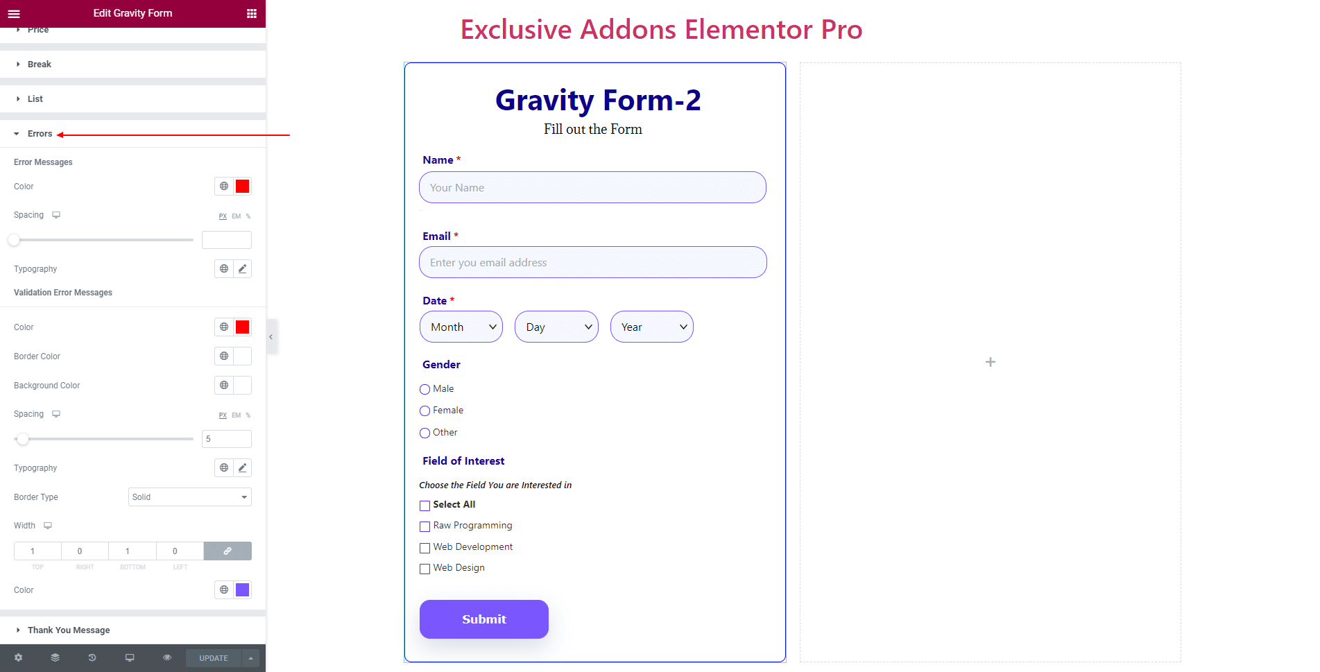
3.12 In Error section, set Color, Spacing, and Typography for ‘Error Message‘. And set Color, Border Color, Background Color, Spacing, Typography, and Border Type for ‘Validation Error Message‘.
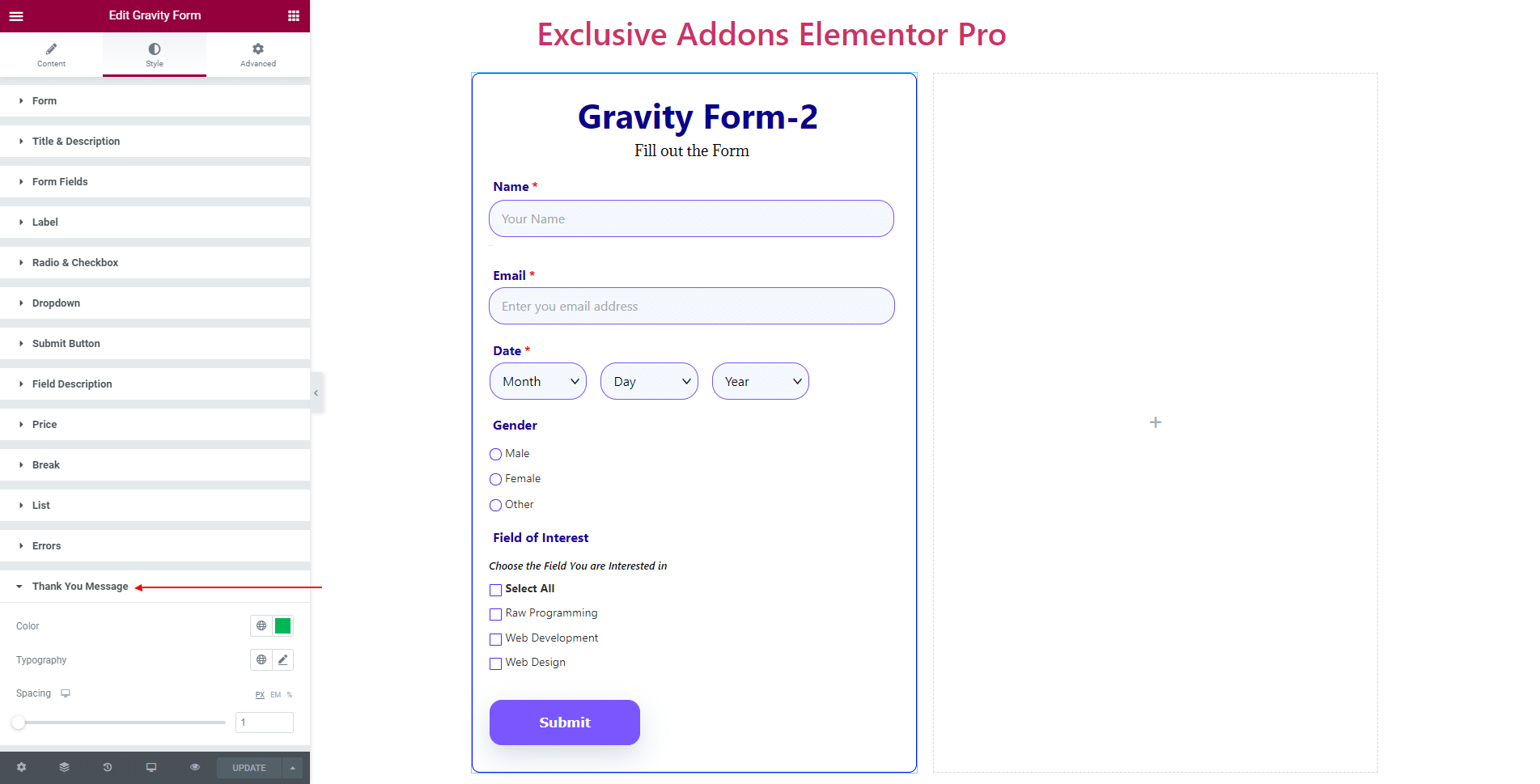
3.13 For Thank You Message, choose its Color, Typography, and Spacing.
STEP 4:
Finally, hit the Update button, and include a stylish Gravity Form Widget on your Wordpress site.
