How to configure and style Modal Popup Widget.
Include a elementor lightbox popup to display contents that appear on hover or on click. Display image, video, gallery, and several more contents in a trendy and stylish way using Exclusive Addons Modal Popup Widget for Elementor.
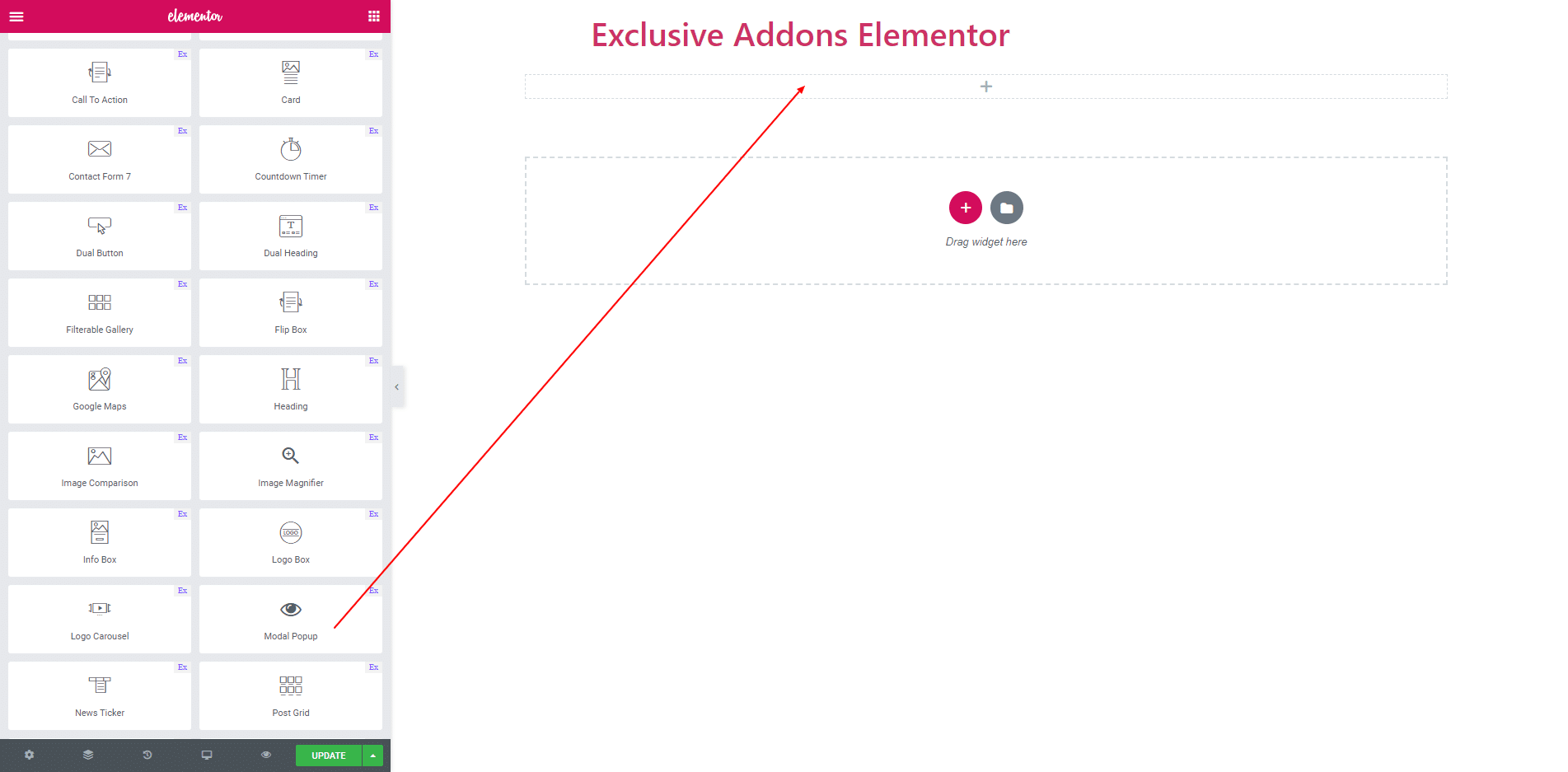
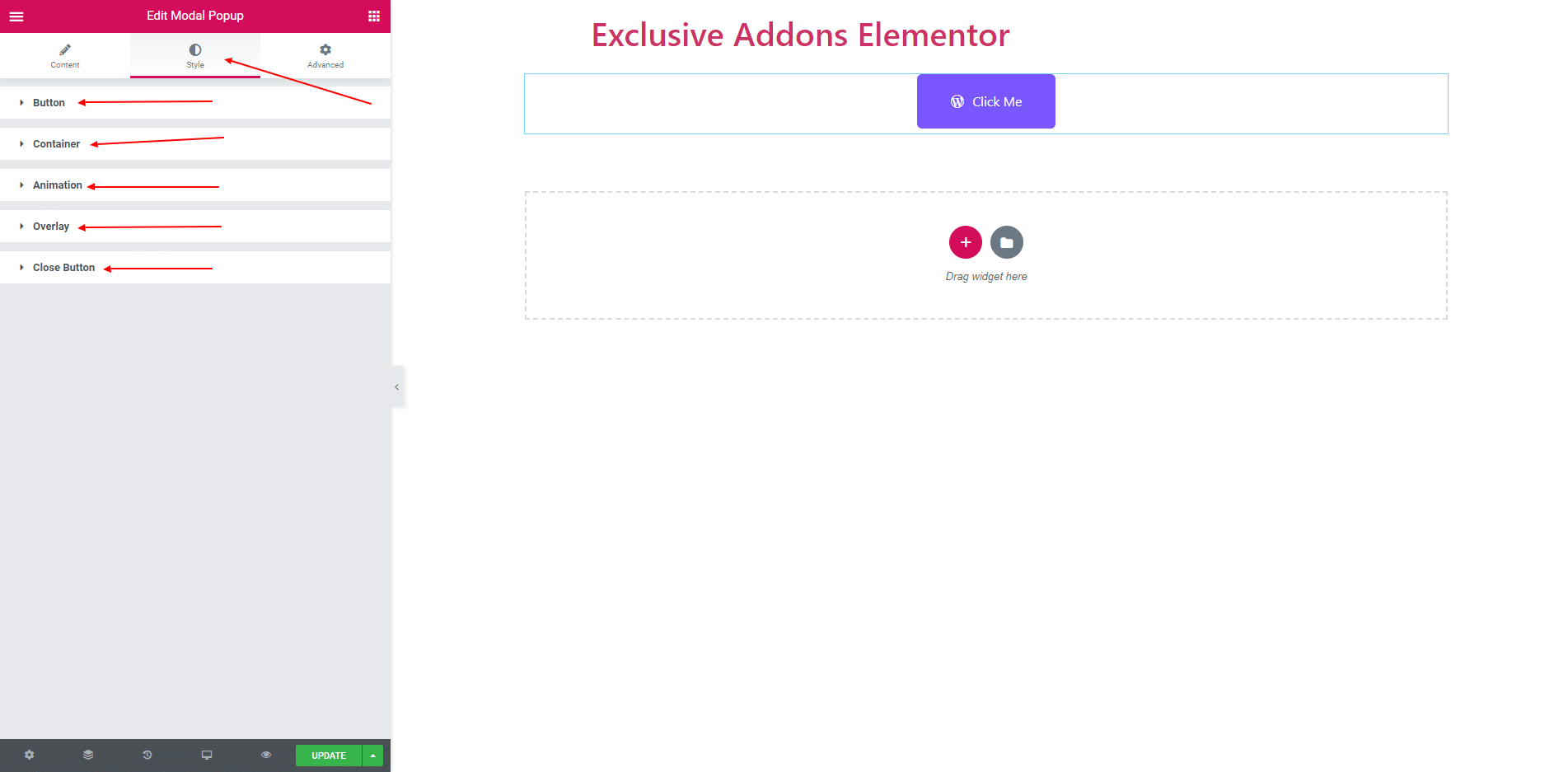
STEP 1:
Select the ‘Modal Popup’ widget from Elementor panel. Then drag and drop it in the selected area.
STEP 2:
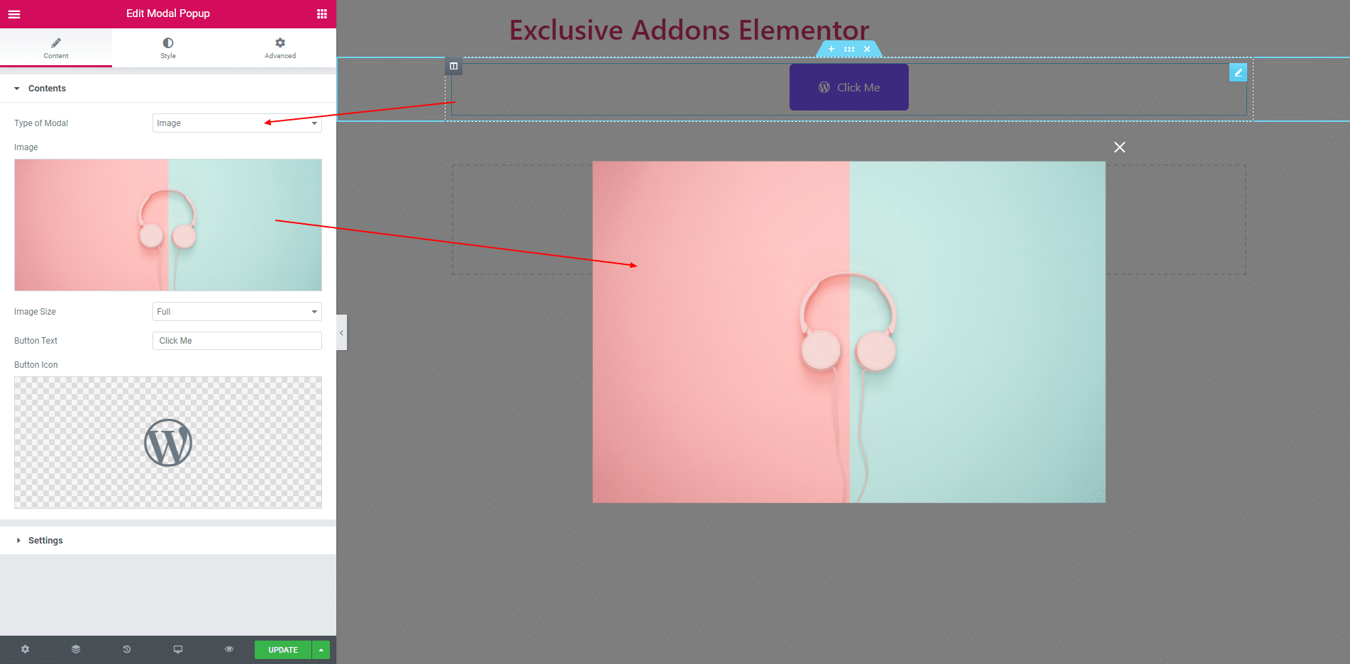
In content section, you can set ‘Modal Type’. You can select ‘Image’, ‘Image Gallery’, ‘HTML Content’, ‘Youtube Video’, ‘Vimeo Video’, ‘Self Hosted Video’ and ‘External page’.
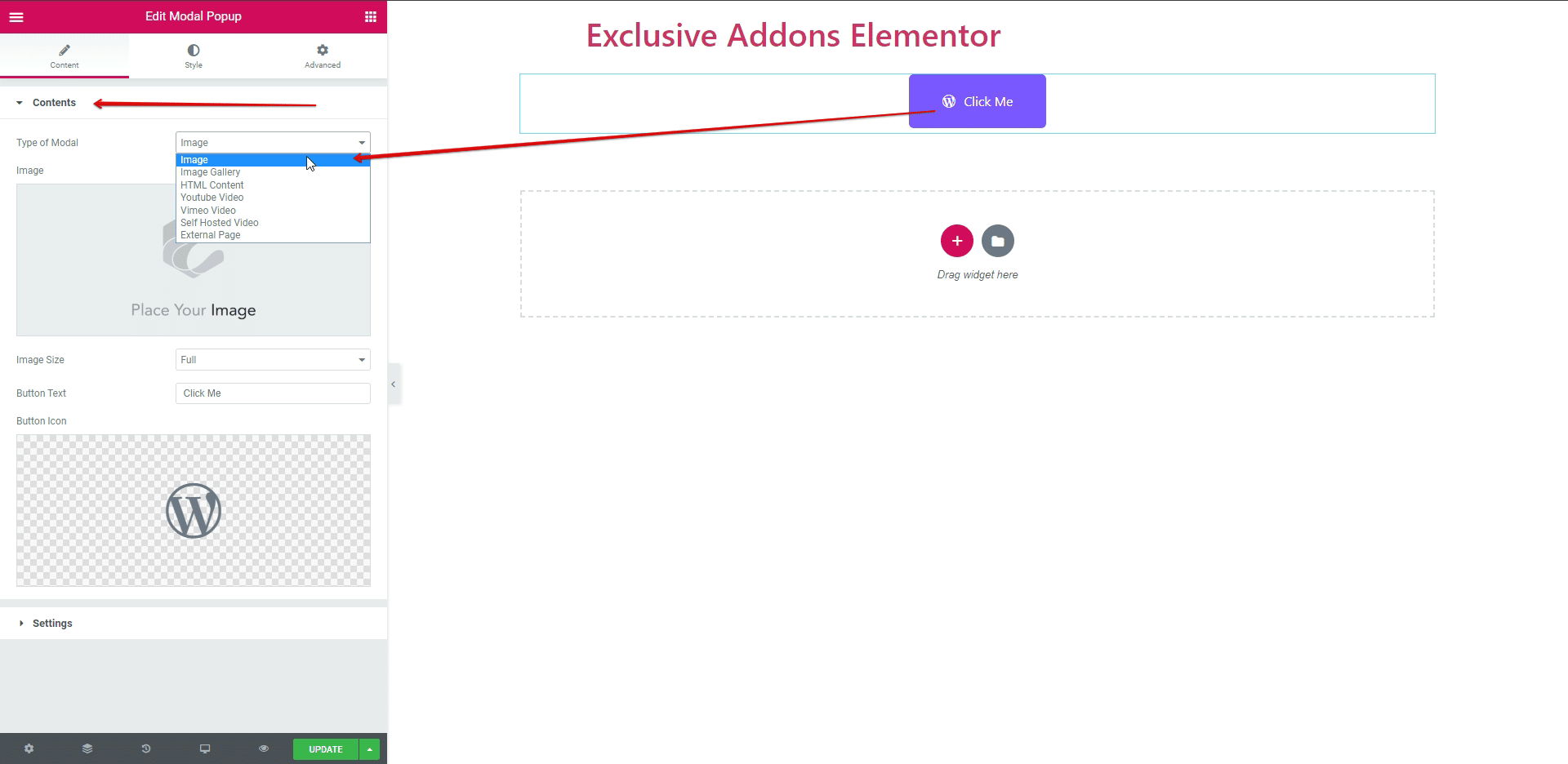
2.1. For modal popup button you can edit button text and add an icon.
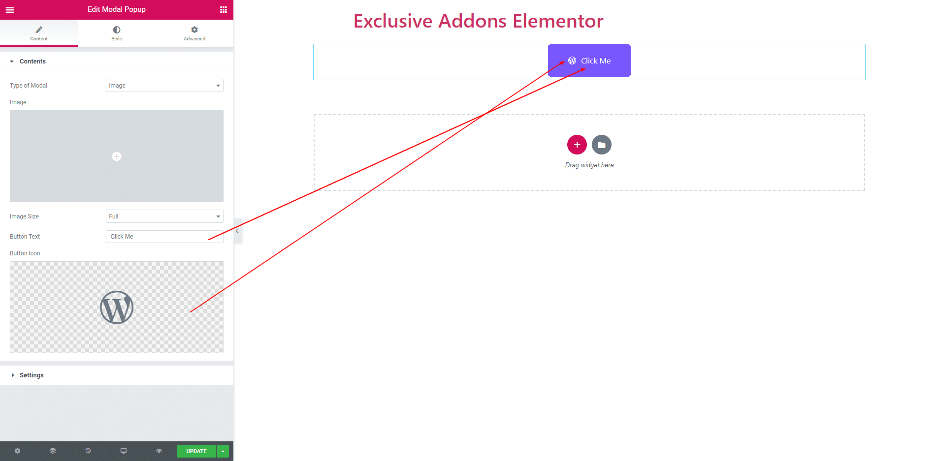
2.2. If ‘Image’ type is selected then you can choose image for modal content.
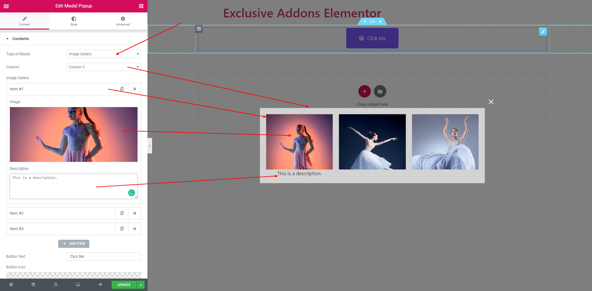
2.3. If ‘Image Gallery’ type is selected then you get multiple item field where you can choose image and add description against that image. You can also select column size. You can add item and also delete item.
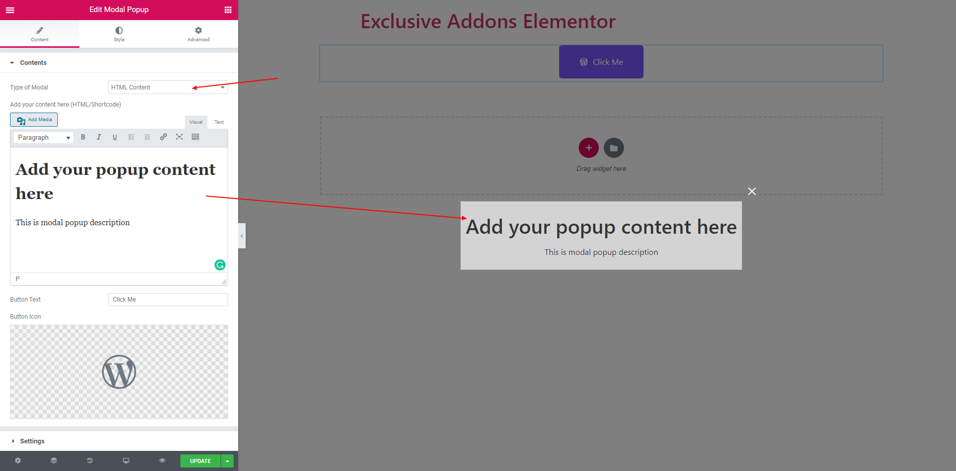
2.4. If ‘HTML Content’ type is selected then you get a field to add text or many things.
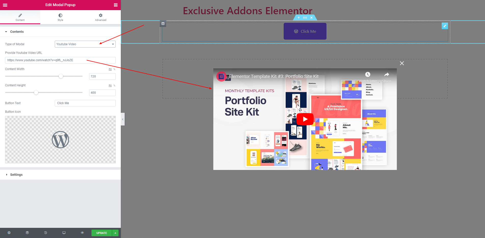
2.5. If ‘Youtube Video’ type is selected then you can provide yooutube video link. you can also set height and width of the video.
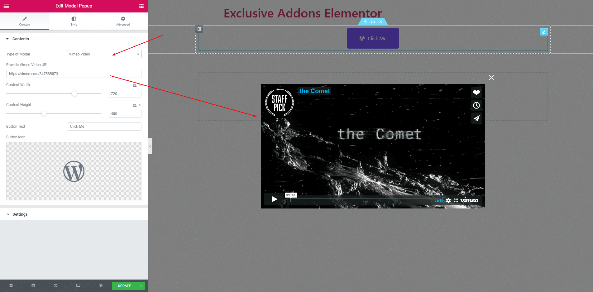
2.6. If ‘Vimeo Video’ type is selected then you can provide vimeo video link. you can also set height and width of the video.
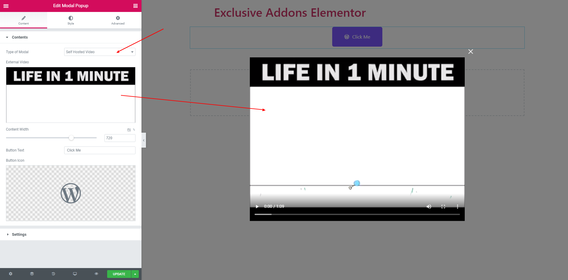
2.7. You can choose a video file from your computer and add this in your popup. You can also set width of this video.
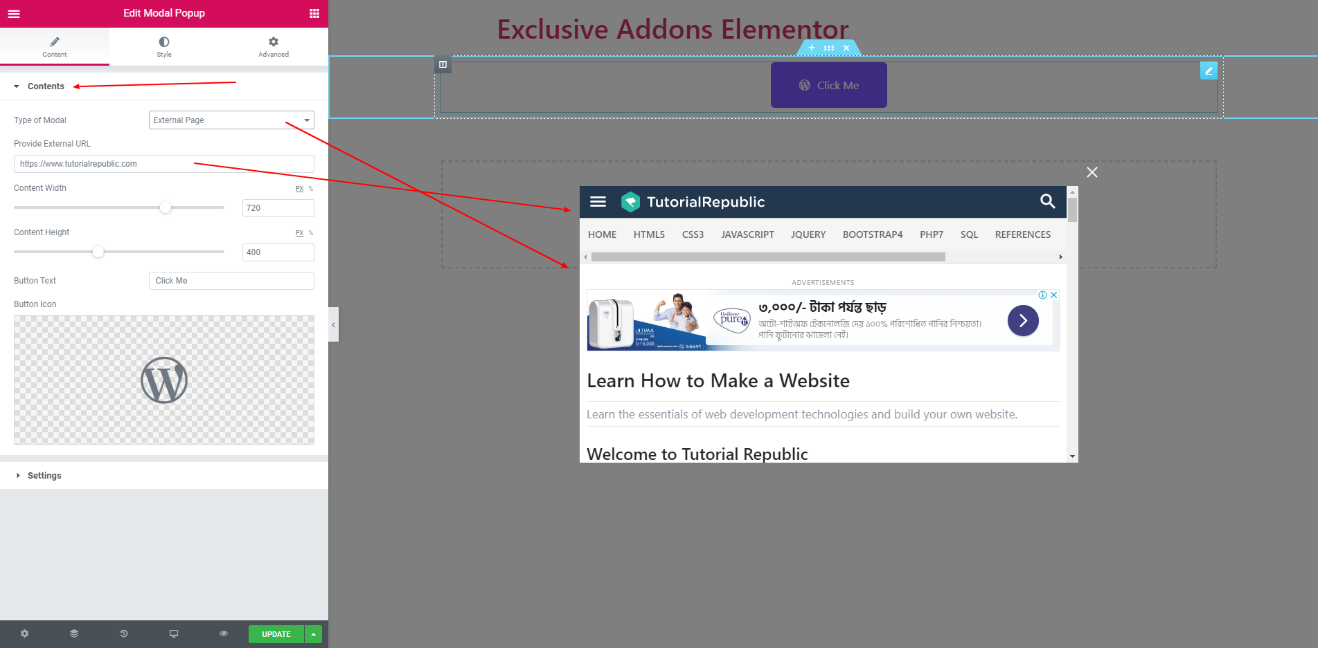
2.7. You can also set external page of any website by seleceting ‘External page’. Just give the page link and set width and height.
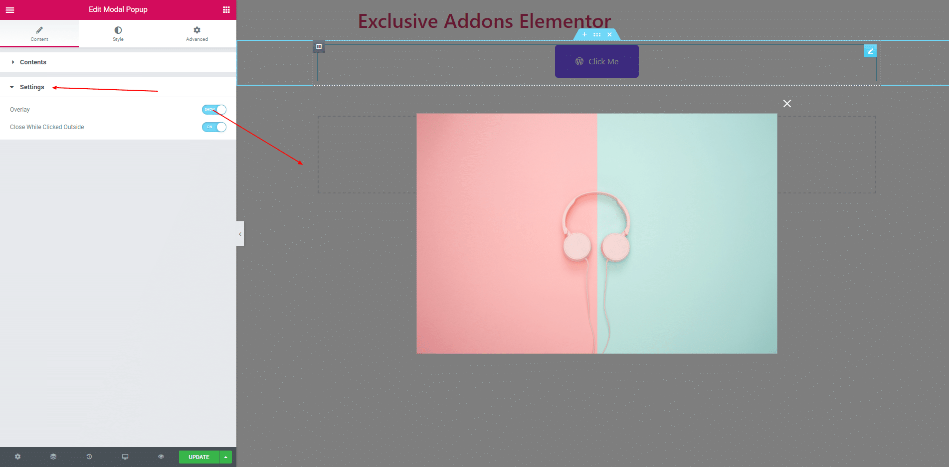
2.8. In ‘Setting’ section you can enable overlay. Also, enable close the popup while click outside of the content.
STEP 3:
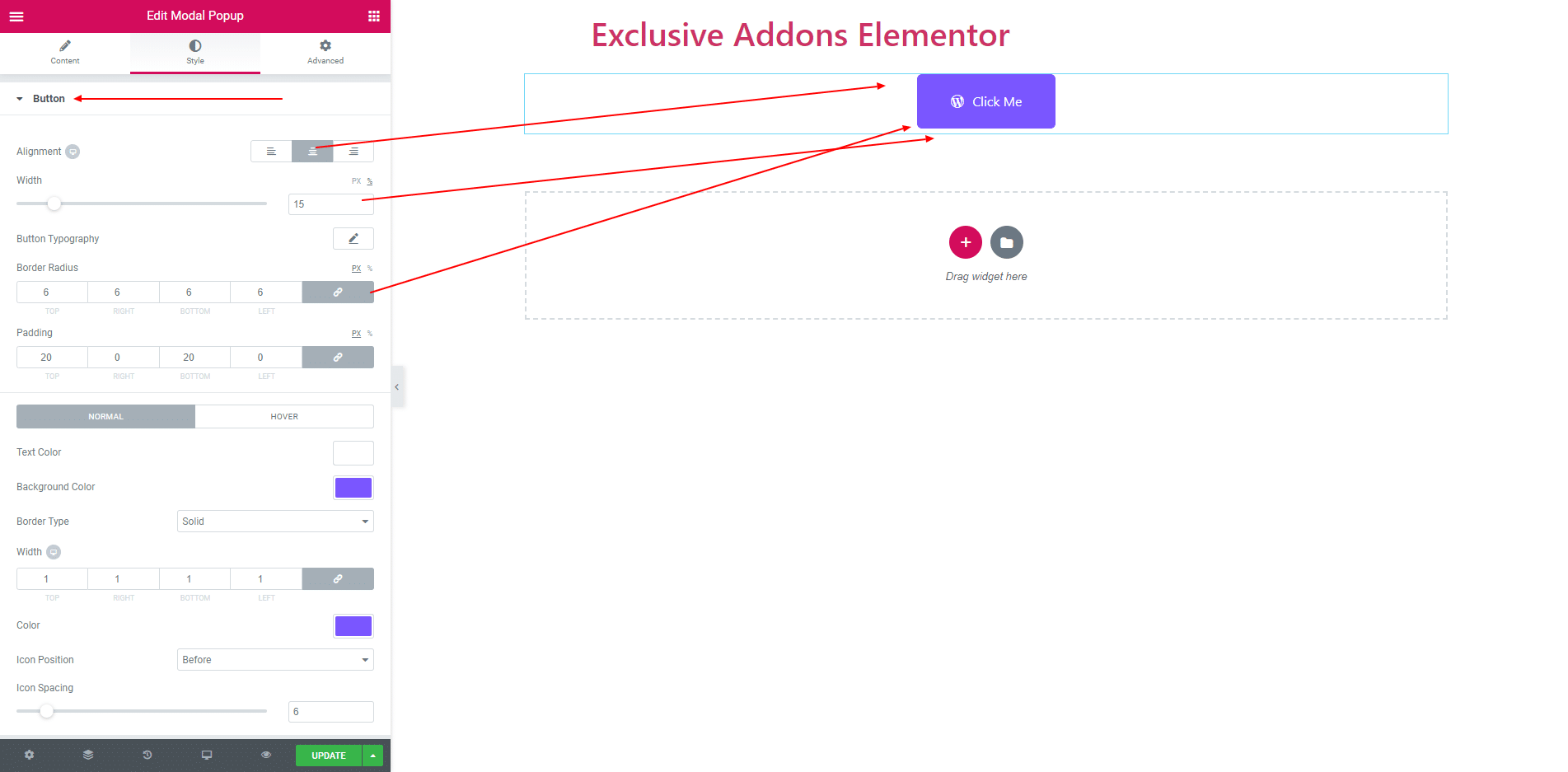
Style section consist of ‘Button’, ‘Container’, ‘Animation’, ‘Overlay’ and ‘Close Button’.
3.1. ‘Alignment’, ‘Border Radius’, ‘Margin’ and ‘Padding’ and some more options are self-explanatory. They applies to the Button section.
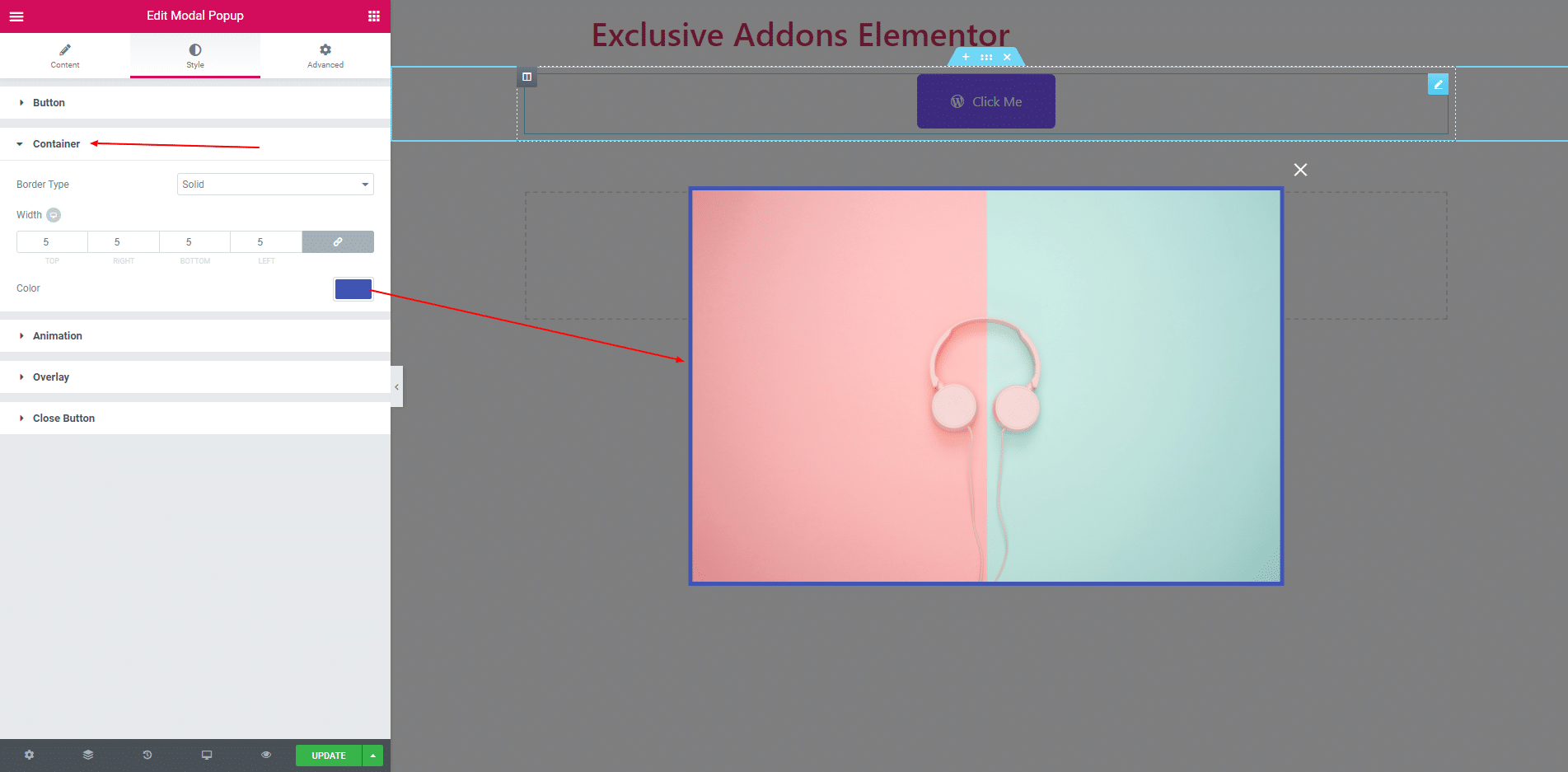
3.2. In container section you can set border when image modal type is selected. And more option is apaired when other type is selected.
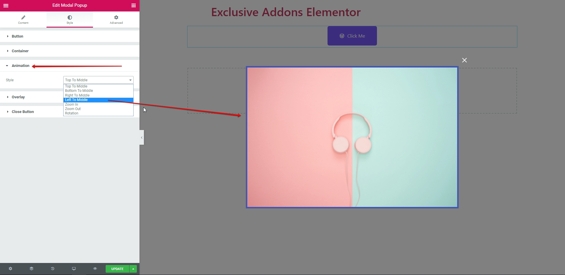
3.3. You can also choose your preferred animation options from the Animation drop-down menu. By default, it is set to ‘Top to Middle’.
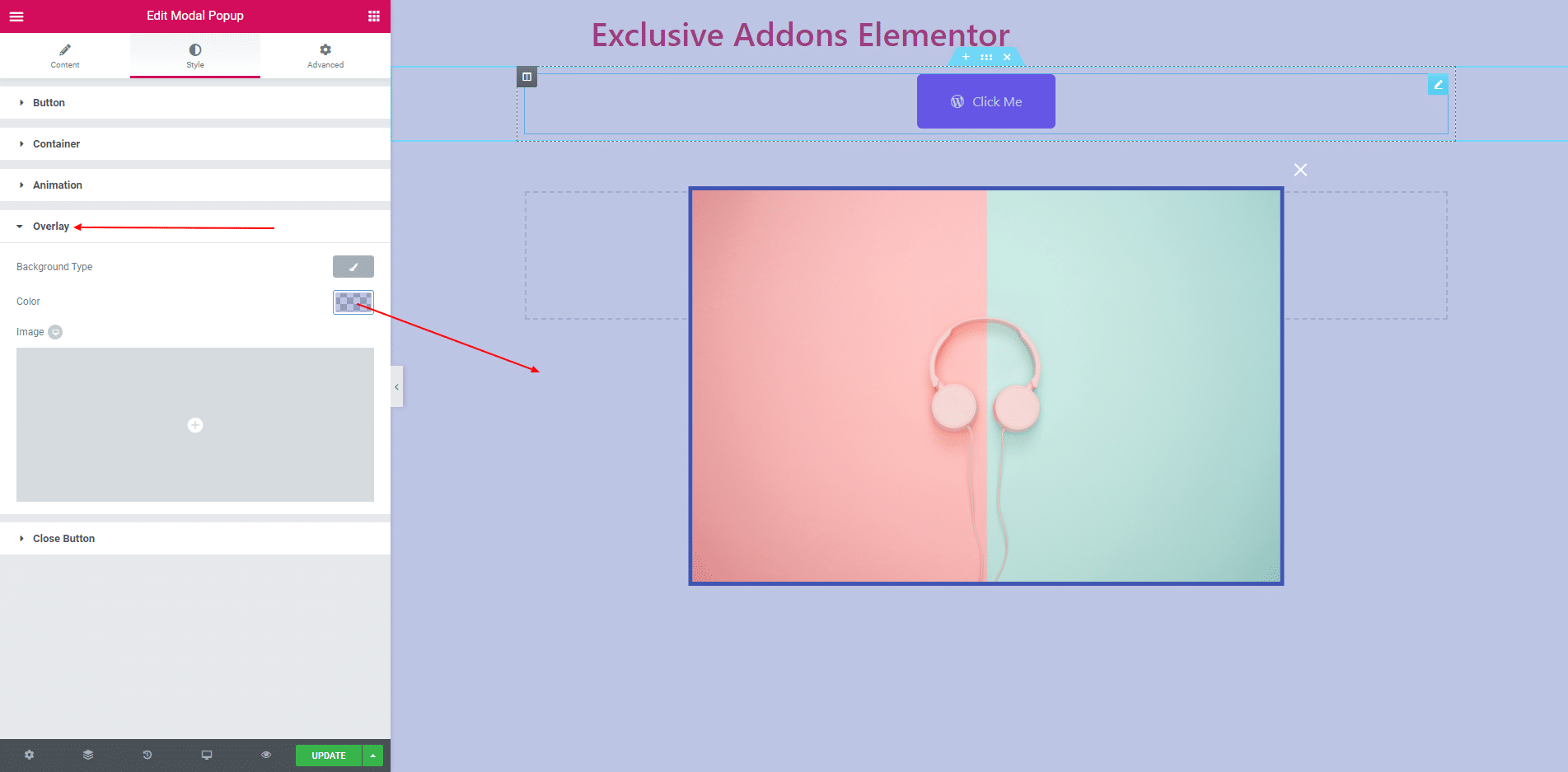
3.4. Solid color, RGB color or image can be used as a overlay. Also set nothing as overlay.
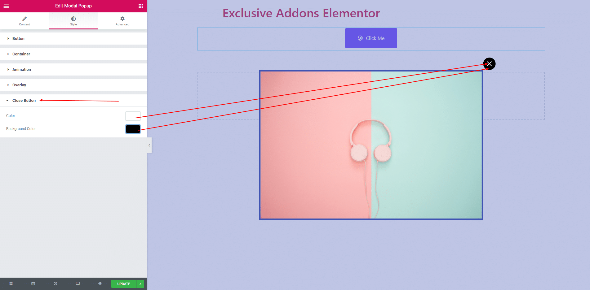
3.5. You can set color and background color of the close button in Close Button section.
STEP 4:
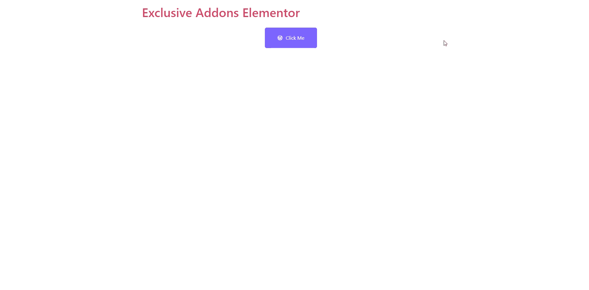
Finally, after clicking the update button you will see the beautiful Modal Popup on your webpage.