How to configure and style Accordion Widget.
Create an interactive drawer on your website that expands when you click on it, using Exclusive Addons Accrodion Widget for Elementor.
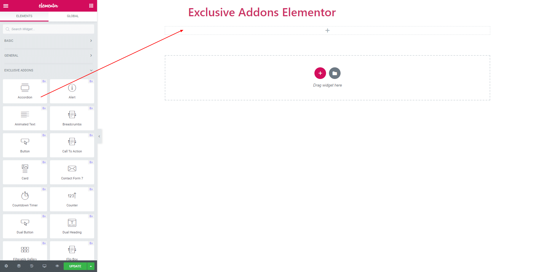
STEP 1:
Select the ‘Accordion’ widget from Elementor panel. Then drag and drop it in the selected area.
STEP 2:
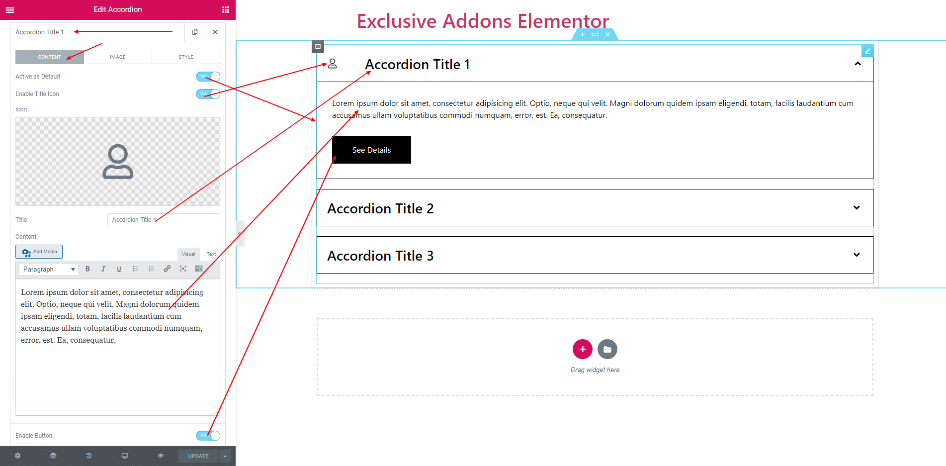
In Content section, you will find options to edit ‘Contents’.
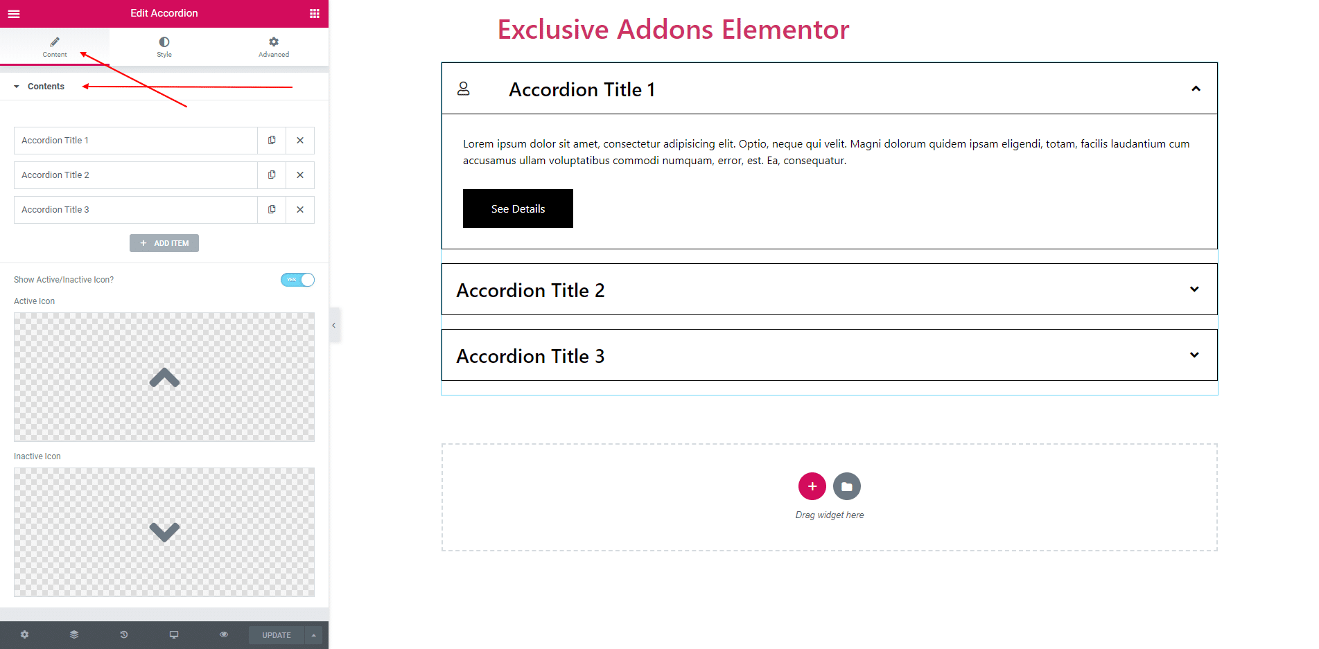
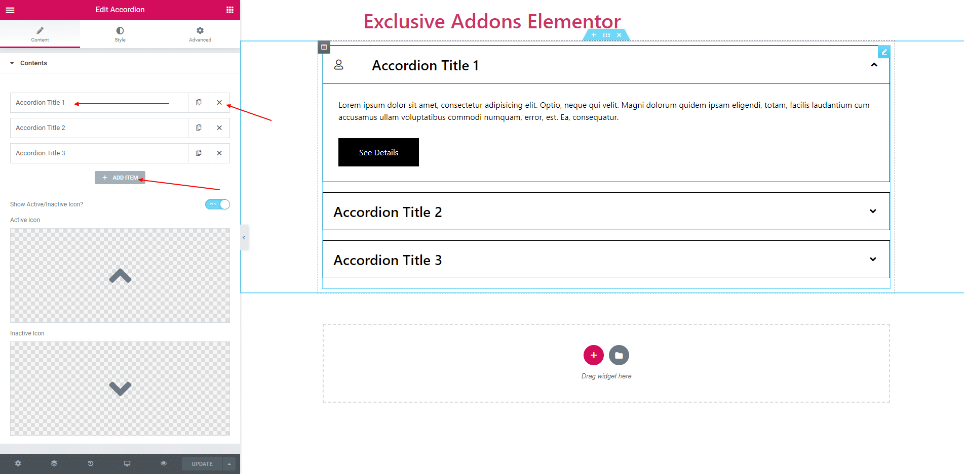
2.1. You can Add Item by clicking add item button. And delete item by clicking the cross button.
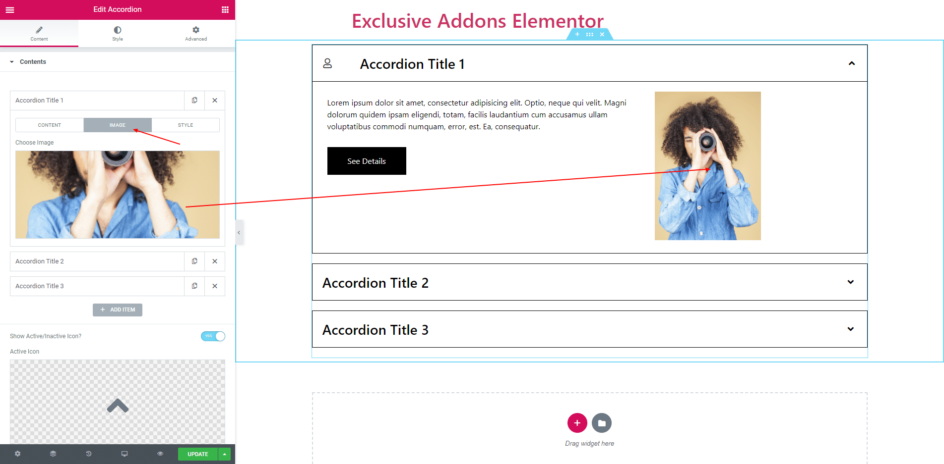
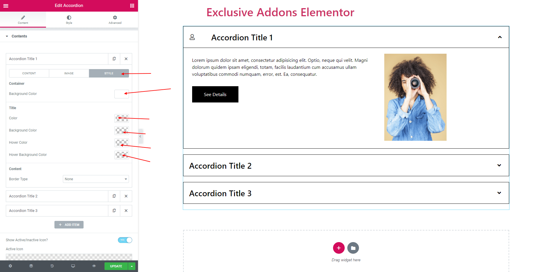
2.2. Each accordion item has three options ‘Content’, ‘Image’ and ‘Style’.
In Content Option you can set this item is defultly active or not, Enable title icon, set a Icon, Accordion Title, and content. You can also enable button.
You can choose an image for content.
In Style option you can set full container Background Color. Set Title Color, Background Color, Hover Color and Hover Background Color. You can also set Content Border.
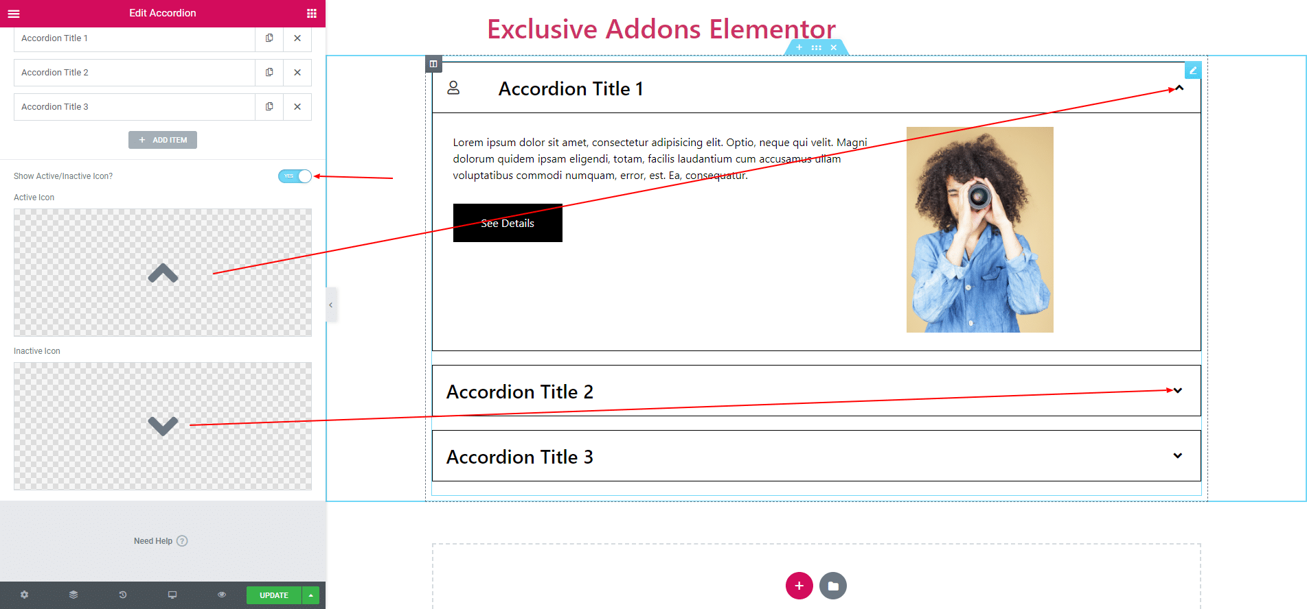
You can also Enable or Disable inactive/active icon. Also set that icon.
All other items have same options.
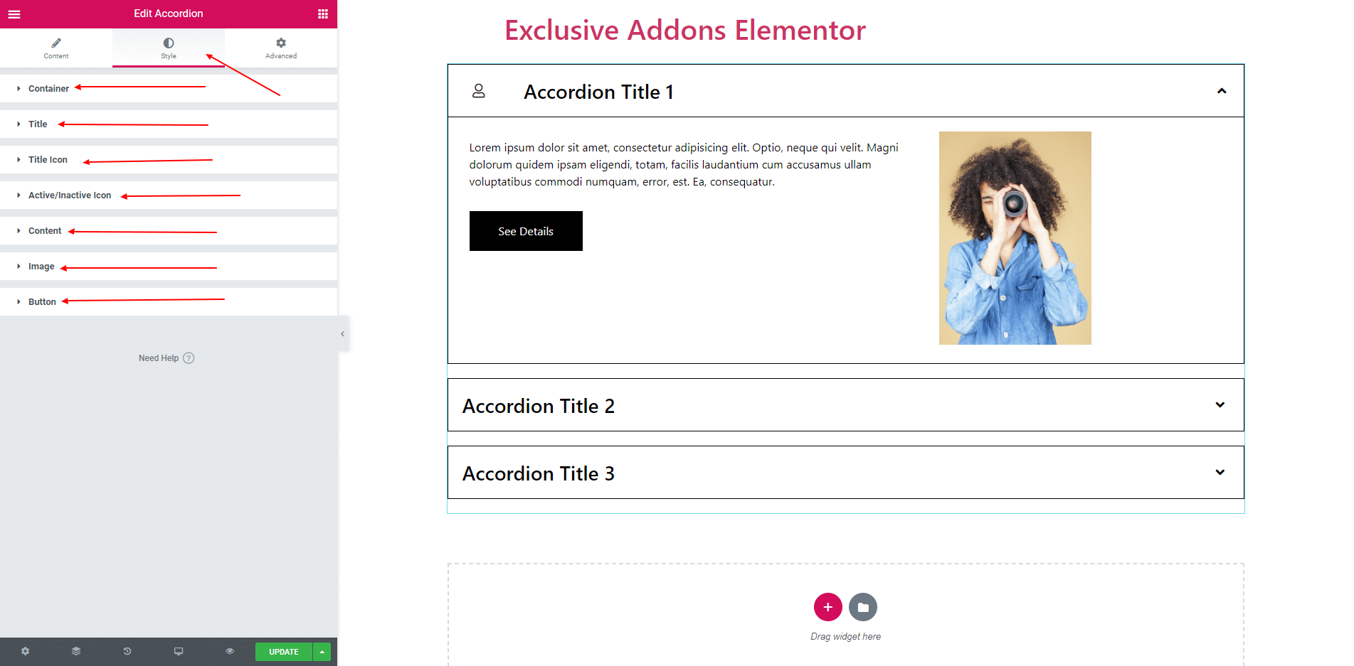
STEP 3:
In Style section, you will find options to edit ‘Container’, ‘Title’, ‘Title Icon’, ‘Inactive/Active Icon’, ‘Content’, ‘Image’, ‘Button’.
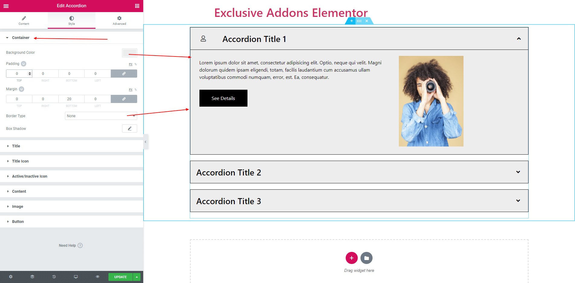
3.1. Container section consists of ‘Background Color’, ‘Padding’, ‘Margin’, ‘Border’ and ‘Box Shadow’.
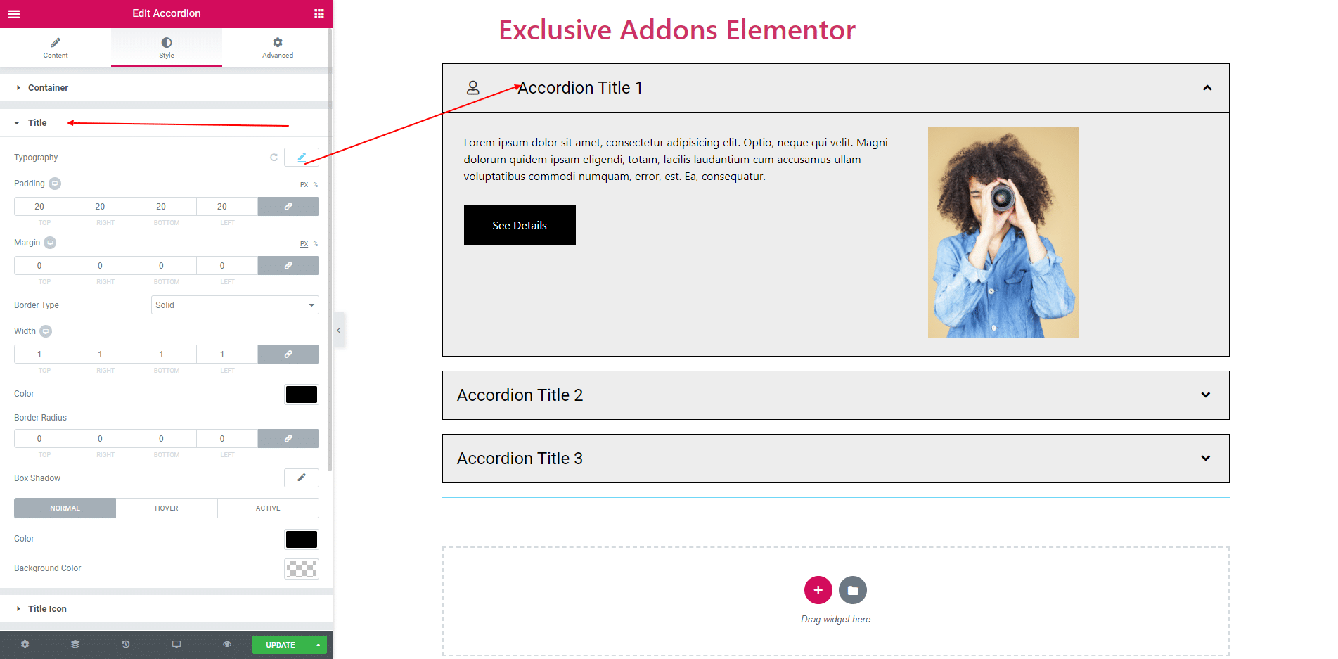
3.2. In Title section you can set ‘Typography’, ‘Padding’, ‘margin’ and some more options. You can also set Text Color and background for Normal, Hover and Active status.
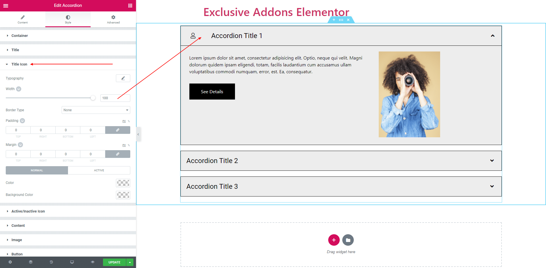
3.3. Title Icon Consist of ‘Width’, ‘Margin’, ‘Padding’, ‘Border’ and some more options. You can also set Color and Background Color for both Normal and Active status.
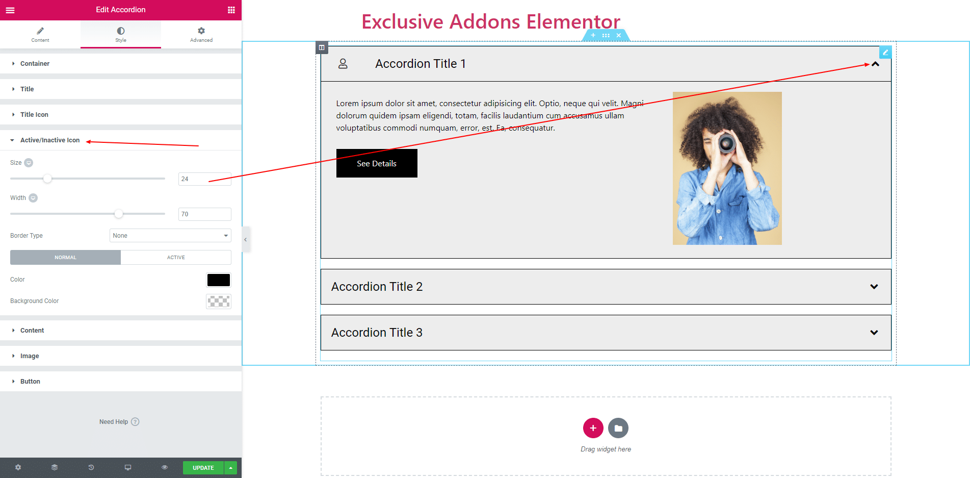
3.4. Active/Inactive Icon consist of Icon Size, Width, Border and some more options.
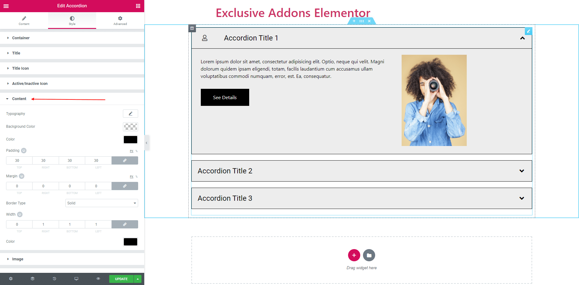
3.5. In Content section, you can set Typography, Background Color, Text Color, Border, Border Radius and some more options.
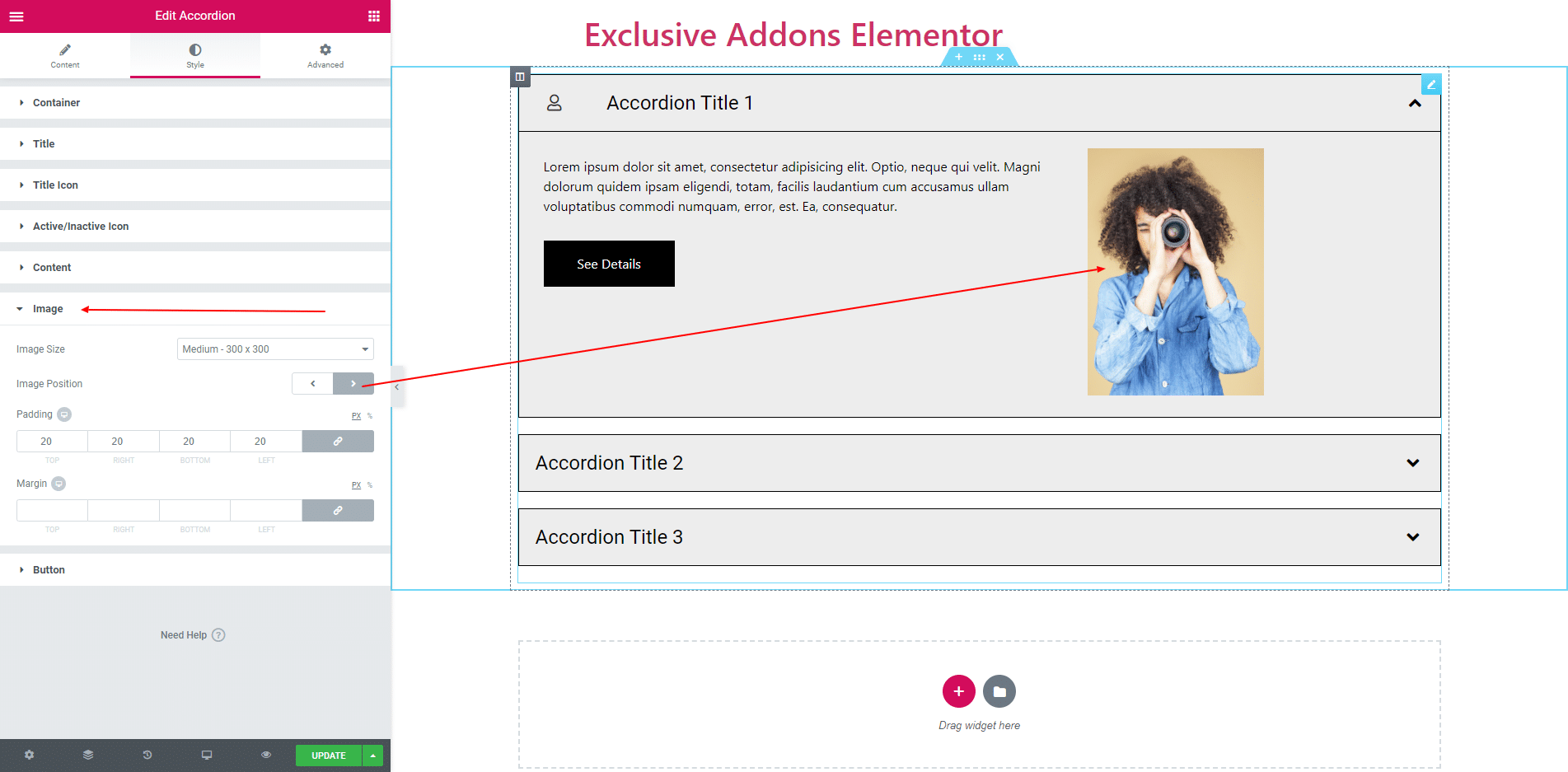
3.6. In Image section, you can set Image Position, Image Size, Padding and Margin.
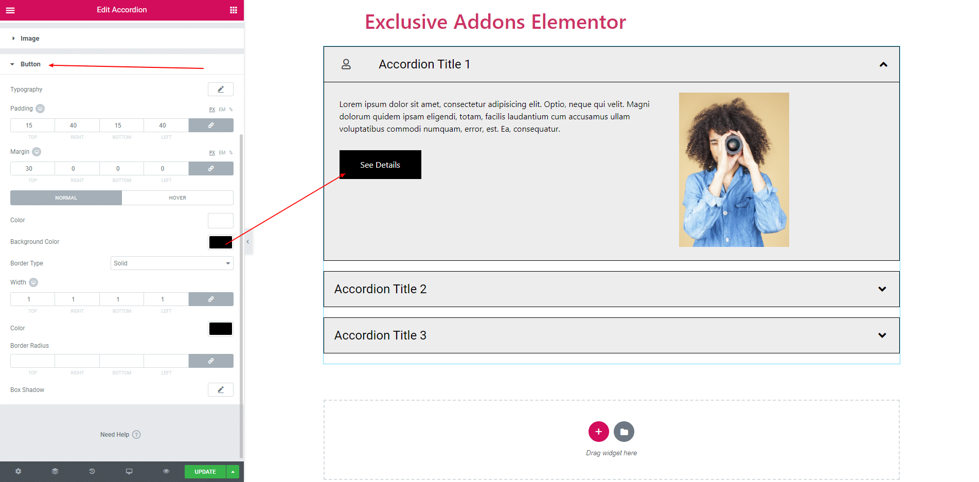
3.7. Button section consists of Typography, Padding, Margin, Text Color, Background Color for both normal and hover states.
STEP 4:
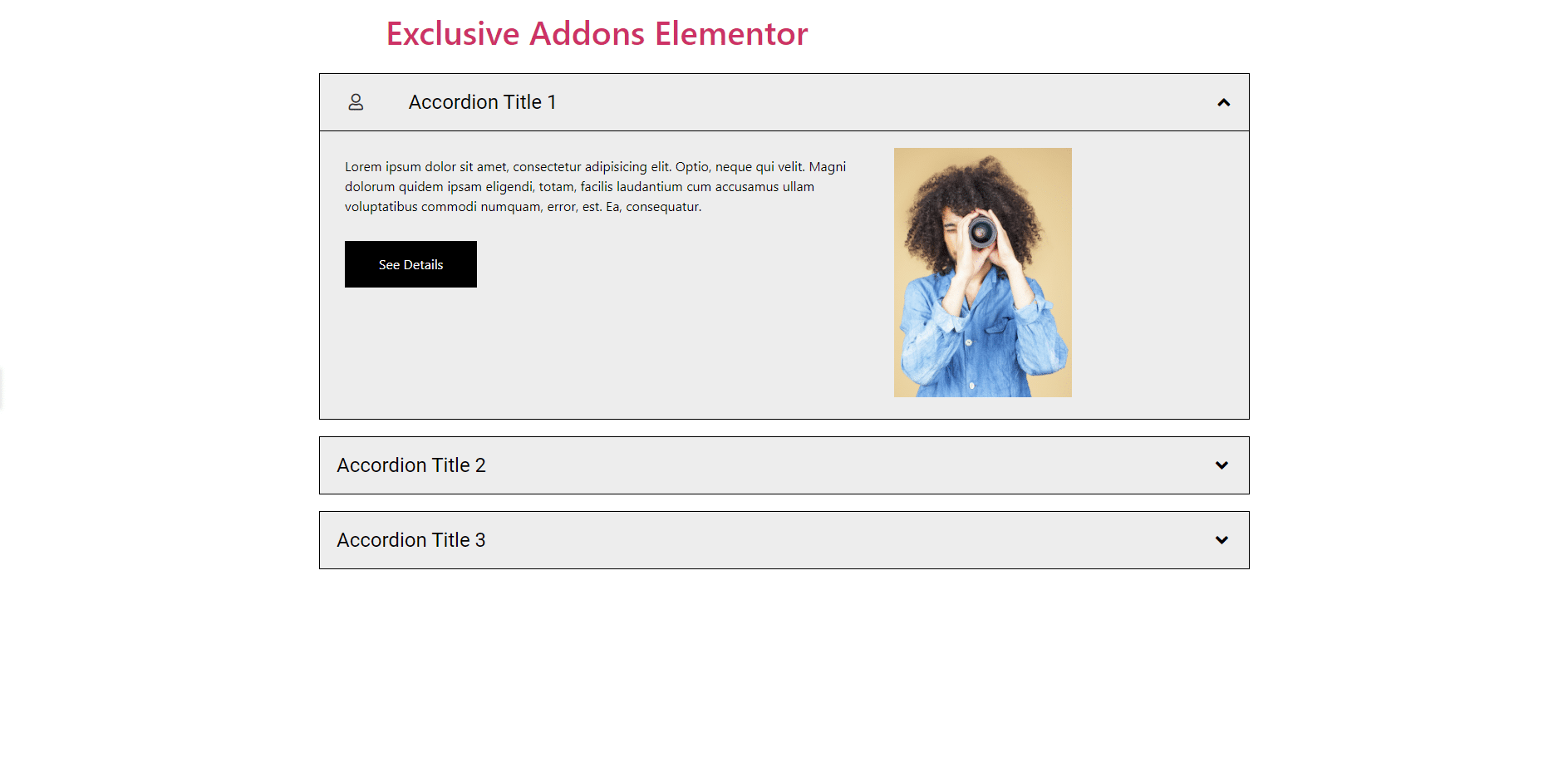
Finally, after clicking the update button you will see the beautiful Accordion on your webpage.