How to configure and style Elementor Team Carousel Widget
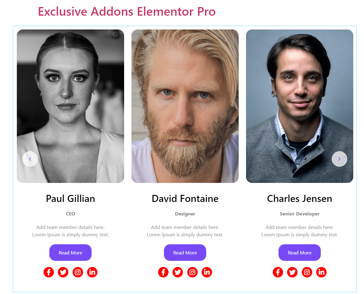
Present your team with a beautiful sliding carousel. Design the section with team member name, photo, designation, and other details using the Team Carousel Widget of Exclusive Addons Elementor.
STEP 1:
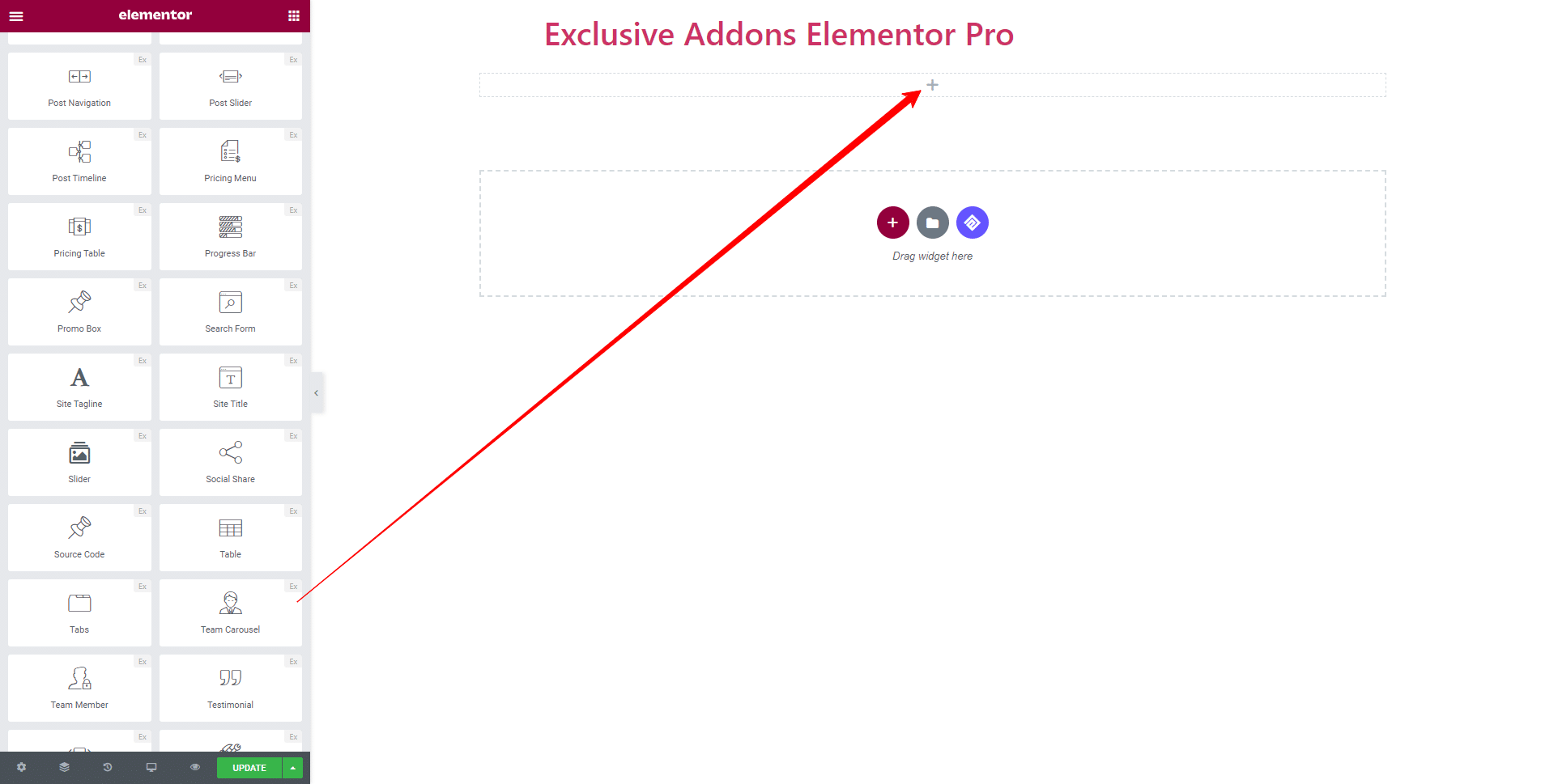
Select the ‘Team Carousel‘ widget from Elementor panel. Then drag and drop it in the selected area.
STEP 2:
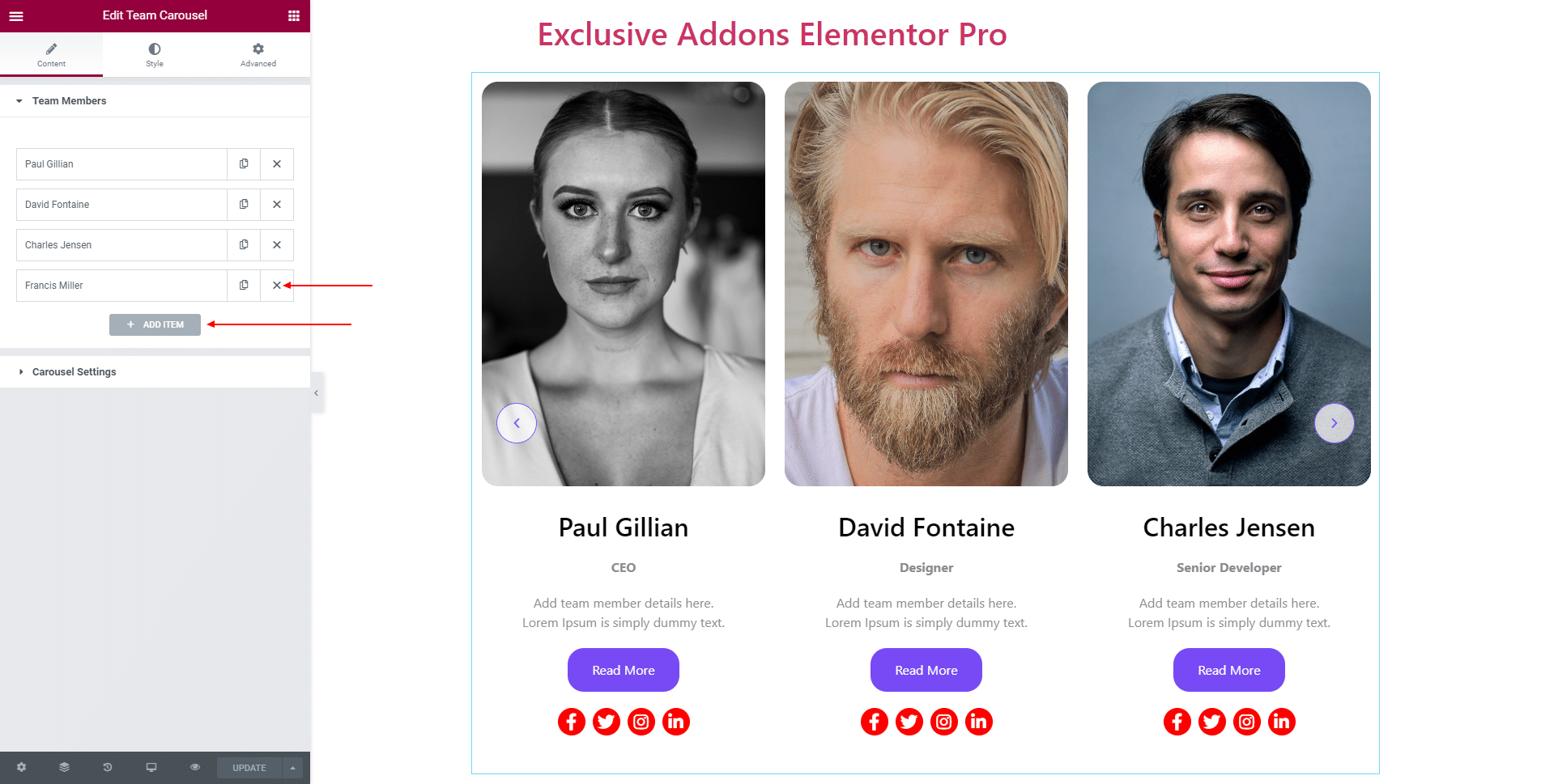
Content tab allows you to configure Team Member section and Carousel Settings.
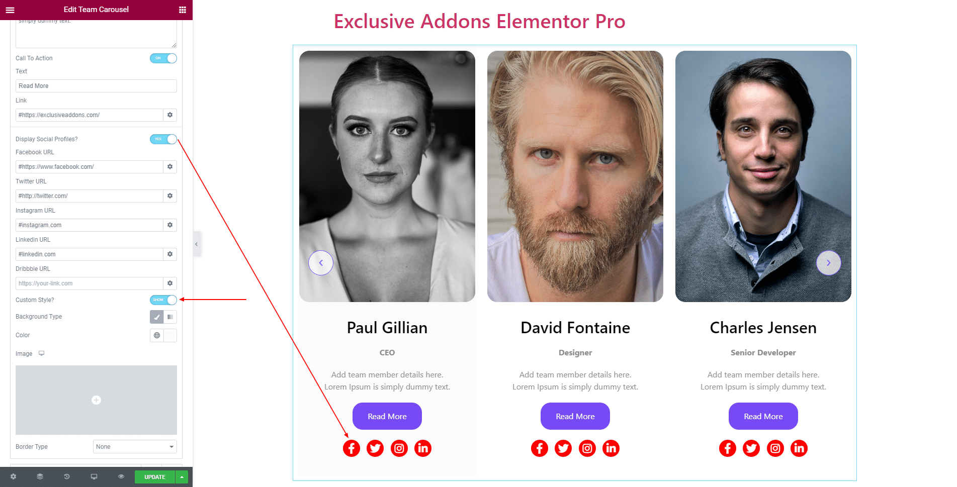
2.1 In Team Member section, hit the ‘Add ITEM‘ button and add as many team members’ info as you want. Also can delete one simply by clicking to ‘Cross‘ Button.
Edit each member’s info individually. You can add their Image and adjust Image Size and set their Name, Designation, and Description. Also can enable Call To Action button and set the button Text and Link.
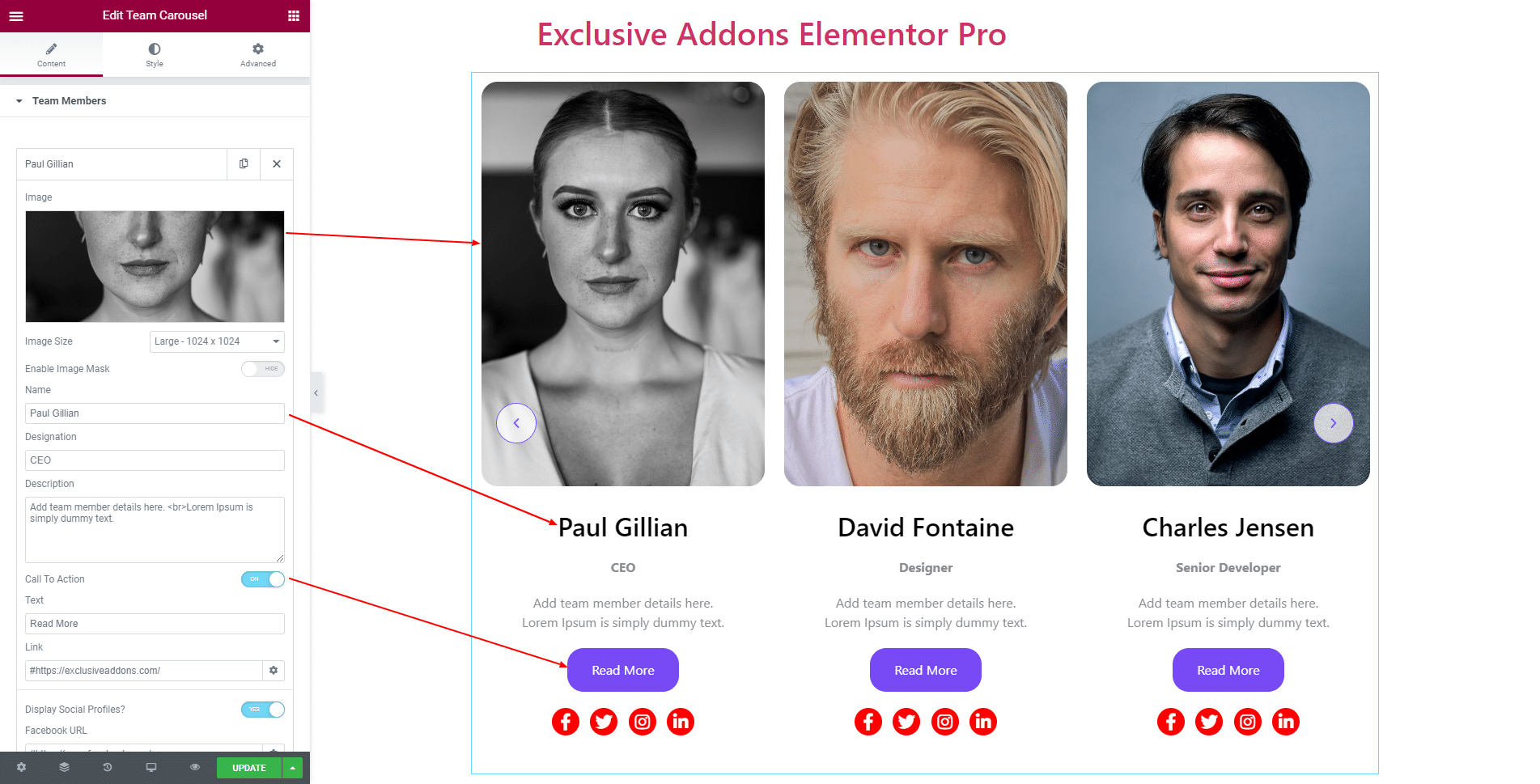
You have the option to Display Social Profiles and set individual URL for each social icon. Also can enable Custom Style.
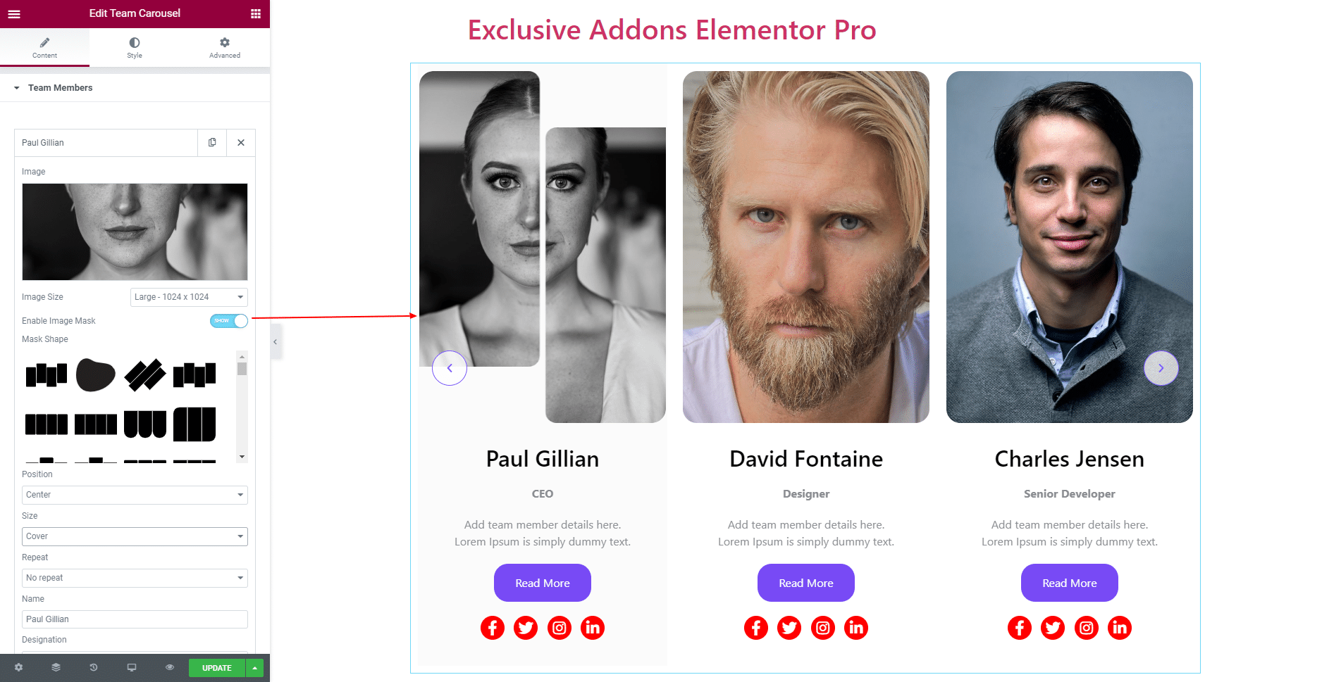
Furthermore, you can Enable Image Mask and get to choose Position, Size, and Repeat option.
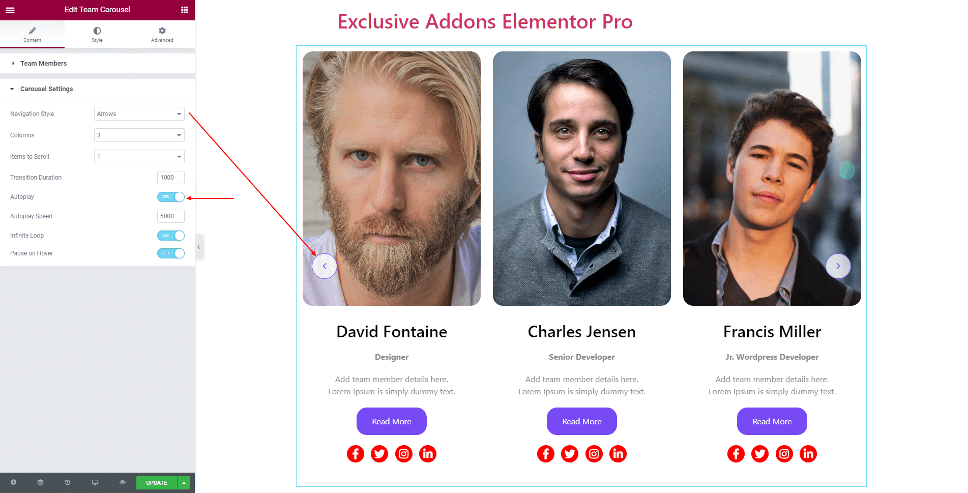
2.2 In Carousel Settings section, select Navigation Style, Columns number, Items to Scroll, and the value of Transition Duration.
Besides, you can enable Autoplay, Infinite Loop, Pause on Hover options. If enabled, set Autoplay Speed.
STEP 3:
Style tab allows you to customize Container, Image, Content, Name, Designation, Description, Call to Action, Social Icons, Arrows, and Animation Mask.
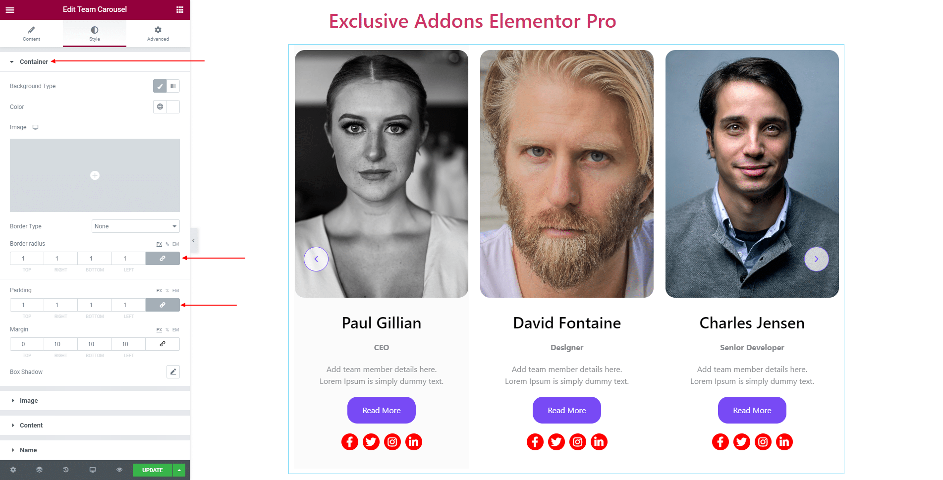
3.1 In Container section, select Background Type, Border Type, Border Radius, Padding, Margin, and Box Shadow.
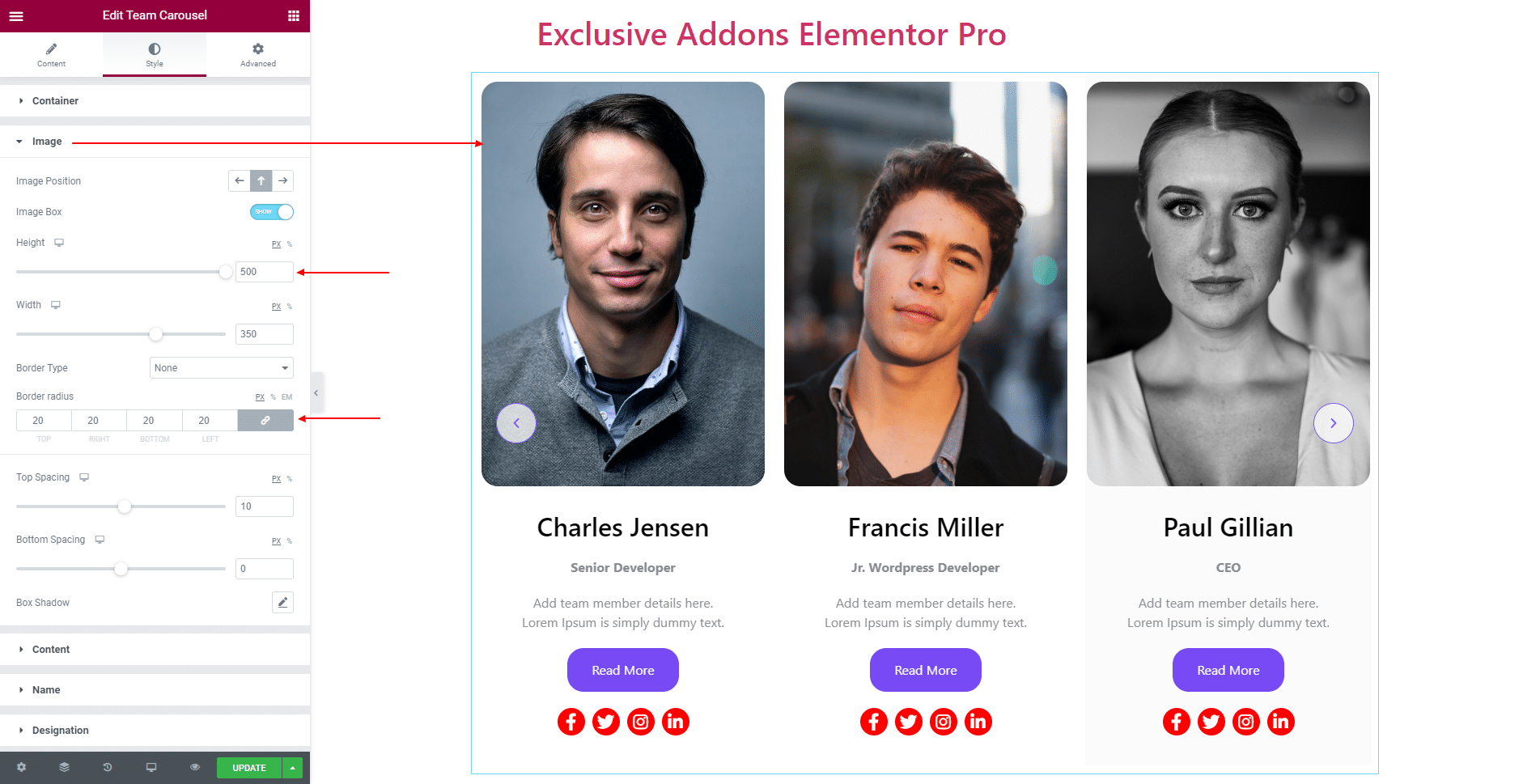
3.2 In Image section, set Image Position, and Border Radius. You can enable Image Box and adjust the Height, Width, Top Spacing, Bottom Spacing, Border Type, and Box Shadow.
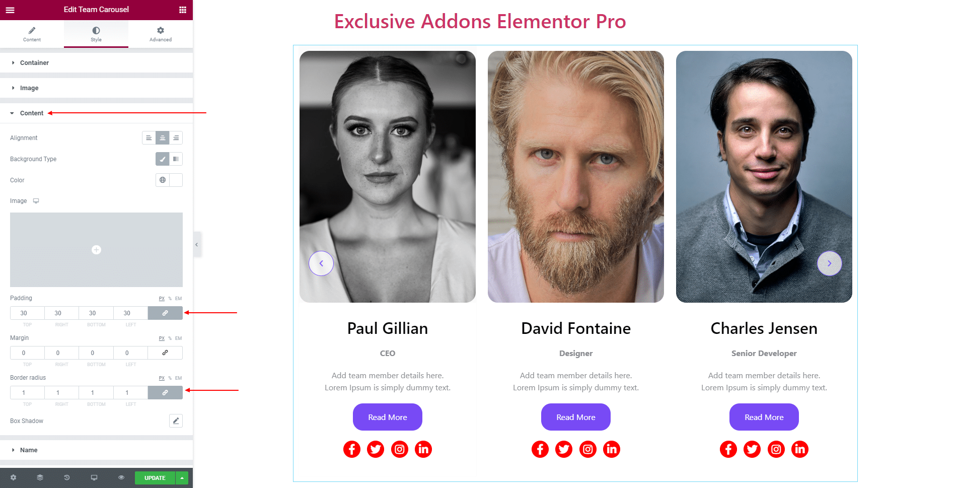
3.3 In Content section, set content Alignment, Background Type, Padding, Margin, Border Radius, and Box Shadow.
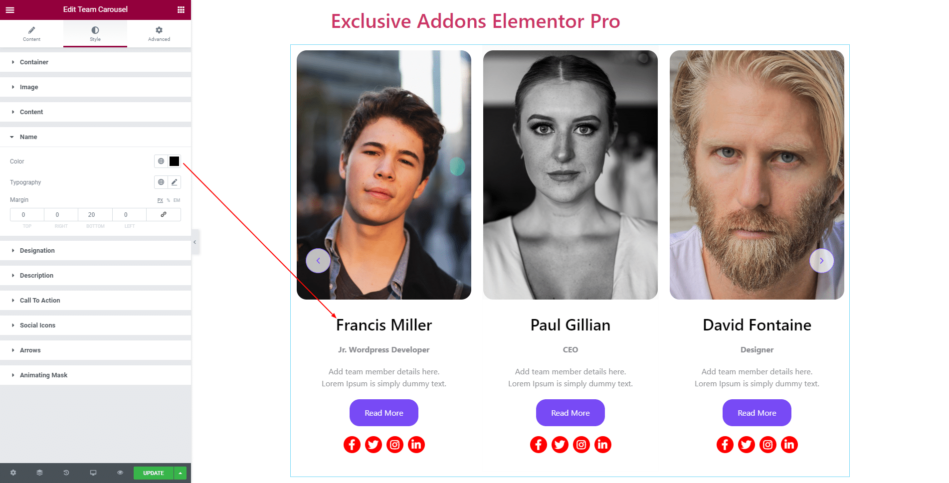
3.4 In Name section, select its Color, Typography, and Margin.
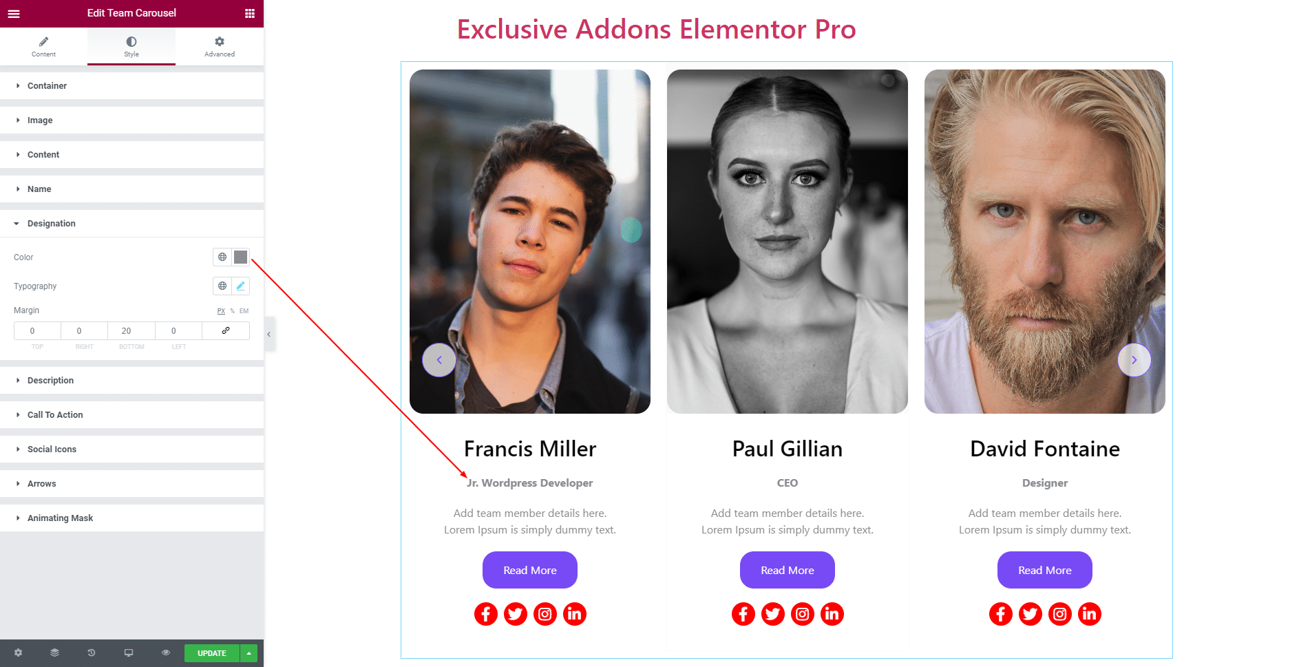
3.5 In Designation section, select its Color, Typography, and Margin.
3.6 In Description section, select its Color, Typography, and Margin.

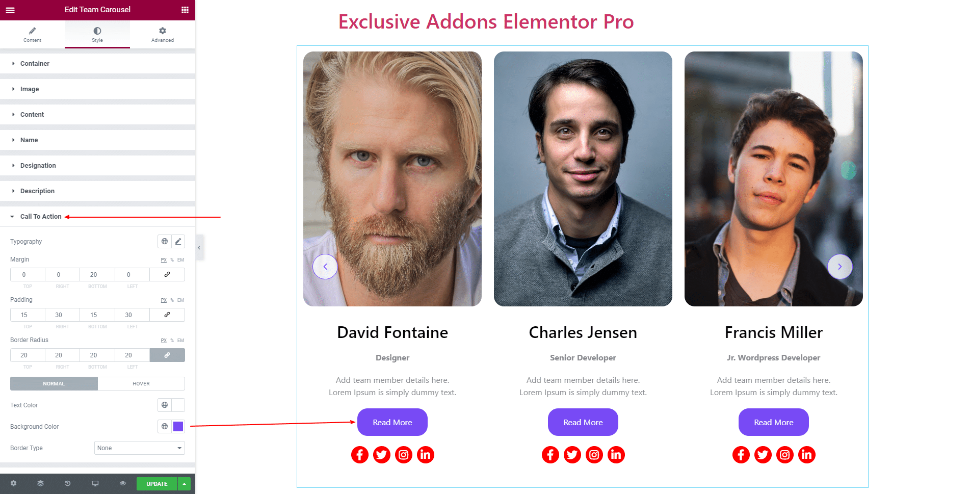
3.7 For Call To Action, you can change its Typography, Margin, Padding, and Border Radius. Use individual Text Color, Background Color, and Border Type for both ‘Normal’ and ‘Hover’ state.
3.8 For Social Icons, adjust Icon Size, Spacing Between Item, Border Radius, and Padding. Use individual Background Color, Icon Color, Border Type, and Box Shadow for both ‘Normal’ and ‘Hover’ state.

3.9 For Arrows, you can change Box Size, Icon Size, Border Radius, and set Previous Arrow Position and Next Arrow Position. For ‘Normal’ and ‘Hover’ state, choose Background Color, Icon Color, Border Type, and Box Shadow individually.

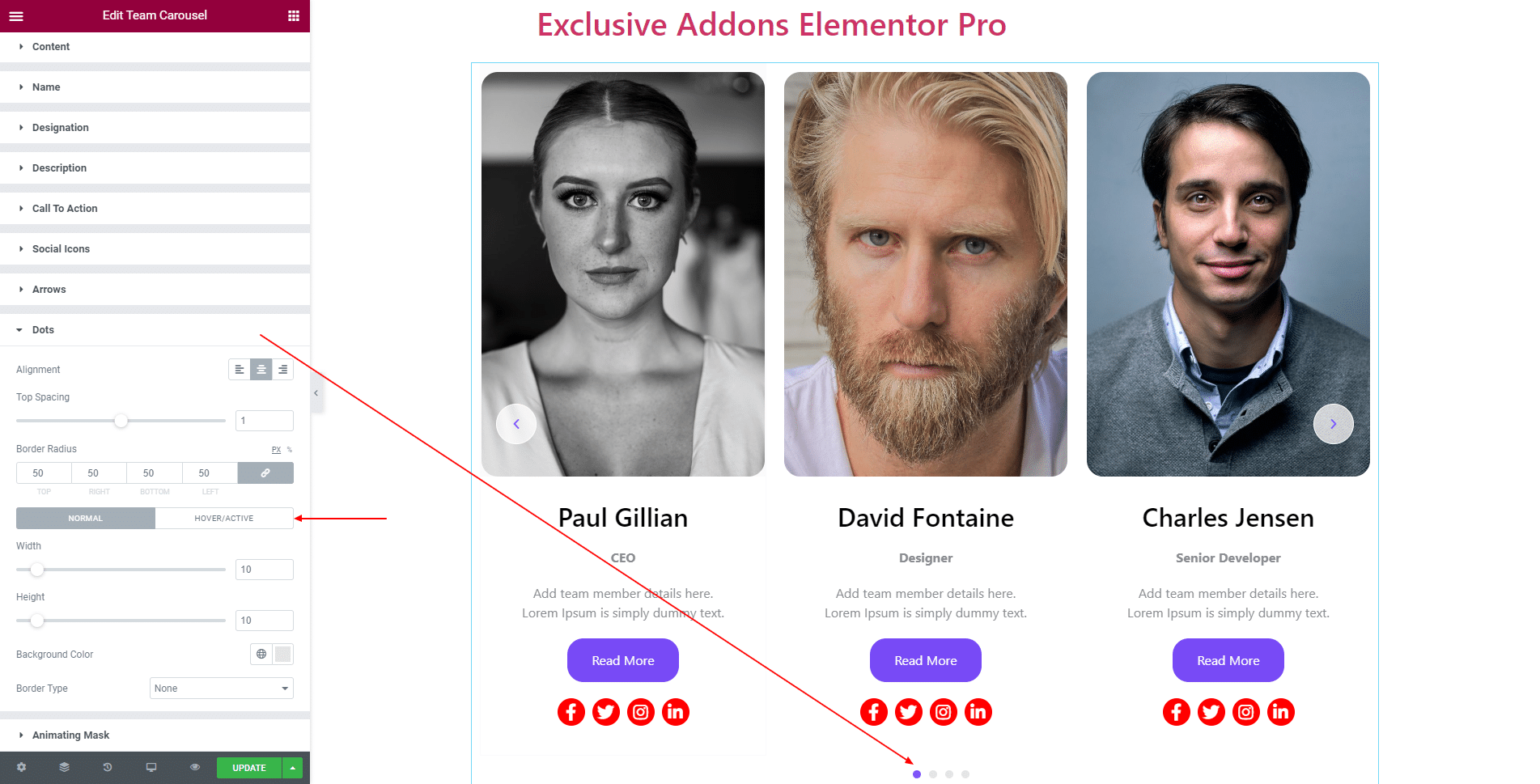
3.10 For Dots, you can set Alignment, Top Spacing, Border Radius, and individual Height, Width, Background Color, and Border Type for ‘Normal’ and ‘Hover’ state.
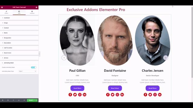
3.11 You can even add an animated mask to team member’s image.
In the Animating Mask section, ‘Enable’ the feature and Animating Mask Style from the three available styles.
STEP 4:
Finally, hit Update button, and include a stylish Team Carousel Widget on your Wordpress site.