Following shortcuts is a bandwagon now! People want ready-made elements for their websites so that they can adorn them conveniently.
In the past, we had a notion that without having coding knowledge, we can not build eye-catching pages or websites. But the exclusive page builders for WordPress like Elementor have made things possible.
You can make a fully functional WordPress website within moments with just ‘drag and drop’ by using the Elementor widgets.
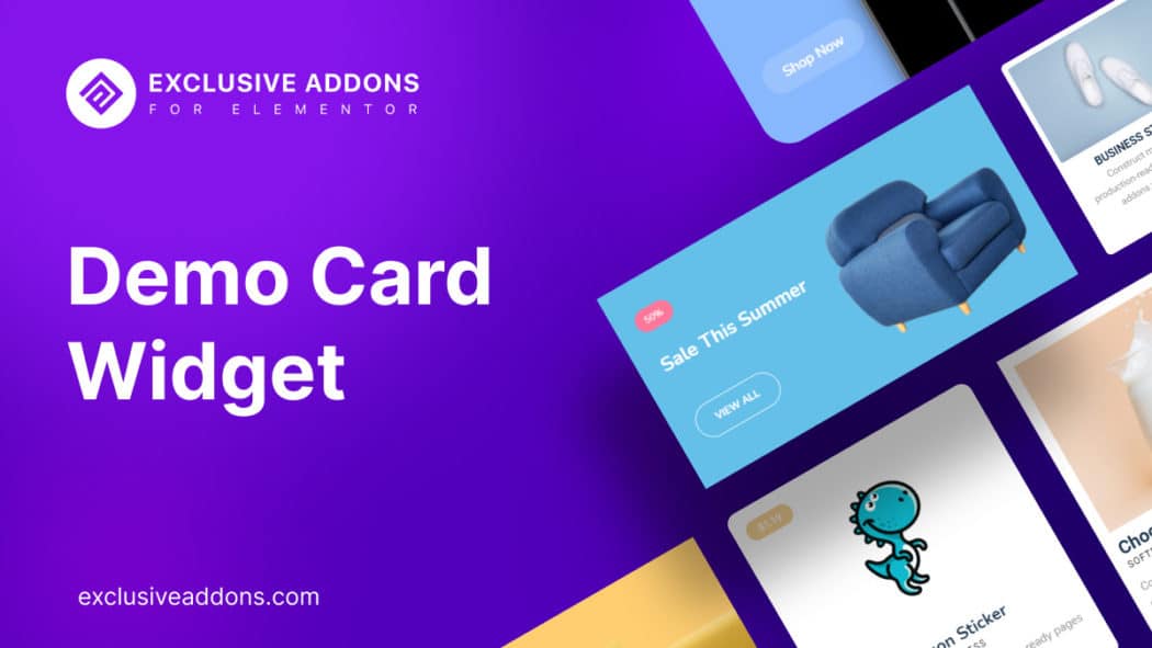
And the demo card widget is the one to make your website look at its best. Card widget allows you to display a summary of the link you share on your site. By using a card widget you can create your website’s page classily and attractively.
About Demo Card Widget
The Demo card widget displays thumbnails, titles, and descriptions for one or more items in your scalar book.
Card widget helps in showcasing a group of data products for your audience to find what they need and click cards for easy access. This widget cooperates with visitors when you want to display a visual summary for a place with brief text.
This widget provides you with functionally and incredible power to demonstrate your products, articles, or creative posts using a beautiful combination of text, image, and link.
Where is the Demo Card Widget Useful?
The card widget is one of the ways to increase your website’s visitor attraction and build an eye-catchy section to take attention. If you want your website outlook to be effective for your users then a card widget is the way.
- Showcase your team members
- Practice author biography
- Create stunning testimonials
- Custom loop with postcard showcase
What Do We Have in Demo Card Widget?
You have ultimate opportunities to design a beautiful demo card with Exclusive Addons.
Design a demo card with an image, title, tagline, description, and CTA button. All the basic functionalities required to show a demo at any time.
Zoom Animation
You can add any image of your choice, set its size, and also can add a badge to it. You get to add an attractive Zoom Animation effect, i.e. when hovered, users will have a zoomed view of the image.
Choose a Layout
An amazing feature that you have is choosing the layout. There are two different layouts.
The Default Layout displays card contents below the image. While with the Text on Image Layout, all the contents are over the image. Giving it an aesthetic look.
Image Masking
Oh, did I forget to mention! Another incredible feature is image masking. We have included some of the functionalities of the Image Mask widget here. Choose between 64 creative shapes to mask the image and make it eye-catchy.
Title URL
With the title, you can set a Title URL to lead your users to a detail page or the product page.
Design CTA Button
You can do the same with a well-designed CTA button. Along with the text & URL, you will find an option to add a custom icon to it. Design the button the way you want.
Ultimate Customizable Options
For each section, you have individual styling options. You can literally customize each section of the demo card with this widget.
How to Style with Card Widget
We are presuming that you have already activated the elementor on WordPress. The next work is to drag the ‘card’ widget from the elements panel and drop it in the selected area. Methods to configure and style the demo card widget is such as below:
Content tab
In the content tab, you can configure the widget with the Content section and Layout section.
Content Section: In the content section, you will find two rows – content and layout. Here, in the content section, you will find – 1. Image. 2. Card title 3. Tag 4. Description 5. CTA button.
You can customize the image. You can set the title and add a description as you like, and there is also an option for tags. Lastly, the action button is like for ‘Call to action’. You can also change the icon.
Layout section: There are two types of layout – 1. Default, and 2. Text on Image.
Style Tab
In the style tab, you get to customize the widget design. There you have multiple sections like-
Container: Set background color, padding, and border and give the card an attractive look.
Image: Adjust image height, width, set CSS filters to it and if you want, enable Zoom animation effect.
Badge: You get to adjust X- offset and Y-offset individually. Set its typography, background color, and other attributes.
Content: The content section in the style tab lets you set content alignment, and other attributes.
Title, Tag & Description: These are individual sections. You can set color, typography, and margin for each section separately.
Button: Customize the button and make it look appealing to the users. Adjust icon space, set typography, padding, and border radius. To add a stylish hover effect, you can set individual text color, background color, border type, and border color to normal and hover state.
After doing all of these customizations, the last thing you need to do is click the update and see what you have got.
Why Use The Card Widget?
Let us tell you a real story first. One of our friends was having issues arranging the information in the content nicely.
So, he was losing his viewers. And most importantly, he did not even have excellence in HTML or CSS. We are quite sure many of you are having this same kind of dilemma!
The card layout is card-like boxes where you can display a large amount of data. There will be synchronization in both sleek and stylish ways.
You will find a really simple, flexible, and beautiful way to add new information to your site.
Card Widgets are for single items. If you want to display multiple item previews on one page, give it a try with our Demo Previewer widget.
Have Your Webpage Got Cards?
When anyone gives us cards in real life, you get pleased. The same goes for the website. When the viewers see the demo cards, they get really amazed too.
Give dramatic effects to your site and enhance your traffic rate.
Exclusive Addons has a bunch more amazing widgets like Card Widget. Check out our list of widgets and what best matches your requirement.