Designing a great website with amazing functionalities isn’t enough these days. You need to make the website responsive. You need to make the design responsive. However, the endless variation of device screen sizes makes it more challenging to create responsive web designs.
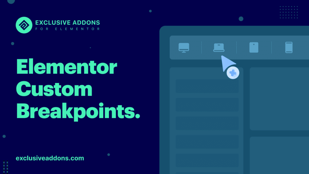
This is where Elementor comes to the rescue like always. You can now keep your design more pixel-perfect with additional custom Elementor breakpoints. Whether it’s an iPhone 13 pro max, an 85 inch full HD TV, or a custom screen for a presentation, your website will fit perfectly on any device. Your website isn’t limited to typical devices anymore.
So let’s dive in to learn about breakpoints, how to add additional custom breakpoints on Elementor, and how it’s gonna help you design user-centric websites.
What are web design breakpoints?
In general, a breakpoint is where a website’s design adapts to a certain screen size. For example, if you set the mobile breakpoint to 480 pixels, the web design will adapt to the mobile screens at 480 px to provide the optimum user experience.
As for Elementor, there are three default breakpoints. When you design a web page with Elementor, the design is automatically adapted to devices like desktops, tablets, and mobiles. You can get a live preview of your design for these devices, and make it precise.
Additional custom breakpoints from Elementor
Look at the hot trendy devices. The iPhone 13 has four variants alone. iPhone 13, 13 mini, 13 pro, and 13 pro max. Each of them has different screen sizes. As you design a website, you must make it responsive for all those variants. And the iPhone is not the only example. People browse websites on their smart TVs more often than ever. So, websites should be responsive to widescreens too.
To match this vast variety of screen sizes, Elementor has introduced four additional custom breakpoints in the Elementor 3.4 version. Designing websites for a wide range of devices won’t be a headache anymore.
- Four additional custom breakpoints
- Choose the active breakpoints
- Set value of each breakpoint
- Scale the preview up or down
- Two mobile and two tablet breakpoints
- Breakpoints for laptop and widescreens
Also, they have put the control to your hand. From choosing the active breakpoints to setting their value you can control the breakpoint settings for your design.
You have a total of 7 breakpoints including 6 custom breakpoints. You can customize your designs for extra mobile screens, tablets, laptops, and widescreen devices. As for customizing them, you have the control to choose active breakpoints, set the value of each breakpoint. Elementor gives you the ability to scale up or down the previewer.
Now you don’t have to worry if your client asks to make the design compatible with widescreens. Or you have to present your web designs on a custom size screen for approval. Making your website even more responsive is easier than ever before.
Read our article on Elementor’s year review and learn more about all the 2021 major updates.
Elementor Breakpoints: Which are common breakpoints for responsive design?
Since a lot of devices with different screen sizes are available in the market, you might get confused about how many and which breakpoints to add to your design. Nevertheless, there are some common breakpoints you can include in responsive designs. These aren’t exact numbers, but approximate values set based on the standard screen sizes of the most used devices.
Here is a list of common breakpoints for responsive designs:
- Small Devices (Mobile): Up to 640px
- Medium Devices (Tablets and Small Laptops): 641 - 1023px
- Large Devices (Desktops, Wide Screen, and more): 1024px and above
To be a bit more specific, for mobile devices with 4″ to 6.9″ screens breakpoint is 320px to 414px (in portrait), 568px to 812px (in landscape). Tablet portrait breakpoints for devices 7″ to 10″ are 768px to 834px and up to 1023px for tablet landscape.
Elementor Breakpoints: How do I add custom breakpoints in Elementor?
This is an obvious question. Adding custom breakpoints is an easy process. However, you need to change some settings to get the additional custom breakpoint feature on your WordPress site. Follow these steps:
Step-1: Update the Elementor version
Elementor 3.4 introduces the additional custom breakpoint feature. So go to WordPress dashboard > Plugins and check the Elementor version installed. If it shows 3.4 or higher, then everything is alright. Otherwise, update the version.
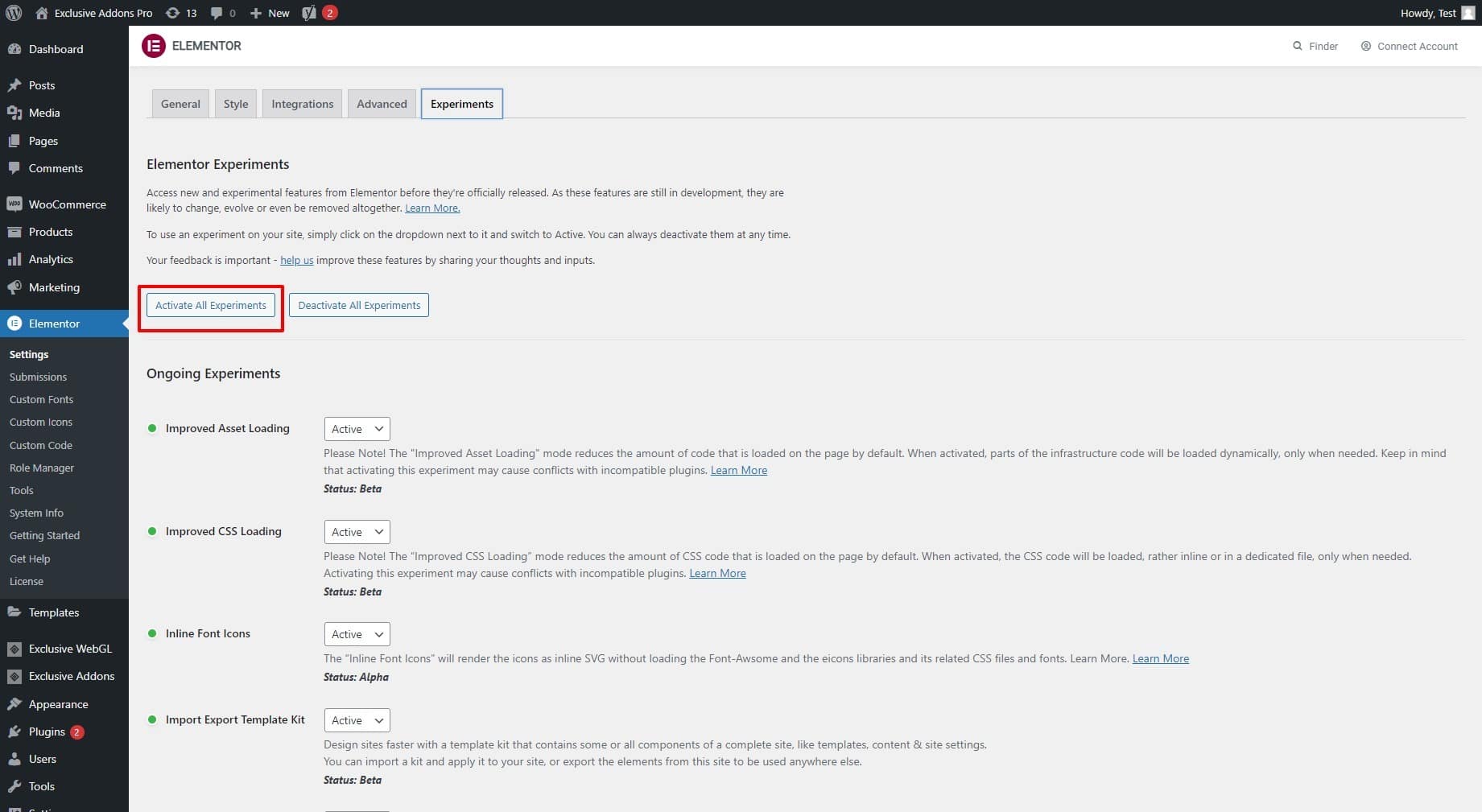
Step-2: Activate Experiments for Elementor
Then go to Elementor > Settings and switch to Experiments. Now set the experiments to active.
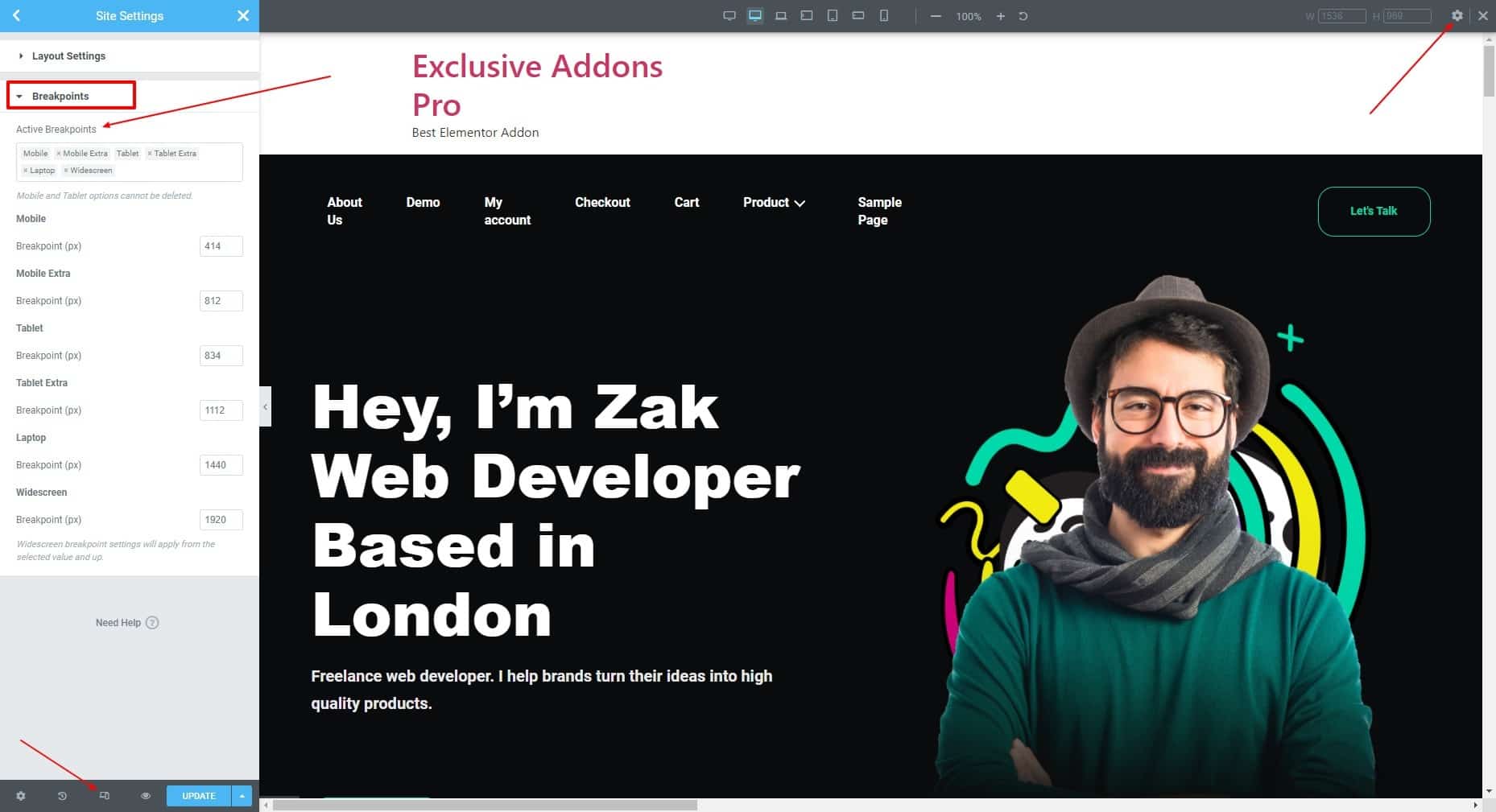
Step-3: Open responsive mode editor
After that, open the Elementor editor. At the bottom of the editor panel, click “Responsive Mode”. Then click on the Settings icon that appears on the top. Then in the Site Settings, under the Breakpoints section, you can add additional custom breakpoints for Elementor.
Rolling up
Elementor always gives the best and easiest way to design the most sophisticated websites with a top user experience. And they stepped up with a responsive setting as well. The additional custom Elementor breakpoints give you the ability to build real responsive designs for more devices and elevate the user experience even further.
Did you find this article helpful? Let us know in the comment section. If you find value in this article, visit our blog page to know about WordPress, Elementor, and industry-related topics.