
Effective web menu design is way more than just slapping a list of pages at the top of your site. It’s about creating a clear, intuitive roadmap that guides visitors exactly where they need to go, shaping their experience from the moment they land. A great menu builds trust and keeps people engaged without them even noticing.
Why Your Menu Is More Than Just Navigation
Think of your website’s menu as its command center, not just a directory. It’s the first tool visitors use to get their bearings, and it sets the tone for their entire journey. A well-thought-out menu is like an invisible guide, effortlessly leading users to the information they’re looking for.
This navigational structure is a huge asset for keeping users happy and helping your business grow. When people arrive, they immediately scan for clues on how to find what they want. A logical menu gives them that clarity, which cuts down on frustration and lowers your bounce rate. A confusing one, on the other hand, throws up an immediate roadblock.
The Business Impact of Intuitive Design
The link between good design and solid business results is undeniable. Research shows that a staggering 94% of a user's first impression is tied directly to your site's design. If that experience is bad, 38% of visitors will click away almost instantly. Get it right, though, and a powerful user experience can boost conversion rates by up to 400%. That stat alone shows just how critical your menu design is to your bottom line.
A website menu doesn't just direct traffic; it reveals how your brand thinks. A simple, logical menu suggests a clear, customer-focused brand. A cluttered one just implies chaos.
From Coding Headache to Creative Opportunity
It wasn't that long ago that building a decent menu required some serious coding chops, which was a real hurdle for many designers. Thankfully, those days are over. Modern tools have turned menu creation into a design opportunity anyone can tackle.
With tools like Exclusive Addons for Elementor, you can build everything from a sleek horizontal navigation bar to a full-blown mega menu without writing a single line of code. This shift lets you focus completely on the user experience—how to organize content, what to name your links, and how to create a visual flow that just makes sense.
Here’s a peek at the Elementor interface, a completely visual, drag-and-drop environment for building your site.
This shot shows just how clean and intuitive the workspace is. You can combine widgets and elements to build a seamless experience, including your navigation menus.
If you want to think outside the box, check out some inspiring menu board design ideas. Even though they're for physical spaces, the principles of guiding choices and engaging users are totally transferable.
Ultimately, your menu is the first promise you make to your visitors: "We've made this easy for you."
Core Principles of Effective Menu Design
Before you start dragging and dropping widgets, let's talk about what actually makes a menu work. A great menu feels so intuitive that it's almost invisible. It guides users without them ever feeling lost or confused, and that's not an accident. It all boils down to thinking like your visitors and making their journey as seamless as possible.
This isn't just fluffy design theory; it's practical strategy. The two big ideas you need to get right are information architecture and visual hierarchy. Think of information architecture as the logical blueprint of your site—how you organize and label everything. Visual hierarchy is how you use design elements like size, color, and spacing to pull the user's eye toward what really matters.
Structuring Your Content Logically
Information architecture sounds complicated, but it's really just a fancy term for organizing your website’s content in a way that makes sense. A visitor should be able to guess where to find something before they even click. For instance, on an e-commerce site, you’d expect to find "Men's," "Women's," and "Kids" right at the top, not tucked away under a vague label like "Products."
To get this kind of clarity, you'll want to:
- Use clear and concise labels: Ditch the corporate jargon. Vague terms like "Solutions" or "Resources" mean nothing to a new visitor. Use straightforward language they already understand, like "Blog," "Pricing," or "Contact Us."
- Group related items together: Keep similar pages under a single, logical parent menu item. This cuts down on clutter and helps people understand the layout of your site at a glance.
- Limit your main menu items: Try to stick to around 5-7 top-level items. Giving users too many choices often leads to decision paralysis, where they feel so overwhelmed they just don't click anything at all.
Nailing this initial planning phase is a huge deal. Getting your content structure right is a cornerstone of our broader guide on website navigation best practices, which dives even deeper into user flow and smart organization.
Guiding the User with Visual Hierarchy
Once your structure is solid, visual hierarchy is what tells people what to look at first. It’s the subtle art of using visual cues to signal importance. This isn't just a web design thing; it’s a core concept in all design, from magazines to restaurant menus.
Speaking of which, the restaurant industry is a fantastic real-world example. Research has shown that diners spend an average of just 109 seconds looking at a menu, and their eyes often scan in a predictable 'Z' pattern. Smart menu designers use this knowledge to their advantage, placing high-profit items in the top-right corner—a natural visual "hot spot." By using a slightly larger font or a subtle border, they guide a customer's choice without being pushy.
You can apply that exact same psychology to your web menu design. Make your most important link—maybe it’s "Shop" or "Get a Quote"—stand out. Give it a slightly different color or, better yet, style it as a button at the end of the list to draw the eye.
An effective menu doesn't make users think; it makes them feel understood. Every element, from the labels you choose to the spacing between them, should contribute to a feeling of effortless control for the visitor.
Choosing the Right Menu Type
Not all websites are built the same, so why would all menus be? The kind of menu you choose really depends on how much content you have and what you want your visitors to do. Choosing the right menu is a critical piece of the puzzle, and it fits into the larger picture of general website design best practices.
To help you decide, it's useful to see how the common menu types stack up against each other. Each one has its place, and picking the right one from the start will save you a lot of headaches down the road.
Choosing the Right Menu Type for Your Website
Here’s a quick breakdown of the most common menu types to help you figure out what's best for your project.
| Menu Type | Best For | Pros | Cons |
|---|---|---|---|
| Horizontal Bar | Websites with 5-7 main sections (e.g., portfolios, small business sites). | Familiar, easy to scan, saves vertical space. | Limited space for top-level items. |
| Vertical Sidebar | Dashboards, web apps, or sites with many primary categories. | Can accommodate more items, highly scannable. | Takes up horizontal screen space. |
| Hamburger Menu | Mobile views and minimalist desktop designs. | Saves significant screen space, clean aesthetic. | Less discoverable; requires an extra click. |
| Mega Menu | Large e-commerce stores, news sites, or extensive corporate sites. | Displays many options at once, can include images and icons. | Can be overwhelming if poorly organized. |
As you can see, the context is everything. Choosing the right format, like a mega menu for a huge online store, allows you to present a ton of information without completely overwhelming your visitors. This kind of thoughtful approach is what ensures your navigation actually empowers users instead of just confusing them.
Alright, let's move from theory to actually building something. This is where you get to see just how easy it is to take those design principles and turn them into a real, high-performing navigation menu. We'll walk through creating a professional and functional menu using the powerhouse Mega Menu widget from Exclusive Addons for Elementor.
To make this practical, we’ll put ourselves in the shoes of an online retail store owner. In e-commerce, clear navigation isn't just a nice-to-have; it's absolutely essential for driving sales. The goal here isn't just to make a list of links, but to create a helpful guide that leads shoppers right where they want to go.
Getting Started with the Mega Menu Widget
First things first, let's grab the right tool for the job. Assuming you've got Exclusive Addons installed and activated on your WordPress site, just open any page or template with the Elementor editor.
In the left-hand widget panel, type "Mega Menu" into the search bar. You'll see the widget pop right up.
From there, simply drag and drop the Mega Menu widget into your desired section—this is almost always going to be your site's header. The moment you do, a placeholder menu appears, ready for you to start molding. This is the foundation we're about to build on.
Defining Your Menu Structure
With the widget in place, the real work begins: deciding what goes in your menu. A great web menu always starts with a logical hierarchy. For our retail store example, we need to create top-level items that shoppers will instantly recognize and understand.
I've found these top-level categories work wonders for most e-commerce sites:
- Shop by Category: This is the main doorway for anyone ready to browse products.
- New Arrivals: A perfect hook to highlight the latest products and keep repeat visitors engaged.
- Best Sellers: This leverages social proof, gently guiding users toward your most popular items.
- Sale: An absolute must-have link for attracting those bargain-hunting customers.
- Our Story: This helps build brand trust and creates a more personal connection with your audience.
This process flow infographic does a great job of visualizing the core steps of menu design, from organizing your thoughts to simplifying the final product.
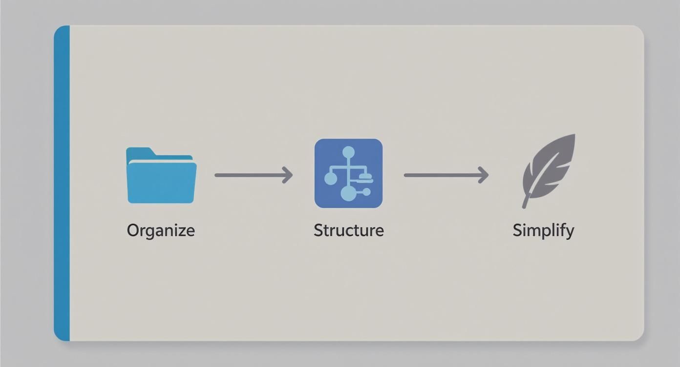
This visual is a good reminder that a successful menu isn’t just thrown together; it's carefully architected with the user's journey in mind. Notice how each of those labels is clear, concise, and action-oriented. No room for confusion.
Creating Multi-Column Dropdowns
Now for the fun part. This is where the "mega" in Mega Menu really proves its worth. A standard dropdown is just a single, often long, list that can be a pain to scan. A mega menu, on the other hand, lets you create clean, organized, multi-column layouts that can display a ton of information without feeling cluttered.
Let’s take our "Shop by Category" item. Instead of one long, scrolling list of every single product type, we can break it down into logical groups. For instance, you could create columns for "Men's Apparel," "Women's Apparel," and "Accessories."
A well-organized mega menu transforms navigation from a chore into a discovery tool. It allows users to see the breadth of your offerings at a glance, significantly reducing the number of clicks needed to find what they're looking for.
Inside each of those columns, you can then list the specific sub-categories (like Shirts, Pants, and Shoes). This structured approach makes browsing feel effortless and keeps your visitors from getting overwhelmed. The Exclusive Addons widget makes this incredibly easy, letting you define columns and add content to each one using the familiar Elementor interface. If you want to get into the nitty-gritty, you can learn more about the Elementor Mega Menu builder and everything it can do.
Adding Rich Content to Your Menu
One of the biggest advantages of a tool like the Exclusive Addons Mega Menu is that you are not stuck with just text links. You can drop a variety of Elementor widgets directly into your menu dropdowns, creating a much richer and more engaging user experience.
Think about the possibilities for our retail store:
- Image Widgets: Under the "New Arrivals" menu item, why not feature a small, enticing image of your flagship new product?
- Button Widgets: In the "Sale" dropdown, a brightly colored button that says "Shop All Sale Items" can create a powerful call-to-action.
- Icon Lists: Use icons next to sub-categories for quick visual cues—a small T-shirt icon next to "Tops" immediately tells a user what to expect.
This turns your navigation from a static utility into a dynamic and helpful part of your site's design. By following these steps, you can build a custom, intuitive, and engaging menu without ever having to touch a single line of code.
Advanced Styling and Customization Techniques
Once you've got a solid menu structure built, it's time for the fun part: adding the visual polish that turns a functional menu into something that truly represents your brand. This is where we go beyond simple usability and start creating a genuinely enjoyable experience for your visitors. The advanced styling options inside Exclusive Addons are a designer's playground, giving you the power to fine-tune every last pixel.
This isn't just about making things look pretty, though. Smart styling has a direct impact on the user experience. For instance, using your primary brand color to highlight the active menu item gives people a clear, instant signpost of where they are on your site. It’s the small, thoughtful details like this that create a cohesive and intuitive journey.
Elevating Your Menu with Typography and Icons
Never underestimate the power of typography. The right font choice is a subtle but powerful tool that reinforces your brand’s identity, whether you're going for modern and minimalist or classic and trustworthy. Inside the Exclusive Addons widget, you get full control over the font family, weight, size, and even letter spacing for every piece of your menu, from the main links to the dropdown content.
Icons are another fantastic way to improve how quickly people can scan and understand your menu. Think of an icon as a visual shortcut—it helps users process information much faster than text alone.
Here are a few quick wins I always recommend:
- Pop a simple "home" icon next to your Home link for immediate recognition.
- Use a shopping cart icon for an e-commerce "Cart" or "Basket" page.
- Place a small envelope icon next to "Contact" to make it stand out.
These little additions make your web menu design feel more professional and user-friendly by leaning on symbols everyone already understands.
Implementing Subtle Hover Effects and Animations
Micro-interactions, like the subtle effect when a user’s mouse passes over a menu item, are what make a website feel alive and responsive. Instead of a jarring, instant change, a smooth transition provides satisfying feedback and signals that an element is interactive.
Exclusive Addons makes setting this up a breeze. You can easily change the text color, background, or add an underline that gracefully fades in on hover. The key here is subtlety. A smooth, 0.3-second fade-in for a color change is often all it takes to create a premium feel without being distracting.
A great hover effect shouldn't shout for attention. Its job is to quietly confirm the user's action, making the interaction feel smooth and intentional. It’s a small detail that contributes to a much larger sense of quality and care.
The impact of this kind of interactive design can be huge. In the restaurant industry, for example, studies have shown that scientifically designed digital menus can boost average sales by a whopping 40%. Why? Because dynamic and visually engaging designs guide user choices more effectively.
Mastering Responsive Menu Design
Let's be blunt: a menu that looks incredible on a desktop but is a complete mess on a phone is a failed menu. With most web traffic now coming from mobile devices, responsive design isn't just a nice-to-have; it's an absolute must. This is where the classic "hamburger" menu shines.
Exclusive Addons gives you incredibly detailed control over how your menu behaves on smaller screens. You can set the exact breakpoint where your standard menu collapses into a hamburger icon. Even better, you can style the mobile menu completely independently from its desktop counterpart.
Here are my essential tips for a killer mobile menu:
- Make the tap target big enough. That hamburger icon needs to be easy to hit with a thumb without precision.
- Use an off-canvas or fullscreen overlay. When tapped, the menu should slide in from the side (off-canvas) or take over the screen, creating a focused, distraction-free navigation space.
- Keep it simple. Prioritize your most important links on the mobile menu. Use accordions to tuck away sub-menus and save precious screen real estate.
If you're hunting for more creative ideas, our gallery of modern menu designs for websites is packed with inspiration for both desktop and mobile views.
By pulling together custom typography, thoughtful icons, subtle animations, and a rock-solid responsive strategy, you can build a navigation experience that’s not just functional, but a true reflection of your brand's quality and attention to detail.
Common Menu Design Mistakes to Avoid
I’ve seen it happen time and time again—even the most experienced designers can fall into some pretty common navigation traps. Honestly, a truly great menu is often more about what you leave out than what you cram in. Think of this section as your final quality check before pushing your site live.
Getting this right ensures your navigation isn't just a list of links, but a clear, effective guide for your visitors. Let's walk through the pitfalls that can frustrate users and sink your site's performance.
Overlooking Clarity for Cleverness
One of the mistakes I see most often is people getting too clever with their menu labels. They'll use vague, jargon-heavy terms like "Solutions," "Resources," or "Products" thinking it sounds professional. But what it really does is force users to stop and guess what’s behind the click. That's friction you just don't need.
Always, always choose clarity. Instead of "Resources," get specific with "Blog," "Case Studies," or "Guides." Don't just say "Services"—list the actual services like "Web Design" or "SEO Consulting." Your navigation should speak your customer's language, not your internal company dialect.
Your menu isn't the place for creative wordplay. Its primary job is to provide a clear, unambiguous path to information. Prioritize straightforward language above all else.
This direct approach doesn't just help users; it builds instant trust and makes your site feel much more intuitive from the first click.
Creating Decision Paralysis
Here's another classic blunder: jamming way too many items into the main navigation. It's tempting to put everything front and center, but research has shown that giving people too many choices leads to "decision paralysis." When a visitor is staring at ten different top-level options, they often get overwhelmed and just click away.
The sweet spot is usually between five to seven items in your main navigation. This limitation forces you to be disciplined and really think about your site's hierarchy and what's absolutely essential to the user's journey.
Got more content than that? No problem. You've got options:
- Group related items: This is what mega menus are for. You can cluster sub-pages logically under a single, clear heading.
- Use the footer: Less critical links like "Careers," "Press," or "Privacy Policy" are perfectly at home in the footer. That's where people expect to find them anyway.
- Rethink your architecture: If you're struggling to get below seven items, it might be a sign that your overall site structure is too complicated and needs a rethink.
Neglecting Accessibility Standards
This one's a big deal. Accessibility isn't some optional add-on; it's a core part of good menu design. A menu might look stunning, but if it's unusable for someone with a screen reader or who relies on keyboard navigation, it's fundamentally broken. Sadly, this is an area that still gets overlooked far too often.
A truly accessible menu has to be built for everyone, ensuring it works seamlessly with assistive technologies. This isn't just about the visuals; it’s baked into the code.
Here are the non-negotiables for an accessible menu:
- Full Keyboard Navigability: A user must be able to get to every single link and submenu using only their Tab, Enter, and arrow keys. No exceptions.
- Clear Focus States: When someone tabs to a menu item, there needs to be a clear visual cue—like a prominent outline—showing them exactly where they are.
- High Color Contrast: The text color has to have enough contrast against its background. This is crucial for users with visual impairments.
- Descriptive Labels: If you use icons, they must have either accompanying text or the proper
aria-labelsso screen readers can announce their purpose clearly.
Building an inclusive menu isn't just about compliance; it's a commitment to providing a better experience for 100% of your audience. The good news is that tools like Exclusive Addons for Elementor give you all the controls you need to style these elements correctly, so there’s really no excuse for getting it wrong.
Your Top Web Menu Design Questions, Answered
When you're deep in the weeds of web design, a few questions about navigation menus always seem to pop up. Whether you're wrestling with an existing site or mapping one out from scratch, getting these fundamentals right can save you a world of headaches. Let's tackle some of the most common queries I hear all the time.
How Many Items Should Be in a Main Navigation Menu?
This is the classic "how long is a piece of string?" question, but there's a surprisingly solid answer. The gold standard is to aim for 5 to 7 top-level menu items.
This isn't just some arbitrary number pulled from thin air; it’s based on how our brains work. Give someone too many choices, and they get overwhelmed—a phenomenon known as cognitive load. Sticking to that 5-7 range forces you to be strategic and clear about your website's most important sections. If you find yourself needing more, it's a great signal that you should probably explore a mega menu or rethink your site's overall structure.
What Is the Difference Between a Mega Menu and a Regular Dropdown?
A regular dropdown is exactly what it sounds like: a simple, single-column list of links that appears when you hover or click. It’s clean, straightforward, and perfect for sites with a simple hierarchy.
A mega menu, on the other hand, is the dropdown's bigger, more powerful sibling. It's a large, multi-column panel that can show off not just links, but also images, icons, and even dynamic widgets.
Think of it this way: a regular dropdown is like a chapter list, while a mega menu is the full index, complete with illustrations. It lays out a huge chunk of your site structure in one go, which is a lifesaver for massive e-commerce stores or content-heavy sites.
The bottom line? For simple sites, a standard dropdown is your friend. For anything complex, a mega menu is practically a necessity.
Should My Website Menu Be Sticky?
A "sticky" menu locks itself to the top of the screen as a user scrolls down the page. And for most websites today, the answer is a resounding yes.
Especially on long pages, a sticky menu is a massive user experience win. It keeps the navigation constantly accessible, so your visitors don't have to endlessly scroll back to the top just to find another page. It's about reducing friction and keeping them engaged.
The only catch? You have to be smart about it. A sticky menu that's too bulky can hog precious screen space, especially on mobile. The goal is to design something compact and efficient that helps without getting in the way.
How Do I Make My Menu Design Accessible?
Accessibility isn't a feature; it's a fundamental requirement for any good web menu design. A menu that looks great but is unusable for some people has failed at its one job. Getting accessibility right means focusing on a few key areas to ensure everyone can navigate your site.
- Keyboard Navigation: Can someone use the Tab key to move through every single link and open submenus? They absolutely must be able to.
- Clear Focus States: When a user tabs to a menu item, there needs to be a clear visual cue—like an outline or a color change—so they know exactly where they are.
- High Color Contrast: Text has to stand out clearly from its background. This is non-negotiable for users with visual impairments. Tools online can help you check your contrast ratios.
- Semantic HTML and ARIA: Use the right code for the job. Proper HTML tags and ARIA (Accessible Rich Internet Applications) attributes give screen readers the context they need to understand what an element is and how it works. Always, always label your icons with text.
Ready to stop wrestling with these challenges and start building menus that just work? With Exclusive Addons for Elementor, you get all the tools you need—from a powerful Mega Menu builder to granular styling controls—to create the perfect navigation experience for your website.
Discover Exclusive Addons and transform your web menu design today!