
From Clicks to Conversions: The Blueprint for Irresistible Landing Pages
In the digital marketplace, your landing page is your most critical sales pitch. It’s the first handshake, the core value proposition, and the final call-to-action all rolled into one powerful digital asset. Yet, countless businesses see potential customers click away in seconds, leaving conversions and revenue on the table. Why? The difference between a page that converts and one that falters often comes down to a specific set of design principles. Getting these right isn’t just about aesthetics; it’s about psychology, clarity, and building a frictionless path for your visitor.
This guide moves beyond generic advice to provide a definitive blueprint. We will dissect the 10 most crucial landing page design best practices that high-converting brands use every day. From crafting a value proposition that resonates instantly to leveraging psychological trust signals, you’ll gain actionable strategies to transform your pages into conversion powerhouses. To maximize conversions, effective landing page design is crucial, especially when driving traffic from paid channels like Google Ads campaigns.
This article will explore the following key areas:
- Crafting a single, clear value proposition and a compelling call-to-action (CTA).
- Optimizing for mobile-first design and lightning-fast loading speeds.
- Building credibility with social proof and minimizing form friction.
- Ensuring message matching and removing navigation distractions.
- Structuring content with a clear visual hierarchy for immediate impact.
We’ll illustrate these principles with real-world examples and show you how to implement them effortlessly using tools like the Exclusive Addons for Elementor, empowering you to build pages that not only look stunning but deliver tangible results. Prepare to turn more clicks into loyal customers.
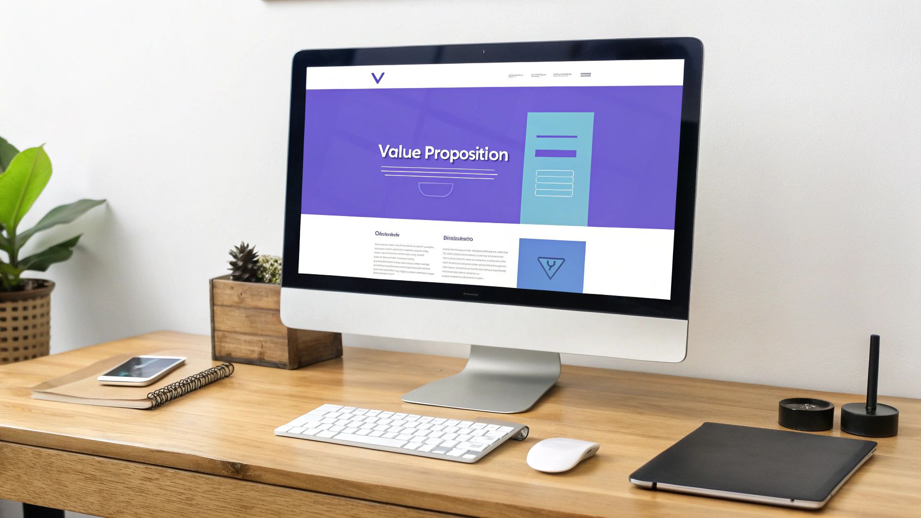
1. Single, Clear Value Proposition
The very first element a visitor should encounter on your landing page is a single, clear value proposition. This is the cornerstone of effective landing page design best practices. It’s a concise statement that instantly tells visitors what you offer, who it’s for, and why it’s valuable. A user should be able to grasp this core message in five seconds or less. Without this clarity, visitors will become confused and are more likely to bounce, abandoning your page before you have a chance to convert them.
Think of Slack’s famous “Where work happens.” It’s simple, powerful, and communicates the benefit of streamlined team collaboration without listing a single feature. Similarly, Dropbox’s “Everything you need for work, all in one place” clearly states the outcome: simplified access to work files. These examples succeed because they focus on the user’s desired end result, not the technical specifications of the product. This immediate communication of value is what separates a high-performing landing page from one that fails to engage.
How to Implement a Strong Value Proposition
Crafting a compelling value proposition requires focusing on benefits over features. Instead of saying your software has “AI-powered scheduling,” say “Effortlessly find the perfect meeting time, every time.” This benefit-driven language resonates more deeply with user needs.
- Be Specific and Quantifiable: If possible, add numbers. “Join 50,000+ designers” is more compelling than “Join our community.”
- Use the 5-Second Test: Ask a colleague or friend to look at your page for five seconds and then explain what your offer is. If they can’t, your proposition isn’t clear enough.
- Maintain Message Match: Ensure your value proposition aligns perfectly with the ad or link the visitor clicked to get there. Inconsistency creates distrust and confusion.
- Leverage A/B Testing: Continuously test different versions of your headline and sub-headline to find the combination that converts best. Small changes in wording can lead to significant improvements in performance.
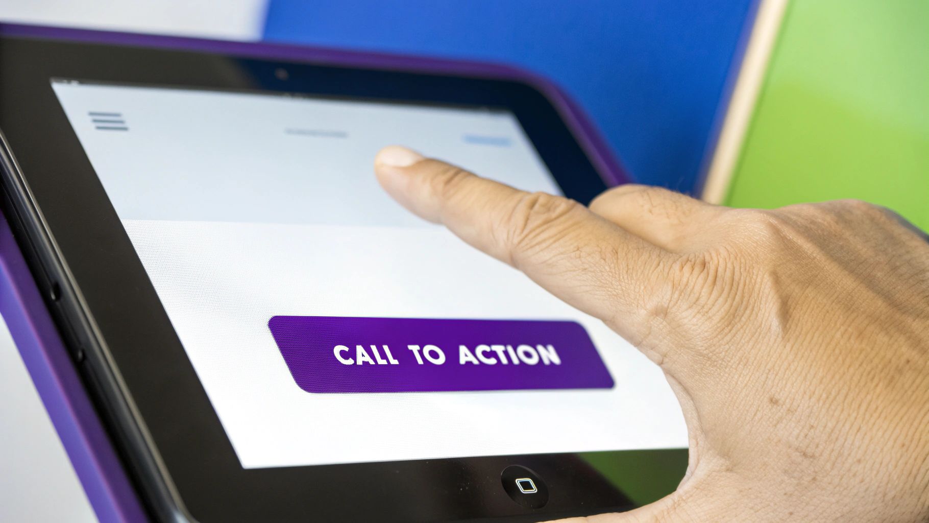
2. Compelling Call-to-Action (CTA)
After your value proposition grabs their attention, the call-to-action (CTA) is the element that seals the deal. The CTA is the button or link that prompts visitors to take the specific, desired action, making it one of the most critical components of landing page design best practices. It’s the gateway to conversion. An effective CTA must be visually prominent, use compelling, action-oriented language, and clearly communicate the value of clicking it. Without a strong CTA, even the most persuasive page will fail to convert interest into action.
Look at how major brands master this. HubSpot’s “Get free tools” isn’t just a command; it’s a value statement emphasizing what the user receives at no cost. Similarly, Spotify’s “Get Spotify Free” leaves no room for ambiguity, directly stating the offer. These examples succeed because they are clear, benefit-driven, and create a frictionless path for the user. The goal is to make clicking the button feel like the most natural and logical next step in the visitor’s journey.
How to Implement a Compelling CTA
Designing a CTA that converts goes beyond just making a button. It involves a mix of psychology, design, and direct-response copywriting. You need to remove friction and anxiety while boosting the perceived value of the action.
- Use Action-Oriented, Specific Text: Avoid generic words like “Submit” or “Click Here.” Instead, use specific language that completes the sentence “I want to…” For example, “Download My Free Guide” is far more effective than “Download.”
- Create Visual Contrast: Your CTA button should stand out from the rest of the page. Use a color that contrasts with your background but still aligns with your brand palette. Bright colors like orange, green, or red often perform well.
- Focus on First-Person Language: A/B tests have shown that using first-person phrasing can increase conversions. For instance, “Get My Free Trial” often outperforms “Get Your Free Trial” because it puts the user in control.
- Ensure Mobile Accessibility: Mobile buttons need to be large enough for easy tapping. A minimum size of 44×44 pixels is a widely accepted standard to ensure a thumb-friendly experience. For more advanced designs, you can explore creating unique interactive buttons to capture attention. To see how this is done, you can learn more about creating a dual Elementor button.
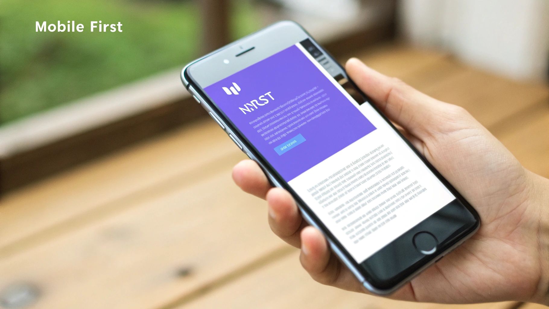
3. Mobile-First Responsive Design
In today’s digital landscape, prioritizing a mobile-first approach is no longer optional; it is an essential component of landing page design best practices. Mobile-first design involves creating your page for the smallest screen first, then progressively enhancing it for larger screens like tablets and desktops. Given that mobile devices generate the majority of website traffic, designing for them from the outset ensures a seamless, optimized user experience for the largest segment of your audience. This approach not only boosts conversions but also directly impacts your search engine rankings, as Google uses mobile-first indexing to evaluate and rank pages.
Think of Uber’s rider signup page. It is perfectly streamlined for a mobile user who is likely on the go. The form is simple, the fields are large, and the call-to-action is prominent, making it incredibly easy to sign up from a smartphone. Similarly, WhatsApp’s download page immediately presents a clear, tappable button to install the app, recognizing that its primary user is on a mobile device. These examples excel because they strip away non-essential elements for mobile users, focusing entirely on a frictionless path to conversion. This focus on the mobile experience ensures your most critical audience segment is served first and most effectively.
How to Implement Mobile-First Responsive Design
To effectively implement a mobile-first strategy, you must shift your design perspective. Instead of thinking about what to remove for a mobile site, start with the core content and functionality needed for a small screen and add complexity for larger ones. This forces a focus on what truly matters.
- Prioritize Above-the-Fold Content: On a small screen, this space is precious. Your value proposition and primary call-to-action must be immediately visible without any scrolling.
- Use Large, Thumb-Friendly Tap Targets: Ensure all buttons, links, and form fields are easy to tap. A minimum size of 44×44 pixels is a widely accepted standard to prevent frustrating mistaps.
- Optimize Images and Media: Use responsive image formats like WebP or AVIF to ensure fast load times on mobile connections without sacrificing quality on larger displays.
- Test on Actual Devices: Browser resizing tools are helpful, but they cannot fully replicate the experience of using a physical device. Test your landing page on various popular smartphones to identify real-world usability issues.
- Leverage Mobile-Specific Features: Incorporate features like click-to-call buttons for phone numbers or integrations with mobile payment systems to make it even easier for users to convert.
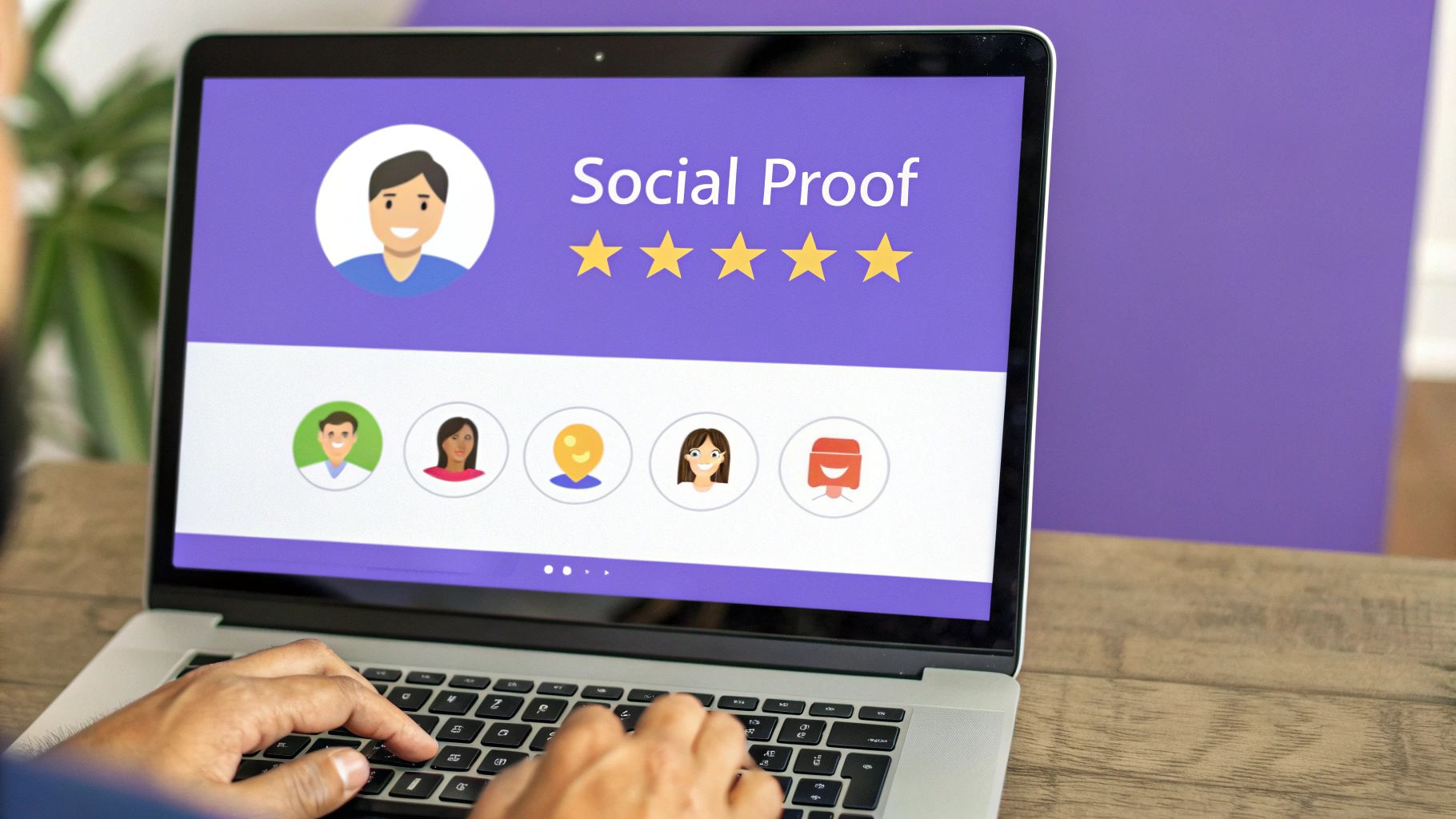
4. Social Proof and Trust Signals
One of the most powerful psychological tools in your toolkit for landing page design best practices is social proof. It operates on a simple principle: people trust the actions and opinions of others. When a visitor is uncertain, they look for external validation to guide their decision. By strategically placing trust signals like testimonials, reviews, client logos, and user counts, you can reduce their anxiety, build credibility, and make them feel more confident about converting.
Look at how major brands leverage this. Shopify prominently displays “Over 1,700,000 businesses have made over $200 billion in sales using Shopify.” This specific, impressive number instantly builds trust. Similarly, Basecamp showcases detailed customer testimonials that highlight specific business results, making their claims more tangible and believable. These signals tell a visitor, “You’re in the right place; many others like you have succeeded here.”
How to Implement Social Proof Effectively
To make your social proof compelling, it needs to be authentic and specific. Generic praise like “Great service!” is far less effective than a detailed testimonial that explains how your product solved a real problem. For those using WordPress, integrating these elements is straightforward; you can explore how to showcase Google reviews on your WordPress site to add powerful, automated social proof.
- Be Specific and Authentic: Use detailed testimonials with real names, companies, and photos. Quantifiable results like “We increased our leads by 40%” are incredibly persuasive.
- Show, Don’t Just Tell: Display logos of well-known clients to leverage their brand authority. Security badges (like SSL certificates) also act as crucial trust signals, especially on pages asking for personal information.
- Place It Strategically: Position your strongest social proof, such as a powerful testimonial or an impressive user count, near your primary Call-To-Action (CTA) to overcome last-minute hesitation.
- Use Video Testimonials: Videos are highly engaging and harder to fake, lending them an extra layer of credibility. A short, genuine video of a happy customer can significantly boost conversions.
5. Minimal Form Fields
Every field you add to a form introduces friction, a small hurdle that can deter a user from completing your call to action. Minimizing form fields is a critical landing page design best practice because it directly reduces this friction. The goal is to ask for only the absolute essential information required to achieve your conversion goal. Each additional field, from phone number to company size, gives a potential lead another reason to abandon the process, significantly impacting your conversion rates.
Consider the signup process for services like Slack or Medium. They often start by asking for just a single piece of information: an email address. This low-commitment first step gets users through the door. Medium even streamlines this further by offering one-click social logins, eliminating the form altogether. This approach respects the user’s time and drastically lowers the barrier to entry, a key principle championed by marketing automation leaders like HubSpot and Marketo who have proven the direct correlation between fewer fields and higher conversions.
How to Implement Minimal Form Fields
Optimizing your forms requires a ruthless focus on necessity. For every field, ask yourself: “Is this information absolutely critical at this specific stage?” Often, you can collect additional data later in the customer journey.
- Remove Non-Essential Fields: Start by eliminating anything that isn’t vital. Do you really need a phone number for an ebook download? Probably not. A/B test removing fields one by one to find the sweet spot between lead quantity and quality.
- Use a Single-Column Layout: Studies show that single-column forms are easier for users to scan and complete than multi-column layouts, which can disrupt a user’s vertical momentum.
- Clearly Mark Optional Fields: If you must include fields that are not required, make sure they are explicitly labeled as “(Optional)”. This tells users they can skip them, reducing perceived effort.
- Consider Multi-Step Forms: For complex processes that genuinely require more information, break the form into several smaller, manageable steps. This technique, known as the “foot-in-the-door” principle, makes the process feel less daunting and increases completion rates.
6. Fast Loading Speed
In the digital landscape, speed is not a feature; it’s a fundamental requirement. Fast loading speed is a critical component of landing page design best practices because it directly impacts user experience, bounce rates, and conversion rates. Today’s users expect instant access, and studies consistently show that even a one-second delay can cause a significant drop in conversions. A slow page frustrates visitors before they even have a chance to see your value proposition, leading them to abandon your site and turn to a competitor.
Tech giants have built their empires on this principle. Amazon famously calculated that a 100-millisecond delay in load time could cost them 1% in sales, a figure that translates to billions of dollars. Similarly, when Pinterest reduced perceived wait times by 40%, they saw a 15% increase in sign-ups and search engine traffic. These examples underscore a universal truth: a fast, responsive page signals professionalism and respect for the user’s time, building trust from the very first interaction. Google’s Core Web Vitals initiative has even made page experience a direct ranking factor, solidifying speed’s role in both SEO and user satisfaction.
How to Implement Fast Loading Speed
Optimizing for speed involves a multi-faceted approach, from your server configuration to the assets on your page. The goal is to make your page feel instantaneous to the user, especially on mobile devices where network conditions can be less reliable.
- Aim for Under 3 Seconds: Your page should fully load in under three seconds. Use tools like Google PageSpeed Insights or GTmetrix to analyze your current performance and get actionable recommendations.
- Optimize Images: Images are often the biggest culprits of slow load times. Compress them without sacrificing quality and use next-gen formats like WebP or AVIF, which offer superior compression compared to traditional JPEGs and PNGs.
- Minimize Code: Minify your CSS, JavaScript, and HTML files. This process removes unnecessary characters like spaces and comments from the code, reducing file sizes and speeding up parsing time.
- Test on Slower Networks: Don’t just test on your high-speed office connection. Simulate a 3G or 4G network to understand how your landing page performs for mobile users in real-world conditions. For those using WordPress, optimizing can feel daunting, but there are clear steps to take. You can learn more about how to optimize your WordPress site on exclusiveaddons.com.
7. Clear Visual Hierarchy
A clear visual hierarchy is a non-negotiable component of high-converting landing page design best practices. It’s the art of arranging page elements in order of importance to guide the visitor’s eye. By using size, color, contrast, and strategic placement, you create a path that directs users from your value proposition to your key benefits and, ultimately, to your call-to-action. Without this intentional structure, visitors are left to wander, often missing the critical information needed to make a conversion decision.
Consider Stripe’s homepage. It masterfully uses a large, bold headline to state its value, followed by smaller subheadings and body text. The call-to-action button stands out with a contrasting color, making it an unmissable final step. Similarly, Apple uses generous white space and dominant product imagery to create a focal point, naturally drawing the eye to the most important message. These pages work because they don’t force users to think; the design itself tells them what to look at and in what order, creating a seamless and persuasive journey.
How to Implement a Clear Visual Hierarchy
Implementing an effective visual hierarchy means making conscious design choices that signal importance. It’s about creating a flow that feels intuitive to the user, leading them effortlessly toward your conversion goal.
- Apply the Squint Test: Squint your eyes while looking at your page. The most critical elements, like your headline and CTA, should remain visible and distinct. If everything blurs together, your hierarchy is too weak.
- Leverage Size and Scale: Your main headline should be significantly larger than your sub-headlines and body text. This immediately establishes what information is most important.
- Use Color and Contrast: Place your most important elements, especially CTAs, in a color that contrasts with the background and surrounding elements. This makes them pop and draws immediate attention.
- Follow Reading Patterns: Design for natural reading patterns like the “Z-pattern” for visually-driven pages or the “F-pattern” for text-heavy content to align your layout with how users instinctively scan information.
8. Consistent Message Matching
Message matching is the critical practice of ensuring your landing page content perfectly aligns with the ad, email, or link that brought a visitor to your page. This alignment is a cornerstone of effective landing page design best practices because it fulfills the promise made in the initial source. When a user clicks a link with a specific headline and offer, they expect to see that same message reinforced instantly. This consistency builds trust, reduces confusion, and significantly lowers bounce rates by immediately confirming to the visitor that they are in the right place.
Consider a Facebook ad promoting “50% Off All Winter Jackets.” If a user clicks that ad and lands on a generic homepage or a page about new spring arrivals, the disconnect is jarring. The user feels misled and is highly likely to leave. Conversely, if the landing page prominently features a headline like “Your 50% Discount on All Winter Jackets Starts Now” with corresponding imagery, the user’s journey feels seamless and logical. This principle is heavily rewarded by platforms like Google Ads and Facebook, which use relevance scores to determine ad costs and visibility.
How to Implement Consistent Message Matching
Achieving strong message match requires a disciplined approach to campaign creation. It moves beyond a one-size-fits-all landing page to a more targeted, segmented strategy that speaks directly to the source of the traffic. This level of personalization shows visitors you understand their intent.
- Create Dedicated Landing Pages: For each major ad campaign, email promotion, or traffic source, build a unique landing page. This ensures the headline, hero image, and call-to-action perfectly mirror the source.
- Use Dynamic Text Replacement: For PPC campaigns, leverage dynamic text replacement (DTR). This powerful feature automatically inserts the keyword a user searched for directly into your landing page headline, creating a hyper-relevant experience.
- Maintain Visual Consistency: The match should be visual as well as textual. Use the same colors, fonts, imagery, and overall branding from your ad on your landing page. This creates an uninterrupted visual narrative.
- Track Source-Specific Conversions: Use analytics to monitor conversion rates for each traffic source. If a specific ad campaign has a high bounce rate, it’s a clear signal that your message matching is off and needs to be optimized.
9. Remove Navigation Distractions
One of the most impactful landing page design best practices is to deliberately remove navigation menus and other distracting links. The goal of a landing page is to guide a visitor toward a single, specific action, whether it’s signing up, downloading a resource, or making a purchase. Every extra link on the page, from a “Home” button to a “Blog” link, presents an opportunity for the visitor to leave the conversion path. By eliminating these escape routes, you create a focused, high-intent environment that significantly increases the likelihood of conversion.
Think of a dedicated webinar registration page or a lead generation page from a platform like Unbounce. These pages are famously minimalist, often removing the main site header and footer entirely. The only clickable options are the call-to-action button and perhaps essential legal links tucked away at the bottom. This isn’t an accident; it’s a calculated strategy. By reducing cognitive load and decision paralysis, you make the desired action the easiest and most obvious next step for the visitor to take. This principle, popularized by direct response marketing and funnel optimization experts, is a cornerstone of high-converting design.
How to Implement a Distraction-Free Environment
Creating a focused page doesn’t mean sacrificing your brand identity. It’s about strategically curating the user’s journey to align with a single campaign goal.
- Remove the Main Navigation Menu: This is the most crucial step. Eliminate the primary site header that links to other pages like “About Us,” “Services,” or “Contact.”
- Keep Essential Links in the Footer: Don’t remove everything. Retain legally required links like “Privacy Policy” and “Terms of Service” in a discreet footer to build trust without causing a distraction.
- A/B Test Your Approach: For some audiences, especially colder traffic unfamiliar with your brand, removing all navigation might feel too restrictive. Test versions with and without a stripped-down menu to see what performs best for your specific campaign.
- Focus on a Single CTA: Reinforce this minimalist approach by ensuring there is only one primary call-to-action on the page. Don’t ask users to “Sign Up” and also “Follow Us on Social Media.” Stick to one goal.
10. Above-the-Fold Optimization
The “above-the-fold” section is the digital equivalent of a storefront window. It’s the content a visitor sees on your landing page without having to scroll down. This prime real estate is where you make your first, and most critical, impression. Since research shows that users spend the vast majority of their attention on this visible area, optimizing it is a fundamental landing page design best practice. Your goal is to deliver your core message and primary call to action immediately, ensuring visitors understand your offer and know what to do next.
Look at how Shopify masters this. When you land on their homepage, you are instantly met with a clear value proposition, a primary call to action to start a free trial, and trust-building social proof. Similarly, Zoom places its simple headline, prominent CTA button, and an engaging visual right at the top. These examples work because they don’t force the user to hunt for essential information; they present everything needed to make a quick, informed decision right away. This immediate clarity reduces friction and significantly increases the chances of conversion.
How to Implement Above-the-Fold Optimization
Perfecting this area means being ruthless with prioritization. You must include your most persuasive elements without creating a cluttered or overwhelming experience. Focus on communicating value swiftly and guiding the user toward your primary goal.
- Prioritize Critical Elements: Your value proposition (headline and sub-headline), a compelling hero image or video, and your primary CTA must be visible above the fold on all major devices.
- Test on Multiple Devices: The “fold” is not a fixed line; it varies dramatically across desktops, tablets, and mobile phones. Use browser developer tools or dedicated testing platforms to see how your page renders on different screen sizes and ensure key elements remain visible.
- Use Heatmaps: Tools like Hotjar or Crazy Egg can generate heatmaps showing where users actually click and focus their attention. This data is invaluable for confirming that your most important content is indeed capturing eyeballs.
- Keep it Concise and Compelling: Avoid long paragraphs or dense blocks of text above the fold. Use benefit-oriented bullet points or short, punchy sentences to convey your message quickly and effectively.
Landing Page Design Best Practices Comparison
| Item | Implementation Complexity 🔄 | Resource Requirements ⚡ | Expected Outcomes 📊 | Ideal Use Cases 💡 | Key Advantages ⭐ |
|---|---|---|---|---|---|
| Single, Clear Value Proposition | Medium – Crafting concise message | Moderate – Copywriting & testing | Clear visitor purpose, reduced bounce, higher conversions | Early visitor engagement & qualification | Strong first impression, sets clear expectations |
| Compelling Call-to-Action (CTA) | Low to Medium – Design & wording | Low – Design & copy tweaks | Directly drives conversions, easy to optimize | Conversion-focused pages | Clear next steps, high ROI impact |
| Mobile-First Responsive Design | High – Technical design & testing | High – Dev effort, device testing | Better UX on mobile, improved search rankings | Mobile-heavy traffic sites | Future-proof, increased mobile conversions |
| Social Proof and Trust Signals | Medium – Content gathering & design | Medium – Collecting authentic proof | Boosts credibility, lowers skepticism, higher conversions | Building trust & validation | External validation, increases credibility |
| Minimal Form Fields | Medium – Form design and testing | Moderate – UX & testing | Higher form completions, lower friction | Lead capture forms | Improved mobile experience, reduced abandonment |
| Fast Loading Speed | High – Technical optimization | High – Dev expertise & monitoring | Better UX, SEO boost, higher conversions | All landing pages, especially mobile-heavy | Improved rankings, lower bounce rates |
| Clear Visual Hierarchy | Medium to High – Design expertise | Moderate – Design resources | Guides attention, better comprehension | Content-heavy, conversion-focused pages | Enhances professionalism, boosts engagement |
| Consistent Message Matching | Medium – Coordination & testing | Moderate – Marketing alignment | Reduced bounce, higher conversion, better ad quality score | Multi-channel campaigns | Seamless user experience, improved ad relevance |
| Remove Navigation Distractions | Low to Medium – Simplify design | Low – Design & content decisions | Higher focus, reduced decision paralysis | Focused conversion funnels | Prevents traffic leakage, simplifies decisions |
| Above-the-Fold Optimization | Medium – Design & testing | Moderate – Design & analytics | Immediate attention capture, higher conversions | All landing pages, especially mobile | Maximizes prime screen space, supports impatient users |
Putting It All Together: Your Path to High-Converting Landing Pages
We’ve journeyed through the ten foundational pillars of exceptional landing page design, dissecting everything from the psychological power of social proof to the technical necessity of lightning-fast page speed. Understanding these principles is the crucial first step, but the true art lies in their synthesis and consistent application. A landing page isn’t just a collection of disparate elements; it’s a finely tuned conversion machine where every component works in harmony to achieve a single, specific goal.
Think of it as a strategic conversation with your visitor. Your singular value proposition is the opening line, grabbing their attention. The clear visual hierarchy guides their eyes, directing them through the most important points. Trust signals and testimonials build rapport and credibility, while a mobile-first design ensures the conversation flows smoothly on any device. Every step is deliberately designed to lead them to the climax: your compelling call-to-action.
From Theory to Tangible Results
The difference between a landing page that converts at 1% and one that converts at 10% isn’t magic; it’s a commitment to applying and testing these landing page design best practices. The concepts we’ve covered, such as removing navigation distractions and ensuring message matching between your ads and your page, are not just suggestions. They are proven methods for reducing friction, eliminating confusion, and keeping your user focused on the intended action.
Your next steps shouldn’t feel overwhelming. Instead of attempting a complete overhaul of all your pages at once, adopt a methodical approach.
- Start with an Audit: Use the ten principles from this article as a checklist. Go through your most critical landing pages and score them on each point. Where are the most significant gaps?
- Prioritize and Hypothesize: Identify the one or two areas that offer the biggest potential for improvement. Perhaps your form has too many fields, or your CTA button is lost in the design. Form a hypothesis: “By reducing our form from seven fields to three, we believe we can increase lead submissions by 20%.”
- Test and Measure: This is the most critical phase. Implement your change on a variation of your page and run an A/B test against the original. Let the data tell you what works. Tools like Google Optimize, Optimizely, or VWO are invaluable for this process.
- Iterate and Refine: Whether your test wins, loses, or is inconclusive, you’ve learned something valuable. Apply your winnings, learn from your losses, and formulate your next hypothesis. This continuous loop of auditing, testing, and refining is the engine of conversion rate optimization.
The Power of the Right Toolkit
For WordPress and Elementor users, this entire process can be streamlined. Mastering landing page design best practices becomes significantly easier when your tools are built to support them. You don’t need to be a coding expert to implement a lightweight, fast-loading design or to add a dynamic testimonial carousel that builds instant trust. The goal is to move quickly from idea to implementation, and the right toolkit makes that possible.
By weaving together a powerful value proposition, a frictionless user experience, and unwavering focus on a single CTA, you transform a simple webpage into a powerful business asset. These pages become reliable, predictable engines for lead generation, sales, and growth. Your commitment to mastering these practices is a direct investment in your business’s bottom line, turning clicks into customers and visitors into advocates.
Ready to implement these powerful design strategies without the heavy lifting? Exclusive Addons for Elementor provides a massive library of 100+ lightweight widgets and 1000+ pre-made blocks and templates, including advanced forms, testimonial carousels, and CTA buttons, designed to help you build high-converting landing pages faster than ever. Start building better landing pages today with Exclusive Addons and turn these best practices into your reality.