
In the competitive world of online retail, a visually appealing website is just the beginning. True success lies in creating a seamless, intuitive, and trustworthy user experience that guides visitors from browsing to buying. Mastering ecommerce website design best practices isn't just about aesthetics; it's a critical strategy for boosting conversions, building brand loyalty, and maximizing revenue. A thoughtfully designed online store anticipates customer needs, removes friction from the buying journey, and instills confidence with every click.
This guide moves beyond theory to provide a clear blueprint for a high-converting storefront. We will dissect 8 essential design principles, covering everything from mobile-first responsiveness and streamlined navigation to high-quality visuals and a frictionless checkout process. Each point is designed to be immediately actionable, offering practical implementation steps.
More importantly, we will show you exactly how to bring these concepts to life using the powerful widgets and features within Exclusive Addons for Elementor. By following this guide, you will learn how to build a top-tier ecommerce site that not only looks professional but also functions as a powerful sales engine, all without writing a single line of code. Let's begin building a better online store.
1. Mobile-First Responsive Design
In today's digital marketplace, a significant portion of online shopping happens on smartphones. A mobile-first approach is one of the most critical ecommerce website design best practices because it prioritizes the user experience on the smallest screens first. Instead of designing for a desktop and then shrinking it down, you build the core experience for mobile and then progressively enhance it for tablets and desktops. This strategy ensures your site is fast, accessible, and easy to navigate for the majority of your visitors.

The primary benefit is improved usability and performance on mobile devices, which directly impacts conversion rates and customer satisfaction. Furthermore, Google’s mobile-first indexing means a well-optimized mobile site is crucial for SEO, helping you rank higher in search results. Think of successful retailers like Target or Allbirds; their mobile sites are clean, fast, and intuitive, setting a high standard for mobile commerce.
How to Implement a Mobile-First Design
Implementing a mobile-first design in Elementor is straightforward thanks to its built-in responsive controls. You can adjust layouts, typography, padding, and margins specifically for mobile, tablet, and desktop views.
- Start with Mobile View: Begin your design process in Elementor’s mobile editing mode. Focus on a single-column layout, large tap-friendly buttons, and legible text.
- Utilize Responsive Controls: Click the responsive mode icon in the Elementor panel to switch between device views. Hide or show specific widgets on certain devices to declutter the mobile experience.
- Optimize Images: Use Elementor's image optimization features and consider using the Image Comparison widget from Exclusive Addons to showcase product details effectively without slowing down your site. The addon ensures all its widgets are fully responsive.
- Thumb-Friendly Navigation: Ensure key elements like the "Add to Cart" button and navigation menus are easily reachable by a user's thumb, typically in the lower or central part of the screen.
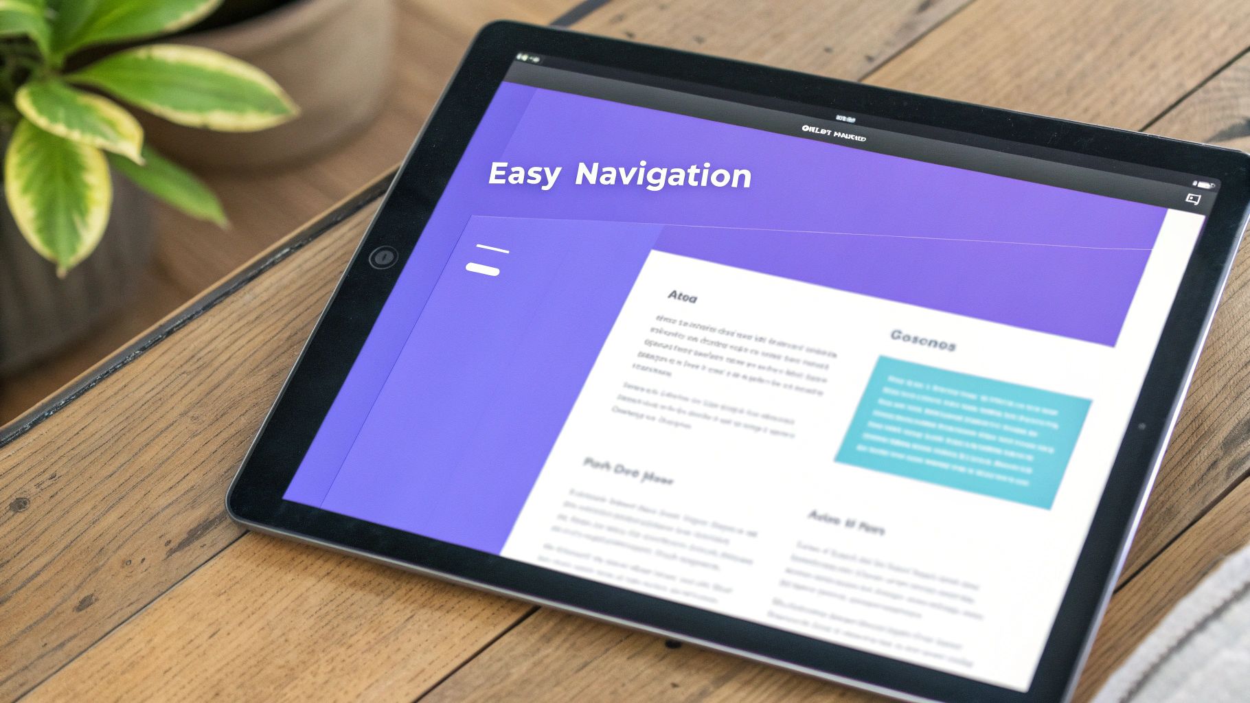
2. Simplified and Intuitive Navigation
If customers can't find what they're looking for, they can't buy it. Simplified and intuitive navigation is one of the most fundamental ecommerce website design best practices because it directly addresses this challenge. This principle focuses on creating a clear, logical, and predictable path for users to discover products with minimal effort. By reducing the number of clicks and cognitive load, you eliminate frustration, lower bounce rates, and guide visitors smoothly toward a purchase.
The primary benefit is a drastically improved user experience, which builds trust and encourages repeat visits. Effective navigation turns casual browsers into confident buyers. Industry leaders like Apple master this with minimalist top-level menus, while ecommerce giants like ASOS and Best Buy use comprehensive, yet clearly organized, category structures and filtering systems to manage vast inventories without overwhelming the user.
How to Implement Intuitive Navigation
Elementor provides the tools to build clean navigation, and with the right addons, you can create a truly advanced and user-friendly menu system. The goal is to make product discovery feel effortless.
- Create a Logical Hierarchy: Structure your product categories logically from broad to specific. Use Elementor’s native Menu widget for simple menus or a more advanced solution for complex stores. For an in-depth guide, check out this tutorial on creating an Elementor Mega Menu.
- Implement a Powerful Search: A prominent, predictive search bar is non-negotiable. Use a plugin or custom code to enable autocomplete and show suggested products as users type.
- Limit Top-Level Items: Follow the "less is more" principle, popularized by usability experts like Steve Krug. Keep your main navigation menu to seven items or fewer to avoid decision paralysis.
- Use Descriptive Labels: Avoid vague or overly creative terms for your categories. Use clear, conventional labels like "Men's Shoes" instead of "Stride Styles" so users know exactly what to expect.
3. High-Quality Product Images and Videos
In ecommerce, your product visuals do the heavy lifting. Since customers can't physically touch or see the product, high-resolution images and detailed videos are essential ecommerce website design best practices for building trust and driving sales. This means going beyond a single, static shot to include multiple angles, zoom capabilities, lifestyle photos, and even 360-degree views to give shoppers a comprehensive understanding of what they’re buying.
The primary benefit is a significant reduction in customer uncertainty, which directly lowers return rates and increases conversion rates. Professional visuals convey quality and legitimacy, justifying your product's price and setting you apart from competitors. Think of how Zappos showcases shoes from every conceivable angle or how IKEA uses AR to let you visualize furniture in your own room; these immersive visual experiences are powerful sales tools.
How to Implement High-Quality Visuals
Elementor and Exclusive Addons provide powerful tools to create visually rich product pages that convert without sacrificing performance. The goal is to present your products in the best possible light while keeping your site fast and user-friendly.
- Showcase Every Angle: Use an image carousel or gallery to display multiple high-resolution photos. The Image Carousel widget by Exclusive Addons is perfect for creating a sleek, swipeable gallery for your product images.
- Implement Zoom and Lightbox: Allow users to inspect product details up close. Elementor’s native gallery widgets often include lightbox and zoom functionalities that can be easily enabled.
- Optimize for Performance: High-quality images can slow down your site. It's crucial to compress and resize them appropriately. Learn more about the best image format for your website to balance quality and speed.
- Add Product Videos: Embed videos showcasing the product in use. You can use the Video widget from Exclusive Addons to easily add YouTube or Vimeo links, providing a dynamic look at your product's features and benefits.
4. Streamlined Checkout Process
The checkout process is the final and most crucial step in a customer's journey. A complicated or lengthy checkout is a primary cause of cart abandonment. One of the most impactful ecommerce website design best practices is to create a streamlined checkout process that minimizes friction, reduces the number of required fields, and gets the customer to the finish line as quickly as possible. This involves features like guest checkout options, progress indicators, and clear calls-to-action.

The primary benefit of a simplified checkout is a direct increase in conversion rates. By removing unnecessary barriers, you make it easier for customers to complete their purchase, which boosts revenue and customer satisfaction. Industry leaders like Amazon, with its one-click purchasing, and Shopify's accelerated checkouts have set the standard for a frictionless experience, proving that simplicity sells. To truly streamline the checkout process and ensure customer satisfaction, it's essential to consider strategies for effectively managing shipping restrictions, which can significantly reduce friction at the final stage of purchase.
How to Implement a Streamlined Checkout Process
Elementor Pro’s WooCommerce Builder allows you to fully customize your checkout page, giving you control over the layout and elements to optimize the user experience.
- Customize Your Checkout Page: Use the Elementor Theme Builder to create a custom Checkout page. You can design a clean, single-page or multi-step layout that guides the user smoothly through the process.
- Reduce Form Fields: Go through your default WooCommerce checkout fields and remove anything that isn't absolutely necessary. The less a customer has to type, the better.
- Use Progress Indicators: If you opt for a multi-step checkout, use a progress bar or step indicator to show users where they are in the process. The Progress Bar widget from Exclusive Addons is perfect for visually representing completion stages.
- Offer Multiple Payment Options: Integrate various payment gateways, including digital wallets like Apple Pay and PayPal, to give customers their preferred method. Display these options clearly using icons.
5. Fast Loading Speed and Performance Optimization
In the competitive world of ecommerce, every second counts. Fast loading speed is a non-negotiable component of modern ecommerce website design best practices, as it directly correlates with user retention and conversion rates. A slow website frustrates visitors, leading them to abandon their carts and seek faster alternatives. Prioritizing performance optimization means compressing images, minifying code, leveraging browser caching, and using a Content Delivery Network (CDN) to ensure your pages load almost instantly for every user, regardless of their location.
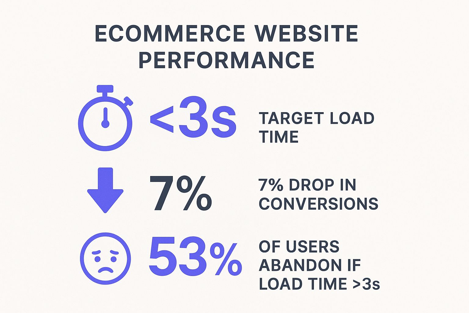
The primary benefit is a direct boost to your bottom line. As the infographic highlights, a mere one-second delay can cause a 7% drop in conversions, while over half of mobile users will leave a site that takes longer than three seconds to load. Industry giants like Amazon and Google have set the standard, proving that exceptional speed leads to higher engagement, better SEO rankings (as speed is a key ranking factor), and increased revenue.
How to Implement Performance Optimization
Optimizing your Elementor site for speed involves several key steps, most of which can be managed with the right tools and settings. The goal is to reduce server requests and decrease the size of your page assets.
- Optimize Images: Large images are the most common cause of slow load times. Use modern formats like WebP and compress all images before uploading. The Image Comparison widget from Exclusive Addons is built to be lightweight, allowing you to showcase details without sacrificing performance.
- Enable Caching: Use a reliable caching plugin to store static versions of your site, which drastically reduces server processing time for repeat visitors.
- Minify Code: Minification removes unnecessary characters from your HTML, CSS, and JavaScript files without changing their functionality. Many caching and optimization plugins handle this automatically.
- Use a CDN: A Content Delivery Network (CDN) like Cloudflare distributes your site's assets across a global network of servers, ensuring faster delivery to users worldwide. For a deeper dive, explore these strategies for WordPress speed optimization.
6. Trust Signals and Security Features
Online shoppers are inherently cautious, especially when sharing personal and financial information. Integrating trust signals and security features is one of the most fundamental ecommerce website design best practices because it directly addresses these concerns. Trust signals are visual cues that reassure customers your store is legitimate, secure, and reliable. These elements, such as SSL certificates, security badges, and transparent policies, build the confidence needed to convert a hesitant visitor into a paying customer.
The primary benefit is a reduction in cart abandonment and an increase in conversion rates. When customers feel safe, they are more likely to complete their purchase. Moreover, visible security measures protect your business and your customers from fraud. Well-known examples include the Norton Shopping Guarantee and McAfee Secure badges, which provide instant visual verification of a site’s security. Platforms like Trustpilot have popularized the integration of authentic customer reviews, adding another layer of social proof and credibility to your store.
How to Implement Trust Signals and Security Features
Elementor makes it easy to strategically place these signals throughout your ecommerce site, especially on product pages and during the checkout process. The goal is to make them visible without cluttering the design.
- Display Security Badges: Use Elementor’s Image or Icon widgets to place security badges (e.g., SSL, McAfee, Norton) in your site’s footer and prominently near "Add to Cart" or checkout buttons.
- Showcase Customer Reviews: Leverage the Testimonial Carousel widget from Exclusive Addons to display a rotating feed of authentic customer reviews. This provides social proof and builds confidence in your products.
- Highlight Guarantees: Create a section using the Icon Box widget to clearly communicate your money-back guarantees, secure payment options, and free shipping policies. Place this section directly on product pages.
- Ensure Policy Transparency: Link to your privacy policy, terms of service, and return policy in your website’s footer. A clear and accessible set of policies shows that your business is transparent and trustworthy.
7. Effective Search Functionality
For an ecommerce store with more than a handful of products, an intuitive and powerful search bar isn't just a feature; it's a necessity. Effective search functionality is one of the most vital ecommerce website design best practices because it acts as a direct line between a customer's intent and your products. It transforms a potentially frustrating browsing session into a quick, satisfying purchase by helping users find exactly what they need with minimal effort.
A great search experience, like the one pioneered by Amazon, includes features like autocomplete, typo tolerance, and filtering. This instantly elevates the user experience, reduces bounce rates, and significantly boosts conversion rates. When customers can find products easily, they are far more likely to buy. This is especially true for stores with large, diverse inventories where manual browsing is impractical.
How to Implement Effective Search Functionality
While Elementor’s native search widget is basic, you can enhance it significantly with the right tools to create a more dynamic experience. The goal is to make your search bar intelligent and helpful.
- Implement Autocomplete and Suggestions: Use a search plugin or service like Algolia that integrates with WordPress. This provides live search results and suggestions as users type, guiding them toward relevant products and categories.
- Add Advanced Filtering: After a search is performed, users need to narrow down results. The Filterable Gallery widget from Exclusive Addons allows you to create a visual, filterable product display that can be used on search results pages, letting customers sort by price, category, or other attributes.
- Enable Typo Tolerance: Your search system should be smart enough to understand common misspellings and typos, presenting the correct results instead of a "no results found" page.
- Analyze Search Data: Regularly review what your customers are searching for. This data provides invaluable insights into product demand, popular terms, and gaps in your inventory, helping you make smarter business decisions.
8. Clear Call-to-Action (CTA) Buttons
A Call-to-Action (CTA) button is arguably the most important element on any product or landing page. These strategically designed buttons guide users toward a desired action, like ‘Add to Cart’ or ‘Buy Now.’ As one of the most vital ecommerce website design best practices, a clear CTA acts as a signpost, telling your customers exactly what to do next and eliminating friction in the purchasing journey. Without a compelling and visible CTA, even the most interested shopper can get lost or abandon their cart.
The primary benefit is a direct increase in conversion rates. An effective CTA removes ambiguity and creates a seamless path from product discovery to checkout. Think of Amazon's iconic bright orange 'Add to Cart' button; it stands out on the page and uses simple, direct language. This approach minimizes hesitation and encourages immediate action, a principle that has been adopted by countless successful online stores. A well-placed CTA can dramatically improve user experience and boost your bottom line.
How to Implement Clear CTA Buttons
Elementor provides extensive styling options for buttons, and Exclusive Addons enhances this with unique widgets like the Animated Text and Button widgets, which can create more dynamic and eye-catching CTAs.
- Use Contrasting Colors: Make your CTA buttons pop. In Elementor, select a background color for your button that stands out from the page's color scheme but still aligns with your brand identity.
- Write Action-Oriented Copy: The text on your button should be concise and start with a verb. Instead of "Submit," use "Get Your Free Quote" or "Shop Now." Keep it short and impactful.
- Optimize Placement and Size: Position your CTA above the fold where users can see it without scrolling. Ensure the button is large enough to be easily tapped on mobile devices, a core principle of thumb-friendly design.
- Create a Sense of Urgency: Use the Countdown Timer widget from Exclusive Addons near your CTA for limited-time offers ("Shop Now – Sale Ends in 24 Hours"). This psychological trigger can significantly increase click-through rates.
Ecommerce Design Best Practices Comparison
| Feature / Aspect | Mobile-First Responsive Design | Simplified and Intuitive Navigation | High-Quality Product Images and Videos | Streamlined Checkout Process | Fast Loading Speed and Performance Optimization | Trust Signals and Security Features |
|---|---|---|---|---|---|---|
| Implementation Complexity 🔄 | Moderate – needs flexible grids & testing | Moderate – requires info architecture | High – professional photography needed | Moderate to High – payment integrations | High – code, caching, CDN sophistication | Moderate – security and policy enforcement |
| Resource Requirements ⚡ | Medium – dev time + device testing | Low to Medium – planning & testing | High – storage, bandwidth, pro media | Medium – dev & security infrastructure | Medium to High – hosting and optimization tools | Medium – ongoing certification & monitoring |
| Expected Outcomes 📊 | ⭐⭐⭐⭐ Better UX & SEO, higher mobile conversions | ⭐⭐⭐ Improved usability, reduced bounce | ⭐⭐⭐⭐ Increased trust, conversions, lower returns | ⭐⭐⭐⭐ Reduced cart abandonment, increased sales | ⭐⭐⭐⭐ Better SEO, UX, conversions, lower bounce | ⭐⭐⭐⭐ Higher trust, conversions, lower abandonment |
| Ideal Use Cases 💡 | Mobile-centric ecommerce, multi-device users | Complex catalogs needing easy browsing | Products reliant on visual appeal | Sites with complex purchase flows | Sites requiring fast performance & SEO boost | Ecommerce sites needing customer confidence |
| Key Advantages ⭐ | Future-proof, mobile SEO benefit | Faster product findability, less frustration | Enhanced product clarity & trust | Smooth purchase, fewer abandons | SEO boost, UX improvement, reduced bounce | Builds confidence, strengthens brand reputation |
| Insights / Tips 💡 | Use CSS Grid/Flexbox, thumb-friendly taps | Limit nav items, descriptive labels | Consistent lighting, lazy load images | Max 3 checkout steps, show all costs | Use WebP, browser caching, monitor metrics | Display badges, show reviews, clear policies |
Elevate Your Ecommerce Store Today
The journey through the essential ecommerce website design best practices reveals a clear roadmap to building a successful online store. We've explored the critical need for a mobile-first approach, the power of simplified navigation, and the undeniable impact of high-quality visuals. These are not just isolated suggestions; they are interconnected components of a cohesive and compelling user experience.
By weaving these principles together, you transform your website from a simple product catalog into a dynamic, customer-centric platform. An intuitive layout, coupled with a streamlined checkout process and prominent trust signals, removes friction and builds the confidence necessary to convert visitors into loyal customers. Remember, every design choice, from the color of a CTA button to the speed of your search function, contributes to the overall perception of your brand and its reliability.
Turning Knowledge into Action
The true value of understanding these best practices lies in their application. Don't feel overwhelmed by the need to implement everything at once. Instead, adopt a strategy of continuous improvement.
- Start with an audit: Objectively review your current site against the principles we've discussed. Where are the most significant gaps? A slow loading speed or a complicated checkout process might be your most urgent priorities.
- Focus on high-impact areas: Improving your mobile experience or enhancing your product imagery can yield immediate and substantial results. Prioritize changes that will most directly affect user satisfaction and your bottom line.
- Leverage powerful tools: As we've demonstrated, you don't need to be a coding expert to implement these advanced features. Elementor, amplified by the versatile widgets in Exclusive Addons, provides the building blocks to create a professional, high-converting store efficiently.
Mastering these ecommerce website design best practices is an ongoing commitment to your customers and your business. It's about creating an online environment that is not only visually appealing but also effortless, secure, and trustworthy. By prioritizing the user experience at every turn, you lay a durable foundation for sustainable growth, enhanced brand loyalty, and, ultimately, a more profitable ecommerce venture.
Ready to put these principles into practice without the heavy lifting? Exclusive Addons for Elementor provides a powerful toolkit with over 112 widgets and extensions, including specialized WooCommerce tools, designed to help you implement these very best practices with ease. Download Exclusive Addons today and start building the high-performance, conversion-focused ecommerce store your business deserves.