
In an era dominated by a multitude of devices, from smartwatches to ultra-wide monitors, ensuring your website provides a seamless experience on every screen is paramount. Responsive design has evolved from a 'nice-to-have' feature to the foundational pillar of modern web development. For Elementor users, this means going beyond simply adjusting column widths; it's about crafting intuitive, high-performing experiences that adapt intelligently to the user's context. A failure to implement sound responsive design best practices can lead to higher bounce rates, poor user engagement, and a direct negative impact on search engine rankings, as Google continues to prioritize mobile-first indexing.
This guide dives deep into 10 crucial responsive design strategies, offering actionable techniques you can implement today using Elementor and the powerful tools within Exclusive Addons. We will move past the basics and explore specific methods to create genuinely adaptive digital experiences. You will learn how to:
- Build with a mobile-first mindset for a solid foundation.
- Implement flexible grids and media that scale gracefully.
- Optimize performance and typography across all viewports.
- Design touch-friendly interfaces and consistent navigation patterns.
We'll skip the high-level theory and focus directly on practical implementation, providing the specific steps needed to build truly fluid and user-centric websites. By mastering these principles, you can ensure your Elementor projects not only look great but also perform exceptionally, delivering a superior user experience that meets the demands of 2025's diverse digital ecosystem. Let's explore the techniques that will set your work apart.
1. Mobile-First Design Approach
A truly effective responsive design strategy begins before you even touch a single design element. The mobile-first approach, a concept championed by industry leaders like Luke Wroblewski and Google's mobile-first indexing initiative, fundamentally reverses the traditional desktop-to-mobile workflow. Instead of designing for a large screen and then stripping away elements to fit a smaller one, you start with the most constrained environment: the mobile viewport.
This methodology forces you to prioritize what is truly essential. By designing for a small screen first (often starting at a 320px width), you must make critical decisions about content hierarchy and core functionality from the outset. This ensures that the mobile experience is not a compromised afterthought but a robust, focused, and performant foundation.
Why It's a Top Practice
Adopting a mobile-first mindset is one of the most impactful responsive design best practices because it directly addresses the modern user's browsing habits. With mobile traffic consistently dominating, this approach guarantees that the majority of your audience receives an optimized experience. It leads to faster load times on mobile devices, as non-essential scripts and heavy assets are only loaded on larger screens through progressive enhancement. This focus on core content improves usability and can positively impact your site's SEO, especially with Google's emphasis on mobile-friendliness.
The following graphic summarizes the core tenets of this design philosophy.
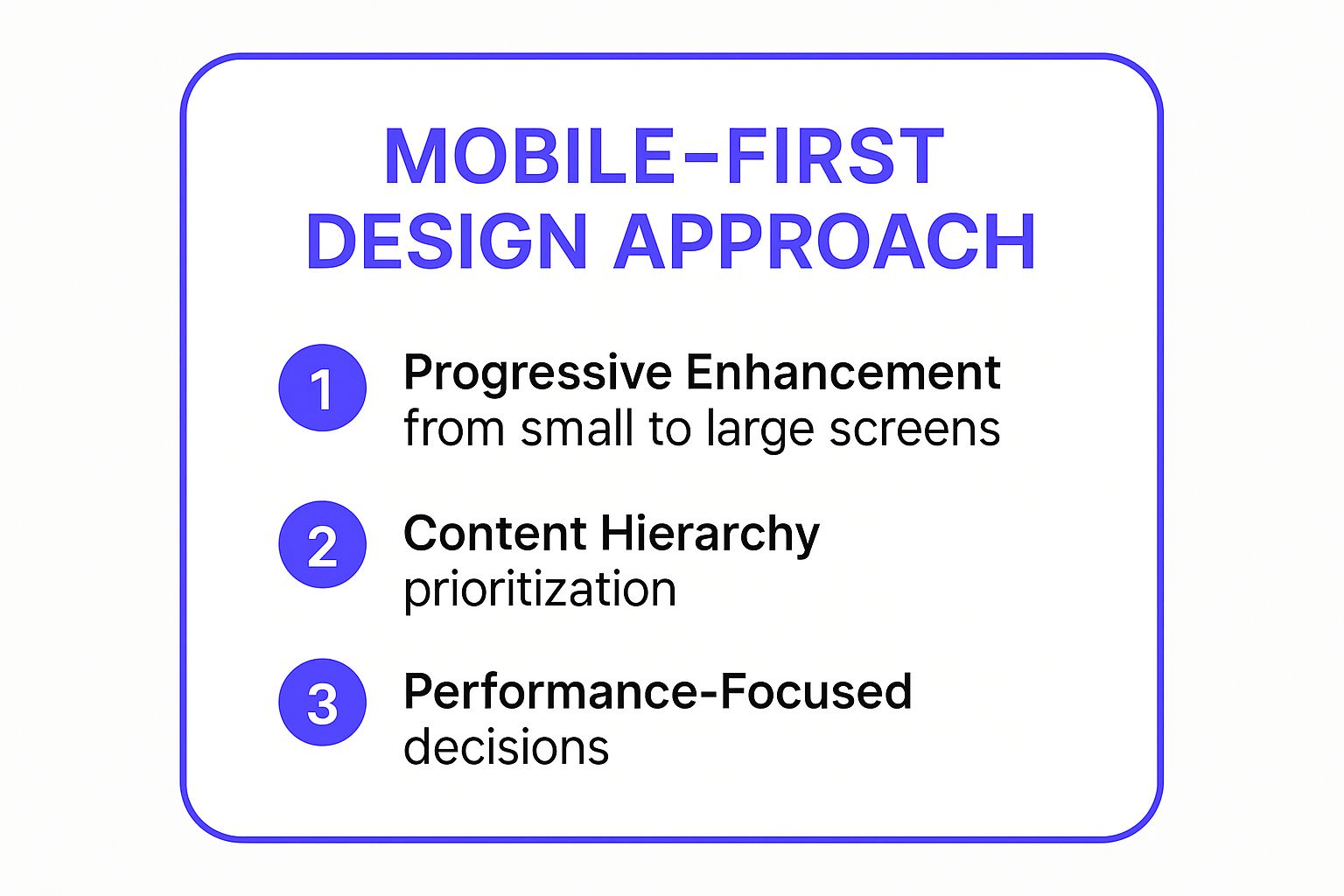
This visual highlights how starting small forces a focus on content, performance, and a layered user experience. By building upon this solid mobile foundation, you can then progressively enhance the design for tablets and desktops, adding features and complexity that are appropriate for larger viewports and more powerful devices. This structured approach prevents the common issue of cluttered mobile layouts and slow performance that often results from a desktop-down design process.
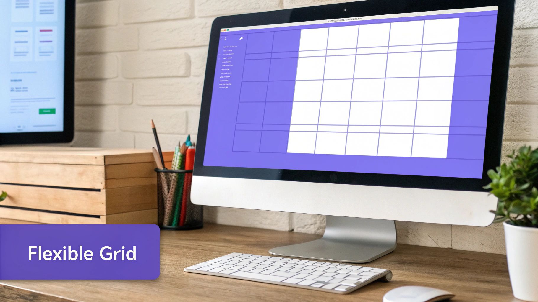
2. Flexible Grid Systems
At the core of any responsive layout is a flexible grid system. This foundational concept, popularized by frameworks like Bootstrap and championed by web pioneers like Ethan Marcotte, moves away from rigid, pixel-based layouts. Instead, it utilizes relative units such as percentages, viewport units (vw/vh), and flexible container properties like CSS Flexbox and Grid to create a fluid structure that adapts seamlessly across different screen sizes.
This system works by dividing the page into a series of columns (often 12) and rows, allowing content to reflow and resize in a predictable, organized manner. Instead of a layout "breaking" at certain sizes, it gracefully adjusts, ensuring content remains legible and accessible regardless of the device.
Why It's a Top Practice
Using a flexible grid is one of the most fundamental responsive design best practices because it provides the structural integrity for your entire design. It ensures visual consistency and alignment across all viewports, preventing the common problem of overlapping elements or awkward spacing on different devices. Modern CSS technologies have made grid implementation more powerful than ever. CSS Flexbox is perfect for arranging items in a single dimension (like a row of cards or a navigation bar), while CSS Grid excels at managing complex, two-dimensional layouts for entire page structures.
For Elementor users, this is directly applicable. The page builder's section and column system is built upon these principles. You can easily adjust column widths using percentages for different devices (desktop, tablet, and mobile) directly within the editor. Leveraging this native functionality ensures your designs are inherently fluid. A well-implemented flexible grid not only improves the user experience by creating a predictable and orderly layout but also simplifies the development and maintenance process, as the layout logic is consistent and scalable.
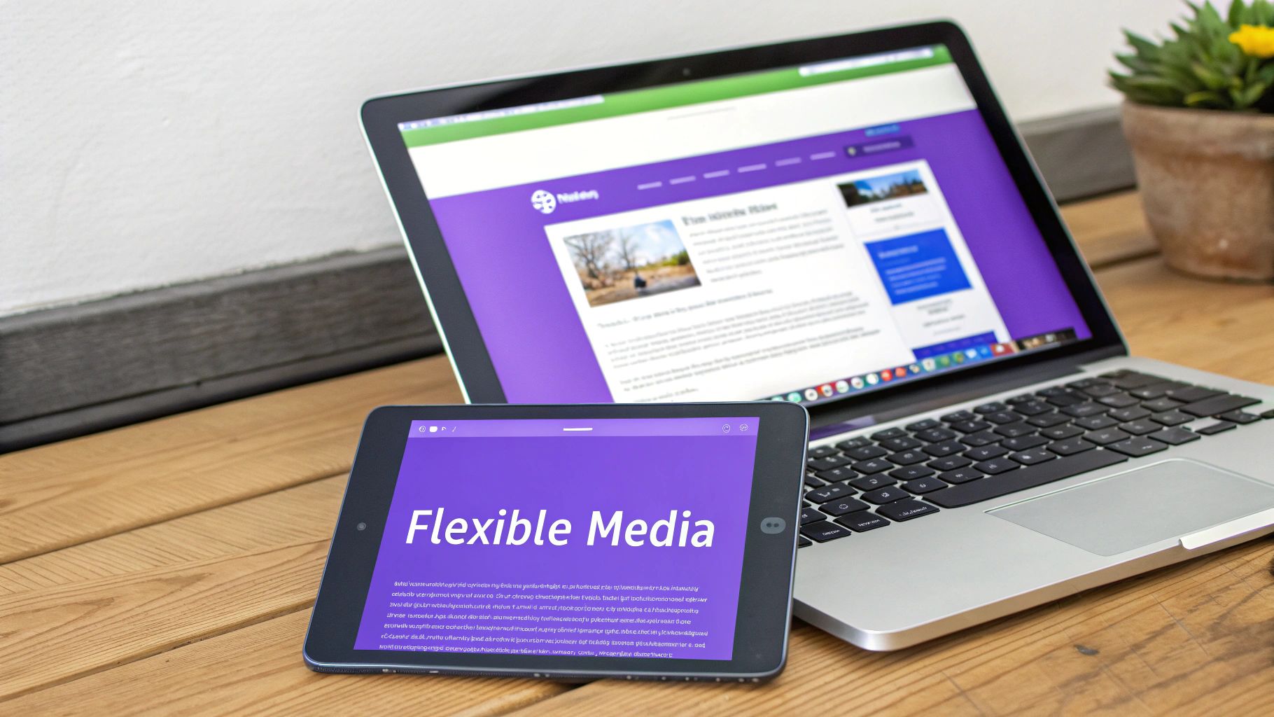
3. Flexible Images and Media
Static, fixed-width images and media are one of the biggest roadblocks to a truly fluid user experience. Flexible media is a foundational technique that ensures images, videos, and iframes scale gracefully within their containing elements, preventing them from breaking the layout on different screen sizes. Instead of assigning a rigid pixel width, you define rules that allow media to shrink and grow with the viewport, maintaining aspect ratios and visual integrity.
This approach is crucial for performance and aesthetics. It prevents horizontal scrolling caused by oversized images on small screens and ensures visual content looks sharp and correctly proportioned on every device, from a narrow mobile phone to a wide-screen desktop monitor. By combining simple CSS rules with modern HTML attributes, you can deliver an optimized media experience for every user.
Why It's a Top Practice
Implementing flexible images is one of the most essential responsive design best practices because visual content is often the heaviest part of a webpage. Unoptimized media can drastically slow down page load times, especially on mobile networks, leading to a poor user experience and higher bounce rates. Sites like Netflix, with its adaptive video thumbnails, and Unsplash, which serves dynamically resized images, showcase how fluid media can create a seamless and performant interface.
This practice goes beyond simple scaling and directly impacts your site's core web vitals. By using modern techniques, you can improve loading performance and visual stability. The key is to serve the right image for the right context:
- Start with a Baseline: Use
max-width: 100%;andheight: auto;on images to ensure they never overflow their containers. This is the simplest and most effective first step. - Implement Resolution Switching: Use the
srcsetattribute to provide the browser with multiple image sizes. The browser will then select the most appropriate one based on the device's screen resolution and viewport size, saving bandwidth. - Use the
<picture>Element: For art direction, where you need to show a different crop or an entirely different image on mobile versus desktop, the<picture>element provides explicit control. - Embrace Modern Formats: Convert images to next-gen formats like WebP or AVIF for superior compression and quality, significantly reducing file sizes.
- Leverage Lazy Loading: For images below the fold, implement lazy loading to defer their download until the user scrolls them into view. This simple attribute (
loading="lazy") dramatically improves initial page load speed.
4. CSS Media Queries
Media queries are the cornerstone of responsive design, acting as conditional logic within your CSS. Popularized by pioneers like Ethan Marcotte and standardized by the W3C, this powerful technique allows you to apply specific styles only when certain conditions are met, such as the viewport's width, height, orientation, or resolution. This is what enables a layout to fundamentally transform across different devices. Instead of a one-size-fits-all design, media queries create adaptive layouts that are optimized for each context.
At their core, media queries are simple if statements for your stylesheets. For example, a rule can be set to apply a two-column layout only if the screen width is greater than 768 pixels. Below that "breakpoint," a single-column layout might be used instead. This ensures content remains legible and accessible, regardless of the device, from a small smartphone to a large desktop monitor. Sites like BBC News and Twitter masterfully use media queries to adjust their complex layouts and navigation systems across devices.
Why It's a Top Practice
Mastering media queries is fundamental to implementing effective responsive design best practices because they provide the direct mechanism for adaptation. They empower you to move beyond fluid grids and flexible images, allowing for complete structural changes at key breakpoints. This granular control is essential for optimizing the user experience, ensuring that elements like navigation, typography, and spacing are perfectly tailored to the viewing environment. Proper use of media queries prevents common responsive issues like awkward text wrapping, oversized images, or inaccessible interactive elements on smaller screens.
For Elementor users, this is handled intuitively through the Responsive Mode controls, but understanding the underlying CSS principles is crucial. Here are some actionable tips:
- Establish Key Breakpoints: Start with common device breakpoints (e.g., 480px for small mobile, 768px for tablets, 1024px for small desktops) but always test and adjust them based on your specific content.
- Design for Ranges: Use
min-widthandmax-widthtogether to target specific screen size ranges, preventing styles from unintentionally cascading. - Use Relative Units: Consider using
emorremunits for your breakpoints. This allows the layout to adapt not just to screen size but also to the user's default font size settings, improving accessibility. - Think Beyond Width: Remember that media queries can also target device orientation (
portraitvs.landscape) and even resolution, allowing for high-DPI (Retina) image optimization.
5. Touch-Friendly Interface Design
Effective responsive design extends beyond how elements reflow on different screens; it must fundamentally consider how users interact with those screens. Touch-friendly interface design focuses on creating experiences optimized for human fingers on touch devices, a principle heavily emphasized by pioneers like Apple's Human Interface Guidelines and Google's Material Design. This means moving away from the pixel-perfect precision of a mouse cursor and designing for the less precise, larger surface area of a fingertip.
This approach involves meticulously planning the size, spacing, and feedback of all interactive elements. From buttons and links to sliders and navigation menus, every component must be easy and comfortable to tap without accidentally hitting an adjacent element. It's about acknowledging the physical reality of mobile and tablet usage, ensuring that the interface is not just visually appealing but also ergonomically sound and frustration-free for users on the go.
Why It's a Top Practice
Prioritizing a touch-friendly interface is one of the most crucial responsive design best practices because it directly impacts usability and user satisfaction on the dominant platform: mobile. A design that ignores touch ergonomics can lead to high bounce rates and user abandonment due to interaction errors and frustration. Well-sized touch targets, for instance, are not just a convenience; they are an accessibility requirement. Ensuring your design is easy to navigate by touch can significantly improve the user experience for everyone, including those with motor impairments. For more details on this topic, review this comprehensive website accessibility checklist.
Implementing these principles ensures your Elementor site is a pleasure to use, not a challenge.
- Minimum Target Size: Aim for a minimum touch target size of 44×44 pixels for all interactive elements, like buttons and icons, to accommodate the average fingertip.
- Sufficient Spacing: Provide at least 8 pixels of space between touch targets to prevent accidental taps, a common source of user frustration.
- Visual Feedback: Implement clear visual cues, such as a change in color or scale, when an element is tapped. This provides immediate confirmation that the interaction was successful.
- Consider Thumb Zones: Design mobile layouts with an understanding of the "thumb zone," placing primary actions within easy reach for one-handed use, as researched by Steven Hoober.
6. Performance Optimization
A responsive design is only as effective as it is fast. Performance optimization is the critical practice of ensuring your website loads quickly and runs smoothly across all devices, regardless of network conditions or processing power. It involves a suite of techniques aimed at reducing the amount of data transferred and minimizing the browser's workload, from compressing images to streamlining code execution.
This process ensures that the user experience is not just visually consistent but also functionally efficient. A slow-loading site on a 3G connection is a failed responsive design, even if the layout is perfect. Prioritizing performance means focusing on delivering the most critical content to the user as quickly as possible, a principle championed by web performance pioneers like Steve Souders and the Google PageSpeed team. For instance, Amazon's progressive loading techniques deliver a usable page almost instantly, loading lower-priority elements in the background.
Why It's a Top Practice
Optimizing for speed is one of the most crucial responsive design best practices because it directly impacts user retention, conversion rates, and SEO. Mobile users are notoriously impatient; studies show that even a one-second delay can significantly increase bounce rates. A fast-loading, responsive site provides a superior user experience, which Google rewards with higher search rankings. This practice ensures your carefully crafted design is actually seen by users before they lose patience and navigate away.
Implementing performance strategies like image optimization, code minification, and efficient loading ensures that your site is accessible and usable for everyone. By enabling compression and minimizing JavaScript execution, you reduce the strain on the user's device and data plan. This focus on efficiency is a cornerstone of a user-centric design philosophy. To dive deeper into the specific techniques you can implement with Elementor, explore our comprehensive guide on website performance optimization tips.
7. Progressive Enhancement
Progressive enhancement is a powerful web design strategy that stands as a counterpart to graceful degradation. It flips the development process by starting with a core, baseline experience that works for all users, regardless of browser or device capabilities. This foundational layer provides essential content and functionality. From there, more advanced features and richer experiences are layered on top for browsers and devices that can support them, such as complex animations or JavaScript-driven interactions.
This approach, popularized by web standards advocates like Jeremy Keith and Aaron Gustafson, ensures that your website is universally accessible and functional. A prime example is GOV.UK, which ensures its core services are accessible even on older devices or with JavaScript disabled. The core content remains available, and enhancements are only applied when the user's environment can handle them, guaranteeing a robust and inclusive user experience for everyone.
Why It's a Top Practice
Adopting progressive enhancement is one of the most resilient responsive design best practices because it builds a more durable and accessible web experience from the ground up. It ensures that critical content and functionality are never locked behind a technology that a user might not have, whether due to a slow network, an older device, or assistive technology. This directly improves accessibility and reach.
This methodology also promotes cleaner, more modular code. By separating content (HTML), presentation (CSS), and behavior (JavaScript) into distinct layers, you create a more maintainable and future-proof website. The core experience is solid, and as new technologies emerge, you can add new enhancement layers without breaking the foundation. This layered approach ensures that your website provides the best possible experience for each user's specific context, making it a truly responsive and user-centric strategy.
8. Consistent Navigation Patterns
Navigation serves as the roadmap for your website, and its consistency across different devices is paramount for a seamless user journey. A consistent navigation pattern means that while the visual presentation may adapt, the core structure, terminology, and location remain predictable. For example, a full horizontal navigation bar on a desktop might collapse into a well-organized "hamburger" menu on mobile, but the menu items, their order, and their labels stay the same.
This strategy, championed by usability experts at the Nielsen Norman Group, is about building a reliable mental model for the user. When a visitor understands how to navigate your site on one device, they should be able to apply that knowledge intuitively on any other device. This predictability reduces cognitive load, prevents frustration, and allows users to find the information they need quickly and efficiently, regardless of their screen size.
Why It's a Top Practice
Maintaining navigation consistency is one of the most crucial responsive design best practices because it directly impacts usability and user retention. An inconsistent experience, where links disappear or are rearranged between viewports, can disorient and frustrate users, often leading them to abandon your site. Consistent patterns ensure that your site feels like a single, cohesive entity rather than a collection of separate, disjointed experiences.
In Elementor, achieving this is straightforward. You can design your primary navigation using the Nav Menu widget and then fine-tune its mobile appearance using the responsive controls. For instance, you can set a specific breakpoint where the menu collapses into a hamburger icon. The key is to ensure that the menu items and structure within that collapsed mobile menu perfectly mirror the desktop version. This approach creates a trustworthy and professional user experience that builds confidence and encourages exploration.
9. Flexible Typography
Responsive design extends beyond layout and images; it deeply influences how users read and interact with your text. Flexible typography is the practice of creating a typographic system that scales appropriately across different screen sizes. Instead of fixed pixel values, this approach uses relative units and modern CSS techniques to ensure text remains readable, maintains its intended hierarchy, and feels aesthetically balanced on any device.
This method, championed by typography experts like Tim Brown and Jason Pamental, moves away from static font sizes. It treats typography as a fluid element that adapts to the viewport. For Elementor users, this means configuring global font settings to use relative units like rem or em, and leveraging custom CSS for advanced techniques like the clamp() function. The goal is to provide a seamless reading experience, whether on a small smartphone or a large desktop monitor.
Why It's a Top Practice
Implementing flexible typography is one of the most crucial responsive design best practices because it directly impacts readability and user experience. Text that is too small on mobile is a common frustration, while text that is too large on a desktop can disrupt the visual flow. A fluid system prevents these issues, ensuring your content is always accessible and easy to consume, which can reduce bounce rates and increase engagement.
Properly scaled typography also reinforces your design's visual hierarchy across all breakpoints. Headings, subheadings, and body text maintain their relative importance, guiding the user's eye effectively regardless of screen size. This approach is fundamental to creating a professional, polished, and user-centric design that feels intentional on every device. By ensuring text scales smoothly, you build a more inclusive and accessible web experience that respects user preferences, such as browser zoom settings.
10. Content Strategy and Prioritization
Responsive design is more than just rearranging visual elements; it's about delivering the right content at the right time. A robust content strategy, a concept championed by experts like Karen McGrane and Kristina Halvorson, is the bedrock of this principle. It involves strategically organizing and presenting information based on user needs and device constraints, ensuring the most critical content is always easily accessible. Instead of simply shrinking content to fit a smaller screen, this approach demands you rethink its hierarchy and delivery.
This methodology forces you to ask critical questions: What is the primary goal of a user on a mobile device versus a desktop? What information is essential for them to complete that goal? For example, Amazon’s mobile product pages prioritize the "Add to Cart" button and core product images, while detailed specifications and customer reviews are placed further down, accessible via a tap. This ensures the primary action is frictionless on a small screen.
Why It's a Top Practice
Effective content prioritization is one of the most crucial responsive design best practices because it directly impacts usability and conversion rates. By aligning your content with user intent on different devices, you create a more intuitive and efficient experience. A mobile user looking for a store's location needs the address and hours immediately, not a lengthy "About Us" section. This focus on task completion reduces friction and user frustration, leading to better engagement and outcomes.
This approach also significantly improves performance. By loading only the most essential content initially and using progressive disclosure for secondary information, you reduce page weight and decrease load times on mobile networks. As you plan your content, consider how you can create engaging content that is both compelling and optimized for various viewports. This ensures your message is not lost in a cluttered interface, but is instead presented clearly and effectively, regardless of screen size.
Responsive Design Best Practices Comparison
| Item | Implementation Complexity 🔄 | Resource Requirements ⚡ | Expected Outcomes 📊 | Ideal Use Cases 💡 | Key Advantages ⭐ |
|---|---|---|---|---|---|
| Mobile-First Design Approach | Moderate – requires mindset shift | Moderate – planning, testing on devices | Optimized mobile UX, better SEO, performance | Projects prioritizing mobile users, SEO-focused sites | Performance-focused, content prioritization |
| Flexible Grid Systems | High – complex layouts and testing | Moderate – CSS Grid/Flexbox mastery | Fluid layouts adapting seamlessly | Responsive layouts needing flexible column control | Future-proof, reduces breakpoints |
| Flexible Images and Media | Moderate – multiple assets, setup overhead | Moderate – asset management, techniques | Improved media scaling and load performance | Sites with heavy media requiring responsive image handling | Bandwidth savings, enhanced UX |
| CSS Media Queries | Moderate – managing many breakpoints | Low – CSS expertise | Precise style adaptation by device | Broad responsive design, targeting diverse devices | Powerful, widely supported, granular control |
| Touch-Friendly Interface Design | Moderate – UI redesign with gestures | Moderate – design and development | Better usability for touch devices | Mobile/tablet apps and touch-first interfaces | Accessibility, user engagement |
| Performance Optimization | High – ongoing, requires expertise | High – specialized tools and monitoring | Faster load times, better engagement, SEO | All high-traffic or resource-sensitive websites | SEO improvement, reduced bounce |
| Progressive Enhancement | High – multi-layer development | High – layered coding and testing | Universal accessibility with enhanced features | Accessibility-first projects, broad device/browser support | Robust, future-proof, reliable |
| Consistent Navigation Patterns | Moderate to High – complex for multi-level | Moderate – design + JS for interaction | Intuitive, consistent navigation across devices | Multi-device applications needing easy navigation | User experience consistency, accessibility |
| Flexible Typography | Moderate – fluid scaling with calculations | Low to Moderate – CSS knowledge | Improved readability and hierarchy across devices | Content-heavy sites prioritizing readability | Accessibility-friendly, visually consistent |
| Content Strategy and Prioritization | High – requires research and content planning | High – user research and editing | Enhanced user task completion and engagement | Content-driven projects needing prioritization and context adaptation | Clear communication, mobile optimization |
Bringing It All Together: Your Next Steps to Responsive Mastery
We've journeyed through ten foundational responsive design best practices, each a critical pillar in constructing websites that excel in our multi-device world. From the strategic paradigm shift of a mobile-first approach to the nuanced control offered by CSS media queries, these principles are more than just a checklist; they form a cohesive philosophy for modern web development. You now have a blueprint for creating fluid, adaptable, and user-centric experiences that look and function flawlessly, whether on a 4-inch smartphone or a 4K desktop monitor.
The true power of these concepts is realized when they are applied in concert. A flexible grid system is incomplete without flexible images and scalable typography. A touch-friendly interface loses its impact if performance is sluggish. This interconnectedness is central to mastering responsive design. It’s about building a holistic system where every element, from navigation patterns to content hierarchy, intelligently adapts to its environment.
From Theory to Tangible Results
Understanding these principles is the first step, but implementation is where true mastery is forged. The combination of Elementor’s native responsive controls and the specialized widgets within Exclusive Addons provides an unparalleled sandbox for you to put this knowledge into practice. You have the tools to not just make a site work on mobile, but to make it shine.
Remember, the goal is not merely to avoid broken layouts. The goal is to deliver an optimal experience tailored to the user's context. A visitor on a mobile device is often on the go, needing quick access to key information. A desktop user may be in a more exploratory mode. Your responsive design choices, guided by a solid content strategy, should reflect this understanding, ensuring your site is not just functional but also empathetic to user needs.
Actionable Next Steps on Your Responsive Journey
To transition from learning to doing, we recommend a focused approach. Don't feel pressured to implement all ten practices on a single project overnight. Instead, build your skills incrementally.
Here’s a practical roadmap to get you started:
- Audit an Existing Project: Choose one of your current Elementor sites. Use your browser's developer tools and real mobile devices to critically assess its responsiveness. Where does it fail? Where could it be improved? Use this listicle as your guide to identify specific areas for enhancement, like optimizing image file sizes or refining tap targets.
- Commit to Mobile-First: For your very next project, force yourself to design the mobile layout first. This will fundamentally change how you approach content prioritization and layout structure, often leading to a cleaner, more focused final product across all breakpoints.
- Experiment with Advanced Controls: Dive into the advanced responsive settings within Elementor and Exclusive Addons. Practice hiding or showing specific sections or widgets on different devices. Create a test page and see how you can use these controls to craft a truly unique experience for tablet users versus mobile users.
- Prioritize Performance Testing: Make performance optimization a non-negotiable part of your workflow. Use tools like Google PageSpeed Insights and GTmetrix to analyze your site's speed on mobile connections. Focus on image compression and minimizing requests, as these have a significant impact on mobile user experience.
By consistently applying and refining these responsive design best practices, you elevate your work from simply building websites to crafting seamless digital experiences. This commitment not only delights users and improves engagement but also strengthens your reputation as a skilled, forward-thinking developer or designer in a competitive landscape.
Ready to supercharge your responsive workflow? Exclusive Addons provides over 100 highly customizable widgets and extensions for Elementor, many with advanced responsive controls built-in to help you implement these best practices with ease. Unlock your creative potential and build truly remarkable, device-agnostic websites by exploring the toolkit at Exclusive Addons today.