
Improving your website's conversion rate isn't about some massive, expensive overhaul. Honestly, it usually boils down to making a bunch of small, smart tweaks that remove friction for your visitors. It all starts with getting a handle on what a realistic conversion goal even looks like for your industry, and then you can get to work optimizing things like your site speed, call-to-action clarity, and checkout flow.
Setting the Stage for Higher Conversions
Before you can seriously start improving your website's conversion rates, you've got to establish a solid baseline. It's so easy to just chase an arbitrary number, but a "good" conversion rate isn't a one-size-fits-all metric. It’s a moving target, influenced by your industry, where your traffic comes from, and even the device your visitors are using.
Understanding Industry Benchmarks
What works for a beauty brand probably won't fly for a B2B software company. You need to know your playing field.
For instance, average eCommerce conversion rates typically hover somewhere between 2% and 4%. But even within that range, there are huge performance gaps. If your store is converting above 3.2%, you're already in the top 20% of performers. Hit 4.7%, and you're in the top 10%.
This entire process of analyzing and improving is what we call Conversion Rate Optimization (CRO). Think of it as the science of turning casual window shoppers into committed buyers. It’s not about grand redesigns. It's about making focused, data-driven improvements like:
- Boosting Site Speed: Every single second of delay costs you potential customers.
- Clarifying Your Call to Action (CTA): Is it painfully obvious what you want users to do next?
- Simplifying the Checkout Flow: Are you asking for their life story when all you need is a shipping address?
To give you a clearer picture, here’s a quick look at some key benchmarks to help you set realistic goals.
eCommerce Conversion Rate Benchmarks
A summary of key conversion rate statistics to help you set realistic performance goals for your website.
| Performance Tier | Required Conversion Rate | Industry Example (Avg. Rate) |
|---|---|---|
| Average | 2.0% – 2.5% | Beauty & Skincare (3.0%) |
| Good (Top 20%) | > 3.2% | Food & Beverage (3.1%) |
| Excellent (Top 10%) | > 4.7% | B2B SaaS (Varies widely, 3-5% avg) |
Remember, these are just averages. Your own numbers will depend on your specific niche, audience, and marketing efforts. Use them as a starting point, not a final destination.
The heart of CRO is just removing roadblocks. Your job is to create the smoothest possible path from the moment someone lands on your site to the second they complete a purchase. Every obstacle, no matter how tiny, is a potential exit point.
Ultimately, all marketing efforts—including the practical strategies for acquiring new clients—circle back to improving these conversion numbers. By focusing on the user experience, you don't just boost one-time sales; you build a loyal customer base that keeps coming back. The strategies we're about to cover will give you practical, Elementor-based solutions to make that happen.
Closing the Gap Between Desktop and Mobile UX
A killer user experience isn't a "nice to have"—it's everything. But here’s something I see all the time: a design that looks incredible on a big desktop monitor completely falls apart on a smartphone. It's a classic mistake, and it's a major reason why so many sites have terrible mobile conversion rates, even when most of their traffic is coming from phones.
The numbers don't lie. They paint a really clear picture of this performance gap.

Globally, the device someone uses has a massive impact on whether they buy something. Desktop users are still converting at an average rate of 4.8%. That’s almost double the rate for mobile users, who only convert around 2.9%. This gap is a huge sign that just having a "mobile-friendly" site isn't cutting it anymore. The experience has to be truly optimized from the ground up. If you want to dig into the data, these global conversion rate insights from Statista.com are pretty eye-opening.
To fix this, you have to adopt a mobile-first mindset, especially when you're working with a powerful tool like Elementor. This just means you design for the smallest screen first and then scale your design up. It forces you to build a seamless core experience for the biggest chunk of your audience right from the start.
Adopting a Mobile-First Design Philosophy
Going mobile-first isn't just a trend; it's a practical strategy that forces you to prioritize what's actually important. On a tiny screen, you have zero room for clutter or confusing navigation. Every single element has to have a purpose and push the user toward that conversion goal.
Here are a few mobile-first principles you can put into practice with Elementor right now:
- Think Thumb-Friendly: How do people actually hold their phones? The most important interactive elements—like "Add to Cart" buttons or menu links—need to be within easy reach of a thumb. That usually means placing them in the center or lower half of the screen.
- Use Collapsible Menus and Accordions: Long, sprawling menus or huge blocks of text are a nightmare on mobile. Use Elementor's Accordion and Toggle widgets to neatly tuck away things like FAQs or detailed product specs. Let users expand content only when they need it.
- Master Responsive Controls: Elementor’s responsive settings are your secret weapon. You can hide heavy, non-essential desktop elements on mobile, reverse the order of columns to make sure the most important info is at the top, and tweak padding and margins specifically for phone and tablet views.
The goal isn't just to make your desktop site fit on a smaller screen. It's to create an experience that feels intentionally designed for that screen—intuitive, fast, and completely frictionless.
Leveraging Elementor's Responsive Features
Beyond the basic layout, Elementor gives you some really granular tools to fine-tune the mobile journey. For instance, you can set completely different font sizes for your headings on mobile to make them more readable without messing up the desktop version. Another pro tip is to swap out those huge, high-res hero images for smaller, optimized versions that load way faster on a spotty mobile connection.
When you use these features thoughtfully, you're moving past simple responsiveness. You're actually building a mobile experience that feels natural and effortless, directly tackling the usability problems that cause those conversion rates to lag. This kind of targeted optimization is one of the most effective things you can do to close that conversion gap and finally capitalize on all that mobile traffic you're getting.
Pinpoint Your Most Valuable Traffic Channels
One of the hardest truths to learn in this game is that not all traffic is created equal. I’ve seen people pour their entire budget into channels that bring in thousands of casual browsers, only to end up with a handful of sales. It’s a fast track to disappointment.
A much smarter approach? Figure out where your motivated buyers are coming from and double down on those sources.
Think about it this way: if you knew one specific doorway led to your most profitable customers, wouldn't you polish the handle and roll out the welcome mat? That’s exactly what we’re doing by analyzing traffic channels.

Go Where the Conversions Are
When you look at the data, there's a clear winner in the conversion game: email marketing. While organic search brings in steady volume and paid ads deliver targeted clicks, neither typically comes close to the performance of a well-nurtured email list.
Why is that? Well, people on your email list have already raised their hands and said, "I'm interested." You're speaking directly to a warm audience. The numbers don't lie—email marketing boasts an average conversion rate of around 10.3%.
Even a simple tactic like a 'back-in-stock' notification can pull in conversion rates of about 7.28% on its own. For comparison, organic search usually sits between 2% to 4%, and paid search averages 2% to 3%. You can explore more of these eCommerce conversion benchmarks on convertcart.com to see how different channels stack up.
This doesn't mean you should abandon search traffic. Not at all. It just means you need to tailor the user experience to match where they're coming from and what they expect.
The key is message matching. The journey from the ad, email, or social post to your landing page should feel like one seamless conversation, not a jarring handoff.
Customize Landing Pages With Elementor
This is where Elementor really shines. It makes creating unique landing pages for each of your traffic channels incredibly simple. You can perfectly align your page's headline, copy, and visuals with the source that sent the visitor, which builds trust and reduces friction instantly.
Here are a couple of practical ways you can apply this:
- For Paid Search Ads: If your ad promises a "50% Off Spring Sale," your landing page's main headline should shout that exact offer right back at them. Use Elementor to build a dedicated page featuring only sale items, and then drop in a countdown timer from Exclusive Addons to crank up the urgency.
- For Email Marketing Campaigns: Sending out a "back-in-stock" alert? Link them directly to that specific product page. Don't make them hunt for it. You can even use Elementor's pop-up builder to offer a small, exclusive discount for subscribers who click through, making them feel like valued insiders.
By creating these tailored experiences, you guide each visitor segment toward a conversion far more effectively. For a deeper look into this, check out our guide on conversion optimization best practices for more advanced techniques. This channel-specific approach is a powerful way to focus your efforts where they'll make the biggest difference to your bottom line.
Designing Calls to Action That Actually Work
Your Call to Action, or CTA, is the single most important element on any page. Think of it as the final handshake—the moment you ask your visitor to take that next step. A weak, uninspired CTA is like fumbling the ball just yards from the goal line. All the hard work you put into getting them there goes to waste.
So many sites still fall back on bland, generic buttons like "Submit" or "Click Here." Let's be honest, those words are passive and communicate zero value. If you really want to improve your website's conversion rates, your CTAs need to be compelling, crystal clear, and visually impossible to ignore.
Crafting Action-Oriented CTA Copy
The words on your button matter more than you think. They need to be action-oriented and tell the user exactly what they'll get by clicking. Instead of a vague command, promise a specific, desirable outcome. This small shift in perspective can make a massive difference.
- Instead of "Submit," try "Get My Free Quote Now."
- Instead of "Download," use "Send Me the eBook."
- Instead of "Sign Up," go for "Create My Account."
See the pattern? This approach often uses first-person language ("My") which helps the user take ownership of the action. It feels more personal and directly connected to their goal, giving them that final nudge forward.
A great CTA answers the user's silent question: "What's in it for me?" It should complete the sentence, "I want to ______." If your button text fills in that blank perfectly, you're on the right track.
Making Your CTAs Stand Out Visually
Once you've nailed the copy, the design has to grab their attention. A CTA that blends into the background is as good as invisible. It’s all about using color and contrast to make it pop, and Elementor’s button widget gives you total control over this.
A simple rule of thumb is to use a color for your button that contrasts with your page's main color scheme but still feels complementary. For instance, on a website with a lot of blues and grays, a bright orange or yellow button will naturally draw the eye without clashing. This visual pop guides the user's focus right where you want it: on the action.
Placement is just as critical. Your primary CTA should always live "above the fold" so visitors see it without having to scroll. For longer pages, it’s a smart move to repeat the CTA at different points—that way, it’s always accessible the moment a user decides they're ready to act. You can build some stunning, high-converting buttons with the versatile Elementor Call to Action widget from Exclusive Addons, which opens up a ton of advanced styling options.
When you combine urgent copy with strategic design, you transform a simple button into a powerful conversion machine.
Building a Frictionless Checkout Experience
Getting a customer to the checkout page is a huge win, but let's be real—it’s not the finish line. This is the final, most critical step, and it's precisely where a massive number of sales are lost. The biggest culprit? A clunky, confusing, or demanding checkout process.
We call this friction. Every unnecessary field, surprise cost, or moment of doubt is an exit ramp for your customer.
The numbers are staggering. A huge percentage of users who add an item to their cart will bail before paying. The top reason is almost always unexpected costs (like that surprise shipping fee), but a close second is being forced to create an account. People want speed and simplicity, not another password to remember. Your job is to make paying you the easiest thing they do all day.
Just look at what happens when you remove a single unnecessary step from the checkout flow.
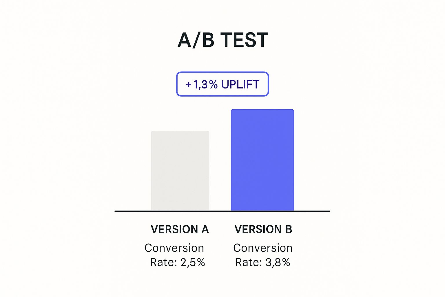
The data doesn't lie. That small simplification resulted in a significant 1.3% conversion rate uplift, turning more browsers into buyers.
Eliminating Common Friction Points
Your first task is to hunt down and eliminate these conversion killers. When you're building with Elementor and WooCommerce, you have a ton of control over the checkout experience. I've seen these same issues trip up countless online stores, so start by looking for them on your own site.
A checkout page is a minefield of potential friction points. Small annoyances can quickly add up to a lost sale. Here’s a quick breakdown of common problems and how you can tackle them using Elementor and its addons.
Checkout Friction Points and Solutions
| Friction Point | Why It Hurts Conversions | Elementor-Based Solution |
|---|---|---|
| Forced Account Creation | It's a major roadblock for new customers who just want a quick purchase. It feels like a commitment they aren't ready for. | Always enable Guest Checkout in WooCommerce settings. You can later offer an option to create an account from their order details page, which feels much less aggressive. |
| Surprise Shipping & Taxes | Nobody likes a nasty surprise right before they enter their credit card details. It breaks trust and is the #1 reason for cart abandonment. | Use a shipping calculator widget on the cart page or early in the checkout process. Be transparent about all costs upfront. |
| Long, Complicated Forms | Asking for too much information makes the process feel like a chore. Every field is another chance for the customer to second-guess their purchase. | Customize your checkout fields. Do you really need a phone number for a digital download? Remove non-essential fields to keep it lean. |
| Lack of Payment Options | Customers have their preferred, trusted payment methods. If you don't offer theirs (like PayPal or Apple Pay), they might not bother finding their credit card. | Integrate multiple payment gateways. Use Elementor widgets to display logos of accepted payments (Visa, PayPal, etc.) to build confidence. |
By addressing these common issues, you're already miles ahead of the competition. Think of it as clearing the runway for a smooth takeoff.
Building Trust Through The Final Steps
As users get ready to enter their payment details, their sensitivity to trust and security skyrockets. This is where you need to go the extra mile to reassure them. You can easily add these elements with Elementor:
- Show Them the Way: A multi-step checkout with a visual progress bar (e.g., Shipping > Payment > Confirm) is a game-changer. It breaks the process into manageable chunks, reduces overwhelm, and shows users exactly where they are and how close they are to finishing.
- Flash the Security Badges: Displaying trust seals like SSL certificates and accepted payment logos (Visa, Mastercard, PayPal) right near the payment fields is a powerful visual cue. It reinforces that their information is safe and the transaction is secure.
- Offer Helpful Error Messages: Nothing is more frustrating than a generic "error" message. If a field is filled out incorrectly, use clear, friendly guidance to explain exactly what needs to be fixed. For example, "Please enter a valid 5-digit zip code."
By focusing on these details, you transform your checkout from a leaky bucket into a streamlined funnel. For a full walkthrough, you can learn how to customize the WooCommerce checkout page with Elementor and apply these principles directly to your store. This proactive approach turns abandoned carts into completed sales, directly boosting your bottom line.
Nudging Buyers with Social Proof and Urgency
We're all wired to follow the crowd. It’s a basic human instinct. When we’re not sure about a decision, what do we do? We look to see what others are doing. This powerful little quirk of psychology is called social proof, and you can ethically use it on your site to guide visitors toward making a purchase. It’s all about building trust by showing that other people have already bought from you—and are happy they did.
On a similar note, creating a sense of urgency taps directly into the fear of missing out (FOMO). When something is limited by time or quantity, we instinctively see it as more valuable and feel a push to act fast. Marry these two concepts together, and you’ve got a proven recipe for boosting conversion rates.

Putting Urgency into Action with Elementor Addons
With Exclusive Addons for Elementor, you can go way beyond just plopping a static testimonial on a page. The goal is to create dynamic, real-time elements that build genuine momentum. The key here is to make sure the urgency feels authentic, not just like a cheap marketing trick.
For instance, you can use widgets on your product pages to show real-time alerts that create a natural sense of scarcity. I've found these small nudges can have a surprisingly big impact.
Here are a few practical ideas you can implement right away:
- Countdown Timers: Got a limited-time offer? Add a timer to your sale banners or product pages. Seeing that clock tick down makes the value of the deal feel immediate and tangible.
- Low-Stock Alerts: A simple message like "Only 3 left in stock!" is incredibly persuasive. It signals that the item is popular and tells shoppers they need to move quickly or they might miss out for good.
- Sales Pop-ups: Use a notification pop-up to show recent purchases in real-time. Something like, "Someone in New York just bought this item," acts as live social proof, confirming that others are actively buying from your store right now.
The most effective urgency isn't aggressive; it's informative. You're not just creating pressure; you're providing valuable context that helps a customer make a confident and timely decision.
Have Questions? We've Got Answers
Still have a few things rattling around in your head about boosting website conversion rates? You're definitely not the only one. Let's tackle some of the most common questions I hear from marketers and business owners trying to turn more of their traffic into tangible results.
What's a Good Conversion Rate, Anyway?
This is the golden question, isn't it? While you'll often hear that a solid conversion rate is somewhere between 2% and 4% for most eCommerce sites, that number is wildly dependent on your industry. A niche store selling custom fishing lures might blow that average out of the water, while a general electronics retailer could see something lower.
Instead of getting hung up on a universal magic number, you're better off benchmarking against your direct competition. The real heavy hitters in many spaces often see rates well above 4.7%. But honestly, the most important goal is simply to beat your own numbers from last month.
The best conversion rate to aim for is one that's just a little better than what you had before. Focus on those steady, incremental gains. That’s how you win the long game, not by chasing some arbitrary industry average that might not even apply to your business.
How Long Until I Actually See CRO Results?
I get it, you want results yesterday. The honest answer is: it depends. The timeline for seeing a real impact from Conversion Rate Optimization (CRO) comes down to the size of your changes and, crucially, how much traffic your site gets.
Making simple tweaks—like changing a button color from blue to orange or rewriting a headline—could show you a statistically significant winner in an A/B test within a couple of weeks, assuming you have decent traffic. But if you're talking about a massive overhaul, like redesigning your entire checkout process, you could be looking at a few months to properly roll it out, test it, and gather enough data to know what worked.
Patience is key here. The trick is to be methodical. Test one major thing at a time so you can confidently say, "Yes, changing that specific element is what moved the needle."
Should I Focus on Mobile or Desktop First?
This is an easy one. While it's historically true that desktop users convert at a higher rate, the vast majority of website traffic now comes from mobile devices. Period. Thinking "mobile-first" isn't just a trendy buzzword anymore; it's a basic requirement for staying in business.
Your number one priority should be perfecting the experience for the biggest chunk of your audience, and that's almost certainly your mobile visitors. When you nail the user journey on a small screen—making it fast, intuitive, and completely frictionless—you're building a rock-solid foundation that makes the desktop experience better by default.
Ready to put these powerful conversion strategies to work on your Elementor site? Get all the widgets you need to make it happen with Exclusive Addons.