
In a competitive market, driving traffic to your website is only half the battle. The real challenge, and where true growth lies, is in converting those visitors into customers, subscribers, or leads. This is the core function of conversion rate optimization (CRO), the systematic process of enhancing your website to increase the percentage of users who take a desired action. A higher conversion rate means a more efficient marketing funnel, a better return on your ad spend, and a healthier bottom line.
This guide moves beyond surface-level tips to provide a deep dive into actionable conversion optimization best practices. We have curated a comprehensive list of high-impact strategies designed to deliver measurable results for WordPress and Elementor users, from freelancers to digital agencies. You won't find generic advice here; instead, you'll get a detailed playbook covering critical areas that directly influence user decisions.
Prepare to explore the nuances of:
- A/B testing to eliminate guesswork.
- Crafting compelling call-to-action (CTA) buttons that demand a click.
- Implementing social proof to build immediate trust.
- Streamlining forms and checkout processes to reduce friction.
- Optimizing for page speed and mobile-first design.
By implementing these proven techniques, you will be equipped to transform your website from a simple digital brochure into a powerful, high-performance conversion engine. Each practice is a lever you can pull to methodically improve performance, ensuring you not only meet but exceed your business objectives. Let's begin building a website that works harder for you.
1. A/B Testing and Split Testing
At the heart of any effective conversion optimization strategy lies a commitment to data-driven decision-making, and A/B testing is the foundational practice for achieving this. Also known as split testing, this method involves creating two versions of a single asset (like a landing page, email, or call-to-action button) and showing them to different segments of your audience simultaneously. By measuring which version, the control (A) or the variant (B), achieves a higher conversion rate, you can eliminate guesswork and implement changes backed by real user behavior.
This scientific approach is a cornerstone of conversion optimization best practices because it provides empirical evidence of what truly resonates with your audience. It moves your strategy from "I think this will work" to "I know this works."
How to Implement A/B Testing Effectively
Successful A/B testing requires a structured approach to ensure your results are reliable and lead to meaningful improvements.
- Isolate One Variable: To get clear, unambiguous results, change only one element at a time. If you alter the headline, button color, and image all at once, you won't know which change caused the uplift in conversions. Start with high-impact elements like headlines, CTAs, or hero images.
- Run Tests for a Full Business Cycle: Don't end a test after just a few days. User behavior can fluctuate significantly between weekdays and weekends. Running a test for at least one to two full weeks ensures you capture a representative sample of your typical traffic patterns.
- Achieve Statistical Significance: Before declaring a winner, ensure your test has reached statistical significance, typically 95% or higher. This confirms that the result isn't due to random chance. Tools like Google Optimize, VWO, or Optimizely will calculate this for you automatically.
Pro Tip: Document every test, including your hypothesis, the variant details, the results, and your final decision. This creates a valuable internal knowledge base that prevents repeating failed experiments and informs future optimization efforts.
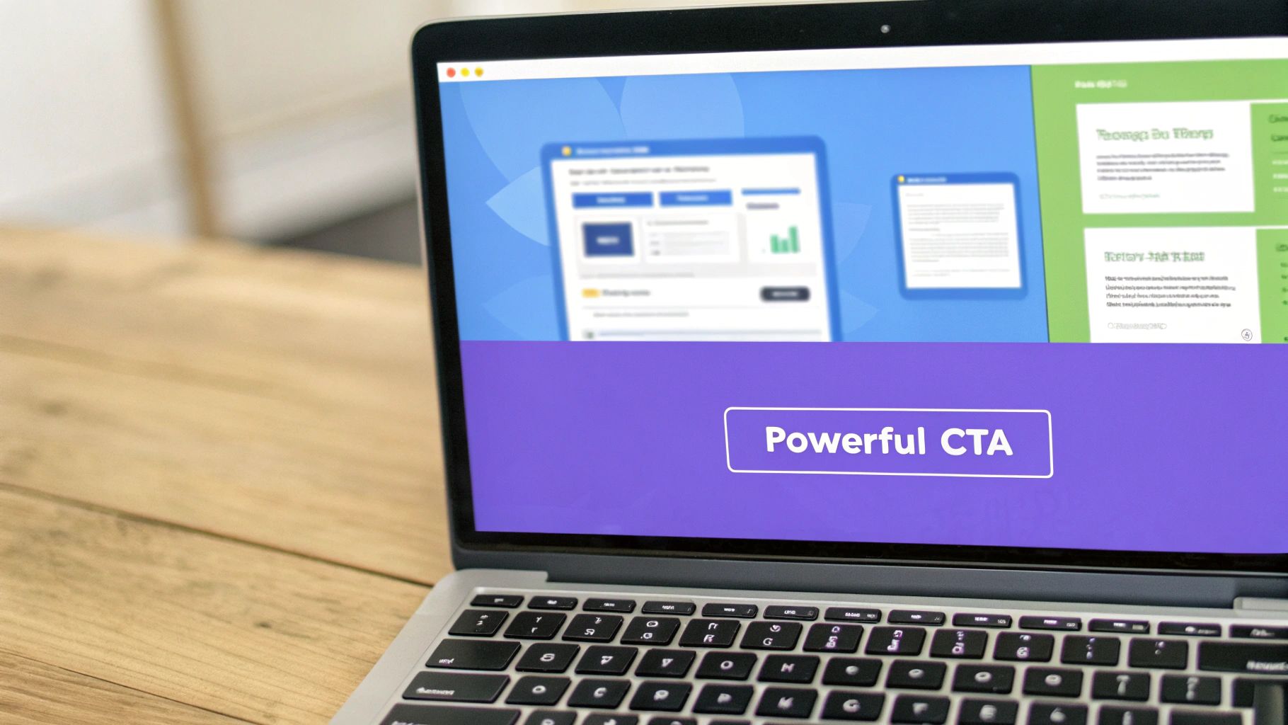
2. Creating Clear and Compelling Call-to-Action (CTA) Buttons
A call-to-action (CTA) is arguably the single most important element on any page aiming for conversions. It's the gateway between a visitor browsing and a user taking a desired action. A well-crafted CTA uses a combination of persuasive copy, strategic placement, and compelling design to eliminate friction and guide users toward the next step, whether that's a purchase, a sign-up, or a download.
Effective CTAs bridge the gap between user intent and business goals. This is a fundamental conversion optimization best practice because even the most persuasive landing page will fail if the final instruction is unclear, uninviting, or hard to find. It transforms passive interest into active engagement.
How to Implement Compelling CTAs Effectively
Creating high-converting CTAs requires a blend of psychology, design, and copywriting. A structured approach ensures your buttons don't just exist, but actively work to boost your conversion rates.
- Use Action-Oriented, First-Person Copy: Instead of generic words like "Submit," use strong action verbs that communicate value. Phrasing it from the user's perspective, such as "Get My Free Trial" instead of "Start Your Free Trial," can create a sense of ownership and increase clicks.
- Create Visual Prominence: Your CTA button must stand out. Use a contrasting color that aligns with your brand palette but pops against the background. Ensure the button is large enough to be easily seen and clicked on all devices, especially mobile, without being overwhelming.
- Place CTAs Strategically: A primary CTA should always be visible "above the fold" so users don't have to scroll to find it. It's also effective to repeat the CTA at natural reading breaks or at the end of a section, catching the user right when they've gathered enough information to make a decision.
Pro Tip: Infuse your CTA with a sense of urgency or scarcity when appropriate. Phrases like "Claim Your Spot Now" or "Get 50% Off Today Only" can motivate immediate action by leveraging the fear of missing out (FOMO). Always A/B test these elements to find what works for your audience.
3. Landing Page Optimization
Landing page optimization is the process of creating focused, conversion-driven web pages designed to achieve a single, specific goal. Unlike a homepage that serves many purposes, a dedicated landing page is built to receive traffic from a particular campaign (like a PPC ad or email promotion) and guide visitors toward one clear action, such as signing up for a trial or downloading an ebook.

This practice is a critical component of conversion optimization best practices because it directly addresses user intent and removes distractions. By creating a seamless journey from an ad or link to a relevant page, you reduce friction and significantly increase the likelihood of conversion. For instance, Slack’s simplified signup page is a masterclass in this, achieving an impressive 32% conversion rate by focusing solely on the signup action.
How to Implement Landing Page Optimization Effectively
Building a high-converting landing page requires a strategic approach that prioritizes clarity, relevance, and a compelling user experience.
- Maintain Message Match: The headline and core message on your landing page must directly reflect the ad or link the visitor clicked. If your ad promises a "50% Discount on SEO Tools," your landing page headline should reiterate that exact offer. This consistency reassures users they are in the right place.
- Eliminate Distractions: High-performing landing pages often remove the main navigation menu and other outbound links. By limiting the visitor's choices, you funnel their attention toward the primary call-to-action. Unbounce famously increased conversions by 30% on one of their pages simply by removing the navigation bar.
- Focus on a Single Goal: Every element on the page, from the headline and copy to the images and form, should work together to support one conversion goal. Avoid asking users to sign up for a newsletter, follow you on social media, and download a guide all on the same page. Keep it simple and focused. You can find more insights on this in our guide to landing page design best practices.
Pro Tip: Keep your forms as short as absolutely necessary. Only ask for essential information. For a lead magnet, a name and email are often enough. Each additional field you add creates friction and can cause a measurable drop in your conversion rate.
4. Social Proof and Trust Signals Implementation
One of the most powerful psychological drivers in marketing is the principle of social proof. This concept, popularized by Robert Cialdini, describes our tendency to assume that the actions of others reflect the correct behavior in a given situation. By implementing social proof and other trust signals, you can alleviate customer anxiety, build credibility, and significantly boost your conversion rates.
These elements are a cornerstone of conversion optimization best practices because they tap into a fundamental human need for validation. When potential customers see that others have purchased, used, and benefited from your product or service, it reduces their perceived risk and makes them feel more confident in their decision to convert.

How to Implement Social Proof and Trust Signals Effectively
Integrating these signals requires more than just adding a few logos; it's about strategically placing credible evidence where users need reassurance most.
- Showcase Authentic Customer Testimonials: Go beyond generic quotes. Display testimonials that include the customer's full name, company, and a real photo. The most effective testimonials detail a specific problem the customer faced and the tangible results your product helped them achieve.
- Leverage Third-Party Reviews and Ratings: Integrate platforms like Trustpilot or Google Reviews directly on your site. These unbiased, third-party validations carry more weight than curated on-site testimonials alone. Displaying star ratings prominently on product or service pages can immediately increase trust.
- Display Trust Badges and Security Seals: Place well-recognized security badges (like SSL certificates, McAfee, or Norton) near checkout forms and any fields where users enter sensitive information. These visual cues reassure visitors that their data is secure, which is crucial for reducing cart abandonment.
Pro Tip: Combine different forms of social proof for maximum impact. For example, pair a glowing customer testimonial with a real-time notification showing "25 people just bought this item in the last 24 hours." This creates a powerful combination of personal validation and herd behavior.
5. Form Optimization and Friction Reduction
Forms are the final gateway between a user's interest and a successful conversion, yet they are often the source of the most friction. Form optimization is the practice of methodically streamlining this data collection process to make it as easy, intuitive, and painless as possible for the user. By reducing the effort required to complete a form, you directly increase the likelihood of submission, making this one of the most impactful conversion optimization best practices you can implement.
Every field you add introduces another micro-decision and another potential point of abandonment. The goal is to collect only the essential information needed for the next step, respecting the user's time and effort. As Expedia famously discovered, removing a single, non-essential "Company" field increased their annual profits by $12 million, proving how small changes can yield massive results.
How to Implement Form Optimization Effectively
A frictionless form experience feels effortless to the user and requires a thoughtful, user-centric design approach.
- Ask Only for What You Need: Scrutinize every field. Is this information critical for this specific stage of the journey? For lead generation, you might only need an email address. You can gather more data later using progressive profiling, a technique that helped HubSpot increase conversions by 120%.
- Use a Single-Column Layout: Research from CXL Institute shows that single-column forms are completed faster than multi-column layouts because they create a clear, linear path for the user to follow. This improves scannability and reduces cognitive load.
- Provide Real-Time Validation: Don't wait until a user clicks "submit" to tell them they made a mistake. Implement inline validation that provides immediate, clear feedback and helpful error messages right after a field is completed, guiding them smoothly through the process.
Pro Tip: Leverage smart defaults, browser auto-fill, and logical field grouping to pre-populate information and simplify the user's task. For example, grouping address fields (Street, City, Zip Code) together creates a more intuitive flow and reduces mental friction.
6. Page Speed and Performance Optimization
In the world of conversion optimization best practices, speed is not just a feature; it's a fundamental requirement. Page speed optimization focuses on reducing the time it takes for your website to load, a factor that directly impacts user experience, bounce rates, and ultimately, your bottom line. With user attention spans shrinking, even a one-second delay can be the difference between a conversion and a lost customer, as users now expect pages to load in under three seconds.
This focus on performance is critical because a slow site frustrates visitors before they even have a chance to see your value proposition. Major companies have quantified the cost of delays: Walmart saw a 2% increase in conversions for every one-second improvement in load time, while Amazon calculated that a single second of latency could cost it $1.6 billion in sales annually. A fast, responsive website is a sign of professionalism and respect for the user's time.
The following bar chart visualizes the direct correlation between page load time and its impact on conversion rates.
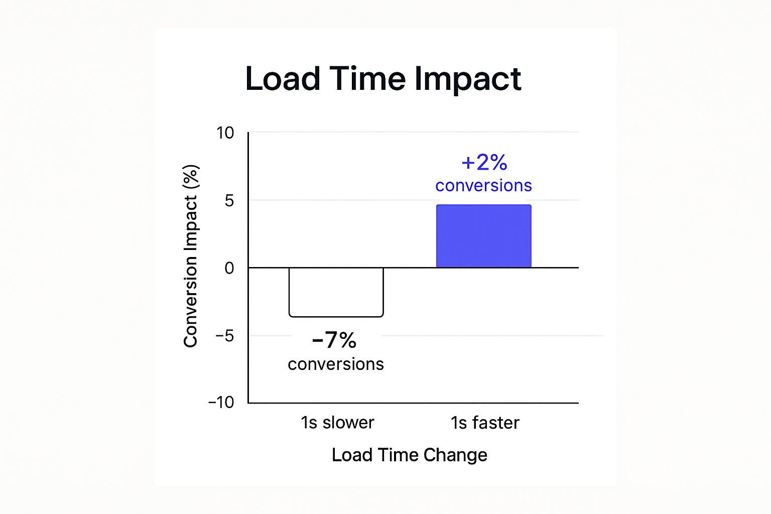
The data clearly illustrates that while improvements yield positive gains, performance degradation results in a disproportionately larger negative impact on conversions.
How to Implement Page Speed Optimization Effectively
Improving your site's performance requires a multi-faceted approach, focusing on technical optimizations that lighten the load on both the server and the end-user's browser.
- Compress and Optimize Images: Large, unoptimized images are one of the most common causes of slow load times. Use tools like TinyPNG or plugins to compress images without sacrificing significant quality. Also, serve images in next-gen formats like WebP.
- Leverage Browser Caching: Instruct browsers to store static files (like CSS, JavaScript, and images) locally on a user's device. This way, on subsequent visits, the browser can load the page without having to re-download every asset, dramatically speeding up the experience.
- Minimize HTTP Requests: Each element on your page (images, scripts, stylesheets) requires a separate HTTP request. Reduce these requests by combining CSS and JavaScript files, using CSS sprites for images, and removing any unnecessary third-party scripts or plugins.
Pro Tip: Regularly use tools like Google PageSpeed Insights, GTmetrix, and Pingdom to audit your site's performance. These tools provide a detailed breakdown of what’s slowing your site down and offer specific, actionable recommendations for improvement.
7. Mobile-First Design and Responsiveness
With mobile traffic now dominating the digital landscape, a mobile-first design philosophy is no longer optional; it's a fundamental requirement for conversion optimization. This approach involves designing the user experience for the smallest screen first and then scaling up to larger devices like tablets and desktops. By prioritizing the mobile experience, you ensure that the core functionality and content are streamlined, fast, and accessible for the majority of your visitors.
This strategy is one of the most critical conversion optimization best practices because it directly addresses the behavior and limitations of mobile users. They often have less patience, are more goal-oriented, and operate on less reliable connections. A clunky, slow, or hard-to-navigate mobile site is a direct path to a high bounce rate and lost conversions.
How to Implement a Mobile-First Strategy
Adopting a mobile-first mindset requires shifting your design process from a "shrinking down" to a "scaling up" model. This ensures the essential elements perform flawlessly where it matters most.
- Design for Thumb Navigation: Place key interactive elements like CTAs and navigation menus within the "thumb zone" at the bottom and center of the screen. This makes one-handed use easy and intuitive.
- Simplify Forms and Inputs: Mobile users despise complex forms. Minimize the number of fields, use larger tap targets for buttons and checkboxes, and enable mobile-friendly inputs like numeric keypads for phone numbers.
- Prioritize Content and Speed: On a small screen, you must be ruthless with prioritization. Place your most critical information, like the value proposition and primary CTA, above the fold. Optimize images and scripts aggressively to ensure lightning-fast load times on mobile networks.
- Test on Real Devices: Browser emulators are useful, but they don't replicate the real-world experience of touch interactions, network latency, or varying screen glares. Always test your site on a range of actual iOS and Android devices to identify usability issues.
Pro Tip: Google's Mobile-First Indexing means the mobile version of your site is what the search engine primarily uses for ranking and indexing. A poor mobile experience not only hurts conversions but can also severely damage your SEO visibility, reducing the traffic you get in the first place.
8. Value Proposition Clarity and Messaging
Your value proposition is the promise you make to your customer. It’s a clear, concise statement that explains the unique benefit they will receive from your product or service, why you're a better choice than the competition, and how you solve their problem. A strong, instantly understandable value proposition is one of the most critical conversion optimization best practices because it answers the visitor’s first and most important question: “What’s in it for me?”
If a user lands on your page and can't figure out what you do and why it matters to them within five seconds, they will leave. A compelling value proposition grabs their attention, communicates relevance, and persuades them to stay and learn more. It sets the stage for every other element on the page.
How to Implement Value Proposition Clarity Effectively
Crafting and presenting a high-converting value proposition requires a deep understanding of your customer and a strategic approach to messaging.
- Focus on Benefits, Not Features: Customers don't buy products; they buy better versions of themselves. Instead of listing technical features, articulate the outcome or benefit. For example, instead of "10GB of cloud storage" (a feature), say "Never lose an important file again" (a benefit).
- Use Your Customer's Language: Avoid industry jargon and corporate buzzwords. Dive into customer reviews, support tickets, and sales calls to understand the exact words and phrases your audience uses to describe their problems and desired outcomes.
- Place It Prominently: Your primary value proposition should be the first thing visitors see, typically in the hero section of your homepage or landing page. It should be impossible to miss. Support it with a sub-headline, a few bullet points, and a hero image that visually reinforces the message.
Pro Tip: Your value proposition isn't just one sentence. It's a cohesive message reinforced by your headline, sub-headline, and key visuals. Test different combinations of these elements to find the most powerful and persuasive formula for your audience.
9. Personalization and Dynamic Content
Moving beyond a one-size-fits-all approach, personalization tailors the user experience based on individual data like behavior, location, and past interactions. By using dynamic content that changes automatically for different user segments, you can create a highly relevant and engaging journey. This makes visitors feel understood and valued, significantly boosting the likelihood of conversion.
This strategy is a cornerstone of modern conversion optimization best practices because it directly addresses user intent. Instead of showing generic offers, you present content that aligns with what the user is actively looking for. Giants like Amazon, which generates a significant portion of its revenue from its recommendation engine, have proven the immense power of a personalized approach.
How to Implement Personalization Effectively
Implementing personalization doesn't have to be overwhelmingly complex. You can start small and scale your efforts as you gather more data and insights.
- Start with Simple Segmentation: Begin by personalizing content based on easily accessible data. For example, you can show different offers based on a user's geographic location (e.g., a "Free Shipping in Canada" banner) or the device they are using.
- Leverage Browsing Behavior: Track which pages or products a user views and use that information to dynamically display related items or content on subsequent visits. This keeps users engaged with offerings that have already captured their interest.
- Create Dynamic Landing Pages: Tailor your landing page content based on the traffic source. A visitor arriving from a Facebook ad about a specific product should see a different headline and hero image than someone who clicked a link in an email about a seasonal sale. This creates a seamless and consistent user journey. For Elementor users, exploring Elementor dynamic content options can greatly simplify this process.
Pro Tip: Always prioritize user privacy and be transparent about the data you collect. Provide clear and easy-to-find opt-out options to build trust, which is essential for long-term customer relationships and sustainable conversion growth.
10. Checkout Process Optimization
The checkout process is the final and most critical step in the customer journey. Checkout process optimization focuses on making this final stage as frictionless, simple, and trustworthy as possible. Even a small amount of friction here can lead to high cart abandonment rates, directly impacting your bottom line. By streamlining forms, clarifying costs, and building trust, you can significantly increase the number of visitors who complete their purchase.
This practice is essential because it targets users with the highest purchase intent. They have already decided to buy; your job is to make it easy for them to give you their money. Success stories like ASOS reducing its checkout to two steps and cutting abandonment by 50% showcase the massive impact of a well-designed checkout flow.
How to Implement Checkout Process Optimization Effectively
A seamless checkout experience is built on a foundation of user convenience and transparency. These key steps will help you reduce friction and boost completed sales.
- Offer a Guest Checkout Option: Forcing users to create an account before purchasing is a major conversion killer. Always provide a prominent guest checkout option to expedite the process. You can offer an opportunity to create an account after the purchase is complete.
- Be Transparent with All Costs: Surprise fees are the number one reason for cart abandonment. Display all costs upfront, including taxes, shipping, and any other handling fees, directly on the cart or early in the checkout process.
- Provide Multiple Payment Options: Cater to user preferences by offering various payment methods beyond traditional credit cards. Including digital wallets like PayPal, Apple Pay, and Google Pay can dramatically speed up the process and increase conversions.
- Simplify Form Fields: Only ask for essential information. Use features like address auto-completion and inline validation to help users fill out forms quickly and accurately. A progress indicator for multi-step checkouts also helps manage user expectations.
Pro Tip: Prominently display trust signals throughout the checkout process. Security badges (like SSL certificates), money-back guarantees, and accepted payment logos reassure anxious customers that their personal and financial information is safe, making them more comfortable completing the transaction. For WordPress users, you can find a guide to customize your WooCommerce checkout page to implement these best practices effectively.
Conversion Optimization Best Practices Comparison
| Item | Implementation Complexity 🔄 | Resource Requirements ⚡ | Expected Outcomes 📊 | Ideal Use Cases 💡 | Key Advantages ⭐ |
|---|---|---|---|---|---|
| A/B Testing and Split Testing | Moderate – requires setup, tracking, and stats | High – needs significant traffic and tools | Reliable data-driven conversion improvements | Validating changes, optimizing key elements | Minimizes risk, measurable ROI, user insights |
| Creating Clear and Compelling CTAs | Low – design and copy adjustments | Low – mainly design resources | Direct uplift in conversion rates | Guiding user actions, quick wins | Easy to test, clear user guidance, measurable |
| Landing Page Optimization | Moderate – design, alignment, and testing | Moderate – multiple pages and updates | Increased conversion rates and user focus | Focused campaigns, paid ads, message match | Higher conversions, better UX, measurable |
| Social Proof and Trust Signals | Low to Moderate – content collection, display | Low to Moderate – content management | Higher trust, credibility, and conversion lift | Building trust, reducing buyer anxiety | Builds trust quickly, reduces acquisition cost |
| Form Optimization and Friction Reduction | Moderate – technical and design changes | Moderate – technical implementation | Higher form completions and lead quality | Lead capture, sign-ups, surveys | Better UX, higher leads, reduced abandonment |
| Page Speed and Performance Optimization | High – technical complexity and monitoring | High – developer time, tools, hosting | Improved conversions, rankings, user experience | All web pages, essential for SEO and conversions | Fast load times, better SEO, reduced costs |
| Mobile-First Design and Responsiveness | Moderate to High – design & dev for devices | Moderate – design and testing on multiple devices | Higher mobile conversions, broader reach | Mobile-dominant audiences, responsive sites | Future-proof, better UX, improved SEO |
| Value Proposition Clarity and Messaging | Low to Moderate – content strategy work | Low – content creation and research | Reduced bounce, stronger message-market fit | Brand positioning, landing pages, marketing | Clear value delivery, brand strength |
| Personalization and Dynamic Content | High – data systems and AI integration | High – data, tech platforms, and compliance | Increased engagement and conversion rates | E-commerce, large audiences, repeat visitors | Relevant content, higher CLV, better engagement |
| Checkout Process Optimization | Moderate to High – technical integration | Moderate to High – payment and security | Reduced cart abandonment, increased completed sales | E-commerce, subscriptions, online stores | Revenue impact, customer satisfaction, retention |
From Theory to Tangible Growth
We've journeyed through the core pillars of conversion optimization, from the meticulous science of A/B testing to the psychological power of social proof. You now have a comprehensive blueprint covering everything from high-performance landing pages and frictionless forms to mobile-first design and crystal-clear value propositions. The path to higher conversions is no longer a mystery; it's a strategic process built on understanding user behavior, eliminating friction, and consistently delivering value at every touchpoint.
But knowledge alone doesn't move the needle. The true transformation begins when you transition from reading about conversion optimization best practices to actively implementing them. The strategies discussed are not isolated tactics but interconnected elements of a holistic system. A lightning-fast page load time, for instance, amplifies the impact of a compelling CTA. A well-placed testimonial can be the final nudge a user needs to complete an optimized checkout process. This synergy is where exponential growth is unlocked.
The Mindset of a Conversion Optimizer
Adopting a CRO mindset is paramount. It means shifting from making assumptions about your audience to making data-driven decisions. Every element on your website, from a headline to a button color, is a hypothesis waiting to be tested. This continuous cycle of hypothesizing, testing, analyzing, and iterating is the engine of sustainable growth.
Remember, optimization is not a one-and-done project. It's an ongoing commitment to excellence and a deep-seated curiosity about your users. Your audience's expectations evolve, market trends shift, and new technologies emerge. The most successful businesses are those that treat their website not as a static brochure but as a dynamic, living asset that constantly adapts to better serve its visitors. This iterative approach ensures you are always moving forward, turning small, incremental wins into significant, long-term gains.
Your Actionable Path Forward
Feeling overwhelmed by the sheer number of strategies? Don't be. The key is to start small and build momentum.
Here’s a simple, actionable plan to get started:
- Identify the Low-Hanging Fruit: Use analytics to find your biggest drop-off points. Is it a specific form field? A confusing step in the checkout? Start there.
- Formulate a Hypothesis: Create a clear, testable hypothesis. For example: "Changing the CTA button text from 'Submit' to 'Get My Free Guide' will increase form submissions by 15% because it highlights the value exchange."
- Choose One Test: Pick a single, high-impact element to A/B test. Don't try to change everything at once; you won't know what actually worked.
- Implement with the Right Tools: For those on WordPress and Elementor, this is where you can accelerate your progress. Instead of coding a new testimonial slider from scratch, you can deploy a professionally designed widget in minutes. This allows you to focus on strategy, not just technical execution.
- Measure and Learn: Run your test until you achieve statistical significance. Whether your hypothesis was proven right or wrong, you have gained an invaluable insight into your audience.
- Repeat: Apply your learnings and move on to the next test.
By systematically applying these conversion optimization best practices, you transform your website from a passive digital storefront into your most powerful engine for growth. You create a superior user experience that not only converts visitors into customers but also fosters loyalty and turns them into advocates for your brand. The journey from theory to tangible growth starts with that first test.
Ready to put these strategies into action without wrestling with code? Exclusive Addons provides a comprehensive toolkit of over 100 powerful widgets for Elementor, designed to implement these conversion optimization best practices effortlessly. Elevate your social proof with advanced testimonial carousels, clarify your offers with dynamic pricing tables, and capture leads with intelligent modal popups by visiting Exclusive Addons today.