How To Configure and Style Call to Action Widget
Create interactive Call to Action (CTA) button with a range of customizable option using Exclusive Addons Call to Action Widget for Elementor.
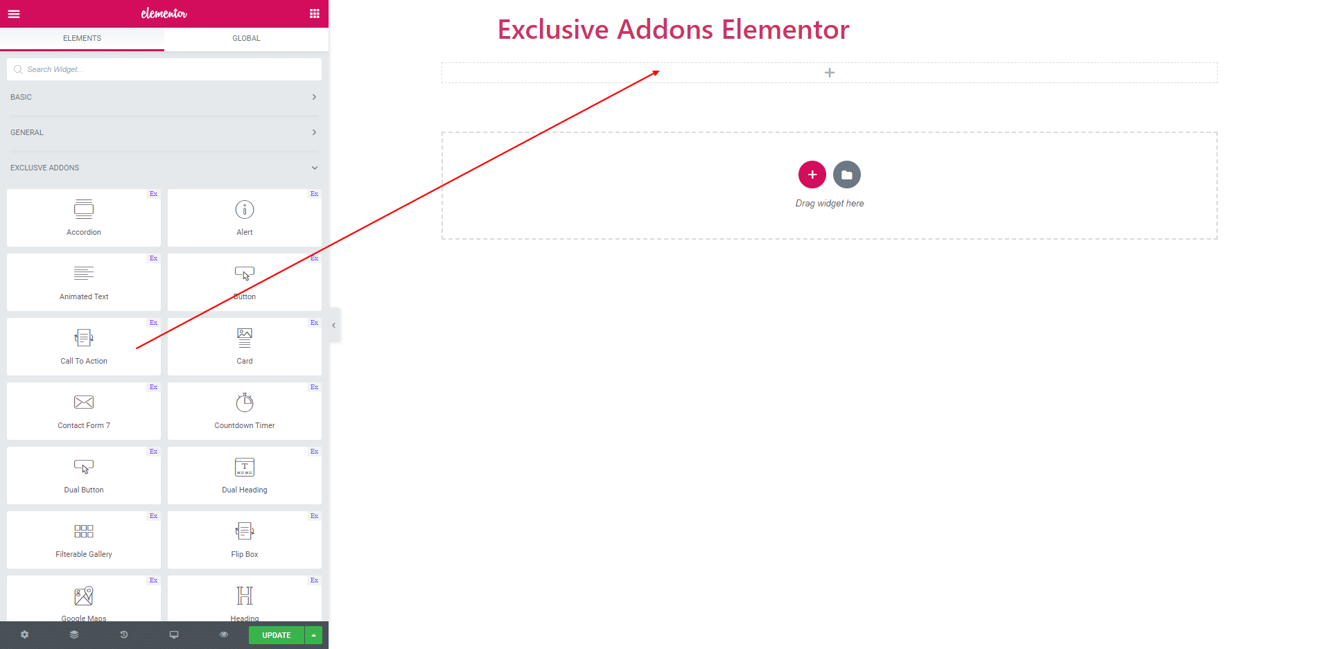
STEP 1:
Select the ‘Call to Action’ widget from Elementor panel. Then drag and drop it in the selected area.
STEP 2:
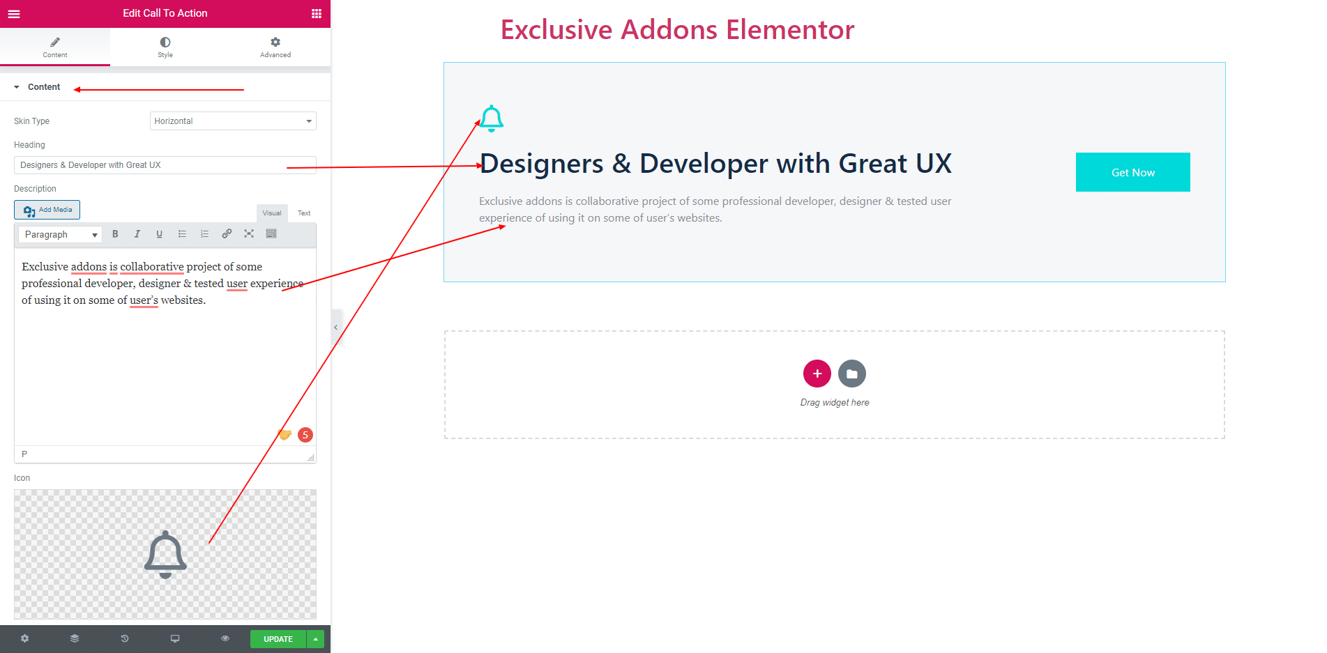
In Content Section you get Contents, Primary Button and Secondary Button.
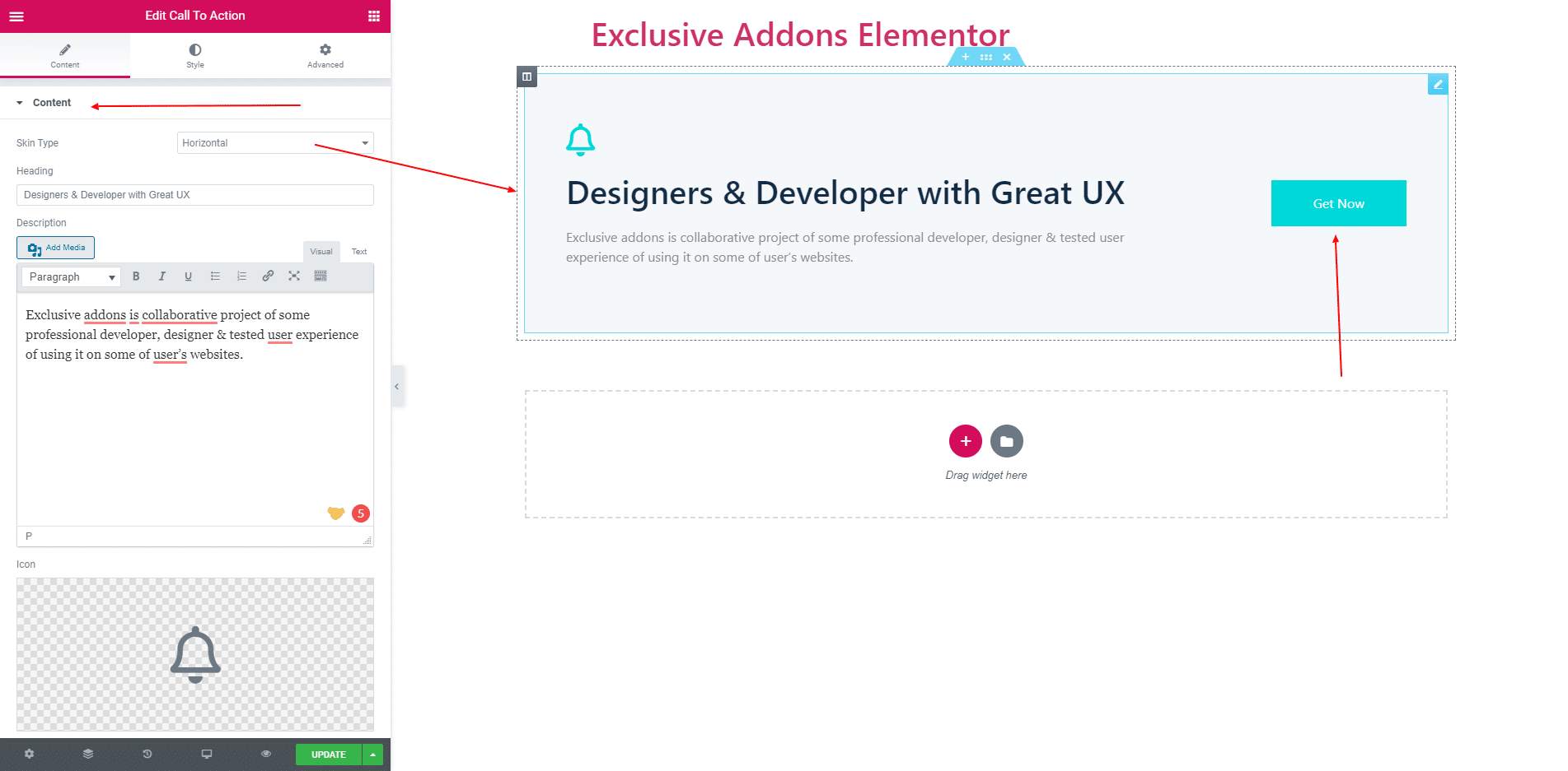
2.1. In Content tab you can set two types of Skin. One is Vertical and other is Horizontal. If you select Vertical Skin then you will get Primary and Secondary Button. And if you Horizontal Skin then you will get only Primary Button.
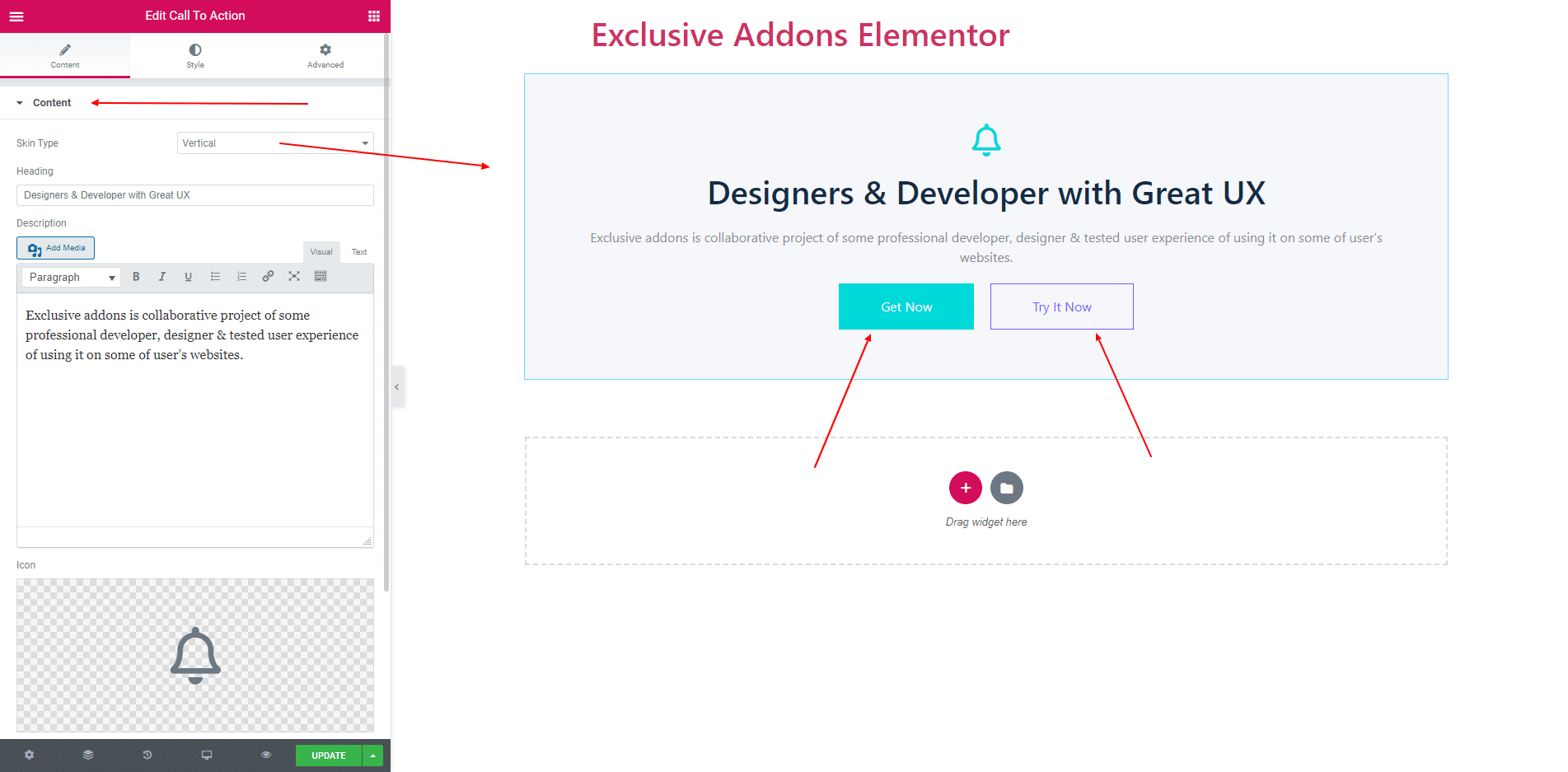
2.2. You can also add Heading, Description and an Icon.
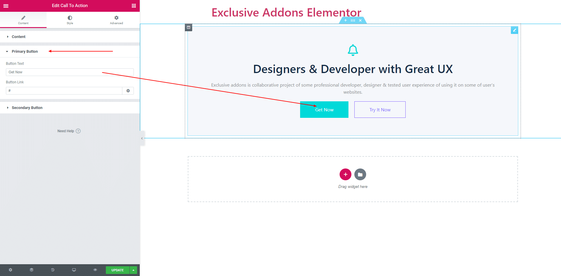
2.3. You can add Text and a Link in Primary Button
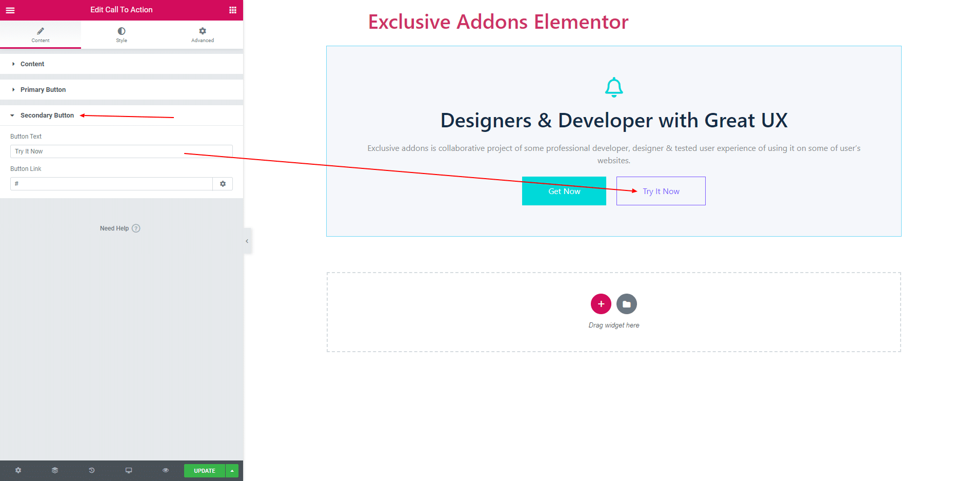
2.4. You can add Text and a Link in Secondary Button
STEP 3:
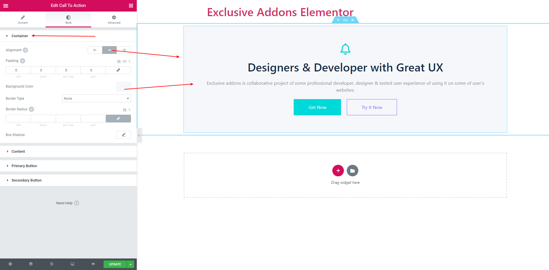
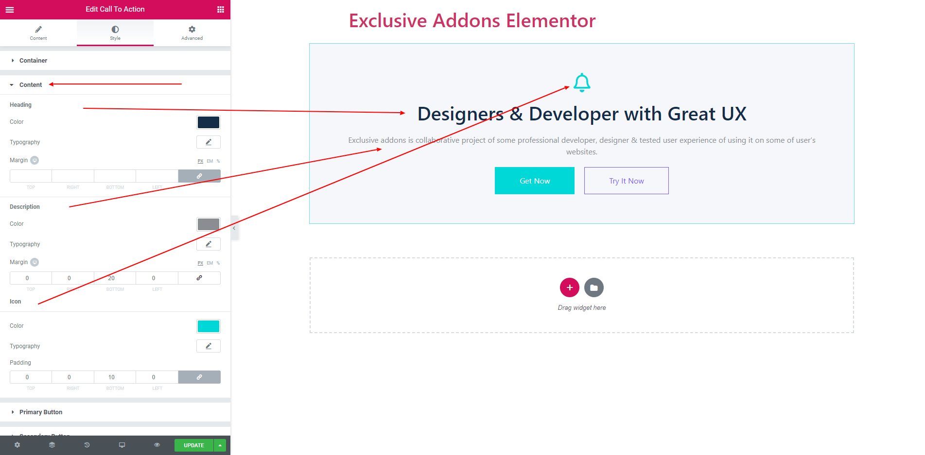
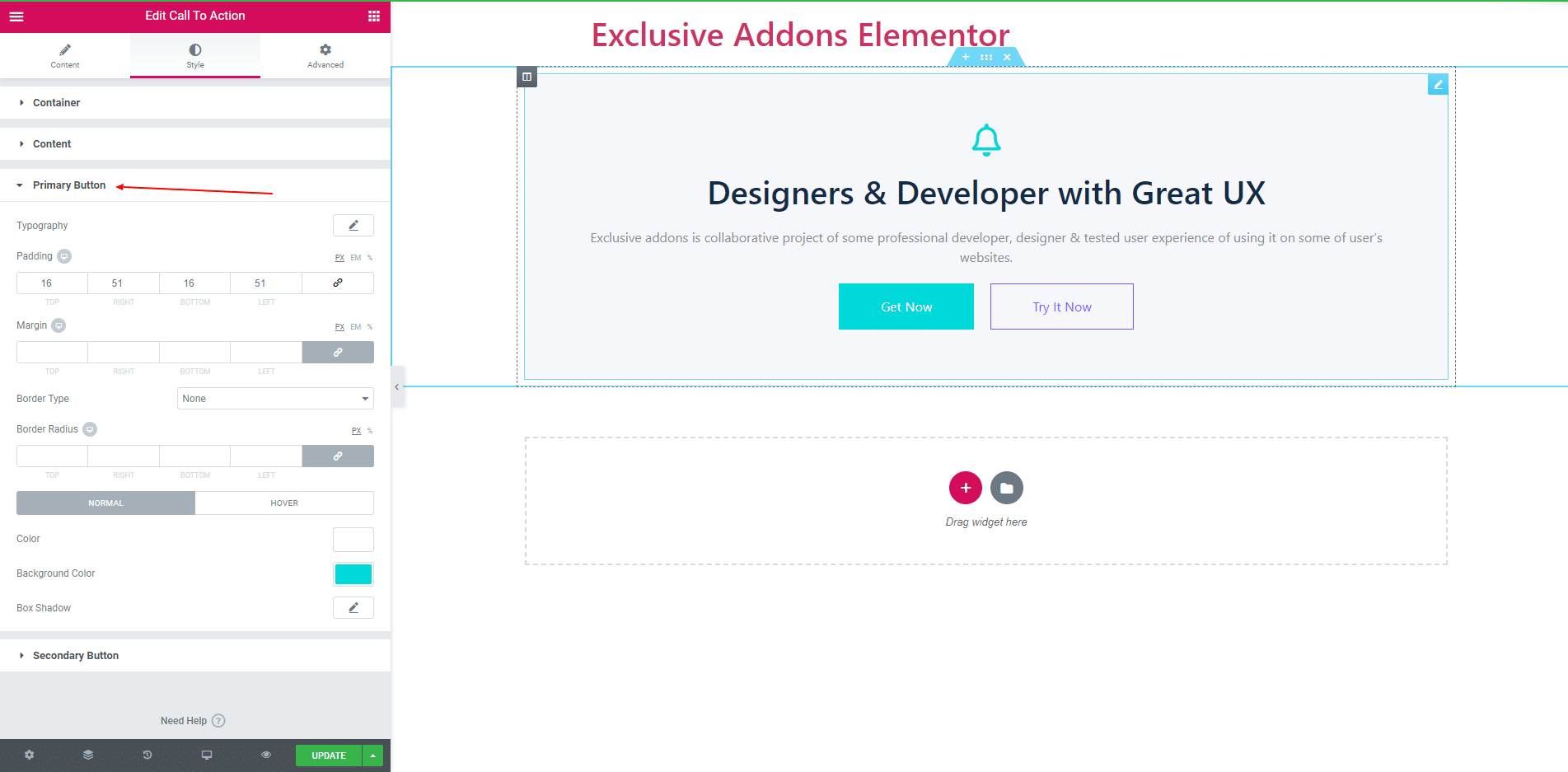
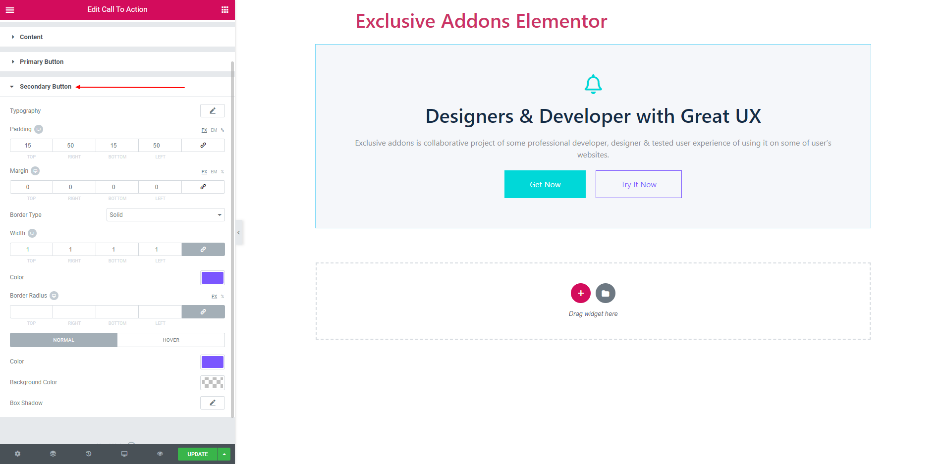
In Style Section you get Container, ‘Content’, ‘Primary Button’ and ‘Secondary Button’.
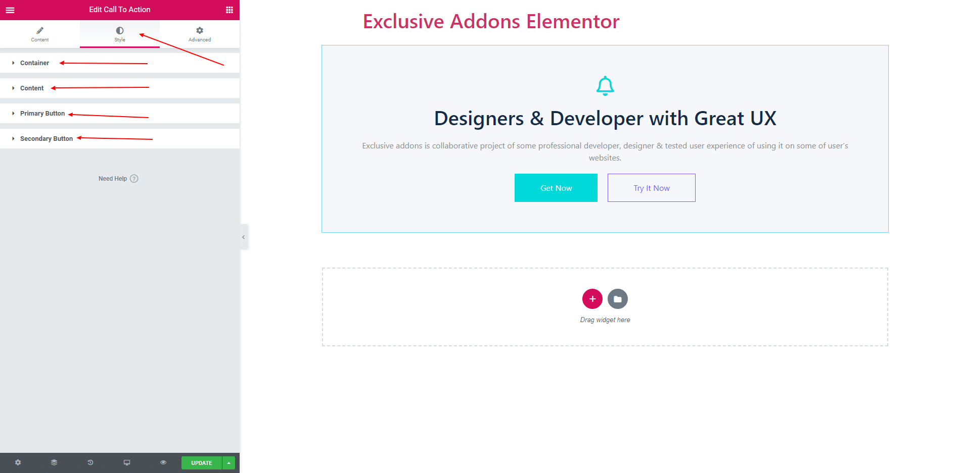
3.1. Using Alignment you can align the item. You can also set Background Color, Padding, Border, Border Radius and Box Shadow.
3.2. Content section consist of Heading, Description and Icon style. You can set Color, Typography and margin all of them.
3.3. Primary and Secondary Button have same style option.
STEP 4:
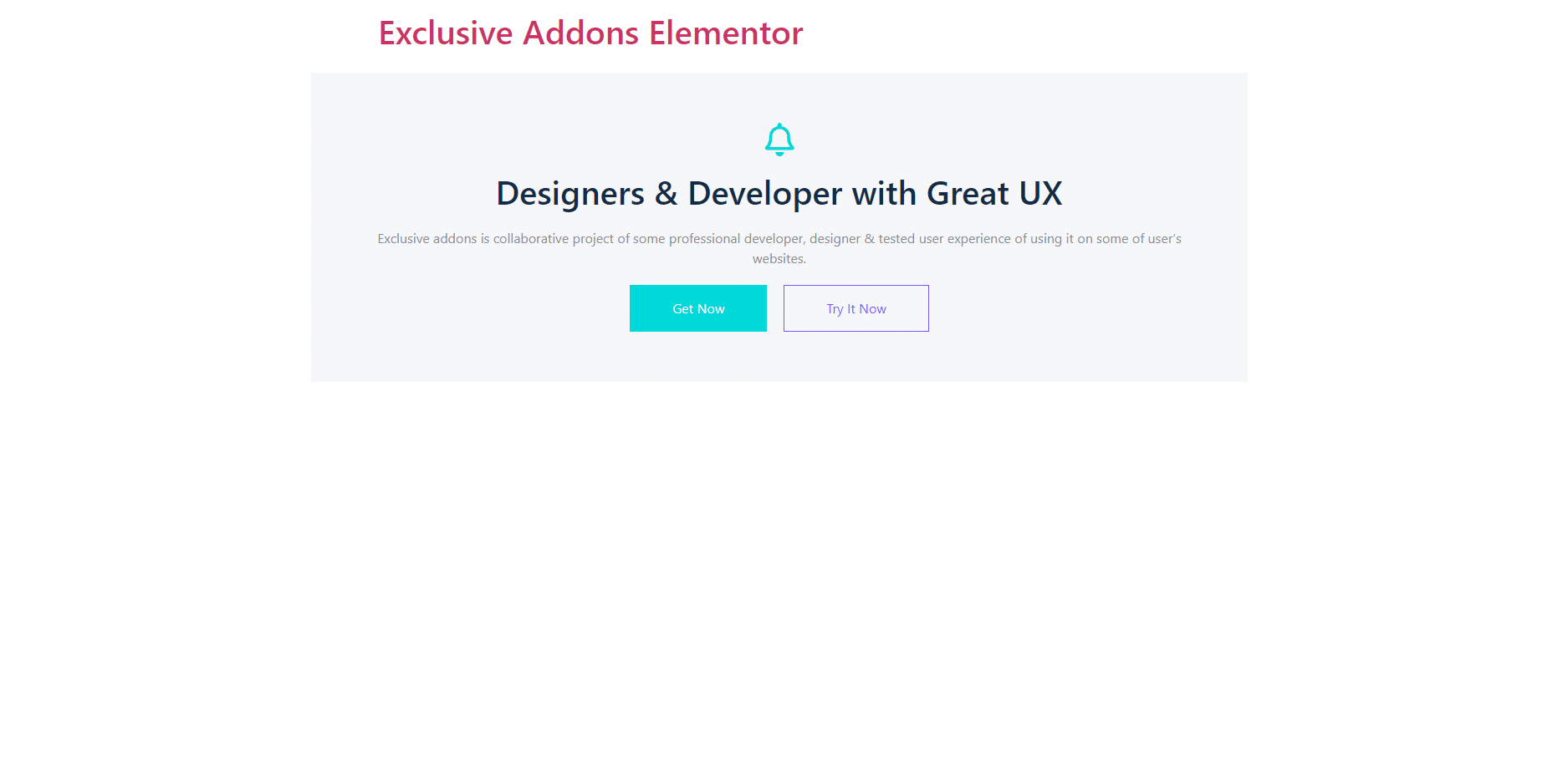
Finally, after clicking the update button you will see the beautiful Call to Action on your webpage.