How to configure and style Tabs Widget.
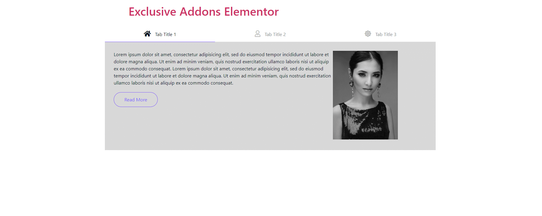
Create an interactive section to show multiple contents in one place by switching between tabs. Lets users switch between posts swiftly using Exclusive Addons Tabs Widget for Elementor.
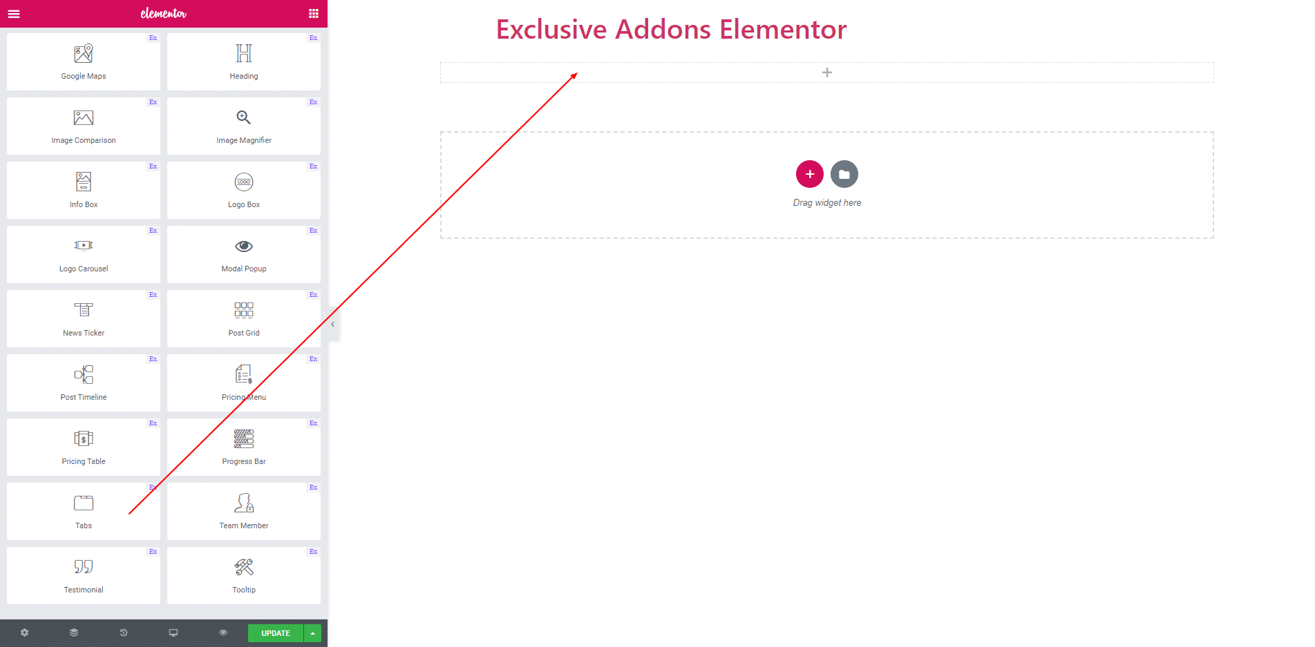
STEP 1:
Select the ‘Tabs’ widget from Elementor panel. Then drag and drop it in the selected area.
STEP 2:
In content section, you can add item by clicking add item button for tab. Also delete item by clicking cross button.
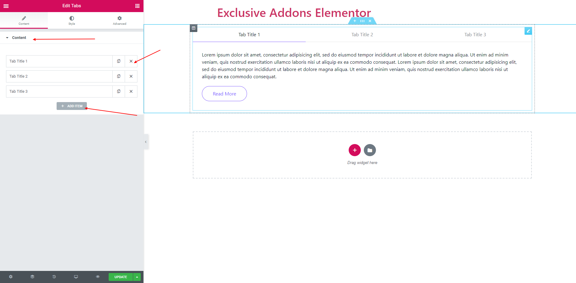
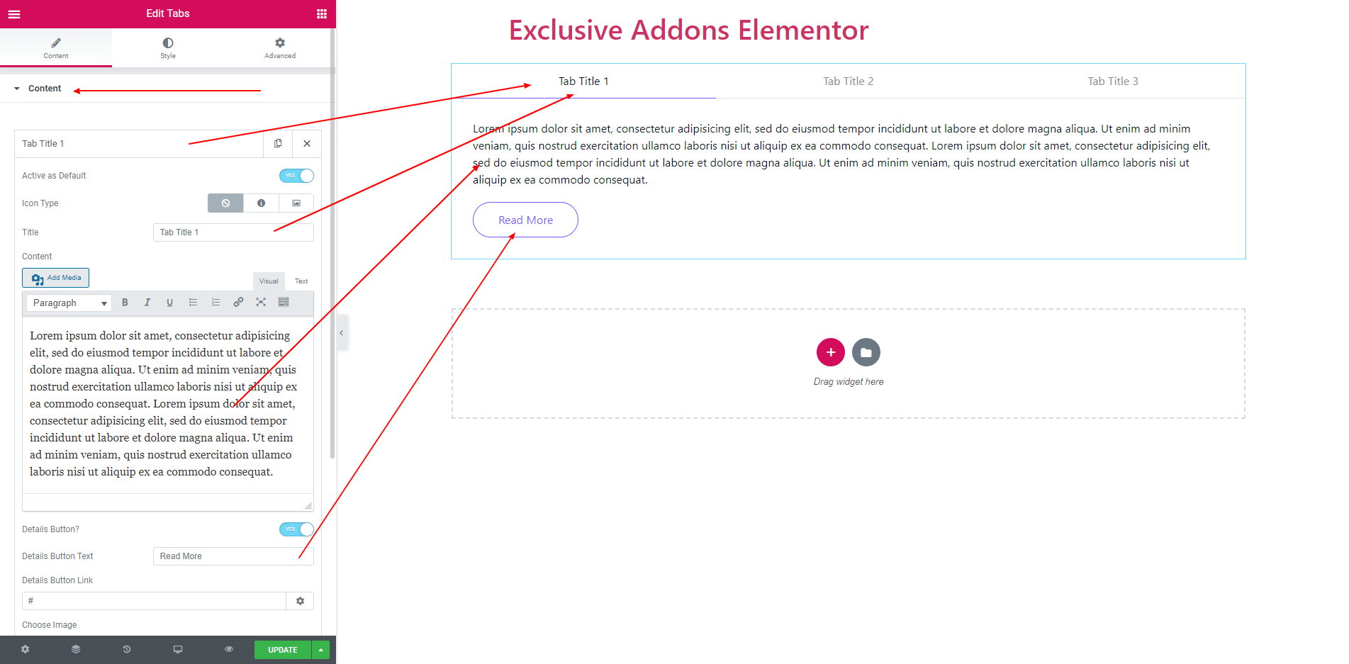
2.1. Each item contains title, content, details button, and image. You can enable the tab as a default. Also can disable details button and edit details button text. Also set tab icon or image.
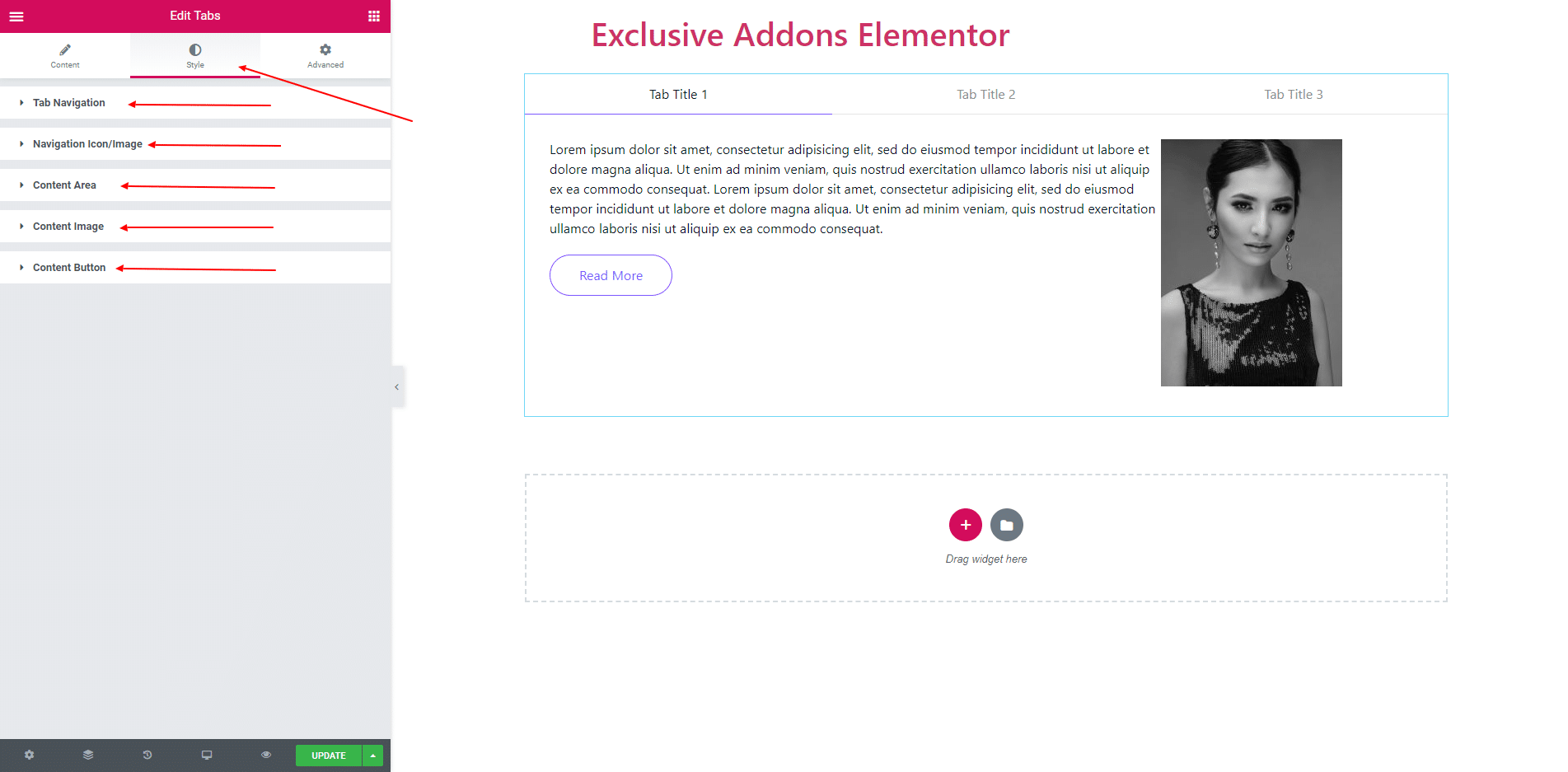
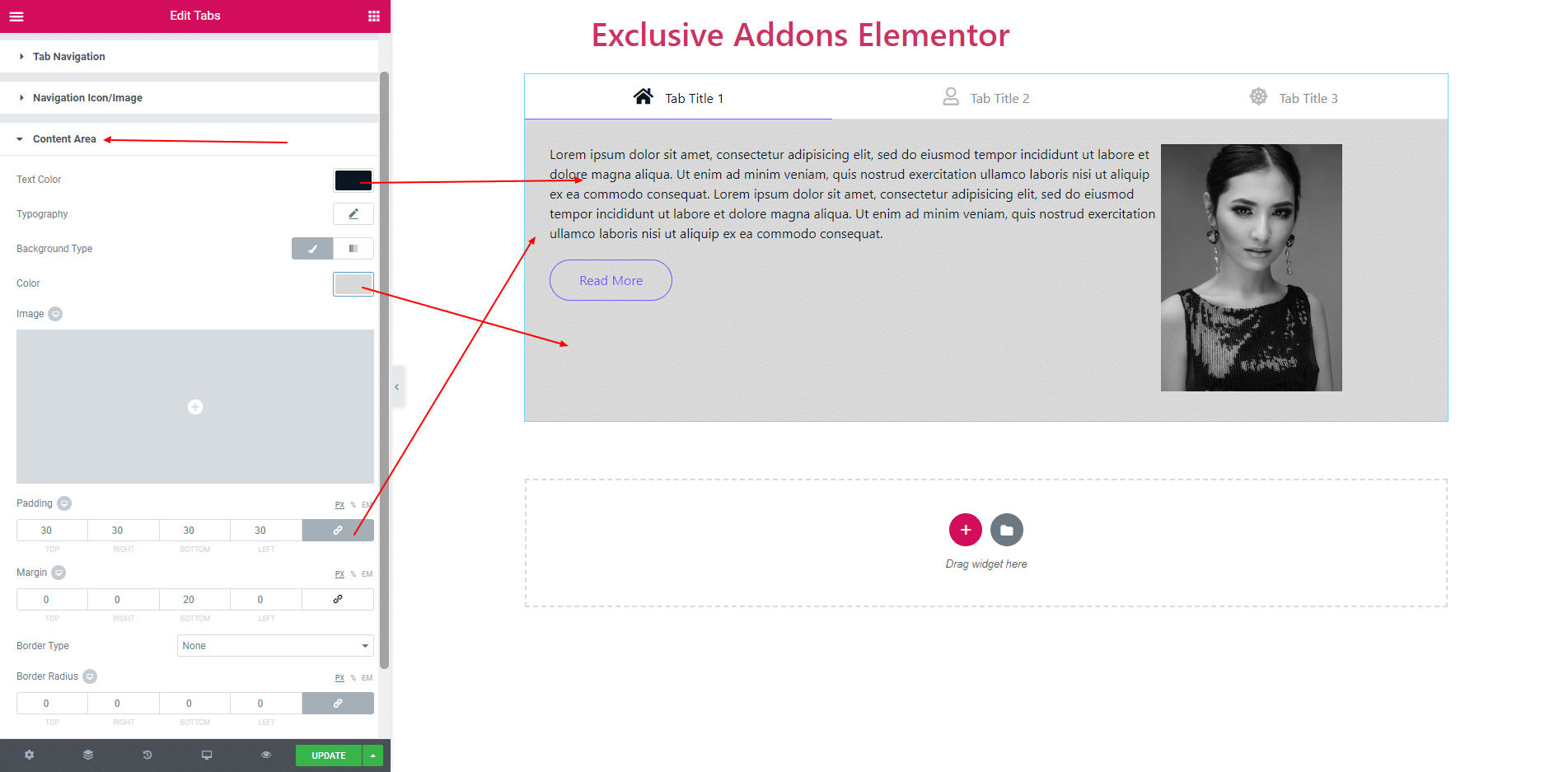
STEP 3:
Style section consist of ‘Tab Navigation’, ‘Navigation Icon/Image’, ‘Content Area’, ‘Content Image’ and ‘Content Button’.
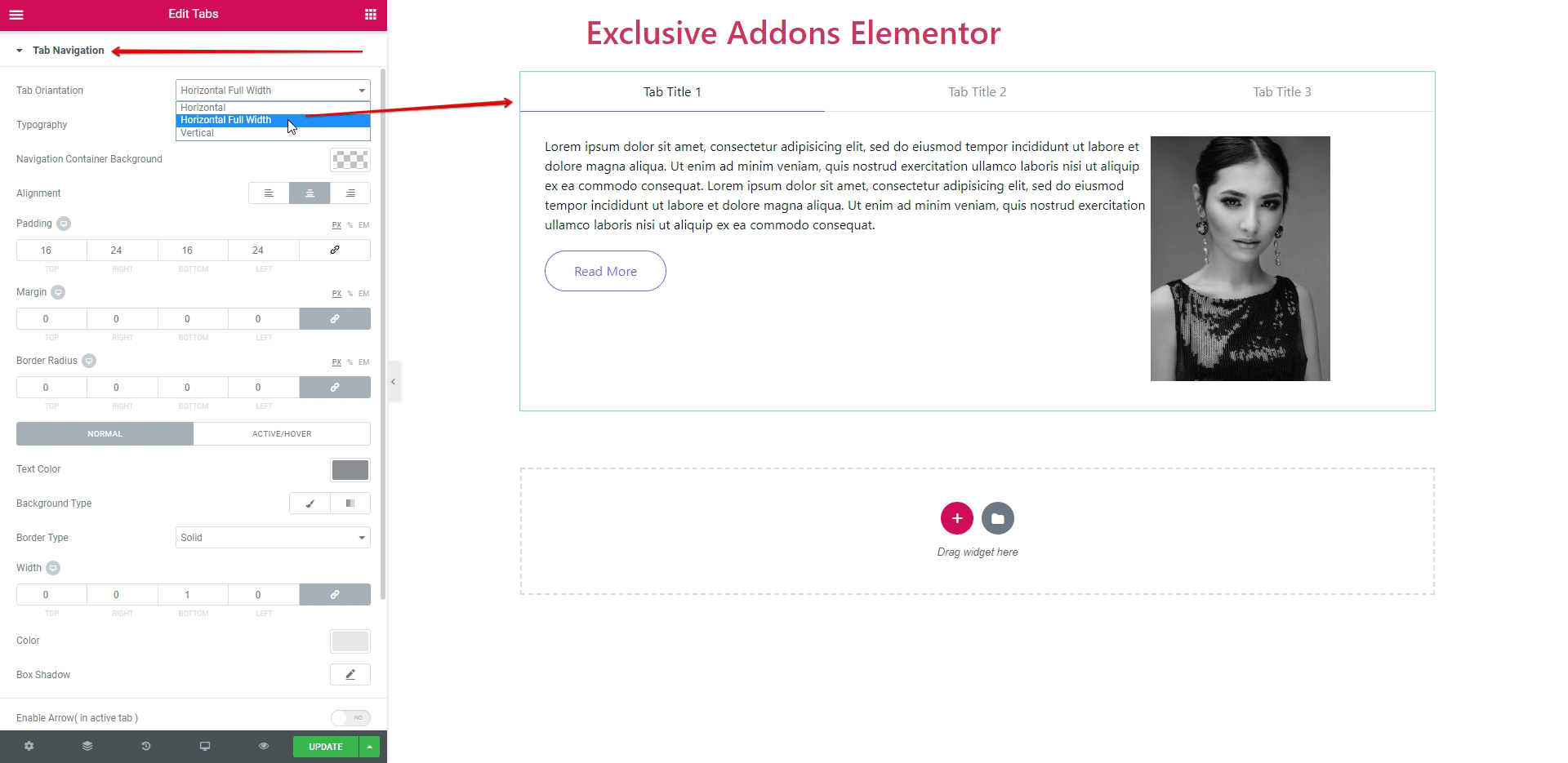
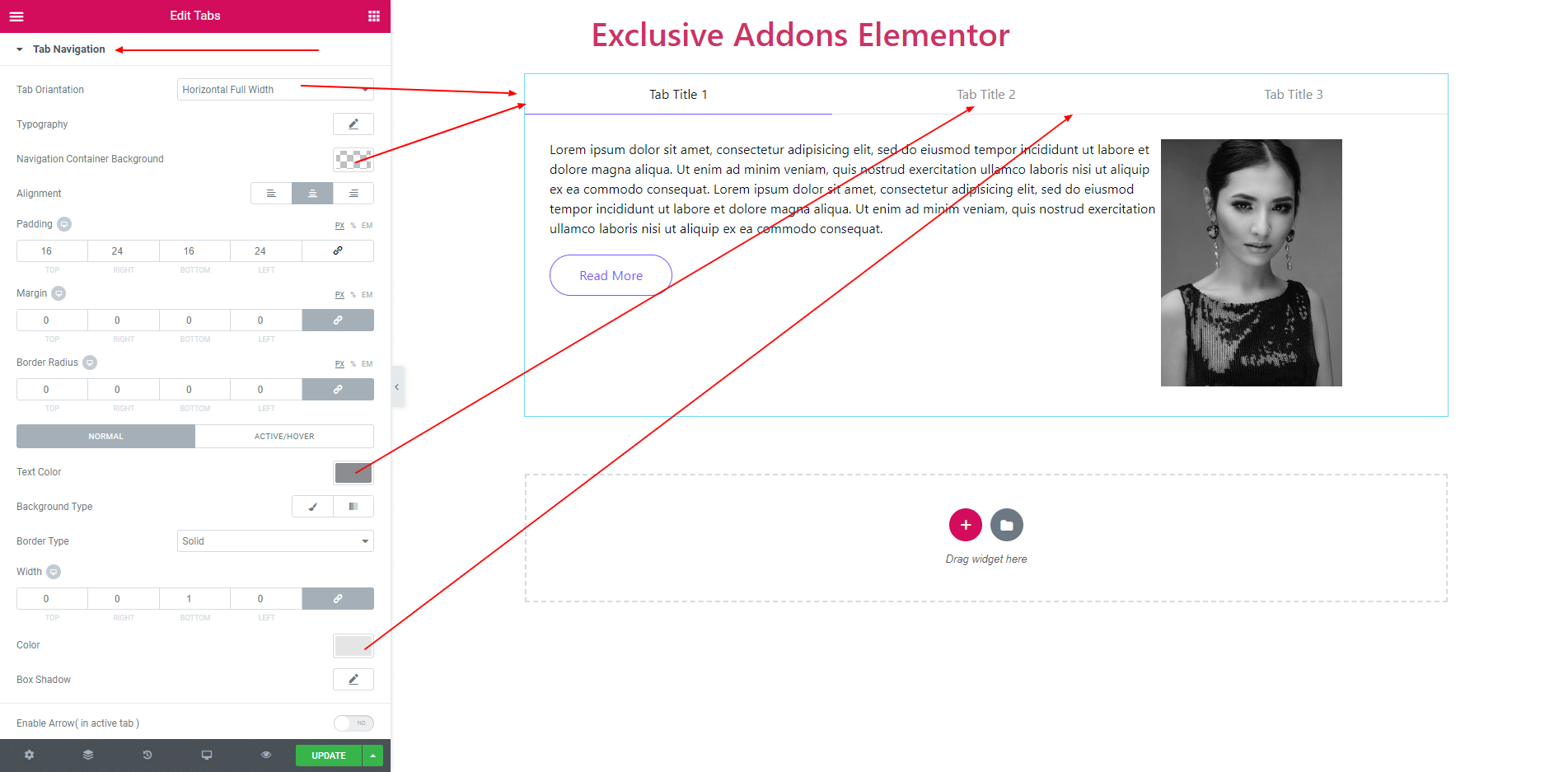
3.1. In tab navigation, the oriantation of the tab is ‘Horizontal’, ‘Horizontal Full Width’ and ‘Vertical’. Also you can set navigation background, align the items, padding, margin, border radius each item. You can set text color, background, border and box shadow both for normal and active. You can also enable or disable arrow. And also can position tit ‘Right’ or ‘Bottom’.
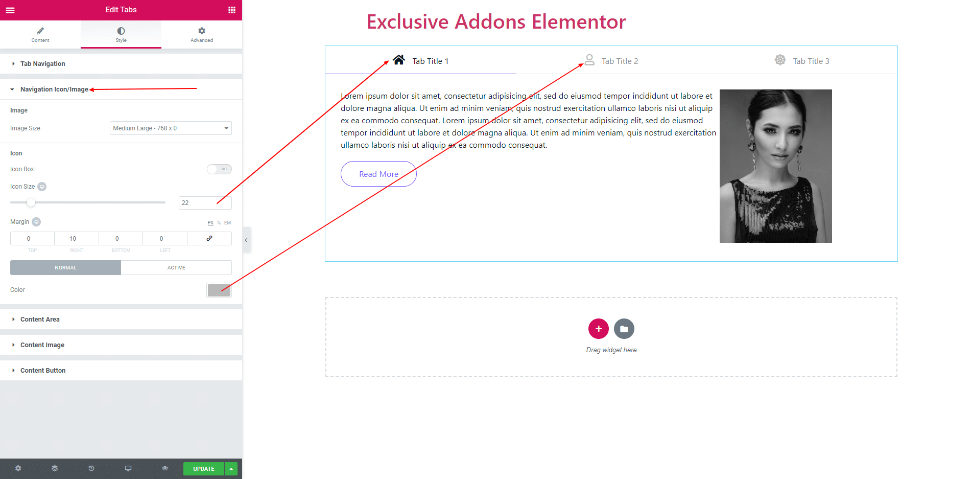
3.2. Navigation Icon/Image consist of icons size, margin and icon box. You can add icon color both for normal and active.
3.3. ‘Background color’, ‘Text color’, ‘Border’, ‘Border radius’, ‘Margin’ and ‘Padding’ are self-explanatory. They applies to the Tabs content area.
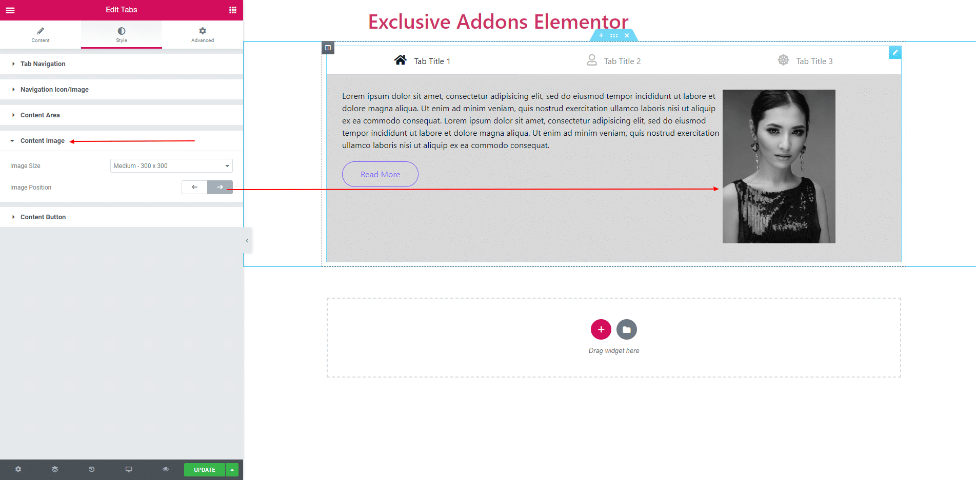
3.4. You can position the content image ‘Left’ and ‘Right’. Also can set image size.
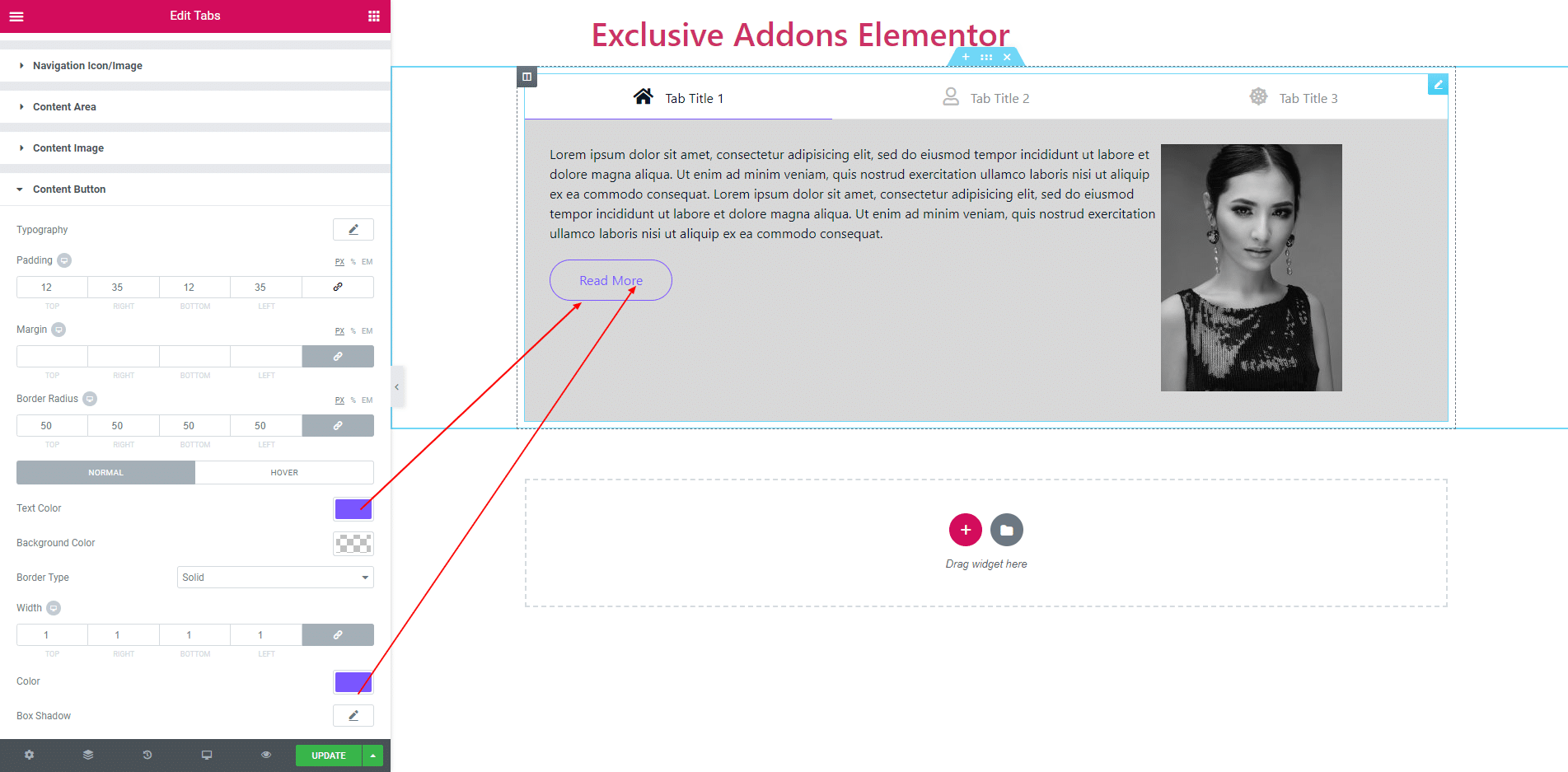
3.5. In content button, you can set typography, padding, margin, border radius and some more options.
STEP 4:
Finally, after clicking the update button you will see the beautiful Tabs on your webpage.