How to configure and style Flip Box Widget
Add a trendy, elegant, and interactive section to your website. You can give front side content, backside content and some flip transition using Exclusive Addons Flip Box Widget for Elementor.
STEP 1:
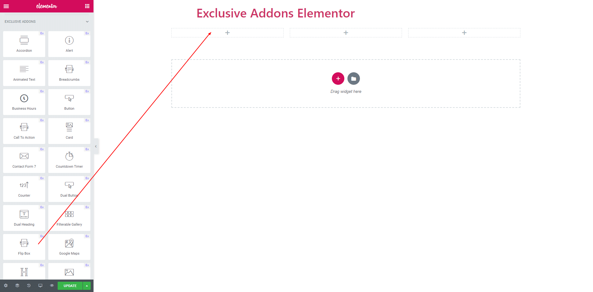
Select the ‘Flipbox’ widget from Elementor panel.Then drag and drop it in the selected area.
STEP 2:
Content section Consists of ‘Front Side’, ‘Back Side’ and ‘Flip Settings’.
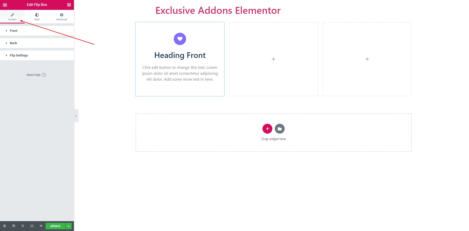
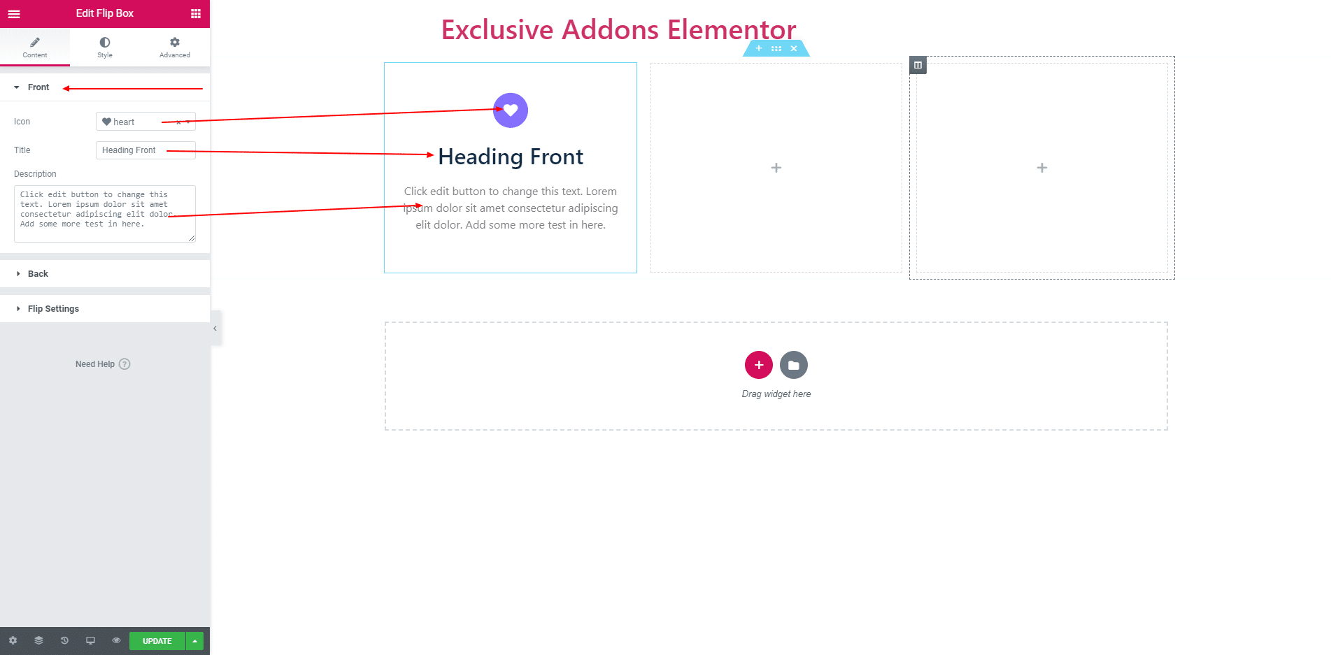
2.1. You can set Icon, Front side Title and Description for front side section.
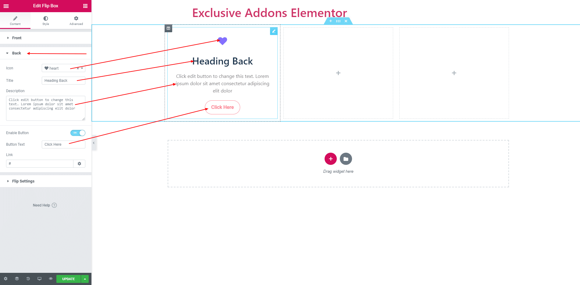
2.2. You can set Icon, Front side Title, Description and Button for backside section. You can enable or disable it by clicking the Enable Button.
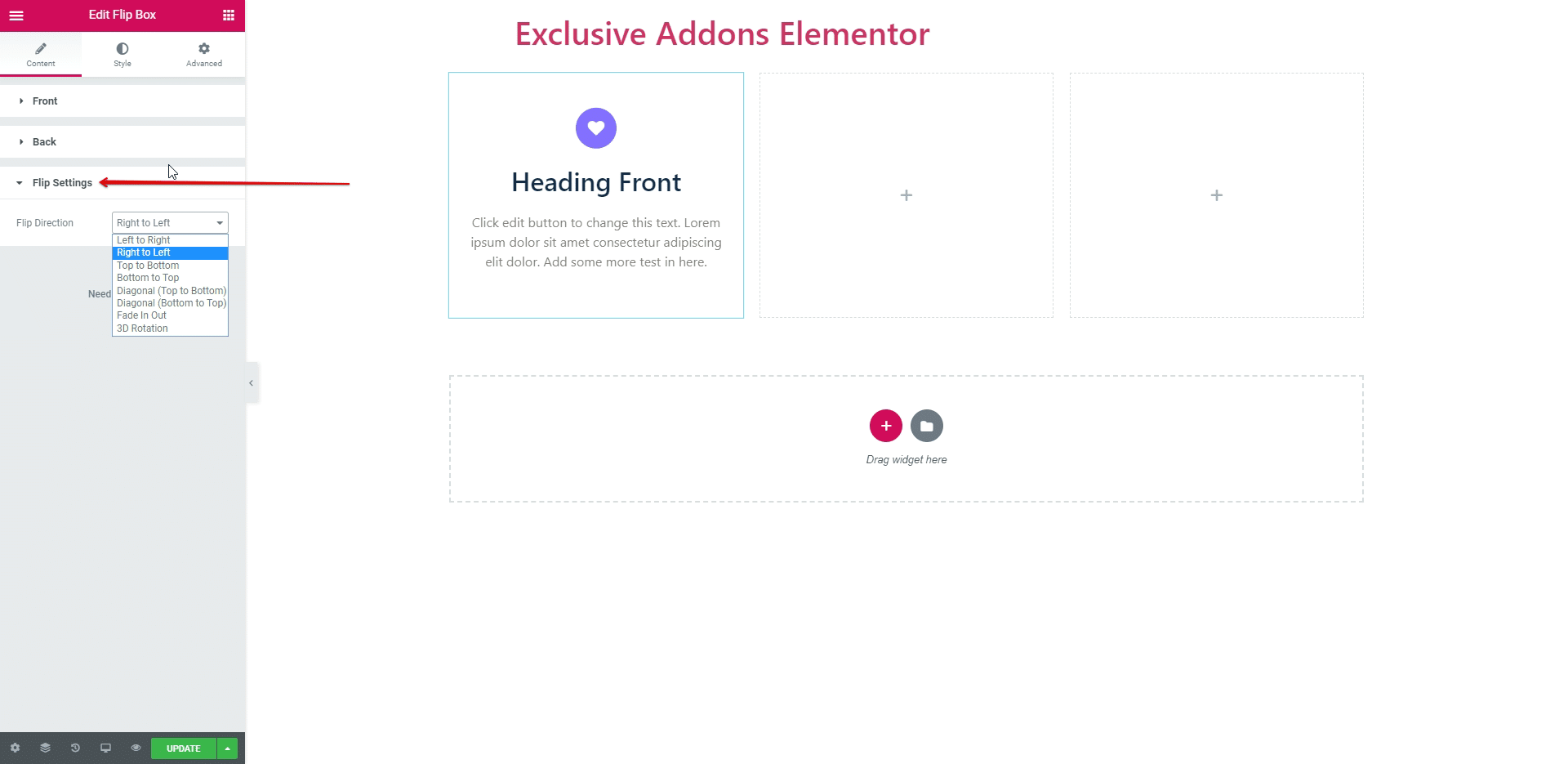
2.3. You can apply the ‘Flip Direction’ to set the direction of the flip when hover over the flip box. The direction should be ‘Left to Right’, ‘Right to Left’, ‘Top to Bottom’, ‘Bottom to Top’, ‘Diagonal(Top to Bottom)’, ‘Diagonal(Bottom to Top)’, ‘Fade In Out’ and ‘3D Rotation’.
STEP 3:
Style Section Consist of ‘Container’, ‘Front’ and ‘Back’.
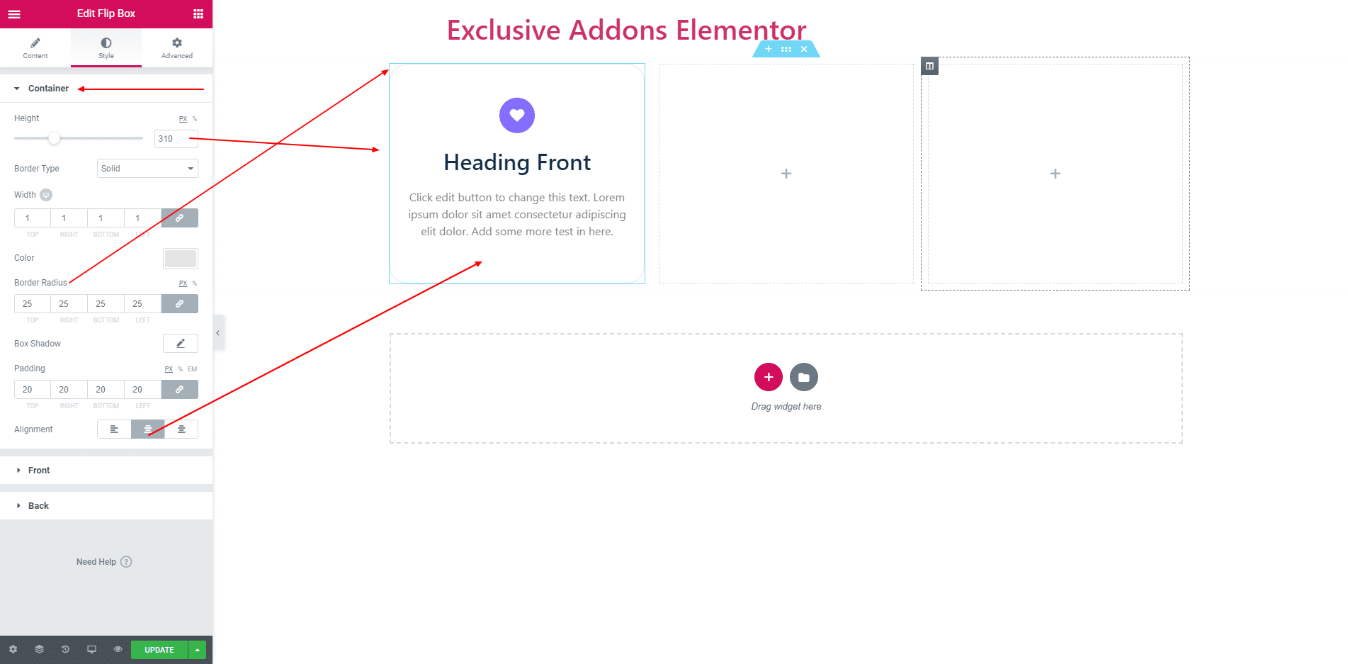
3.1. You can set ‘Height’, ‘Border Radius’, ‘Border’, ‘Padding’ and more options both Front and Back side in ‘Container Style Section’. You can also align all text by ‘Alignment’.
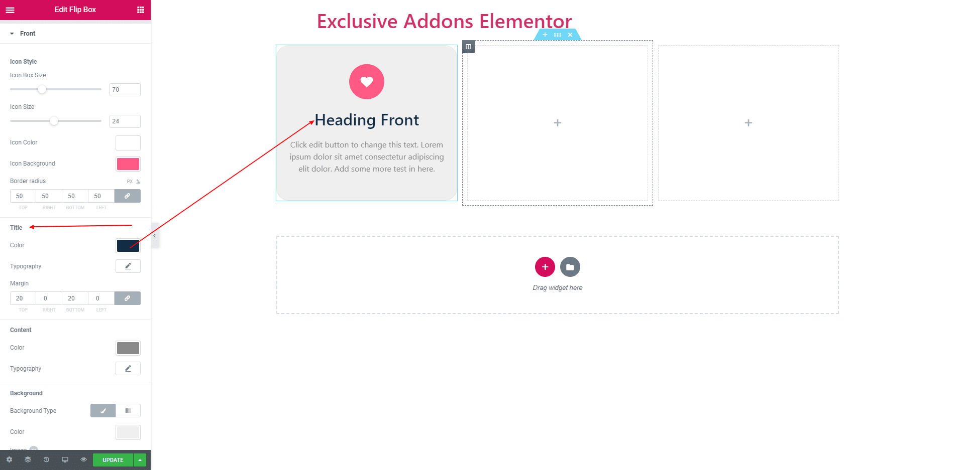
3.2. ‘Front Side’ style section consist of ‘Icon’, ‘Title’ and ‘Description’.In ‘Icon’ section you can set icon box size, icon size, icon box color, icon color and border radius.
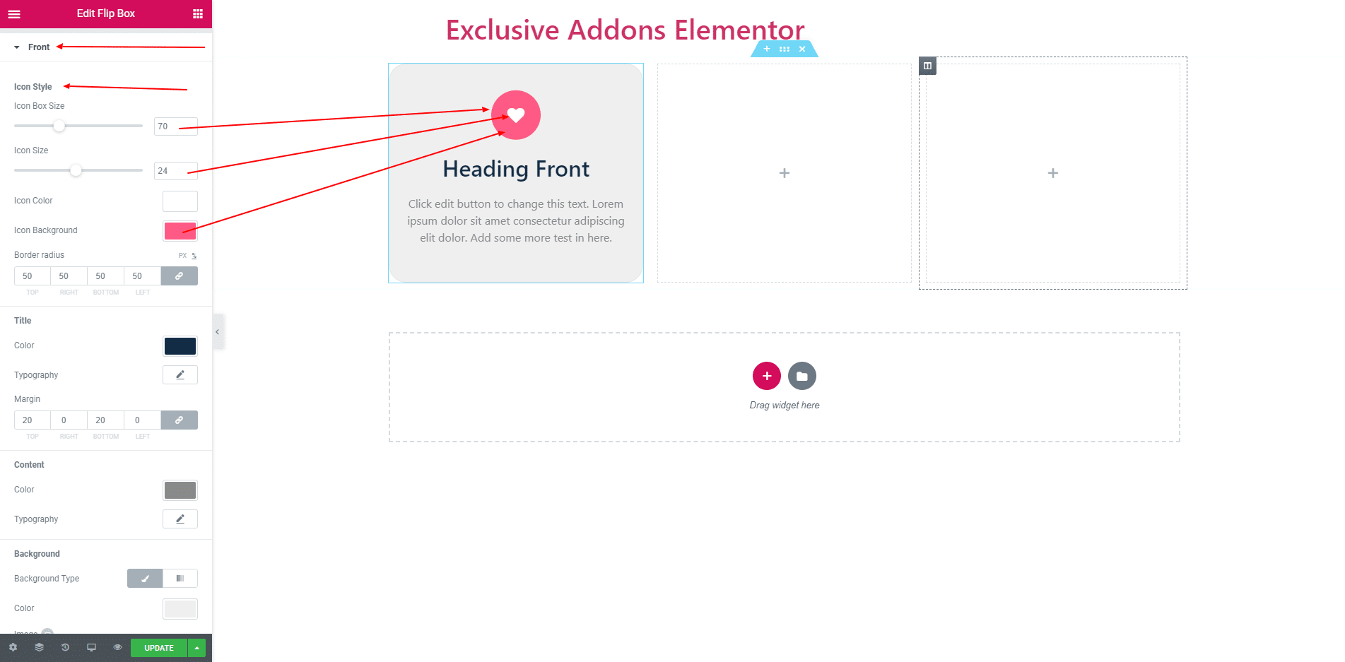
In ‘Title’ section you can apply title color, title typography and title margin.
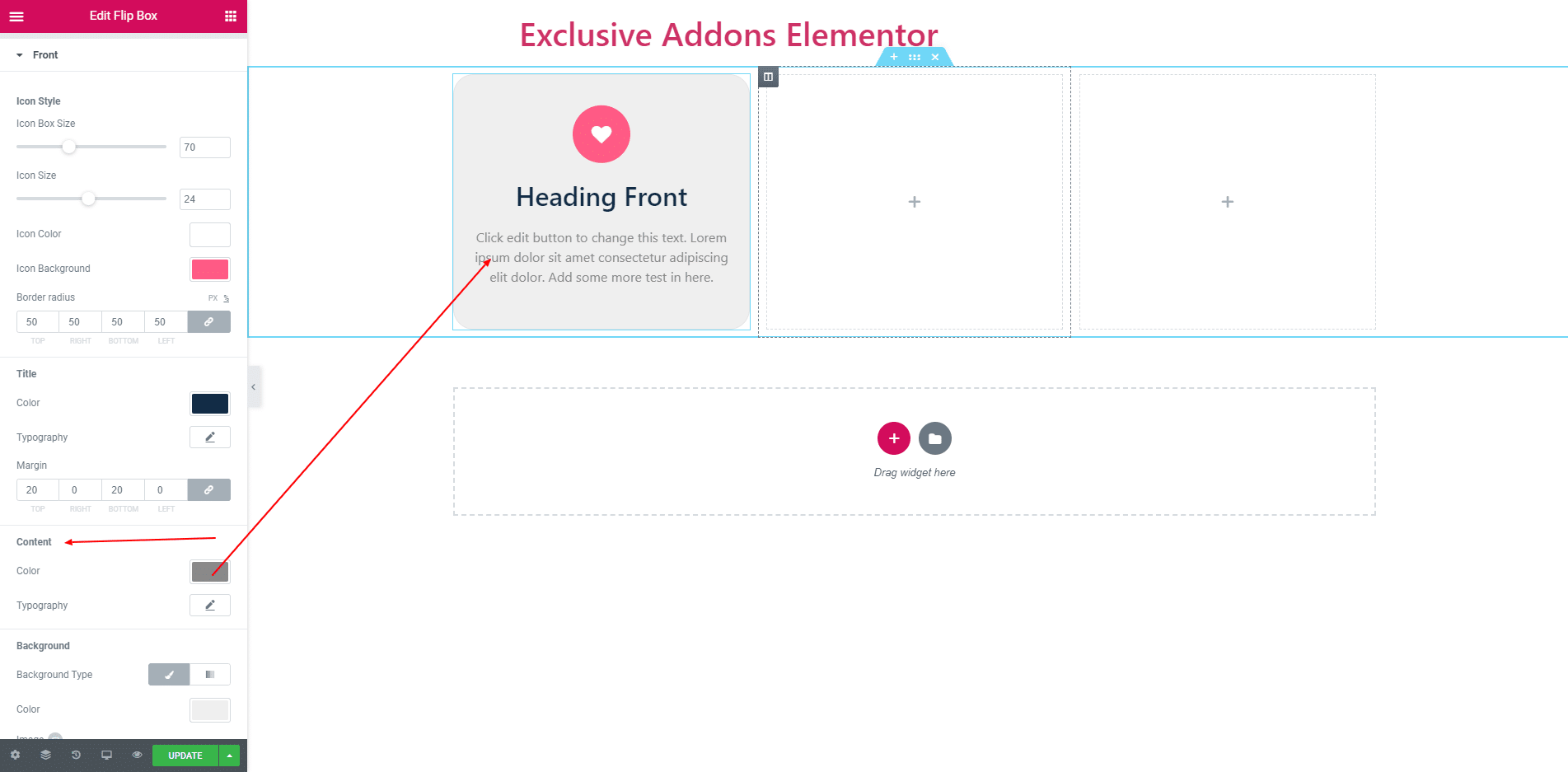
In ‘Content’ section you can apply content color, content typography. You can also give Background Color.
3.3. ‘Back Side’ style section consists of ‘Icon’, ‘Title’, ‘Description’ and ‘Button’.In ‘Icon’ section you can set icon box size, icon size, icon box color, icon color and border radius.
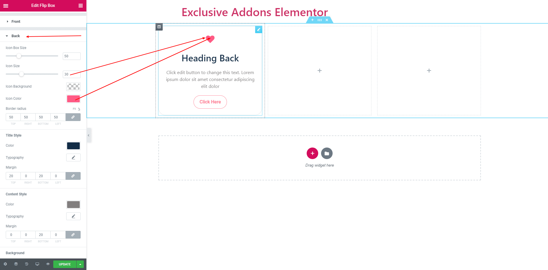
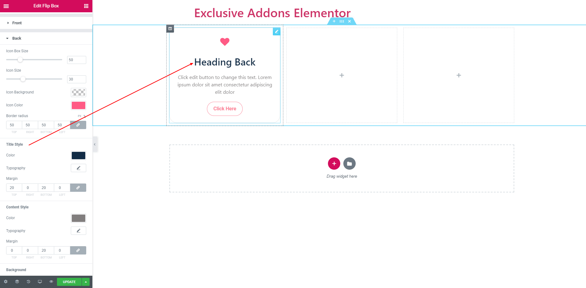
In ‘Title’ section you can apply title color, title typography and title margin.
In ‘Content’ section you can apply content color, content typography and content margin. You can also give Background Color.
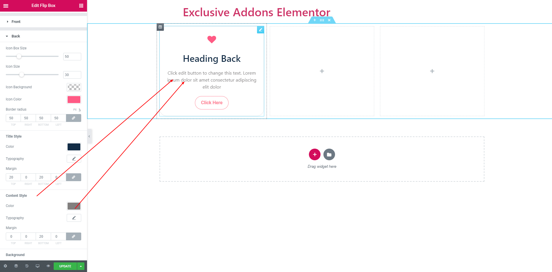
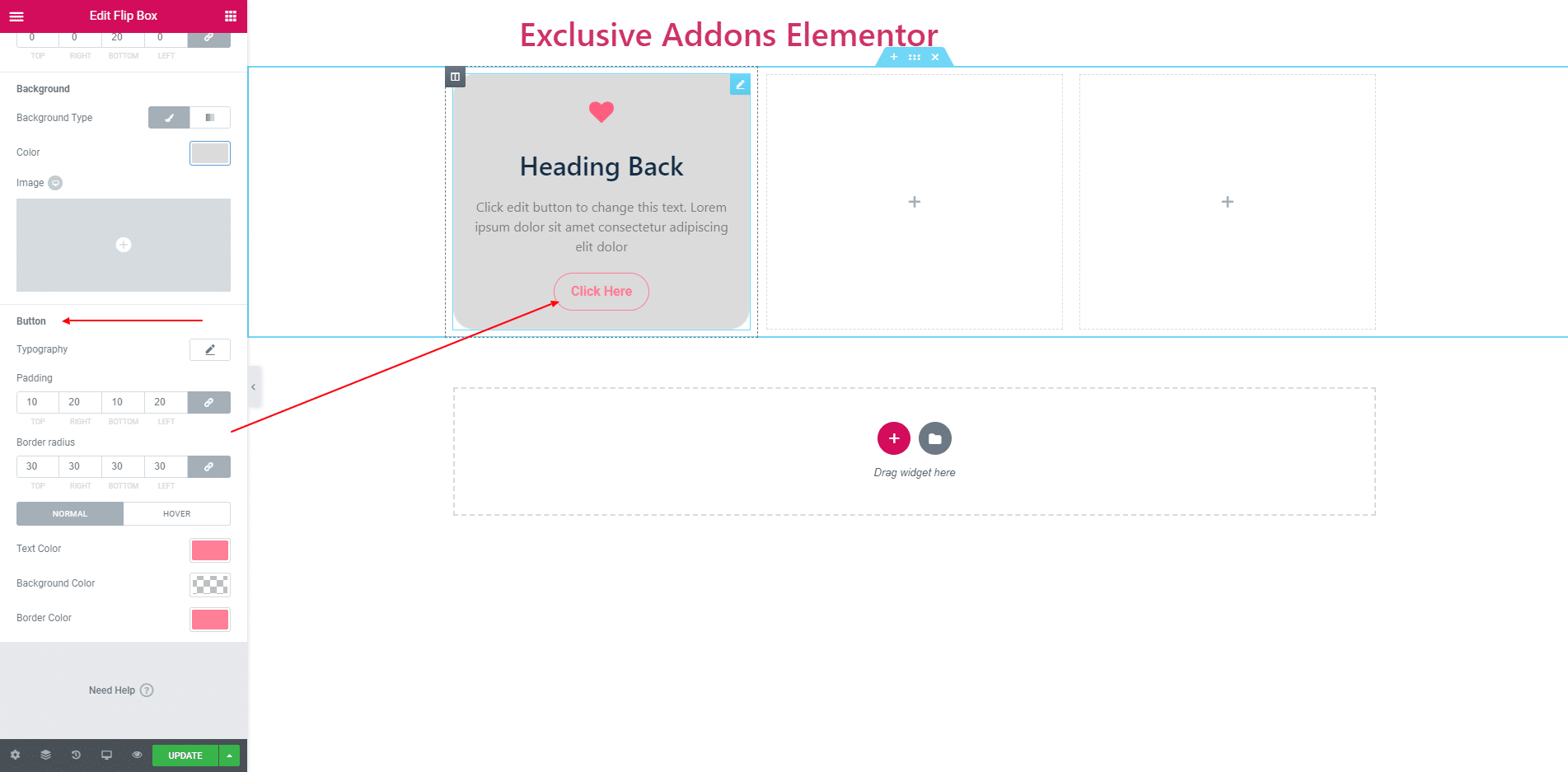
In ‘Button’ style section you can apply button color, background color, padding, border radius and more options for both normal and hover stage.
STEP 4:
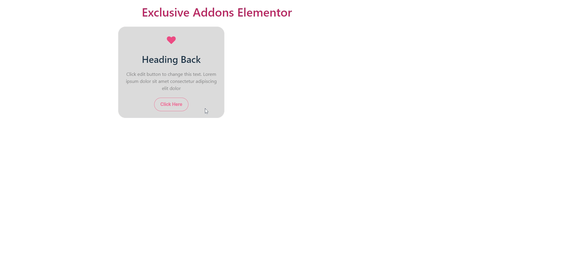
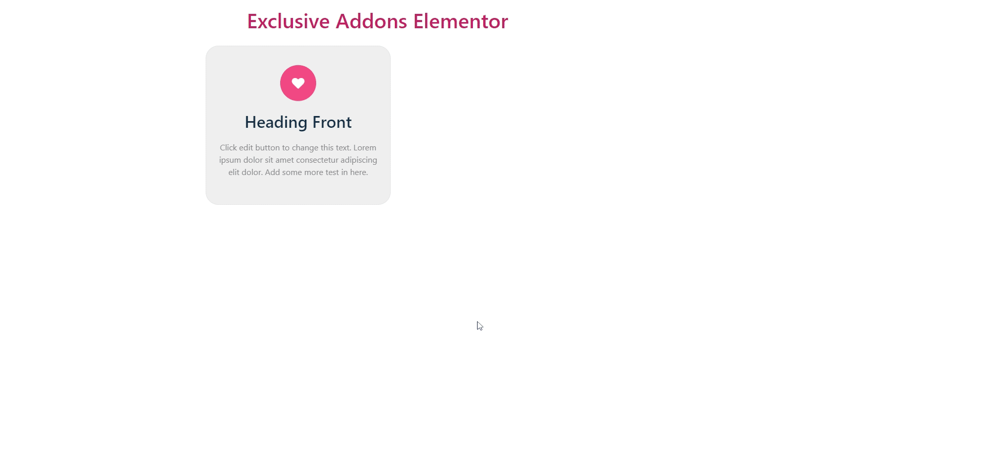
Finally, after clicking the update button you will see the beautiful ‘Flipbox’ on your webpage.The front side you can see at first.
If you hover the flip box you can see the backside with your selected animation.