How to configure and style Elementor Testimonial Carousel Widget
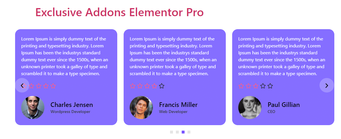
Make your site trustworthy by adding user testimonials in a modern and elegant sliding carousel. Design the testimonial with user credentials and style the section to your wish using Testimonial Carousel Widget of Exclusive Addons Elementor.
STEP 1:
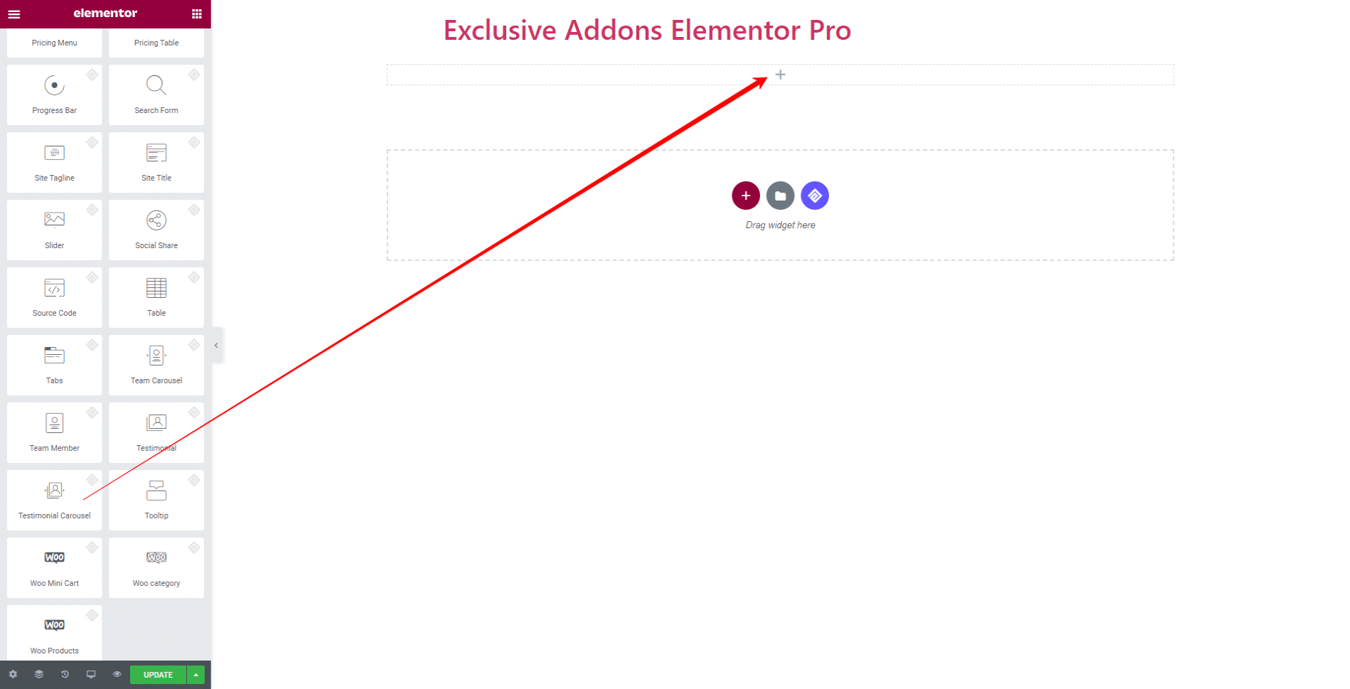
Select the ‘Testimonial Carousel‘ Widget from Elementor panel. Then drag and drop it in the selected area.
STEP 2:
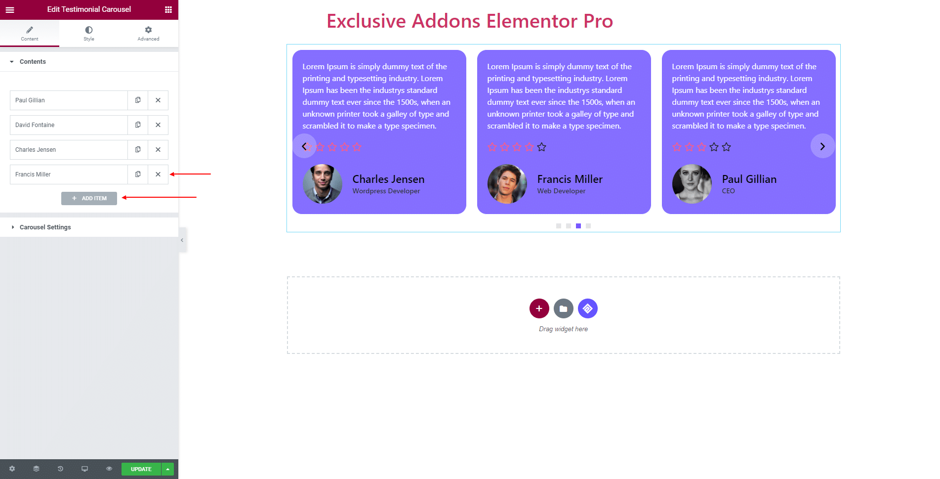
Content tab allows you to configure Contents and Carousel Settings.
2.1 For Contents, hit the ‘Add Items‘ button and add as many items as you want. Also, delete any of the items simply by clicking the ‘Cross‘ button.
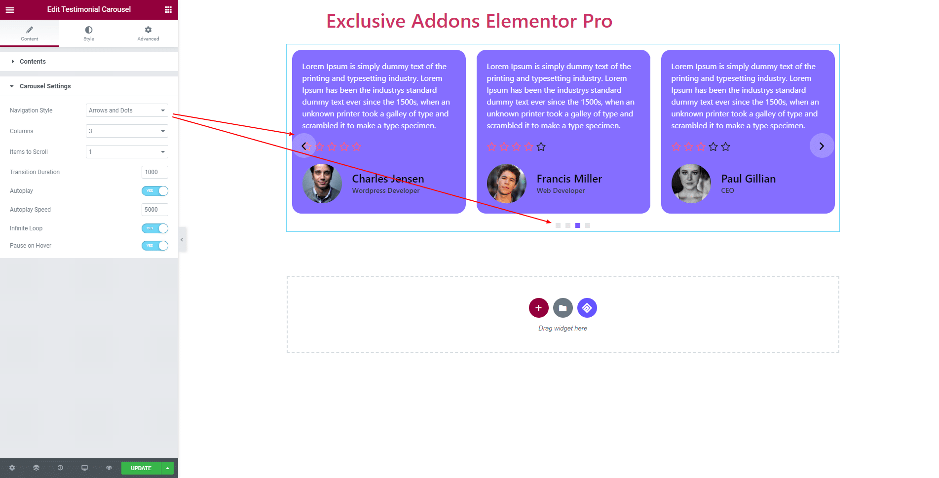
2.2 In terms of Carousel Settings, select Navigation Style to ‘Arrows’, ‘Dots’, ‘Arrows and Dots’, or ‘None’. You can set number of Columns, Items to Scroll, Transition Duration.
Also, enable or disable Autoplay, Infinite Loop, Pause on Hover, and set Autoplay Speed.
STEP 3:
Style tab allows you to customize Container, Reviewer Image, Testimonial, Rating, Reviewer, Arrows, Dots, and Advanced Option.
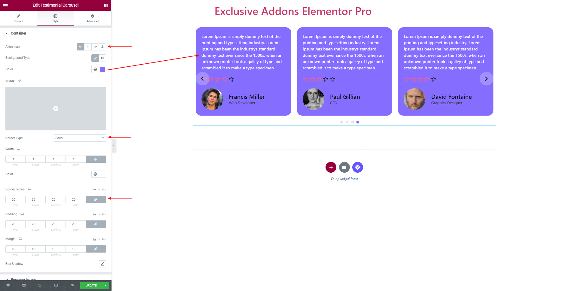
3.1 In Container section, set content Alignment, choose Background Type & color, and Border Type and Border Color.
Adjust its Border Radius, Padding, Margin, and Box Shadow.
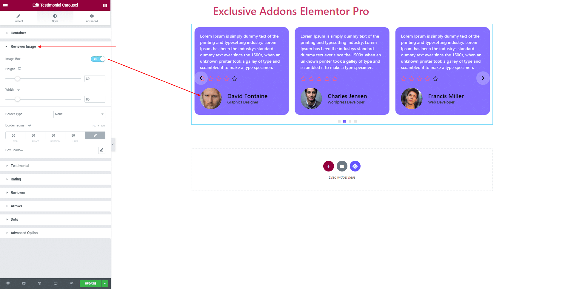
3.2 For Reviewer Image, you can turn on Image Box option. Change image Height, Width, Border Radius, and set Border Type, Box Shadow.
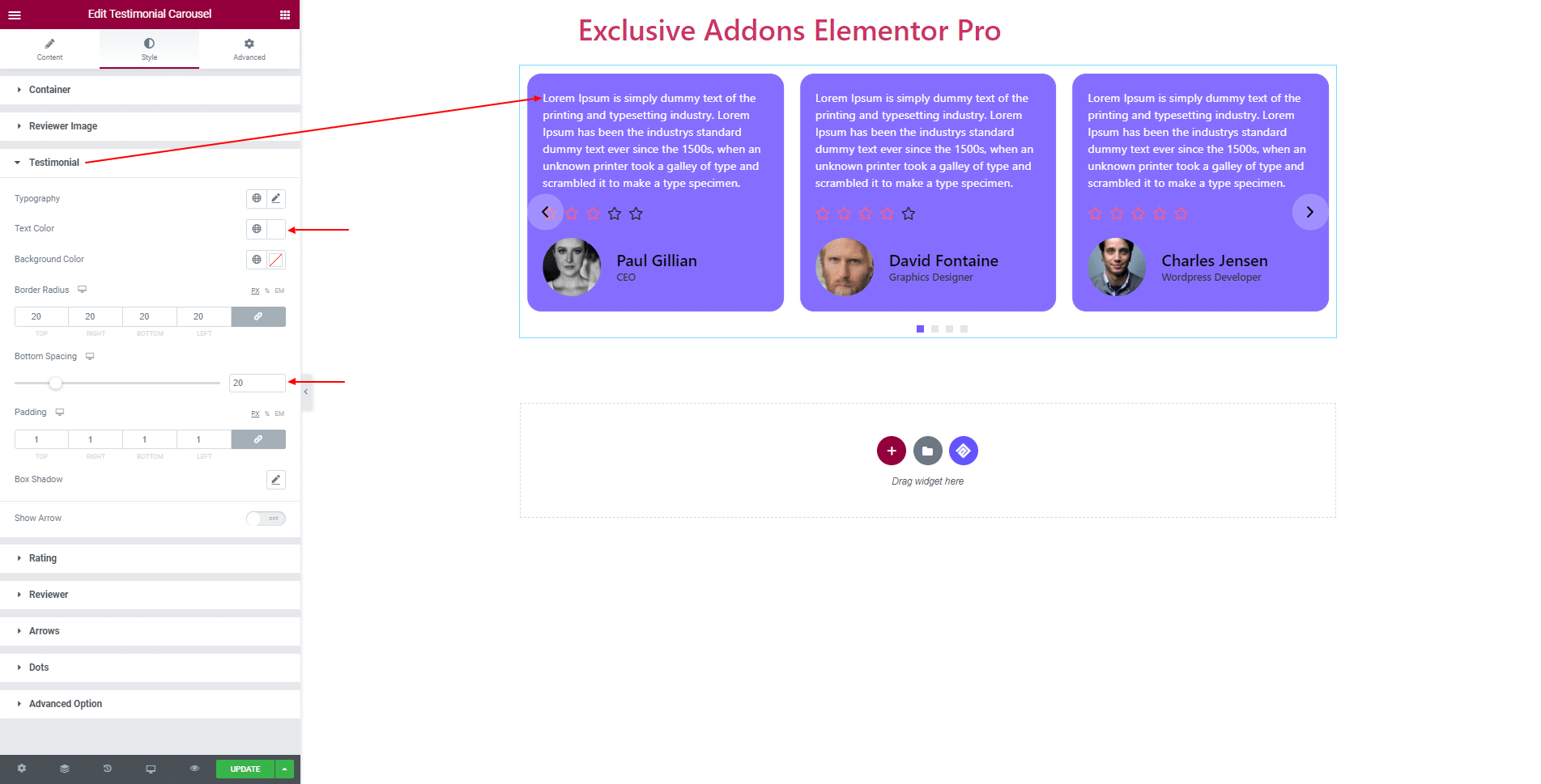
3.3 In Testimonial section, set Typography, Text Color, Background Color, Border Radius, Bottom Spacing, Padding, Box Shadow, and Show Arrow towards reviewer section.
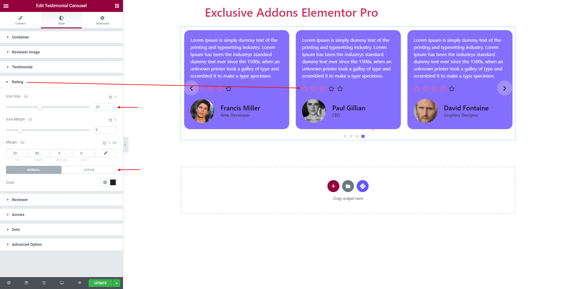
3.4 In terms of Rating, customize the section by changing Icon Size, Icon Margin, section Margin, and use different Colors for ‘Normal’ and ‘Active’ icon.
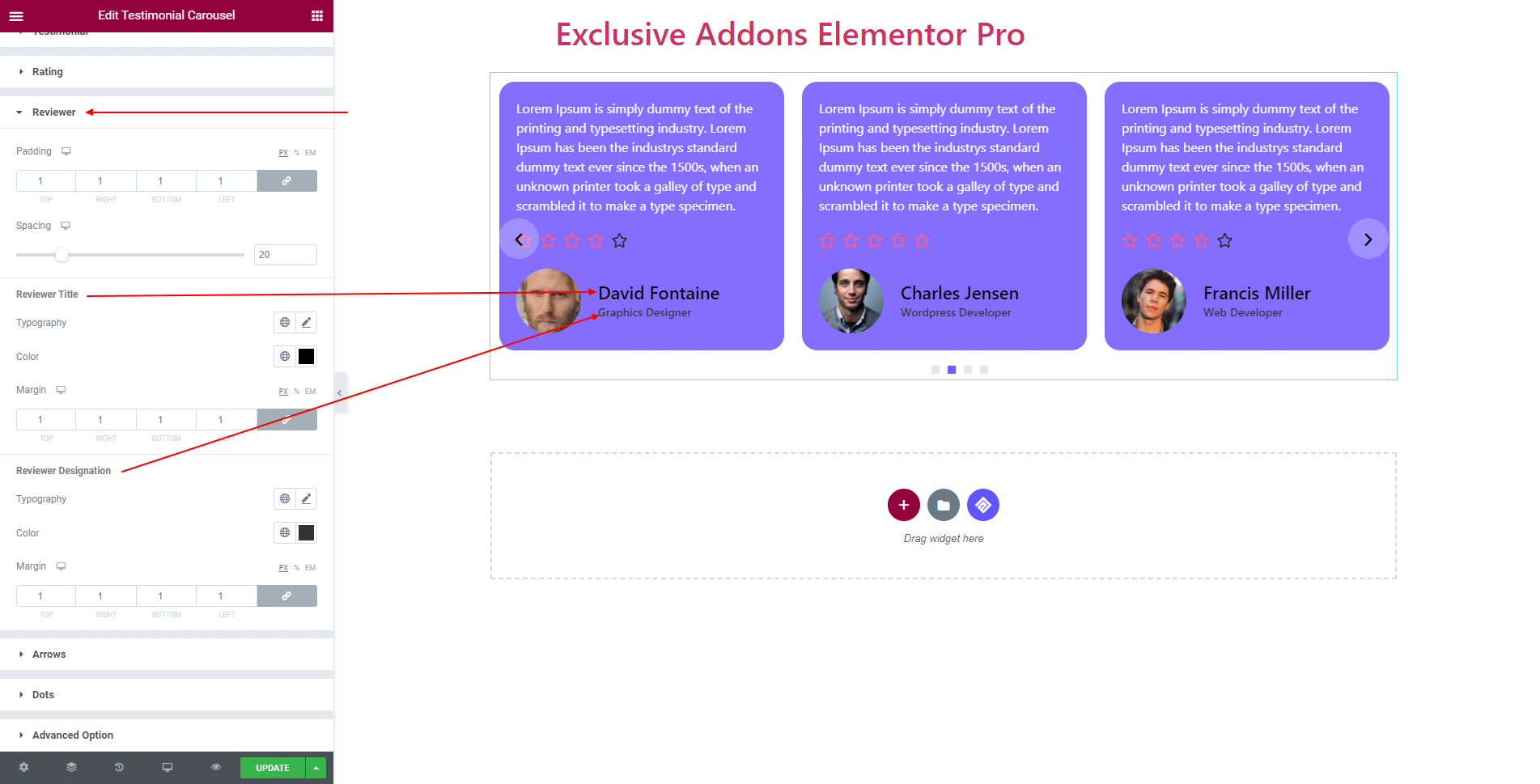
3.5 In Reviewer section, adjust Padding, Spacing, and use separate Typography, Color, and Margin for both ‘Reviewer Title’ and ‘Reviewer Designation’.
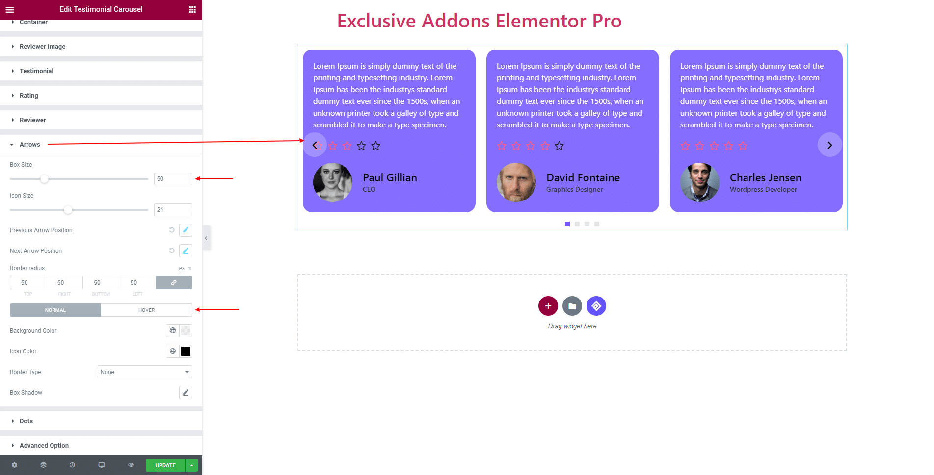
3.6 You can modify Arrow design, and change Box Size, Icon Size, Border-Radius. Put arrows in the section and change Previous Arrow Position and Next Arrow Position individually. Use different Background Color, Icon Color, Border Type, and Box Shadow for ‘Normal’ and ‘Hover’ state.
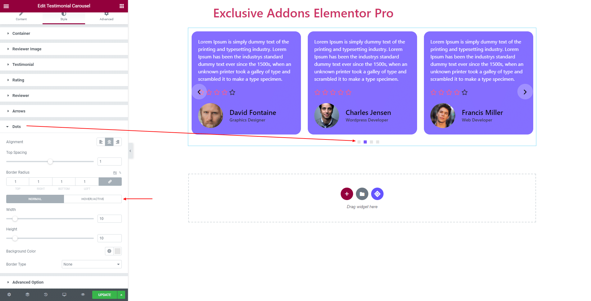
3.7 For Dots, set Alignment, Top Spacing, and Border Radius. Besides, use individual Height, Width, Background Color, and Border Type of ‘Normal’, and ‘Active’ dots.
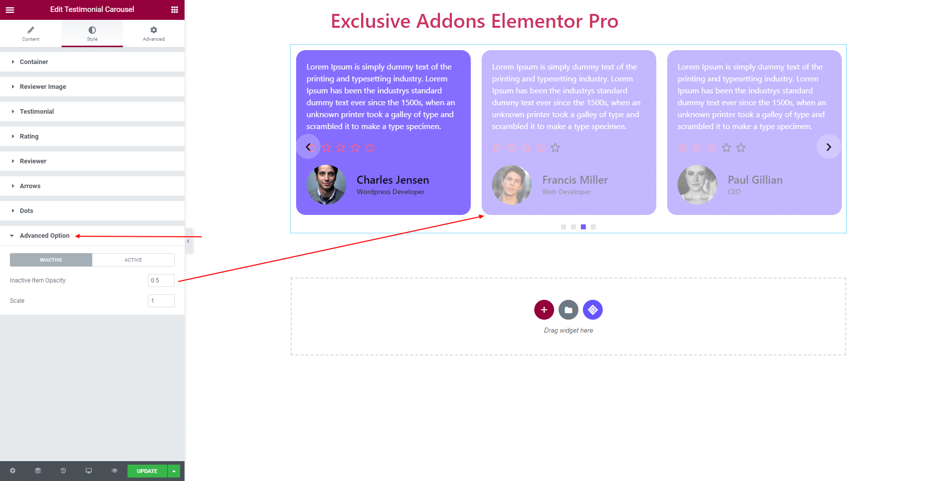
3.8 In Advanced Option, set Item Opacity and Scale of ‘Inactive’ and ‘Active’ items.
STEP 4:
Finally, hit the Update button, and include a stylish Testimonial Carousel Widget on your Wordpress site.